Egypt: Lower [Quenched]
Moderator: Cartographers
Re: LOWER EGYPT V7 (p3) - Gameplay and bonus discussions.
![]() by Kaplowitz on Thu Mar 27, 2008 3:50 pm
by Kaplowitz on Thu Mar 27, 2008 3:50 pm
Where it says "Im u" is there supposed to be a space in between the "m" and the "u"?

-

 Kaplowitz
- Posts: 3088
- Joined: Tue May 01, 2007 5:11 pm


Re: LOWER EGYPT V7 (p3) - Gameplay and bonus discussions.
![]() by cairnswk on Thu Mar 27, 2008 3:57 pm
by cairnswk on Thu Mar 27, 2008 3:57 pm
Kaplowitz wrote:Where it says "Im u" is there supposed to be a space in between the "m" and the "u"?
No. if you look on the small map (small maps are always the master for me because i work from small and then prorogate up to large) it is evenly spaced. This is a kerning issue with the font, and i suspect in the next version, after having just looked into this, i will have to change the font on the territory names.

* Pearl Harbour * Waterloo * Forbidden City * Jamaica * Pot Mosbi
-

cairnswk
- Posts: 11510
- Joined: Sat Feb 03, 2007 8:32 pm
- Location: Australia


Re: LOWER EGYPT V7 (p3) - Gameplay and bonus discussions.
![]() by laci_mae on Thu Mar 27, 2008 4:42 pm
by laci_mae on Thu Mar 27, 2008 4:42 pm
I love this map, and I'm super impressed with what you can accomplish in 2 weeks of map-making.
Question: I'm guessing the stars are the capitals, so is there some bonus related to them?
Minor graphic detail: The line from Am Khent (territory name) to the territory should be rotated clockwise a bit. It appears (at least at first glance) to point to the dow. It would be more clear if it pointed toward the army circle.
Best,
Laci
-

laci_mae
- Posts: 404
- Joined: Tue Jan 08, 2008 6:08 pm
- Location: Arkansas


Re: Re:
![]() by mibi on Thu Mar 27, 2008 6:55 pm
by mibi on Thu Mar 27, 2008 6:55 pm
Kaplowitz wrote:cairnswk wrote:mibi wrote:One of your best maps so far, although the colors could be more Egypt than Atlantis.
mibi...what is the atlantis bit you're referring to....sorry sometimes can't read your thoughts!!!
http://www.unmuseum.org/atlantis.htm
I think he means too watery or too many cool colors.
you read my mind!
-

mibi
- Posts: 3350
- Joined: Thu Mar 01, 2007 8:19 pm
- Location: The Great State of Vermont


Re: LOWER EGYPT V7 (p3) - Gameplay and bonus discussions.
![]() by TaCktiX on Thu Mar 27, 2008 6:57 pm
by TaCktiX on Thu Mar 27, 2008 6:57 pm
The occasional darker color would be good, I agree.
-

TaCktiX
- Posts: 2392
- Joined: Mon Dec 17, 2007 8:24 pm
- Location: Rapid City, SD


Re: LOWER EGYPT V7 (p3) - Gameplay and bonus discussions.
![]() by gimil on Thu Mar 27, 2008 7:19 pm
by gimil on Thu Mar 27, 2008 7:19 pm

get out of here
What do you know about map making, bitch?
Top Score:2403
natty_dread wrote:I was wrong
Top Score:2403
-

gimil
- Posts: 8599
- Joined: Sat Mar 03, 2007 12:42 pm
- Location: United Kingdom (Scotland)


Re: LOWER EGYPT V7 (p3) - Gameplay and bonus discussions.
![]() by cairnswk on Fri Mar 28, 2008 4:19 am
by cairnswk on Fri Mar 28, 2008 4:19 am
TaCktiX wrote:The occasional darker color would be good, I agree.
How these colours now?
* Pearl Harbour * Waterloo * Forbidden City * Jamaica * Pot Mosbi
-
cairnswk
- Posts: 11510
- Joined: Sat Feb 03, 2007 8:32 pm
- Location: Australia
Re: LOWER EGYPT V7 (p3) - Gameplay and bonus discussions.
![]() by cairnswk on Fri Mar 28, 2008 4:51 am
by cairnswk on Fri Mar 28, 2008 4:51 am
laci_mae wrote:I love this map, and I'm super impressed with what you can accomplish in 2 weeks of map-making.
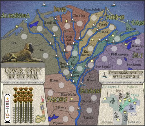
Question: I'm guessing the stars are the capitals, so is there some bonus related to them?
Minor graphic detail: The line from Am Khent (territory name) to the territory should be rotated clockwise a bit. It appears (at least at first glance) to point to the dow. It would be more clear if it pointed toward the army circle.
Best,
Laci
Laci Mae...thanks for your post.
The stars are indeed capitals, but in those days according to research, each of these districts had their own capital. I have, for the purposes of this map created continents based on 7 seven of these more well known capitals. As such, there is NO BONUS attached to the capitals.
It has been a long time since i have created a map this simple, and I hope it is well-received. 26 terts, that's it.
As for the line, i will adjust that.
* Pearl Harbour * Waterloo * Forbidden City * Jamaica * Pot Mosbi
-
cairnswk
- Posts: 11510
- Joined: Sat Feb 03, 2007 8:32 pm
- Location: Australia
Re: LOWER EGYPT V7 (p3) - Gameplay and bonus discussions.
![]() by cairnswk on Fri Mar 28, 2008 4:57 am
by cairnswk on Fri Mar 28, 2008 4:57 am
gimil wrote:
get out of here
Thanks Gimil, that was fast !!!
* Pearl Harbour * Waterloo * Forbidden City * Jamaica * Pot Mosbi
-
cairnswk
- Posts: 11510
- Joined: Sat Feb 03, 2007 8:32 pm
- Location: Australia
Re: LOWER EGYPT V7 (p3) - Gameplay and bonus discussions.
![]() by mibi on Fri Mar 28, 2008 8:24 am
by mibi on Fri Mar 28, 2008 8:24 am
cairnswk wrote:TaCktiX wrote:The occasional darker color would be good, I agree.
How these colours now?
I was thinking along these lines.

but its your map
-
mibi
- Posts: 3350
- Joined: Thu Mar 01, 2007 8:19 pm
- Location: The Great State of Vermont
Re: LOWER EGYPT V7 (p3) - Gameplay and bonus discussions.
![]() by cairnswk on Fri Mar 28, 2008 11:59 am
by cairnswk on Fri Mar 28, 2008 11:59 am
mibi wrote:cairnswk wrote:TaCktiX wrote:
I was thinking along these lines.
but its your map
Thanks mibi, but may i ask why you chose the yellows and mustards.
I was going after the darker look as requested above.
* Pearl Harbour * Waterloo * Forbidden City * Jamaica * Pot Mosbi
-
cairnswk
- Posts: 11510
- Joined: Sat Feb 03, 2007 8:32 pm
- Location: Australia
Re: LOWER EGYPT V8 (p4) [I] - New Colours
![]() by Ogrecrusher on Fri Mar 28, 2008 12:25 pm
by Ogrecrusher on Fri Mar 28, 2008 12:25 pm
I agree with the yellows. They feel more deserty.
-
Ogrecrusher
- Posts: 250
- Joined: Thu Aug 16, 2007 2:55 pm

Re: LOWER EGYPT V8 (p4) [I] - New Colours
![]() by cairnswk on Fri Mar 28, 2008 12:49 pm
by cairnswk on Fri Mar 28, 2008 12:49 pm
Ogrecrusher wrote:I agree with the yellows. They feel more deserty.
Does:
yellow for desert
blue for annual floods
green for fertility
make any sense?
I guess one could come up with all sorts of excuses for colours.
I don't think that the Nile Delta would necessarily be a region where yellow was the main colour. Because of the plentifulness of water and the annual flooding, i would , have thought greens and blue might be more appropriate.
The yellow might be more appropriate for the next map already started in Upper Egypt where apart from the annual floods, fertility was limited to river plains and the areas were surrounded by lots of sandstone hills and deserts.
* Pearl Harbour * Waterloo * Forbidden City * Jamaica * Pot Mosbi
-
cairnswk
- Posts: 11510
- Joined: Sat Feb 03, 2007 8:32 pm
- Location: Australia
Re: LOWER EGYPT V7 (p3) - Gameplay and bonus discussions.
![]() by Blitzaholic on Fri Mar 28, 2008 12:50 pm
by Blitzaholic on Fri Mar 28, 2008 12:50 pm
cairnswk wrote:TaCktiX wrote:The occasional darker color would be good, I agree.
How these colours now?
much better i think

-

Blitzaholic
- Posts: 23050
- Joined: Wed Aug 09, 2006 11:57 pm
- Location: Apocalyptic Area


Re: LOWER EGYPT V8 (p4) [I] - New Colours
![]() by TaCktiX on Fri Mar 28, 2008 1:24 pm
by TaCktiX on Fri Mar 28, 2008 1:24 pm
I like the new colors a good bit. More appropriate to the Nile delta.
-
TaCktiX
- Posts: 2392
- Joined: Mon Dec 17, 2007 8:24 pm
- Location: Rapid City, SD
Re: LOWER EGYPT V8 (p4) [I] - New Colours
![]() by Kaplowitz on Fri Mar 28, 2008 4:25 pm
by Kaplowitz on Fri Mar 28, 2008 4:25 pm
Cairns its true that the Nile Delta would make more sense to have the colors that you are using, but unfortunately when most people hear Egypt, they think of sand, pyramids, and pharaohs.
Either way if you are using cool colors, i think you should use more of a watery texture. The sandy texture would go better with warm colors, as they remind people of sand and deserts.
Either way if you are using cool colors, i think you should use more of a watery texture. The sandy texture would go better with warm colors, as they remind people of sand and deserts.
-
Kaplowitz
- Posts: 3088
- Joined: Tue May 01, 2007 5:11 pm
Re: LOWER EGYPT V8 (p4) [I] - New Colours
![]() by mibi on Fri Mar 28, 2008 4:29 pm
by mibi on Fri Mar 28, 2008 4:29 pm
In reality, its a bit of both sand and fertile land, in stark contrast.

I just don't know where all the blues and purples came from, I would love to see more realistic greens, and beiges.
I just don't know where all the blues and purples came from, I would love to see more realistic greens, and beiges.
-
mibi
- Posts: 3350
- Joined: Thu Mar 01, 2007 8:19 pm
- Location: The Great State of Vermont
Re: LOWER EGYPT V9 (p4) [I] - New Colours
![]() by cairnswk on Fri Mar 28, 2008 5:22 pm
by cairnswk on Fri Mar 28, 2008 5:22 pm
mibi wrote:In reality, its a bit of both sand and fertile land, in stark contrast.
I just don't know where all the blues and purples came from, I would love to see more realistic greens, and beiges.
Yes i agree it's a bit of both in stark contrast, however i am not making this as a representation of an overhead landscape shot from some satellite. You asked for the colours of Egypt, ad a darker less watery repsentation. These are colours that were used in ancient times.
The following colours are - continent, and there is only blue to reprensent the river and sea and one continent of purpple.
Alexandria = Karchi
Buto = red
Mendes = Yellow
Tanis = Green
Bubastic = Brown
Memphis = sandy orange
Sile = Purple.
There is one purple and two blues
All continent colours are treated with 75 Average 50% Plasture texture and a Gaussian Blur of 0.5%
So....I have replaced the SILE purple with a darkish brown, but that is all i am prepared to change.
I prefer to use the colours as are in the version below Version 9.
i am planning that Upper Egypt will have more yellows etc for the desert, and the new kingdon map will be colours of blacks, and golds and browns.
* Pearl Harbour * Waterloo * Forbidden City * Jamaica * Pot Mosbi
-
cairnswk
- Posts: 11510
- Joined: Sat Feb 03, 2007 8:32 pm
- Location: Australia
Re: LOWER EGYPT V9 (p5) [I] - New Colours
![]() by Ogrecrusher on Fri Mar 28, 2008 7:29 pm
by Ogrecrusher on Fri Mar 28, 2008 7:29 pm
Either way it looks beautiful to me.
Nice work!
Nice work!
-
Ogrecrusher
- Posts: 250
- Joined: Thu Aug 16, 2007 2:55 pm
Re: LOWER EGYPT V9 (p5) [I] - New Colours
![]() by Unit_2 on Sat Mar 29, 2008 12:41 am
by Unit_2 on Sat Mar 29, 2008 12:41 am
Take the texture off the Syphix, because it looks like a part of the map.

-

Unit_2
- Posts: 1834
- Joined: Sun Jan 14, 2007 12:59 pm
- Location: Pennsylvania, U.S.A, North America, Earth, Milky Way, Universe.


Re: LOWER EGYPT V9 (p5) [I] - New Colours
![]() by cairnswk on Sat Mar 29, 2008 1:12 am
by cairnswk on Sat Mar 29, 2008 1:12 am
Unit_2 wrote:Take the texture off the Syphix, because it looks like a part of the map.
it already has a plaster texture applied to it.
Now have you updated the development atlas yet...
Battle of Gazala has been quenched
Rail Euirope is in Final Forge
and Lower Egypt is in Map Foundry
none of these presently exist in their right categories.
* Pearl Harbour * Waterloo * Forbidden City * Jamaica * Pot Mosbi
-
cairnswk
- Posts: 11510
- Joined: Sat Feb 03, 2007 8:32 pm
- Location: Australia
Re: LOWER EGYPT V9 (p5) [I] - New Colours
![]() by Kaplowitz on Sat Mar 29, 2008 1:00 pm
by Kaplowitz on Sat Mar 29, 2008 1:00 pm
Upper Egypt is next? 
-
Kaplowitz
- Posts: 3088
- Joined: Tue May 01, 2007 5:11 pm
Re: LOWER EGYPT V9 (p5) [I] - New Colours
![]() by cairnswk on Sat Mar 29, 2008 1:40 pm
by cairnswk on Sat Mar 29, 2008 1:40 pm
Kaplowitz wrote:Upper Egypt is next?
yes it is already started on my computer here
* Pearl Harbour * Waterloo * Forbidden City * Jamaica * Pot Mosbi
-
cairnswk
- Posts: 11510
- Joined: Sat Feb 03, 2007 8:32 pm
- Location: Australia
Re: LOWER EGYPT V9 (p5) [I] - Comments??
![]() by benny profane on Sun Mar 30, 2008 8:44 am
by benny profane on Sun Mar 30, 2008 8:44 am
i very much like the way this is progressing, colors included.
my only suggestion is this:
maybe you'll consider varying the texture between the legend, land, and water?
the uniformity certainly doesn't ruin the map, but the rivers and lakes are the only things that stand out as distinct.
if you're going to distinguish the rivers and lakes, some further variation may help overall.
-

benny profane
- Posts: 248
- Joined: Sat Jun 16, 2007 4:00 pm
- Location: Brooklyn, NY


Re: LOWER EGYPT V9 (p5) [I] - Comments??
![]() by cairnswk on Mon Mar 31, 2008 4:10 pm
by cairnswk on Mon Mar 31, 2008 4:10 pm
benny profane wrote:i very much like the way this is progressing, colors included.
my only suggestion is this:
maybe you'll consider varying the texture between the legend, land, and water?
the uniformity certainly doesn't ruin the map, but the rivers and lakes are the only things that stand out as distinct.
if you're going to distinguish the rivers and lakes, some further variation may help overall.
ok. taken on board, benny, i'll see what i can do
* Pearl Harbour * Waterloo * Forbidden City * Jamaica * Pot Mosbi
-
cairnswk
- Posts: 11510
- Joined: Sat Feb 03, 2007 8:32 pm
- Location: Australia
Who is online
Users browsing this forum: No registered users
|
|||||||
| Conquer Club is not associated with RISK online in any way. Copyright © 2006-2024 by Big Wham LLC | |||||||