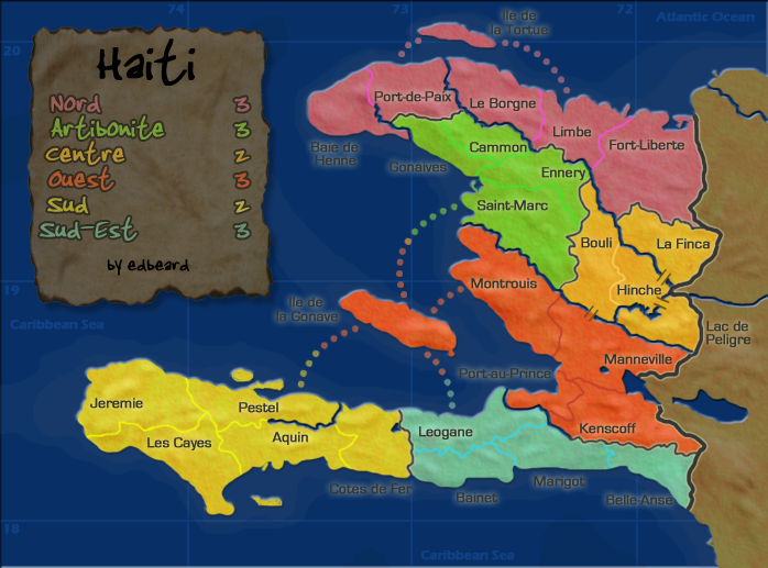
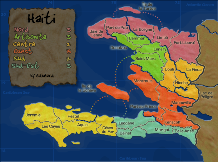
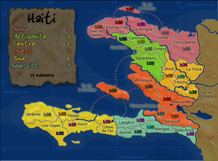
cairnswk wrote:3. i like the overall appearance....it is clean and crisp,,,,even though some have suggested a little bright, but on a map like this bright can be toned down a tad and still retain a sub-tropical flavour.
4. just some attention to differentation between border thickneses and rivers need to be made clearer.
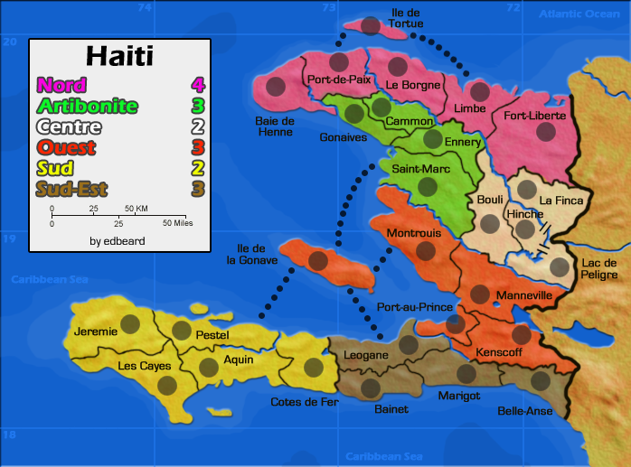
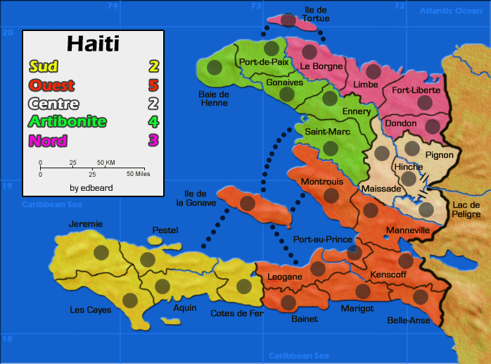
I think the bright colors are fine if it works with the overall theme of the map. Right now it doesn't - some of your colors are a bit dreary, e.g. the sea and the legend. I would also suggest you remove black from the palette entirely - maybe come up with something lighter and friendlier for the borders and text. A dark green, brown, or blue will have the same effect as black if it is used against the right background, without being as heavy (though maybe not blue, because you already have the blue rivers).
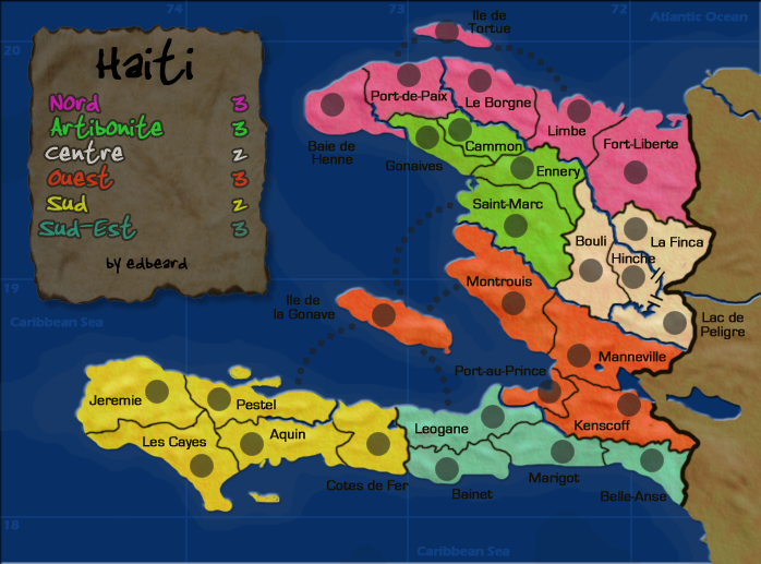
The rivers were my first concern in looking at this map. In some places you break up in impassable river with a black border, while in other places you have a bridge. What's the difference? And you'll need to work out the Lac de Peligre/La Finca border - it is so small I can't tell if it's impassable... or that it's a border at all. You can take some liberties with geography there.
And I agree with Cairnswk (again) that the dots seem wrong for this map... maybe something more fun and tropical, like a boat!


