Page 1 of 10

France 1789

PostPosted: Sat May 03, 2008 2:50 am
by pamoa
ImageImageImageImage
This is not a revamp but an alternative to the current France map!
It is based on the french kingdom territorial division the day before the revolution of july 1789,
in addition with Nice, Savoie, Venaissin and Montbéliard as they were not part of France at that time.

6 regions, 37 territories +1 Paris/Isle-de-France which start neutral with 4 armies
Impassable object are: - the rivers with a double border, bridges cross them! - and the mountains

v21 new features: texts and armies positions
Click image to enlarge.
image

Image

v21 / v20 / v19 / v18 / v17 / v16 / v15 / v14 / v13 / v12 / v11 / v10 / v09 / v08 / v07 / v06 / v05 / v04 / v03 / v02 / v01


Re: FRANCE 18TH century - v01 p1 - may03 p1

PostPosted: Sat May 03, 2008 2:56 am
by dragon dor
belle carte je suis pas specialiste en géografie mais je la trouve bien :P

Re: FRANCE 18TH century - v01 p1 - may03 p1

PostPosted: Sat May 03, 2008 3:07 am
by AndyDufresne
I like the idea, but the graphics feel too reminiscent of Ireland. It looks like you've got some ability to set yourself apart from other maps...do that. :)


--Andy

Re: FRANCE 18TH century - v01 p1 - may03 p1

PostPosted: Sat May 03, 2008 3:21 am
by cairnswk
Wow...great talent! ;)

Re: FRANCE 18TH century - v01 p1 - may03 p1

PostPosted: Sat May 03, 2008 4:17 am
by Ruben Cassar
Mon dieu! C'est tres magnifique! ;)

I love it. I don't mind the graphics being similar to Ireland however I have one problem with that. It is hard for me to determine where a region stops and another one begins at a first glance. Perhaps you should consider keeping this style but increasing the thickness of the inner stroke so that the colours will be more easily distinguishable between each other.

About the legend...it's very nice, but I have become a fan of mini maps lately, specifically for the reason mentioned above, they are easier to read at a first glance.

I don't particularly like the slanted territory names. Perhaps try to keep a consistent style and keep them all horizontal.

I noticed those ports in the south. There should be some ports in the north/north west as well? Are you considering using them for anything other than eye candy? (edit: just read that the southern ports are linked)

And finally the image in the sea. It's nice but I would like to see Marianne (http://en.wikipedia.org/wiki/Marianne) somewhere in this map. Perhaps you could think of somewhere where you can add her? (edit: noticed the 1789 timeline...maybe Marianne came after that date but surely around that time. According to wiki 1792)

Spelling mistake: It should be written Île-de-France.

Great job.

Sei stato bravo amico! Non vedo l'ora di giocare su questa carta:)

Re: FRANCE 18TH century - v01 p1 - may03 p1

PostPosted: Sat May 03, 2008 5:36 am
by t-o-m
looks great, i think it is similar to france - but i dont play on france - but i would play on this!
the colours need a look at though, and those rivers are a bit weird - its hard to see if theyre ment to be there, if theyre immpassables or what (because they dont run along the terit line - that isnt a problem just a bit confusing)
great start :)

Re: FRANCE 18TH century - v01 p1 - may03 p1

PostPosted: Sat May 03, 2008 6:50 am
by Balsiefen
Probably one of the best first versions of a map. Definatly supportive, Historical maps are rather an intrest for me.

Anyway, Graphics, all i have to say is that maybe you should widen the bridges to make them more visible. Also a very light paperish yellow on the neutral may or may not work.

Gameplay wise- Ouest should be a three and i would possibly also think about knocking nord up to a three would be worthwile as well, I know it has paris as well which basicly makes it a four but for a 6 territ cont with 3 protecting against 6 possible attack directions i think it may be worth it.

This however makes for a map with very few small conts which is a feature i enjoy in maps, which is why I play maps like portugal more than ones like Asia. It may be worth, instead of upping bonuses, to add a couple more impassables.

Re: FRANCE 18TH century - v01 p1 - may03 p1

PostPosted: Sat May 03, 2008 7:06 am
by DiM
great start regarding the graphics.
unfortunatelly the gameplay kinda sucks at this moment but this can be sorted. for starters the map is too open and each continent has too many borders.

look at ouest 4 terits 4 borders
centre 7 terits 4 borders
so basically you either need to split the continents in another way or add some impassable borders otherwise the map will be a massive battle where nobody can hold a continent. (except est)

Re: FRANCE 18TH century - v01 p1 - may03 p1

PostPosted: Sat May 03, 2008 7:13 am
by Gilles#1
Bien fait pamoa
Very nice map. =D>

Re: FRANCE 18TH century - v01 p1 - may03 p1

PostPosted: Sat May 03, 2008 7:55 am
by trapyoung
i really like this map, i love the colors, bonus structure, map and docks! awesome work

Re: FRANCE 18TH century - v01 p1 - may03 p1

PostPosted: Sat May 03, 2008 9:05 am
by Kaplowitz
(i just want to see them next to eachother)
Click image to enlarge.
image

Click image to enlarge.
image


I think that compared to the current France map, they have nothing in common other than that they are both France!
This is a great start, i love the graphics, they are good on the eyes.
The one thing i dont like is all the dead space. It looks pretty cool, but the map is going to be very tiny when starting the small map. Maybe for the small map at least, you could have it more zoomed in on France?

Re: FRANCE 18TH century - v01 p1 - may03 p1

PostPosted: Sat May 03, 2008 10:44 am
by ZeakCytho
This looks good!

I agree with basically everything Ruben Cassar said.

Also, the map looks kind of busy now. You might want to consider removing the rivers that are not impassables, or at least decreasing the opacity on them.

Re: FRANCE 18TH century - v01 p1 - may03 p1

PostPosted: Sat May 03, 2008 1:33 pm
by AndyDufresne
Ruben Cassar wrote:Mon dieu! C'est tres magnifique! ;)

I love it. I don't mind the graphics being similar to Ireland however I have one problem with that. It is hard for me to determine where a region stops and another one begins at a first glance. Perhaps you should consider keeping this style but increasing the thickness of the inner stroke so that the colours will be more easily distinguishable between each other.

That is the same problem that cropped up after the Ireland map.

I'd advise going with a different style. I enjoy similar looking maps in series, but I think a more unique graphics look can most surely benefit this map, and make you stand out from the crowd.


--Andy

Re: FRANCE 18TH century - v01 p1 - may03 p1

PostPosted: Sun May 04, 2008 2:27 am
by oaktown
i already like this better than the current France map, but in order to make it work you'll have to give us something that puts us in the era that you're going for... I think the map looks nice, but it doesn't make me think "ooh, this is france in the 18th century" any more than the current France map does.

Toward v02

PostPosted: Sun May 04, 2008 2:49 am
by pamoa
Thanks guys for the warm welcome. :)

GRAPHICS

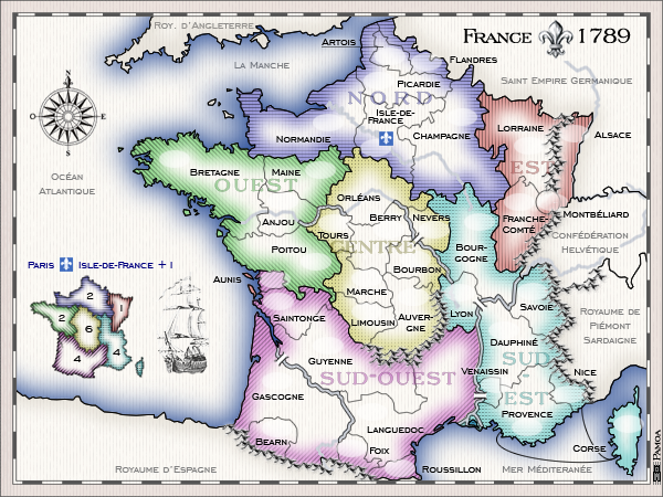
Ruben Cassar:I don't mind the graphics being similar to Ireland however I have one problem with that. It is hard for me to determine where a region stops and another one begins at a first glance. Perhaps you should consider keeping this style but increasing the thickness of the inner stroke so that the colours will be more easily distinguishable between each other.
t-o-m: the colours need a look at though...
AndyDufresne:That is the same problem that cropped up after the Ireland map. I'd advise going with a different style. I enjoy similar looking maps in series, but I think a more unique graphics look can most surely benefit this map, and make you stand out from the crowd.
-> Thanks for pushing me to improve my graphics, i'll work on something for the next version, somthing like a pattern faded in color, i'll see.
Ruben Cassar:About the legend...it's very nice, but I have become a fan of mini maps lately, specifically for the reason mentioned above, they are easier to read at a first glance.
-> I don't know, i find it not adapted for what I had in mind for the graphics. i'll stick to my legend for the moment
Ruben Cassar:I don't particularly like the slanted territory names. Perhaps try to keep a consistent style and keep them all horizontal.
-> i'll fix it
Ruben Cassar: ...the image in the sea. It's nice but I would like to see Marianne somewhere in this map. Perhaps you could think of somewhere where you can add her? (edit: noticed the 1789 timeline...maybe Marianne came after that date but surely around that time. According to wiki 1792)
-> you noticed well, in fact it is France the day BEFORE revolution and Marianne was an icon of revolution, so it won't happen you will see her on this map even if I understand you did want to see some feminine figure in this very male world ;) The only symbol i can use is the fleur-de-lys which is the one of the french king and is allready in light grey background of the map
Ruben Cassar: Spelling mistake: It should be written Île-de-France.
-> it is correct, it's the spelling of that time. The ^ accent in the modern version stand for an S in old french
t-o-m: ... those rivers are a bit weird - its hard to see if theyre ment to be there, if theyre immpassables or what (because they dont run along the terit line - that isnt a problem just a bit confusing)
ZeakCytho :Also, the map looks kind of busy now. You might want to consider removing the rivers that are not impassables, or at least decreasing the opacity on them.
-> I think it may need few seconds of adaptation to understand were they are impassable but the double line on each side is quite a clear indication. I also want to keep rivers runing until the sea ( just for geographical coherence) but i'll work on their opacity
Balsiefen: ... maybe you should widen the bridges to make them more visible.
-> I'll see how to make them more visible
Balsiefen: Also a very light paperish yellow on the neutral may or may not work.
-> Maybe later, but i'm not sure I want the old map realism go this far
Kaplowitz: The one thing i dont like is all the dead space. It looks pretty cool, but the map is going to be very tiny when starting the small map. Maybe for the small map at least, you could have it more zoomed in on France?
-> I'll consider it when i'll reach that point of the map developpement and you would surely make some comment at that point if I never reach it.

GAMEPLAY

Ruben Cassar: I noticed those ports in the south. There should be some ports in the north/north west as well? Are you considering using them for anything other than eye candy? (edit: just read that the southern ports are linked)
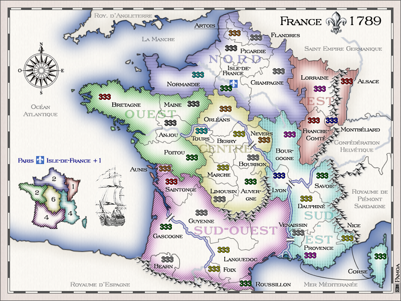
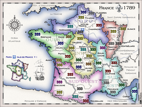
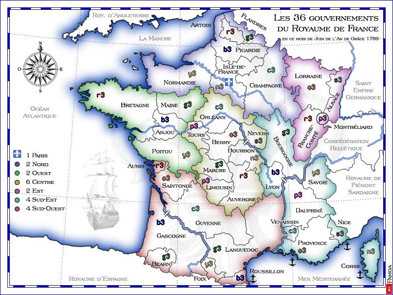
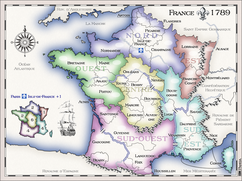
-> I needed to find a way to indicate the links for Corse. But atlantic territories are allready very open so they don't need more connections. I'll make another version of those links and then tell me!
Balsiefen: Ouest should be a three and i would possibly also think about knocking nord up to a three would be worthwile as well, I know it has paris as well which basicly makes it a four but for a 6 territ cont with 3 protecting against 6 possible attack directions i think it may be worth it. It may be worth, instead of upping bonuses, to add a couple more impassables.
-> bonuses are just an indication for the moment, I'll wait for more opinion on this point
DiM: for starters the map is too open and each continent has too many borders. look at ouest 4 terits 4 borders. centre 7 terits 4 borders. so basically you either need to split the continents in another way or add some impassable borders otherwise the map will be a massive battle where nobody can hold a continent. (except est)
-> I didn't work hard on the game play for the moment, but i keep in mind your remark about making regions (continents) more closed

v02 done!

Re: FRANCE 18TH century - maps v02 p1 - comments may05 p1

PostPosted: Sun May 04, 2008 10:54 pm
by Unit_2
I disagree Andy, I like these graphics, they are cool.

Add in the accents.

Re: FRANCE 18TH century - maps v02 p1 - comments may05 p1

PostPosted: Sun May 04, 2008 11:20 pm
by AndyDufresne
Version 2 is perhaps slightly better, but I'd still rather see a more unique look into graphics...you're surely have the ability...Impress us!


--Andy

Re: FRANCE 18TH century - maps v02 p1 - comments may05 p1

PostPosted: Mon May 05, 2008 10:34 am
by yeti_c
Great start Pamoa..

Not much more to say at the moment as most people have said a lot - I'll take a better look when you get the next version up.

Good luck.

C.

Re: FRANCE 18TH century - maps v02 p1 - comments may05 p1

PostPosted: Tue May 06, 2008 9:33 am
by Ruben Cassar
Okay I am going to focus only on the graphical aspect for now.

I definitely prefer version 1 much more. The only problem I had with version 1 is that it was a bit difficult to see where a region ends and another one begins, especially since I am colour blind. I suggest you stick to version 1 but try to fill the territories with more colour and perhaps remove the white areas completely.

I noticed you added the fleur-de-lys. However I think very few people (if any) noticed it. I don't think its place should be as a background for the regions. Perhaps you should place it somewhere else on the map like that vessel.

The rivers: these are also a bit of a problem since rivers which do not act as borders can be misleading for the gameplay. At the moment I don't know how you could tackle this problem though.

Good luck!

P.S. - Those mountains look great. Did you create them yourself?

FRANCE 18TH century - maps v03 p1 - comments may07 p2

PostPosted: Wed May 07, 2008 5:40 am
by pamoa
v03 online!

I need more comments to be able to develop

Re: FRANCE 18TH century - maps v02 p1 - comments may05 p1

PostPosted: Wed May 07, 2008 5:55 am
by Ruben Cassar
Ruben Cassar wrote:Okay I am going to focus only on the graphical aspect for now.

I definitely prefer version 1 much more. The only problem I had with version 1 is that it was a bit difficult to see where a region ends and another one begins, especially since I am colour blind. I suggest you stick to version 1 but try to fill the territories with more colour and perhaps remove the white areas completely.

I noticed you added the fleur-de-lys. However I think very few people (if any) noticed it. I don't think its place should be as a background for the regions. Perhaps you should place it somewhere else on the map like that vessel.

The rivers: these are also a bit of a problem since rivers which do not act as borders can be misleading for the gameplay. At the moment I don't know how you could tackle this problem though.

Good luck!

P.S. - Those mountains look great. Did you create them yourself?


All the comments I made in this previous post apply for version 3 since basically nothing has changed from version 2 to 3.

The mini map which was added in this version doesn't work in my opinion. The fleur-de-lys background is just confusing and detracts from the clarity of the mini map. I suggest you use a colour version of the mini map and shift the fleur-de-lys to somewhere else...perhaps use it next to the map title which also needs to be more prominent.

Good luck!

Re: FRANCE 18TH century - maps v03 p1 - comments may07 p2

PostPosted: Wed May 07, 2008 8:49 am
by bryguy
I like the overall curved look, and im gonna comment on other stuff to


1) I dont care for how the water goes from a good shade ofblue to white, perhaps just from dark blue to light blue?
2) could u make the dotted lines a little more transparent?
3) Everything on this map seems to be french, which i cant read..... Perhaps extending the width of this map and putting the instructions (which im assuming are in french) in french AND english
4) I liked the boat a few versions back in the water.... but what i suggest is that you move the bonuses area up a little and but the boat back in, and see how it looks
5) The blue and white (gray so that you can read it) dont seem to have a point, and hurt my eyes :shock:
6) Why is one of the bonuses saying "2+1"???
7) I like the bridges, but the water could use some work, it annoys me (except i like how it has a border and is darker where u cant pass it, and is lighter with no border when its not an impassable

Hopefully more later :D

Keep up the good work!

v04

PostPosted: Thu May 08, 2008 12:01 pm
by pamoa
GRAPHICS

Ruben Cassar:I definitely prefer version 1 much more. The only problem I had with version 1 is that it was a bit difficult to see where a region ends and another one begins, especially since I am colour blind. I suggest you stick to version 1 but try to fill the territories with more colour and perhaps remove the white areas completely.
Sorry but i'll try to stick the color border and white center effect as it is the way maps were done at that time. But I added the hatching to help
I noticed you added the fleur-de-lys. However I think very few people (if any) noticed it. I don't think its place should be as a background for the regions. Perhaps you should place it somewhere else on the map like that vessel.
Gone with "noise" reducing policy
The rivers: these are also a bit of a problem since rivers which do not act as borders can be misleading for the gameplay. At the moment I don't know how you could tackle this problem though.
I can not make them disappear and reappear so just fadded the color and reinforced borders
Those mountains look great. Did you create them yourself?
Yep, inspired properly from an 18th century map of south east corner of northern america
The mini map which was added in this version doesn't work in my opinion. The fleur-de-lys background is just confusing and detracts from the clarity of the mini map. I suggest you use a colour version of the mini map
Done
and shift the fleur-de-lys to somewhere else...perhaps use it next to the map title which also needs to be more prominent.
No more space, gone with "noise" reducing policy

bryguy : could u make the dotted lines a little more transparent?
Gone with "noise" reducing policy
Everything on this map seems to be french, which i cant read..... Perhaps extending the width of this map and putting the instructions (which im assuming are in french) in french AND english. Why is one of the bonuses saying "2+1"???
+1 stand for paris bonus as explained on the new legend for paris above minimap
I liked the boat a few versions back in the water.... but what i suggest is that you move the bonuses area up a little and but the boat back in, and see how it looks
Gone with "noise" reducing policy
The blue and white (gray so that you can read it) dont seem to have a point, and hurt my eyes
As said before i started a "noise" reducing policy just after reading your comment
I like the bridges, but the water could use some work, it annoys me (except i like how it has a border and is darker where u cant pass it, and is lighter with no border when its not an impassable
I can not make them disappear and reappear so just fadded the color and reinforced borders

I'm waiting for your comments and allways pleased to improve! :D

Re: FRANCE 18TH century - maps v04 p1 - comments may08 p2

PostPosted: Thu May 08, 2008 1:04 pm
by Ruben Cassar
Mini Map - It looks much better now. Thumbs up.

Fleur-de-lys & Map Title- I think you should put this back somewhere. Also what is the title of the map? The long phrase on the right is not good for a map title. I suggest you make this smaller and rename the map France 1789 with a fleur-de-lys next to it.

Colour scheme - Quoting you: "Sorry but i'll try to stick the color border and white center effect as it is the way maps were done at that time. But I added the hatching to help". It's still not enough. Sorry but you'll either have to work on that or change it because I still cannot differentiate well between a region or another. If you use version 1's style and make the colour on the edges a bit thicker you would probably solve this. Keep in mind that in order to get the graphics stamp approval your map should be legible to colour blind people.

Sea contour - The sea contour on version 1 was much better. The sea is supposed to be blue not grey. Why this change?

Re: FRANCE 18TH century - maps v04 p1 - comments may08 p2

PostPosted: Thu May 08, 2008 10:26 pm
by mibi
well done, don't change a thing.