Page 2 of 9
Re: Conquer 4. Page 1 + 3

Posted:
Fri May 16, 2008 3:56 pmby ZeakCytho
I like the drop shadow, but I think it's too strong.
See my earlier comment on adding an image to each button/hole/whatever, also.
Re: Conquer 4. Page 1 + 3
Posted:
Fri May 16, 2008 4:00 pmby yeti_c
Kaplowitz wrote:i think they look more like buttons now
Disagree with that - they quite obviously go into the screen - look at the shadow man!
C.
Re: Conquer 4. Page 1 + 3
Posted:
Fri May 16, 2008 4:15 pmby gimil
ZeakCytho wrote:I like the drop shadow, but I think it's too strong.
See my earlier comment on adding an image to each button/hole/whatever, also.
I dont think adding a shape to the the circles is such a great idea. Keeping this image as simple as possible. The simplier the better I think in this case

Re: Conquer 4. Page 1 + 4
Posted:
Fri May 16, 2008 4:22 pmby gimil
Edited the drop shadow
Re: Conquer 4. Page 1 + 4
Posted:
Fri May 16, 2008 4:45 pmby cicero
Excuse me jumping late (and admitting I've not read much yet) ...
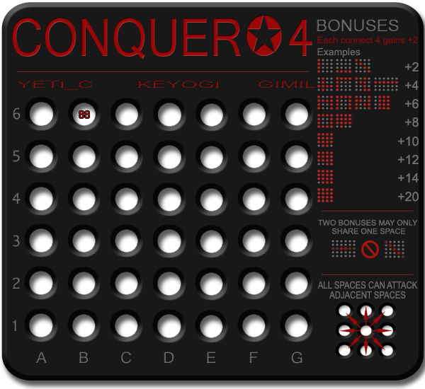
Having called the map "Conquer*4" ... surely the key should read "each Conquer 4 gains +2" or "each line of 4" ... rather than confusing the issue with "connect 4" ?
"line of 4" = 9 chars, "connect 4" = 9 chars - so no space problem.
Space wise the right edge of the board looks a little cramped where it meets the legend ...
Love & 2cents
Cicero
Re: Conquer 4. Page 1 + 4
Posted:
Fri May 16, 2008 4:51 pmby ZeakCytho
[quote="cicero"]Space wise the right edge of the board looks a little cramped where it meets the legend .../quote]
I agree. If you move some of the holes closer together, like Cairns suggested, you could add a vertical divider - a thin red line, like your horizontal dividers between the title and names, or between the sections of the bonus area.
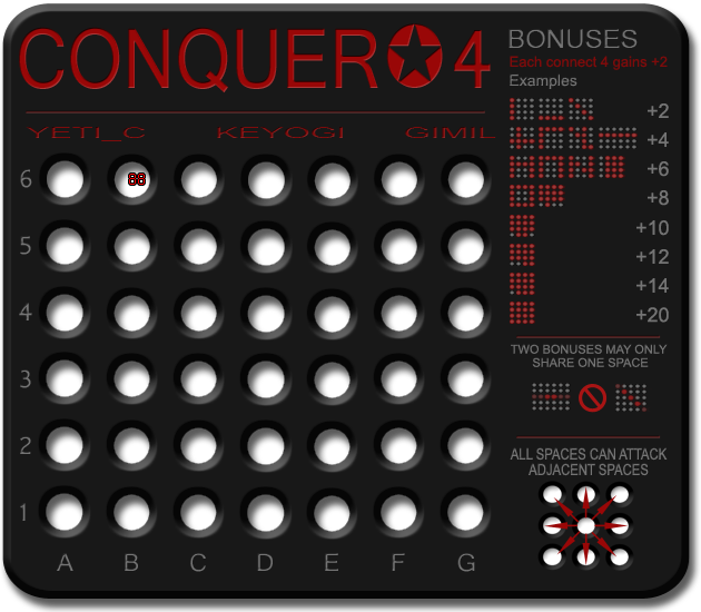
I guess the holes look okay now. The drop shadow is better. There's still a lot of contrast between the white parts of the hole and the board, but barring the addition of an image to the circle, I don't think you can really get around that...Unless, you could just make the background color behind the holes a very very light gray, just slightly off white.
Is there a way to get rid of the drop shadow that's at the bottom of the board while maintaining it for each hole? I don't think it looks especially good at the bottom.
Re: Conquer 4. Page 1 + 4
Posted:
Fri May 16, 2008 5:04 pmby cicero
Further to my thought that the map is little cramped near the key I find myself thinking ...
"Combo making" is the art/skill of playing this map ... explicitly spelling out so many of the combos in the key might detract from the fun or , it could be argued, be somewhat redundant.
It seems there are only 2 rules which needs to be explicity stated:
(a) line of 4 = +2
(b) two bonuses may only share one space
... and if anything it's (b) that needs careful explanation - not extra space spent on (a).
Re: Conquer 4. Page 1 + 4
Posted:
Fri May 16, 2008 5:14 pmby gimil
Added some more space and shuffled things around a little.
Re: Conquer 4. Page 1 + 4
Posted:
Fri May 16, 2008 5:27 pmby Kaplowitz
The title looks like it was stretched up, while the names look like they were stretched sideways. Its not bad, it just looks strange next to each other.
Re: Conquer 4. Page 1 + 4
Posted:
Fri May 16, 2008 5:36 pmby gimil
cicero wrote:Further to my thought that the map is little cramped near the key I find myself thinking ...
"Combo making" is the art/skill of playing this map ... explicitly spelling out so many of the combos in the key might detract from the fun or , it could be argued, be somewhat redundant.
It seems there are only 2 rules which needs to be explicity stated:
(a) line of 4 = +2
(b) two bonuses may only share one space
... and if anything it's (b) that needs careful explanation - not extra space spent on (a).
Ill get onto this for the next update
Re: Conquer 4. Page 1 + 4
Posted:
Fri May 16, 2008 6:14 pmby TaCktiX
I'm noticing that all the text washes out when there's any glare on my monitor. Perhaps make the red less subdued to avoid this problem?
Re: Conquer 4. Page 1 + 4
Posted:
Fri May 16, 2008 6:30 pmby ZeakCytho
I still think a vertical divider separating the bonuses from the map and title would be good.
I agree with Kaplo on the title/names stretching. It's not a major point, but is there anything that can be done to fix this short of using a different font/shrinking the current one?
Re: Conquer 4. Page 1 + 4
Posted:
Fri May 16, 2008 8:08 pmby AndyDufresne
I think a better placement of your signatuares may be in the right bottom corner, perhaps going along the base and then up the vertical in the corner.
--Andy
Re: Conquer 4. Page 1 + 4
Posted:
Sat May 17, 2008 8:39 amby gimil
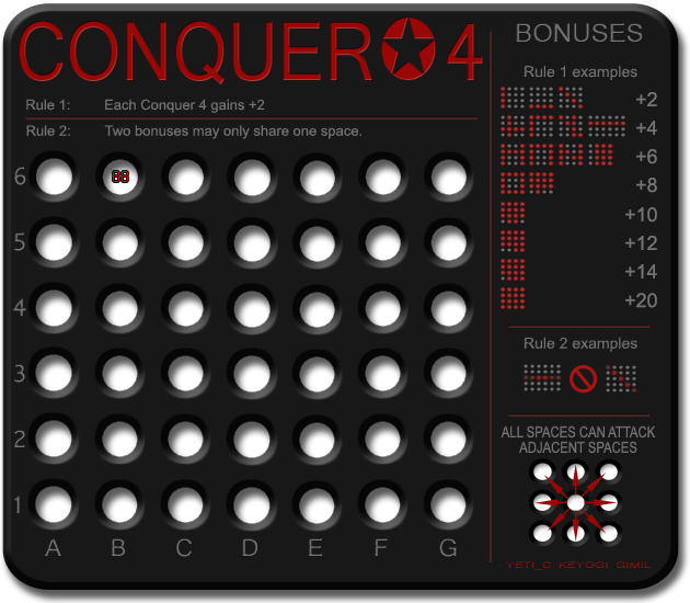
What do we all think of the reshuffle?
Re: Conquer 4. Page 1 + 4
Posted:
Sat May 17, 2008 8:48 amby yeti_c
Critique...
First up - I like the changes - everything seems to be slotting into place a lot more...
Rules - great idea. - consider having the red line above, below (or both) them.
Cicero's point about more space for rule 2 is still valid...
Consider dropping +8, +12, +14...
Then you have 3 lines of extra examples for Rule 2 -> which is the harder one to understand (also - the last example on +4 -> is also a rule 2 example.)
C.
PS -> Why is this still in ideas?
Re: Conquer 4. Page 1 + 4
Posted:
Sun May 18, 2008 10:07 amby gimil
Some changes . . .
Re: Conquer 4. Page 1 + 5
Posted:
Mon May 19, 2008 11:59 amby cairnswk
Gimil....luv the last version, which is what i was alluring to in my first comments on design space.
The "buttons" now look more like holes, to my eyes anyway.
Sorry, i can't move it for you.

Re: Conquer 4. Page 1 + 5
Posted:
Mon May 19, 2008 3:03 pmby Kaplowitz
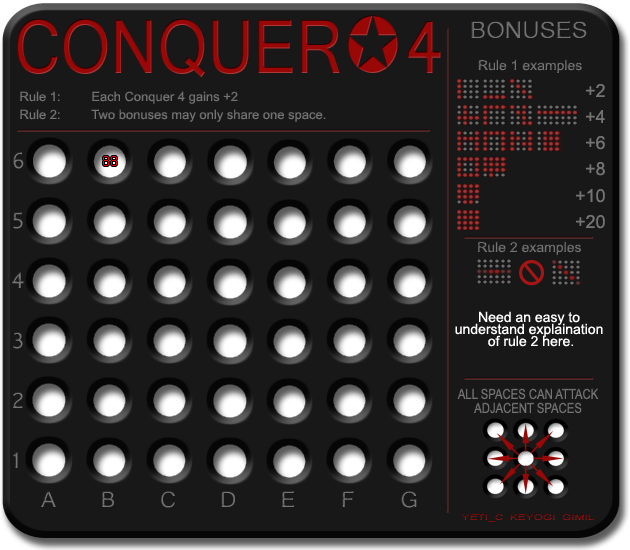
Explanation:
Two lines of four spaces in a row may only intersect in one place.
Is that good?
And the holes look better btw
Re: Conquer 4. Page 1 + 5
Posted:
Mon May 19, 2008 6:54 pmby oaktown
This seems pretty "advanced" to me.
Can you do something with the colors of the circles in the legend examples? I have to look closely to tell them apart - the circles demonstrating what it takes to give a bonus should really pop out.
Any thought of making a 4x4 square a victory condition? Unless it's an advanced escalating game, anybody who holds a block of 16 should win anyway.
Re: Conquer 4. Page 1 + 5
Posted:
Tue May 20, 2008 6:59 amby bryguy
oaktown wrote:Can you do something with the colors of the circles in the legend examples? I have to look closely to tell them apart - the circles demonstrating what it takes to give a bonus should really pop out
I have the same problem, maybe make the circles there all red, and the others bright red
Re: Conquer 4. Page 1 + 5
Posted:
Tue May 20, 2008 8:27 amby yeti_c
oaktown wrote:Any thought of making a 4x4 square a victory condition? Unless it's an advanced escalating game, anybody who holds a block of 16 should win anyway.
Personally I really dislike this idea... for a number of reasons.
a) I don't think a +20 bonus is all seeing all powerful on this board (also proved by your "unless" comment)
b) I think this is completely against the ethos of the idea.
c) It would look like shit in the XML
d) It would look like shit in BOB's Objective summary
C.
Re: Conquer 4. Page 1 + 5
Posted:
Fri May 23, 2008 11:46 amby gimil
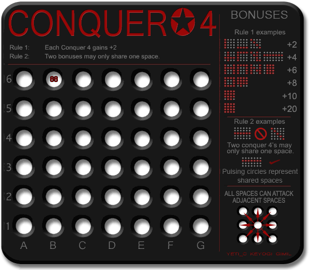
Some reorganisation for rule 2 explaination using animation

Re: Conquer 4. Page 1 + 5 - Animated!
Posted:
Fri May 23, 2008 3:37 pmby TaCktiX
The checkmark is a little too oblique, especially next to the bold crossed-out circle. Really good explanation of the rules now. There's plenty of room for creativity bonus-wise, and that's a good thing.
Re: Conquer 4. Page 1 + 5 - Animated!
Posted:
Fri May 23, 2008 3:41 pmby bryguy
actually it still really confuses me.... but i like the animation!!
Re: Conquer 4. Page 1 + 5 - Animated!
Posted:
Fri May 23, 2008 3:44 pmby yeti_c
I think at least 1 more example of a good bonus (i.e. the N) would be good...
As that shows - it is 1 shared space between 2 different lines...
If you use the N - then oscillate the animation so the pulse at different times -to imply that they are different.
C.