Conquer Club

Land and Sea [Quenched]

Care to peruse completed maps? Take a stroll through the Atlas.

Moderator: Cartographers

Forum rules
Please read the Community Guidelines before posting.

Re: Land and Sea [Beta]

Postby edbeard on Thu Jun 04, 2009 11:53 pm

Bruceswar wrote:I just played this map for the first time. 3 game series on it. I won 2-1 due to dice in a 1 vs 1, but both players made many mistakes thinking that each area touching the water could attack it


to me, that's a not reading the legend issue. we can't do anything about that. I think we've put everything in place for people to understand the map without too much thought. arrow means attack. people know the world and where land is and where water is. oreo.
User avatar
Lieutenant edbeard
 
Posts: 2501
Joined: Thu Mar 29, 2007 12:41 am

Re: Land and Sea [Beta]

Postby Bruceswar on Fri Jun 05, 2009 5:35 am

edbeard wrote:
Bruceswar wrote:I just played this map for the first time. 3 game series on it. I won 2-1 due to dice in a 1 vs 1, but both players made many mistakes thinking that each area touching the water could attack it


to me, that's a not reading the legend issue. we can't do anything about that. I think we've put everything in place for people to understand the map without too much thought. arrow means attack. people know the world and where land is and where water is. oreo.


Ahh yes the legend that part of the map people tune out. Nothing against it, but reality is 9/10 people never take the time to read it. Fault of the people, sure, but a map maker might be better off if he prepared for it. (In your case not 100% sure how you could achieve that other than to have what is natural to people) That is all water touches land and can be attacked both ways. But then again that changes the game play.

If some new player reads the legend in say AOR 2, then goes and plays a good game. 2 things usually happen.
1. He is reported as a multi
2. The other player is usually not nice in chat.

But hey all he did was follow the legend...
Highest Rank: 26 Highest Score: 3480
Image
User avatar
Corporal Bruceswar
 
Posts: 9713
Joined: Sun Dec 23, 2007 12:36 am
Location: Cow Pastures

Re: Land and Sea [Beta]

Postby AndyDufresne on Sun Jun 07, 2009 3:27 pm

Much debate occurred about the arrows, and I think they are suitably understandable for game play. Other's thoughts?


--Andy
User avatar
Corporal 1st Class AndyDufresne
 
Posts: 24919
Joined: Fri Mar 03, 2006 8:22 pm
Location: A Banana Palm in Zihuatanejo

Re: Land and Sea [Beta]

Postby Gilligan on Mon Jun 08, 2009 6:20 am

I haven't been keeping up with the discussion so I apologize if this was already said... Perhaps make them a bit darker and more noticeable?
Image
User avatar
Captain Gilligan
 
Posts: 12478
Joined: Thu May 11, 2006 4:59 pm
Location: Providence, RI

Re: Land and Sea [Beta]

Postby gimil on Mon Jun 08, 2009 6:29 am

Gilligan wrote:I haven't been keeping up with the discussion so I apologize if this was already said... Perhaps make them a bit darker and more noticeable?


I don't think the issue is that the arrows arn't noticable gill. I think the issue is that people are making the assumption that all land and sea territories are connected. Which means people arn't reading the legends, or arn't reading it efficently.

The only solution to this is some kind of distinction between connecting and non connecting terrs (which the arrows are suppose to do). Unfortunatly no matter what solution we have it will have to be put on the legends. If people arn't reading the legends that is their problem since no matter what alternative solution we come up with for differentiating between land and sea connectings people will still beed to read the legends to understand them anyway.
What do you know about map making, bitch?

natty_dread wrote:I was wrong


Top Score:2403
User avatar
Corporal 1st Class gimil
 
Posts: 8599
Joined: Sat Mar 03, 2007 12:42 pm
Location: United Kingdom (Scotland)

Re: Land and Sea [Beta]

Postby Danyael on Mon Jun 08, 2009 7:19 pm

you could change to arrow colours so instead of them being all the same make sea to sea connections blue to blue land to sea conections green to blue
User avatar
Corporal 1st Class Danyael
 
Posts: 352
Joined: Fri Jul 04, 2008 4:26 pm
Location: Winnipeg, Manitoba

Re: Land and Sea [Beta]

Postby edbeard on Mon Jun 08, 2009 8:28 pm

I don't think there's any problem with the arrows at the moment. People just aren't reading which we can't do anything about. It's been made more than clear with both words and visuals.
User avatar
Lieutenant edbeard
 
Posts: 2501
Joined: Thu Mar 29, 2007 12:41 am

Re: Land and Sea [Beta]

Postby danfrank on Wed Jun 17, 2009 9:02 pm

AndyDufresne wrote:Much debate occurred about the arrows, and I think they are suitably understandable for game play. Other's thoughts?


--Andy


i think this map is terrible... The graphics are sub par for what is expected in the foundry..
Image
Corporal 1st Class danfrank
 
Posts: 611
Joined: Mon Dec 24, 2007 1:19 am

Re: Land and Sea [Beta]

Postby danfrank on Wed Jun 17, 2009 9:13 pm

MrBenn wrote:This map has developed nicely, and is very clean and crisp. Getting a map to this stage is no mean feat, so you can be proud of your achievement over the past however-many-months :-p

Anyway, here's my take on the graphics - the intention here is to help you put some thought into making some tweaks to bring the map up to the next level... please take any criticism in the constructive manner in which I mean it

1. Territory Borders

For the most part, the borders are crisp and clear; but in some places there is pixellation/fuzziness (eg. Newton/Cloverdale).
In a couple of spots, the borders don't meet cleanly (eg. Boundary Bay/Burns Bog or Aldergrove/Campbell Valley/Glen Valley).
Where territory names overlap the borders, it might be worth moving some borders to make it more clear where the name blongs (eg you could redraw the bottom of UGC so it isn;t overlapped by the K of Kerrisdale; or in Edmonds, you could move the border to be above the text). There are countless examples of maps where the borders have been slightly distorted to assist legibility, and I think you may have to make some similar geographical sacrifices here

2. Territory Names

As mentioned before, there are a number of places where the text overlaps territory names. You could either resolve this by moving some borders slightly, reducing the font size a little, or possibly even finding a new font altogether?
Some of the text on pale areas of the map (Burnaby) is difficult to read. It might be worth playing around with an outer glow on the text instead of just a drop shadow.

3. Textures

The sea/rivers feels a bit fluffy - have a look at some other maps around (Charleston springs to mind) for some ideas of how to highlight the transition between land and water
In spite of the texture on the land, the map still feels very flat; the texture doesn't feel very 'landy'... it might be worth having a bit of a play around a bit...

4. Train Lines

The purple (pink?) line runs very close to the coast in the yellow area; if you can pull it away from the terrtory edge a little, it will be more obvious that the territry extends beneath it, and that the train line isn't a border. You could possibly add (or increase the distance) of the drop shadow, to make it feel more like the line is above the territory space.
The colouring you've used on Downtown is a little bit confusing, and really doesn;t help visibility of the army number. Consider extending the colour around parts of the circle edge (you could split it almost three ways) - check out the train lines on NYC to see how the double-line-stations are done on there; I'd suggest trying to emulate that style as much as possible as people should be familiar with that concept.

5. Title

A good title should feel like part of the map, and at the moment it feels like it doesn't really belong there and is just filling a convenient space. If you're happy with it, that's fine, but It would be nice to see if there's any way to make it come alive a little bit

6. Legend

The legend is broadly functional, although I'm not sure how easy it is to match up the coloured blobs with the region colours.
The train line symbols aren't clearly differentiated from the other blobs - at first I was looking for another railway line across the Coast Mountains
The order of regions on the legend doesn't seem to correspond with their positions on the map.
The ports symbol doesn;t do a great deal for me, and looks more like a snowflake - this is entirely subjective really I know (think?) you had an attack line over the sea in an earlier version, but it would be nice to see how a narrow dashed/dotted line works now - you could use the current border line colour instead of white?

7. The Small Map

The train lines (at least the stations) will have to be moved a little bit on the small map in order to keep the army numbers centered properly. At some point it would be helpful to see a small version (even if it's just a shrunken large one) to get an idea of any further adjustments that are going to be necessary

All in all, your doing well. Keep up the good work


Why Does this map not have a critiqueing like this one ???????? The graphics on vancouver is 100 times better than land and sea.. The two big blue blobs in the center of the map :lol: :lol: Looks like the artic is growing :-s Also people have legitimate claims about attack routes and there dismissed as if it does not matter :-s
Image
Corporal 1st Class danfrank
 
Posts: 611
Joined: Mon Dec 24, 2007 1:19 am

Re: Land and Sea [Beta]

Postby AndyDufresne on Thu Jun 18, 2009 11:47 am

I understand your concern, danfrank. I encourage you to become more active in the Foundry Process so you can help shape and form maps. :)


--Andy
User avatar
Corporal 1st Class AndyDufresne
 
Posts: 24919
Joined: Fri Mar 03, 2006 8:22 pm
Location: A Banana Palm in Zihuatanejo

Re: Land and Sea [Beta]

Postby gimil on Thu Jun 18, 2009 5:23 pm

danfrank wrote:
Why Does this map not have a critiqueing like this one ???????? The graphics on vancouver is 100 times better than land and sea.. The two big blue blobs in the center of the map :lol: :lol: Looks like the artic is growing :-s Also people have legitimate claims about attack routes and there dismissed as if it does not matter :-s


1. Legit concerns on the arrows have been discussed at lengh and have been agreed to have no real major concern overall.

2. This map has achieved graphically what it intended to. To create a crisp, clean map with straight forward graphics. Many people liked it that way and that is how in managed to make it through the foundry. It isn't sub par, only different.
What do you know about map making, bitch?

natty_dread wrote:I was wrong


Top Score:2403
User avatar
Corporal 1st Class gimil
 
Posts: 8599
Joined: Sat Mar 03, 2007 12:42 pm
Location: United Kingdom (Scotland)

Re: Land and Sea [Beta]

Postby oaktown on Sat Jun 20, 2009 11:18 am

No two maps are created entirely equal... if every map had to look as good as the best looking CC map, we'd only have one map. Vancouver is a beautiful map in its own right, and is on the road to completion.

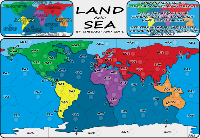
As for this map, the biggest gameplay issue seems to be the way territories connect. I agree that if you read the legend everything is fine, but its become obvious that many people do not bother to read it and are then turned off by the amp. You can lead a horse to water but you can't make him drink, right?

However, as the mapmaker you can lead a horse to a muddy cesspool of disease, or to a crystal blue oasis. While I don't think this map should be overhauled to rework the arrows, I think you (gimil) could take some little steps to make players more likely to notice/access the legend and the arrows/

For starters, I have never liked (and I've said this a few times) that in some places on the image the text is transparent with a grey border, in some places it is black with a white border, and the arrows are a transparent grey with a litghter grey border. For me this has two results: 1) some elements seem more important that other elements, and 2) the image is not clean and balanced. By far the easiest on the eye and thus the most accessible text on the map are the territory titles - and they should be. But the arrows are given much less prominence than the territory titles and as a result are kind of lost in the image.

Next, the text in the top right legend in uninviting. The white stroke on the letters makes the text run together, and its something of a chore to read. Knock the stroke down a point - and perhaps make everything a point size smaller - and the eye can fix itself on the text more easily. And since the part about Land and Sea do not connect is what folks are failing to read maybe that should be first, or somehow more prominent?

And this is the last time I'll say that if the text in the two legends were given the same weight the map would be more visually in balance.

And since the land/sea borders are impassable, have you given any thought to upping the thickness of the borders by a pixel? Right now they are the same weight as the conventional borders between territories, leading to confusion.
Image
User avatar
Captain oaktown
 
Posts: 4451
Joined: Sun Dec 03, 2006 9:24 pm
Location: majorcommand

Re: Land and Sea [Beta]

Postby jefjef on Sat Jun 20, 2009 11:26 am

Good map - attractive - very basic & easy to play/follow.. I like it as is......... Great job!!
This post was made by jefjef who should be on your ignore list.
Image
drunkmonkey wrote:I'm filing a C&A report right now. Its nice because they have a drop-down for "jefjef".
User avatar
Colonel jefjef
 
Posts: 6026
Joined: Mon Feb 23, 2009 8:41 pm
Location: on my ass

Re: Land and Sea [Beta]

Postby gimil on Wed Jun 24, 2009 8:52 am

Would this work for you oaktown?

Click image to enlarge.
image
What do you know about map making, bitch?

natty_dread wrote:I was wrong


Top Score:2403
User avatar
Corporal 1st Class gimil
 
Posts: 8599
Joined: Sat Mar 03, 2007 12:42 pm
Location: United Kingdom (Scotland)

Re: Land and Sea [Beta]

Postby oaktown on Wed Jun 24, 2009 9:28 am

Maybe I'm alone on this, but I think that these arrows look much better than the old gray ones... they now belong on the same image as the text. And if anybody complains that they didn't see the arrows now they should be thwacked repeatedly on the side of the head.

If you really want to make this map idiot proof you could move "are" in the last line line of the legend up next to "regions" and put an example arrow next to the text.
Image
User avatar
Captain oaktown
 
Posts: 4451
Joined: Sun Dec 03, 2006 9:24 pm
Location: majorcommand

Re: Land and Sea [Beta]

Postby Incandenza on Sun Jun 28, 2009 1:46 pm

oaktown wrote:And since the part about Land and Sea do not connect is what folks are failing to read maybe that should be first, or somehow more prominent?


This strikes me as a terrific suggestion. Relatively speaking, that datum is more important than that about the wrapping terits (which should be second) and MS (which should be last, it has the least impact on overall gameplay)... then again, my sympathy level for people who play new maps and don't take thirty seconds to read and digest the legend (especially on a reasonably straightforward map such as this) is notoriously low... :D
THOTA: dingdingdingdingdingdingBOOM

Te Occidere Possunt Sed Te Edere Non Possunt Nefas Est
User avatar
Colonel Incandenza
 
Posts: 4949
Joined: Thu Oct 19, 2006 5:34 pm
Location: Playing Eschaton with a bucket of old tennis balls

Re: Land and Sea [Beta]

Postby edbeard on Tue Jun 30, 2009 8:32 pm

I'm fine with the map as is but shouldn't the map have come out of Beta after gimil's proposed changes? like I said don't matter to me but seems strange
User avatar
Lieutenant edbeard
 
Posts: 2501
Joined: Thu Mar 29, 2007 12:41 am

Re: Land and Sea [Beta]

Postby Gilligan on Wed Jul 01, 2009 12:50 pm

Black arrows = much better
Image
User avatar
Captain Gilligan
 
Posts: 12478
Joined: Thu May 11, 2006 4:59 pm
Location: Providence, RI

Re: Land and Sea [Beta]

Postby ender516 on Wed Jul 01, 2009 7:08 pm

I hate to be the bearer of bad news, but "Arctic" is misspelled "Artic" on the map depicting the bonuses. Despite that, I do believe I will try this map soon. It looks sharp and well thought out.
User avatar
Sergeant 1st Class ender516
 
Posts: 4455
Joined: Wed Dec 17, 2008 6:07 pm
Location: Waterloo, Ontario

Re: Land and Sea [Beta]

Postby edbeard on Wed Jul 01, 2009 8:13 pm

ender516 wrote:I hate to be the bearer of bad news, but "Arctic" is misspelled "Artic" on the map depicting the bonuses. Despite that, I do believe I will try this map soon. It looks sharp and well thought out.


thanks for the post and pointing that out. actually, it is correct on the uploaded map but I've just neglected to update the first post with the latest version. That's done now. Hope you enjoy the map.
User avatar
Lieutenant edbeard
 
Posts: 2501
Joined: Thu Mar 29, 2007 12:41 am

Re: Land and Sea [Beta]

Postby gimil on Tue Jul 14, 2009 11:05 am

Does this work for everyone then?

Click image to enlarge.
image


Click image to enlarge.
image
What do you know about map making, bitch?

natty_dread wrote:I was wrong


Top Score:2403
User avatar
Corporal 1st Class gimil
 
Posts: 8599
Joined: Sat Mar 03, 2007 12:42 pm
Location: United Kingdom (Scotland)

Re: Land and Sea [Beta]

Postby ender516 on Wed Jul 15, 2009 12:07 am

Looks about right to me. I should tell you I have played this map: 1 game, 1 win! \:D/ I may retire from it undefeated... ;)
User avatar
Sergeant 1st Class ender516
 
Posts: 4455
Joined: Wed Dec 17, 2008 6:07 pm
Location: Waterloo, Ontario

Re: Land and Sea [Beta]

Postby cthoenen1 on Sat Aug 01, 2009 10:11 pm

I am 1 for 2 on this map. I really like it!

I think the Mediterranean has been white both times though, 'cause I never noticed it was there until i read this thread!
User avatar
Sergeant 1st Class cthoenen1
 
Posts: 43
Joined: Sun Jan 25, 2009 1:19 am

Re: Land and Sea [Quenched]

Postby zeros on Fri Feb 19, 2010 3:12 pm

Hi folks! I'm not sure if this thread is dead but I'll write in anyway.

I'm considering a return to CC very soon, and have just been browsing the maps to see what's been happening for the last year. This map looked interesting, but at first glance, I was not sure if NA1 and AT3 are allowed to attack each other (since there is no arrow connecting these two territories in spite of the other arrows nearby). So I decided on visiting this 'Discussion topic' for some enlightenment.

After twenty minutes, I've read through loads of the posts but have not found a definitive answer (in spite of seeing several references along the lines of 'arrows should make it obvious').

So I'll ask a straightforward question, to which I hope to get a straightforward 'YES' or 'NO'..............

Can NA1 and AT3 attack each other?
Image
User avatar
Sergeant 1st Class zeros
 
Posts: 32
Joined: Fri Jan 02, 2009 9:07 am

Re: Land and Sea [Quenched]

Postby natty dread on Fri Feb 19, 2010 3:13 pm

no
Image
User avatar
Sergeant 1st Class natty dread
 
Posts: 12877
Joined: Fri Feb 08, 2008 8:58 pm
Location: just plain fucked

PreviousNext

Return to The Atlas

Who is online

Users browsing this forum: No registered users