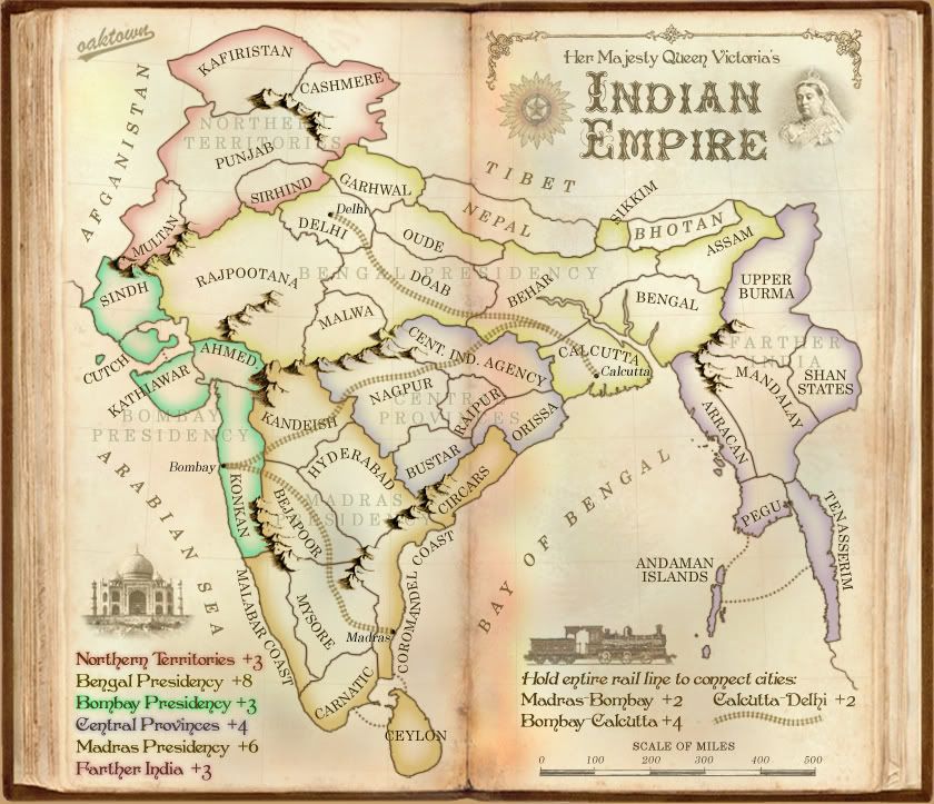
first off, i must say, well done! i like the new look
as for it looking too busy its cuz u have waaaaay too much on the may, you have
- aesthetic things ie mountains
- terr. names
- Border colors
- Bonus names
- RailRoad
i recommend you remove the bonus names from the actually playing area, people ae smart enough to match up colors. And if you wanna argue that a person maybe color blind, well the bonus names are so low in opacity as is that it wont make a difference. as for the aesthetic things, although necessary, it might help to reduce the opacity on those, they are so in-your-face that it distract from the map. another thing the names on unimportant things like "Bay of Bengal" are too distracting from the main picture. Dont remove them because they really do add to the feel. But make them less in-you-face ish. lastly i find some of the terr. names are poorly placed, like "ceylon" etc.
oh and on a side note, instead of using the taj mahal, it would be better to use an indian temple, most of india is Hindu and the Taj Mahal is a grave. just my two cents, indian people have this "guilty by association thing" for example, you shouldnt step over a person because thats what they do to dead people, so similarly putting a grave on the map may not be the best idea. Im not saying its a bad idea and you should conform NOW!!! just throwing out my limited knowledge.
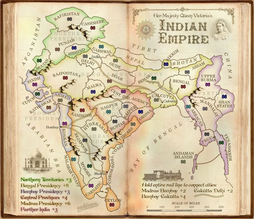
example of a good temple to use (from wikipedia)
- Click image to enlarge.