I think the impassables are good.
Don't need to change.
[Official] Brazil REVAMP [Quenched]
Moderator: Cartographers


Re: [Official] Brazil REVAMP [Beta]
![]() by MrBenn on Fri Jun 05, 2009 1:13 pm
by MrBenn on Fri Jun 05, 2009 1:13 pm
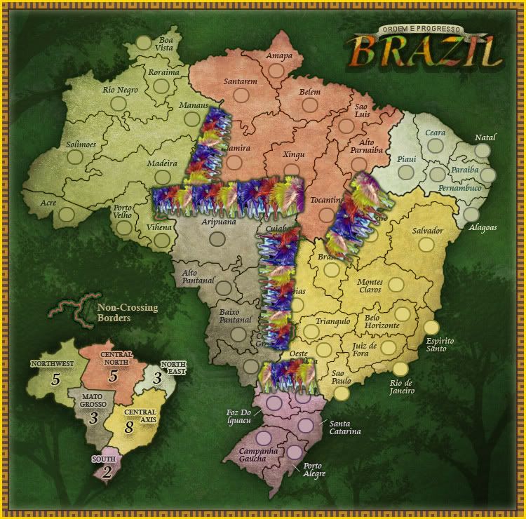
Actually RJ, I think the impassable border could do with a little bit of work... Brazil is renowned for it's parade in Rio - I wonder if you could try and find a way of representing a carnival or something? There's no way you could battle through all those dancing girls, and the bright colours would really help the impassable border to just 'zing'.
Warning wrote:This post may contain trace elements of irony.

PB: 2661 | He's blue... If he were green he would die | No mod would be stupid enough to do that
-

 MrBenn
- Posts: 6880
- Joined: Wed Nov 21, 2007 9:32 am
- Location: Off Duty


Re: [Official] Brazil REVAMP [Beta]
![]() by Bruceswar on Fri Jun 05, 2009 2:08 pm
by Bruceswar on Fri Jun 05, 2009 2:08 pm
Sorry I started a revolution. Lots of work is not needed, but just a simple color shade different. That is just my opinion. Nobody said you had to kill the maps theme to do it, or spend hours going back over it, but just something with a bit more zing to it.
Highest Rank: 26 Highest Score: 3480

-

Bruceswar
- Posts: 9713
- Joined: Sun Dec 23, 2007 12:36 am
- Location: Cow Pastures


Re: [Official] Brazil REVAMP [Beta]
![]() by gimil on Fri Jun 05, 2009 2:14 pm
by gimil on Fri Jun 05, 2009 2:14 pm
An alternative would be to slap a little contrasting glow or something around the unpassable legends part. To be honest though i am not sure this is a grave concern. People will see the 'unpassable' text, see the image next to it and put 2+2 together.
Streching the imagination the only concern that may arise is with colourblind people would may not be able to see it at all. I doubt this will happen however.
Streching the imagination the only concern that may arise is with colourblind people would may not be able to see it at all. I doubt this will happen however.
What do you know about map making, bitch?
Top Score:2403
natty_dread wrote:I was wrong
Top Score:2403
-

gimil
- Posts: 8599
- Joined: Sat Mar 03, 2007 12:42 pm
- Location: United Kingdom (Scotland)


Re: [Official] Brazil REVAMP [Beta]
![]() by Bruceswar on Fri Jun 05, 2009 3:24 pm
by Bruceswar on Fri Jun 05, 2009 3:24 pm
thenobodies80 wrote:
I'm not a advertising man in real life, but i think that your images and the RJ answer are saying the same thing:
The first image is intentionally (like the map) less flashy.
The creators want that you'll see the beer first and then you'll see the wonderful big hand trying to take it.
In the map you'll see the impassable in a second and then you will search what they mean in the rest of the map.
The impassable text is visible, so you'll find the borders, a bit camouflaged in the trees.
The second image you posted is obviously more flashy.
But if RJ will change the colors, the actual problem is only reversed on the map, like in the orange or yellow example.
Visible on legend, horrible on map.
I'm of the opinion that is better to spend a second searching the impassable explaination than destroy the actual wonderful look of this map.
The map is perfect !
Nice work RJ!
thenobodies80
The point is not what you see first, but more so how quick you see it. When driving you only have a small window of time to notice a billboard. Same works many times in CC. People look quick make the drop of men and move on. People will make the mistake taking the impassible for some thickish border between the regions. They will make this mistake 1 or 2 times and think, screw it. I will not play this map again. We must remember not everybody speaks English as a native lang, people are generally not interested in reading a legend,(If so we would all know AOR 2 well the first time we play) and people hurry. Point is we should make maps as user friendly as possible. I am web designer and it is known that ease of use drives people to your site. Colors that are close to each other tend to drive people away.
Highest Rank: 26 Highest Score: 3480
-
Bruceswar
- Posts: 9713
- Joined: Sun Dec 23, 2007 12:36 am
- Location: Cow Pastures
Re: [Official] Brazil REVAMP [Beta]
![]() by Danyael on Fri Jun 05, 2009 3:32 pm
by Danyael on Fri Jun 05, 2009 3:32 pm
gimil wrote:An alternative would be to slap a little contrasting glow or something around the unpassable legends part. To be honest though i am not sure this is a grave concern. People will see the 'unpassable' text, see the image next to it and put 2+2 together.
Streching the imagination the only concern that may arise is with colourblind people would may not be able to see it at all. I doubt this will happen however.
i would have to agree a slight change like gimil states might improve it i think its clear what is and what is not passable (mainly due to the copy past of the one impassable)
having the legend pop out more might make it clearer but i think it would throw the over all feel of the map off
and i'm as colour blind as they come and it does not blend it at all
edit :: forgot to mention that keeping the non passable borders like they are keeps the original ones essence
-

Danyael
- Posts: 352
- Joined: Fri Jul 04, 2008 4:26 pm
- Location: Winnipeg, Manitoba


Re: [Official] Brazil REVAMP [Beta]
![]() by RjBeals on Fri Jun 05, 2009 4:01 pm
by RjBeals on Fri Jun 05, 2009 4:01 pm
where were you people a month ago?

-

RjBeals
- Posts: 2506
- Joined: Mon Nov 20, 2006 5:17 pm
- Location: South Carolina, USA


Re: [Official] Brazil REVAMP [Beta]
![]() by Danyael on Fri Jun 05, 2009 4:03 pm
by Danyael on Fri Jun 05, 2009 4:03 pm
RjBeals wrote:where were you people a month ago?
loving the look of the map
-
Danyael
- Posts: 352
- Joined: Fri Jul 04, 2008 4:26 pm
- Location: Winnipeg, Manitoba
Re: [Official] Brazil REVAMP [Beta]
![]() by Bruceswar on Fri Jun 05, 2009 4:06 pm
by Bruceswar on Fri Jun 05, 2009 4:06 pm
RjBeals wrote:where were you people a month ago?
I was around, but I did not notice it. But for me this is not such an issue as I know the map. For others it will be.
Highest Rank: 26 Highest Score: 3480
-
Bruceswar
- Posts: 9713
- Joined: Sun Dec 23, 2007 12:36 am
- Location: Cow Pastures
Re: [Official] Brazil REVAMP [Beta]
![]() by Bruceswar on Fri Jun 05, 2009 7:38 pm
by Bruceswar on Fri Jun 05, 2009 7:38 pm
Here This is more what I mean... I took your orange from the B in Brazil and used it to highlight the impassable borders. The look you were after seems to be fully there still, yet people know 100% what it is... Obviously this would be copied from the legend to the map area.

Highest Rank: 26 Highest Score: 3480
-
Bruceswar
- Posts: 9713
- Joined: Sun Dec 23, 2007 12:36 am
- Location: Cow Pastures
Re: [Official] Brazil REVAMP [Beta]
![]() by AndyDufresne on Sun Jun 07, 2009 3:24 pm
by AndyDufresne on Sun Jun 07, 2009 3:24 pm
I think any sort of strange glow would detract from the visual experience of the map. The green elegantly meshes with the background a number of color components on the map...
--Andy
--Andy
-

AndyDufresne
- Posts: 24919
- Joined: Fri Mar 03, 2006 8:22 pm
- Location: A Banana Palm in Zihuatanejo


Re: [Official] Brazil REVAMP [Beta]
![]() by Bruceswar on Tue Jul 28, 2009 8:14 am
by Bruceswar on Tue Jul 28, 2009 8:14 am
and like I predicted... "[team]: can I cross those little green lines?" And this is from a high ranking player who is new to the map. They said they could not find a legend... C'est la vie
Highest Rank: 26 Highest Score: 3480
-
Bruceswar
- Posts: 9713
- Joined: Sun Dec 23, 2007 12:36 am
- Location: Cow Pastures
Re: [Official] Brazil REVAMP [Beta]
![]() by sully800 on Thu Aug 06, 2009 4:19 pm
by sully800 on Thu Aug 06, 2009 4:19 pm
This should have been out of Beta a while ago. It is gorgeous and clear. Simple and direct.
I'm not sure how anyone familiar with CC can mistake the impassable borders for anything BUT impassable borders. They are much thicker than any other line, a completely different color, there is a legend describing them, and the gameplay would be shite without them. If someone can't figure them out with a little bit of looking I would hate to see them try a map like Waterloo.
I'm not sure how anyone familiar with CC can mistake the impassable borders for anything BUT impassable borders. They are much thicker than any other line, a completely different color, there is a legend describing them, and the gameplay would be shite without them. If someone can't figure them out with a little bit of looking I would hate to see them try a map like Waterloo.
-

sully800
- Posts: 4978
- Joined: Wed Jun 14, 2006 5:45 pm
- Location: Bethlehem, Pennsylvania


Re: [Official] Brazil REVAMP [Beta]
![]() by RjBeals on Thu Aug 06, 2009 7:14 pm
by RjBeals on Thu Aug 06, 2009 7:14 pm
thank you. the map is what it is. There's no way anything is going to change, unless there is a revamp.
-
RjBeals
- Posts: 2506
- Joined: Mon Nov 20, 2006 5:17 pm
- Location: South Carolina, USA
Re: [Official] Brazil REVAMP [Quenched]
![]() by musicalmaven on Tue Jul 29, 2014 7:39 pm
by musicalmaven on Tue Jul 29, 2014 7:39 pm
i am having a problem with all my games. on this map, in game 14664394, i have managed to deploy my men onto goias, but the computer will only allow me to attack from acre. i've gotten goias to register as the attacking territory, but the computer will not recognize my desire and will only show the surrounding around acre for me to attack.
it is the same problem in city mogul, and i will report this problem on that map as well.
it is the same problem in city mogul, and i will report this problem on that map as well.
-
musicalmaven
- Posts: 1653
- Joined: Sun Mar 04, 2007 12:08 am


 3
3
Re: [Official] Brazil REVAMP [Quenched]
![]() by musicalmaven on Wed Jul 30, 2014 6:30 pm
by musicalmaven on Wed Jul 30, 2014 6:30 pm
i am again having a problem. this time game # 14668010. once again i cannot get the c.c. computer to allow me to attack from a particular territory. the computer is wanting me to attack from another territory and when i change the alphabetically first territory to the territory i want to attack from, the computer will not change to available territories to attack, but keeps my options as the surrounding territories of the alphabetically first territory.
i am on the clock. please resolve this issue.
i am on the clock. please resolve this issue.
-
musicalmaven
- Posts: 1653
- Joined: Sun Mar 04, 2007 12:08 am
3
Re: [Official] Brazil REVAMP [Quenched]
![]() by RjBeals on Wed Jul 30, 2014 10:18 pm
by RjBeals on Wed Jul 30, 2014 10:18 pm
i don't think it's the map or the xml - there's never been a problem like this for years...
-
RjBeals
- Posts: 2506
- Joined: Mon Nov 20, 2006 5:17 pm
- Location: South Carolina, USA
Re: [Official] Brazil REVAMP [Quenched]
![]() by musicalmaven on Wed Jul 30, 2014 11:38 pm
by musicalmaven on Wed Jul 30, 2014 11:38 pm
that may be, but i am still having the problem. if it were confined to the old computer i'd say maybe it's a virus, or just old age, but this afternoon it occurred on my notebook too. they both have BOB. i am sending this on my new computer, which does not have BOB. tonight i played my games on the new computer, using the notebook to see which territory was whose. (the problem starts when i hit the begin button, so if i just look at the game, i can use the BOB apps to highlight the territories, etc.)
another thing - i've been bugged lately by another problem. the BOB apps work until i reduce the size of the map. then the colored lines indicating whose territory it is are out of sync with the map, and even returning to the original size does not get the lines back over the correct territories - they remain out of sync with the map. i can "fix" the problem by coming out and then returning to the game and usually the lines are properly in sync with the territory. i do not know if this was a precursor to the problem or a separate problem.
and, finally, as i have asked in my prior notes, what has happened to BOB ? i have been trying to get it on the new computer, but it is not available.
-
musicalmaven
- Posts: 1653
- Joined: Sun Mar 04, 2007 12:08 am
3
Re: [Official] Brazil REVAMP [Quenched]
![]() by Gilligan on Thu Jul 31, 2014 9:43 am
by Gilligan on Thu Jul 31, 2014 9:43 am
this is a site issue not a map issue. you'll have to take it to bug reports.
-

Gilligan
- Posts: 12478
- Joined: Thu May 11, 2006 4:59 pm
- Location: Providence, RI


Re: [Official] Brazil REVAMP [Quenched]
![]() by musicalmaven on Thu Jul 31, 2014 11:45 am
by musicalmaven on Thu Jul 31, 2014 11:45 am
i'll try it, but i also received a message on my wall that this problem has happened to others and seems to be a compatibility problem with firefox 31 and that the problem was resolved by reverting back to firefox 30. i'm going to try that fix. also, i did get a response from you guys if i was on firefox 31, so someone may already be aware of the possible incompatibility, but they never got back to me saying go back to firefox 30.
-
musicalmaven
- Posts: 1653
- Joined: Sun Mar 04, 2007 12:08 am
3
Re: [Official] Brazil REVAMP [Quenched]
![]() by musicalmaven on Thu Jul 31, 2014 11:59 am
by musicalmaven on Thu Jul 31, 2014 11:59 am
oh - the guy who did respond asking me whether i was on firefox 31, came from people working on the city mogul map.
-
musicalmaven
- Posts: 1653
- Joined: Sun Mar 04, 2007 12:08 am
3
Who is online
Users browsing this forum: No registered users
|
|||||||
| Conquer Club is not associated with RISK online in any way. Copyright © 2006-2024 by Big Wham LLC | |||||||