Nitpicking:
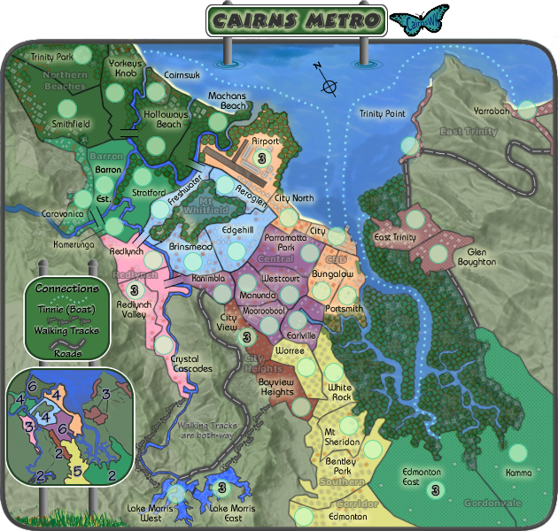
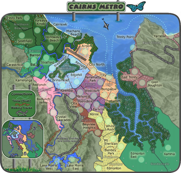
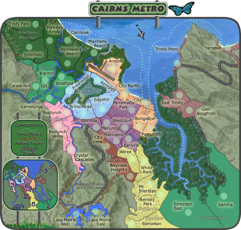
Any chance of retracting the bridge from Redlynch to Freshwater a little so that the bridge does not look like a second border between Freshwater and Brinsmead?
Kamerunga text - have you accidently resized that layer? The letters look thinner in it than anywhere else. It may just be an anti-aliasing thing though.
Where Freshwater Creek empties into Barron River, there's a dark border, might look nicer if it wasn't there

Kudos on everything else though. WM has already pointed out the transparency issues with some of the trees, so no need to point that out. Everything about this is fantastic - you've done your home city proud. I'm tempted to start working on Wollongong