- Click image to enlarge.
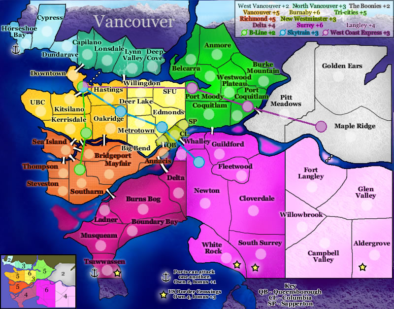
This map feels incredibly busy, and it really is! You've got islands and bridges, ports/docks, Border Crossing and Trains/Monorails.... And they're all competing for my attention!
Gameplay-wise, I think there is so much going on, that things are rapidly going to get very confusing - especially as your instructions are littered around the edges of the map rather than consolidated into one place. Complexity isn't a bad thing, but if you've got a lot going on, then it needs to be clearly explained.
Graphics-wise, the map looks a little blurry for some reason? There are pools of colour in the river that look out of place, and the most noticeable thing is the neon pink of Delta and Surrey - this is the first thing I would change

There is some texture in the background (most noticeable in the white region) which is a nice touch, and I think you could bring this out a bit more once the colours have been toned down a bit.
The borders are fairly pixellated, so at some point you'll need to look at them again. Having said that, you're also going to struggle with getting names and army numbers in parts of the map that are incredibly congested.
Why do some territories have dotted lines connecting them instead of bridges?