- Forest looks great, really suits the design of the map, well done.
- I think the heading could be a little more appealing, it's called Rose City so maybe a fancy font with roses weaved in and out of the letters might look nice.
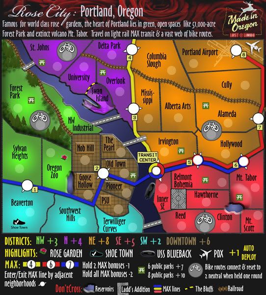
- Swan Island looks like it's been punched in or something? Why doesn't it look like the rest of the mainland?
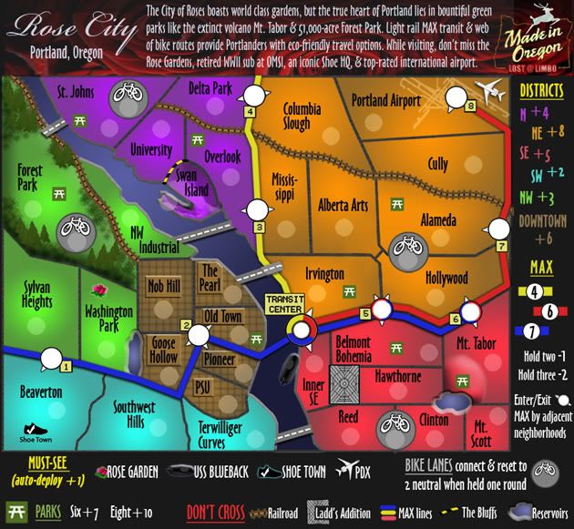
- USS Blueback i think could look more like a ship and less like a black blob with a white outline. See cairnswk's Pearl Harbor map for an example of how the ship could look from an aerial view. Also what does OMSI stand for?
- Are the train tracks supposed to just stop? I know they are just impassables and nothing more. However it seems a bit strange, perhaps putting a train station at the end to signal the end of the train track. In real life train tracks don't just cut-off in odd places. Just a though, you don't have to if you don't want to.
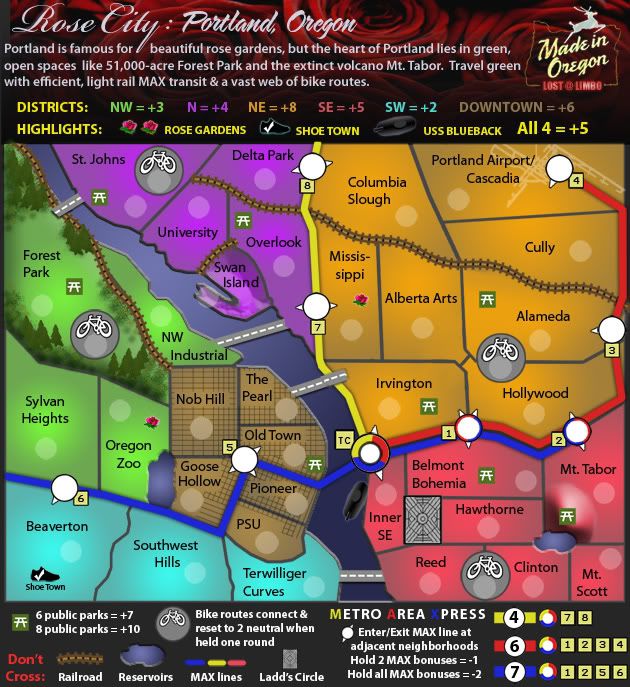
- I think the park benches look nice. However i think the bike routes could look a little better, more so the icons, could have a better picture of a bike. But that is just a personal opinion.
- In the Downtown bonus, the lines are not evenly across. e.g. Nob Hill has some lines all bunched up to the right and more spaced out to the left, just looks a little strange, if it was all the same it would look a lot nicer. Also PSU doesn't have any lines on it?
- Also what is the point of having a bridge from St.Johns to Forest Park if it's blocked by a Railroad track?
- What is the picture on Portland Airport/Cascadia, it looks a little out of place?
Anyway that's all i've got for now, i hope it helps, keep up the good work and a graphics stamp will not be too far away
~Sam


