Portland [Quenched]
Moderator: Cartographers
Re: Portland: Rose City [D, GP] (v 22, pg 8 - Please comment)
![]() by rutherfoo on Thu Jan 28, 2010 4:42 am
by rutherfoo on Thu Jan 28, 2010 4:42 am
You should really add entitled douchebags meandering slowly and obliviously across half the borders, because Portland seems to have the WORST pedestrians I've ever had to drive around, especially in the Pearl District.

-

 rutherfoo
- Posts: 117
- Joined: Mon Jul 14, 2008 11:58 pm


Re: Portland: Rose City [D, GP] (v 22, pg 8 - Please comment)
![]() by RedBaron0 on Sat Jan 30, 2010 2:04 am
by RedBaron0 on Sat Jan 30, 2010 2:04 am
Sorry we haven't gotten to this sooner, but completing posts for the fortnightly reviews has been hard to do this week.
To be honest, we are both in agreement that there is just something missing here. The map looks good but is missing something, it's not really capturing Portland. Where's the Northwestern flavor? You've got a good playable surface, but it's just colors and pathes. It really is missing a texture too. Myself and thenobodies are going to at some point further discuss the map and give more help and direction in this matter, but please look into shaking things up and adding different textures and backgrounds.
To be honest, we are both in agreement that there is just something missing here. The map looks good but is missing something, it's not really capturing Portland. Where's the Northwestern flavor? You've got a good playable surface, but it's just colors and pathes. It really is missing a texture too. Myself and thenobodies are going to at some point further discuss the map and give more help and direction in this matter, but please look into shaking things up and adding different textures and backgrounds.


-

RedBaron0
- Posts: 2657
- Joined: Sun Aug 19, 2007 12:59 pm
- Location: Pennsylvania


Re: Portland: Rose City [D, GP] (v 22, pg 8 - Please comment)
![]() by jwithington on Sun Feb 07, 2010 3:21 pm
by jwithington on Sun Feb 07, 2010 3:21 pm
rutherfoo wrote:You should really add entitled douchebags meandering slowly and obliviously across half the borders, because Portland seems to have the WORST pedestrians I've ever had to drive around, especially in the Pearl District.
That's a ridiculous comment. Portland pedestrians actually obey traffic signals, which does annoy some folks from out of town, but is actually best for everyone involved.
Just sayin, as a former chicagoan who lives here now.
Winner: Lurk's Roulette
Played on the Portland Trailblazers in the NBA 2010 Playoffs
Played as Northwestern in 2008-09, 2009-10, and 2010-11 College Hoops Tourneys.
Semifinalist: CCC Masters: Division 2.
Played on the Portland Trailblazers in the NBA 2010 Playoffs
Played as Northwestern in 2008-09, 2009-10, and 2010-11 College Hoops Tourneys.
Semifinalist: CCC Masters: Division 2.
-

jwithington
- Posts: 378
- Joined: Sat Aug 04, 2007 3:56 pm
- Location: Portland, OR


Re: Portland: Rose City [D, GP] (v 22, pg 8 - Please comment)
![]() by lostatlimbo on Wed Feb 10, 2010 11:05 pm
by lostatlimbo on Wed Feb 10, 2010 11:05 pm
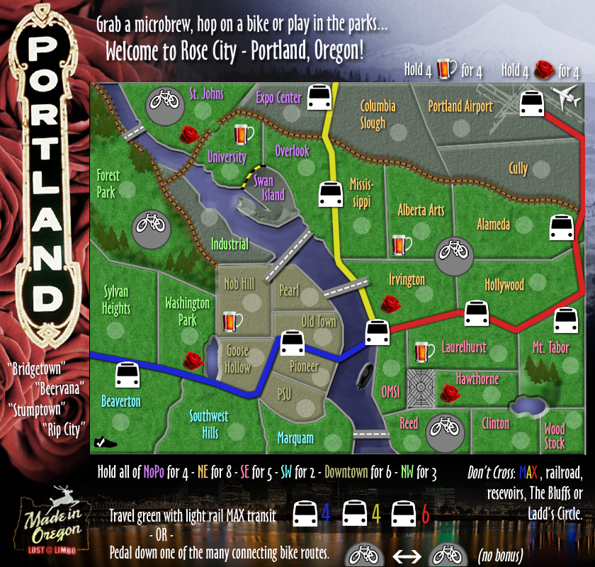
iancanton wrote:now that the must-see bonuses are auto-deploy, we need to reduce the bonus of the zones in which they're located: sw from +2 to +1, se from +5 to +4 and nw from +3 to +2. ne theoretically goes from +8 to +7 but, when i look at it again so long after the map was stamped for gameplay, even +7 still seems a lot for an 8-region, 6-border zone that contains an auto-deploy: i recommend +5.
the max bonuses also seem on the high side when compared with similar bonuses in vancouver and chicago; i wonder whether +3 for yellow and +5 for red or blue are more appropriate (being equal to the number of stations).
lostatlimbo, can u note in the opening post the fact that the yellow line has 3 start positions, so that this isn't missed when the xml is compiled?
ian.
Thanks ian - I am very swamped at work at the moment, but I intend to make these changes in the coming weeks.
-

lostatlimbo
- Posts: 1386
- Joined: Wed Mar 28, 2007 3:56 pm
- Location: Portland, OR


Re: Portland: Rose City [D, GP] (v 22, pg 8 - Please comment)
![]() by lostatlimbo on Wed Feb 10, 2010 11:29 pm
by lostatlimbo on Wed Feb 10, 2010 11:29 pm
RedBaron0 wrote:To be honest, we are both in agreement that there is just something missing here. The map looks good but is missing something, it's not really capturing Portland. Where's the Northwestern flavor? You've got a good playable surface, but it's just colors and pathes. It really is missing a texture too. Myself and thenobodies are going to at some point further discuss the map and give more help and direction in this matter, but please look into shaking things up and adding different textures and backgrounds.
shake it up? that's what I've been doing for the past 22 revisions!
What did you have in mind for Northwest flavor? More hippies? Torrential downpour? Should I add some elk downtown?
I'm open to adding a microbrewery to the map, but I don't know that it would make a great icon.
What - other than the graffiti and statue of liberty captures NYC? Or the train & skyscraper in Chicago? Those are both great maps, but they too are mostly colors and paths.
What defines Portland are A) its Rose Gardens and B) its bountiful Public Parks - and both of those things have been a focal point since the very first draft.
Honestly, everyone I've shown it to who actually lives here loves it - including myself. I've got a lot of positive feedback here and spent uncountable hours tweaking and re-thinking this map for something that looks clean, playable and Portland-esque.
I've seen plenty of maps in worse shape pass through without so much scrutiny. I get that there isn't a great deal of community interest in a smaller US city, but I just wanted to put something on the site that is A) unique, B) enjoyable to play and look at and C) captures the Portland I know - and this is about as close as it gets.
In short - I've done all the shakeups and re-vamps I'm going to do. I'll gladly make Ian's gameplay changes and I'm open to any minor tweaks and adjustments, but I've already spent far too much time working on what feels like a dead end. This could go on for years (I've eclipsed one already) and I doubt I'd ever make the right people happy.
-
lostatlimbo
- Posts: 1386
- Joined: Wed Mar 28, 2007 3:56 pm
- Location: Portland, OR
Re: Portland: Rose City [D, GP] (v 22, pg 8 - Please comment)
![]() by lostatlimbo on Wed Feb 10, 2010 11:31 pm
by lostatlimbo on Wed Feb 10, 2010 11:31 pm
jwithington wrote:rutherfoo wrote:You should really add entitled douchebags meandering slowly and obliviously across half the borders, because Portland seems to have the WORST pedestrians I've ever had to drive around, especially in the Pearl District.
That's a ridiculous comment. Portland pedestrians actually obey traffic signals, which does annoy some folks from out of town, but is actually best for everyone involved.
Agreed - this gave me a good laugh.
-
lostatlimbo
- Posts: 1386
- Joined: Wed Mar 28, 2007 3:56 pm
- Location: Portland, OR
Re: Portland: Rose City [D, GP] (v 22, pg 8 - Please comment)
![]() by rutherfoo on Sat Feb 13, 2010 5:26 am
by rutherfoo on Sat Feb 13, 2010 5:26 am
lostatlimbo wrote:RedBaron0 wrote:To be honest, we are both in agreement that there is just something missing here. The map looks good but is missing something, it's not really capturing Portland. Where's the Northwestern flavor? You've got a good playable surface, but it's just colors and pathes. It really is missing a texture too. Myself and thenobodies are going to at some point further discuss the map and give more help and direction in this matter, but please look into shaking things up and adding different textures and backgrounds.
Honestly, everyone I've shown it to who actually lives here loves it - including myself. I've got a lot of positive feedback here and spent uncountable hours tweaking and re-thinking this map for something that looks clean, playable and Portland-esque.
I live in portland, and I don't love the map. It looks tacky and cluttered. All the extremely bright colors don't remind me of Portland at all. It's so green and lush here, yet only one part on the map is actually green. The bright wild colors don't fit at all, to me. The orange, purple and teal all look bad. As for those "must-see" things in there, I could understand the rose garden, and maybe the submarine/OMSI, but the airport? What major city doesn't have a stupid airport. And the Nike thing is really annoying.
I think if you put the Freemont bridge on there, it would look really good, and would finally start looking more like Portland; it was designed and built to look good and appealing to the eye, to contrast the other, somewhat ugly bridges we already had.
Sorry if all that seems rude... I didn't mean to be, but this map doesn't feel like Portland to me.
I agree with redbaron... it's missing a good texture. It looks like colors and paths.
Last edited by rutherfoo on Sat Feb 13, 2010 5:35 am, edited 1 time in total.
-
rutherfoo
- Posts: 117
- Joined: Mon Jul 14, 2008 11:58 pm
Re: Portland: Rose City [D, GP] (v 22, pg 8 - Please comment)
![]() by rutherfoo on Sat Feb 13, 2010 5:32 am
by rutherfoo on Sat Feb 13, 2010 5:32 am
lostatlimbo wrote:jwithington wrote:rutherfoo wrote:You should really add entitled douchebags meandering slowly and obliviously across half the borders, because Portland seems to have the WORST pedestrians I've ever had to drive around, especially in the Pearl District.
That's a ridiculous comment. Portland pedestrians actually obey traffic signals, which does annoy some folks from out of town, but is actually best for everyone involved.
Agreed - this gave me a good laugh.
I would love to find the routes you two manage to find, because I was specifically talking about jaywalkers. The difference I found between this city and other major cities is at least the pedestrians elsewhere actually HURRY across the street, rather than saunter across streets mid-block, without looking either way.
-
rutherfoo
- Posts: 117
- Joined: Mon Jul 14, 2008 11:58 pm
Re: Portland: Rose City [D, GP] (v 22, pg 8 - Please comment)
![]() by natty dread on Tue Feb 16, 2010 8:02 am
by natty dread on Tue Feb 16, 2010 8:02 am
I haven't commented on this map much, so I'm sorry if this has been said before.
I really don't like the colour scheme of this map. It's all so bright, screaming reds and oranges... I'd suggest to lower the saturation on the colours of the bonus areas.
I do like the iconography though. The bike symbols, the trees in that park, the sneaker, airplane... all those look nice. Good work on those.
The bridges could use some work. They look a bit dull, and the one in the middle (between The pearl and Irvington) seems to have a glitch, the right half of the bridge seems wider than the left half, also the white center lines seem off on the right side.
The train lines: I'm not a huge fan of the red, yellow & blue combination. I'd like it better if you changed the yellow line into green, but that's just my opinion, and you may have reasons for the colours (maybe the lines are colour coded like that in real world, I don't know...)
Other than the few details I mentioned, this map looks solid to me, a little work could make this an excellent map.
Also: your map image looks a bit fuzzy. I noticed you have saved it as a JPEG in photobucket. In case you don't know, photobucket recompresses all JPG:s, which screws with the image. If you save the image as PNG then photobucket can't mess with it.

-

natty dread
- Posts: 12877
- Joined: Fri Feb 08, 2008 8:58 pm
- Location: just plain fucked


Re: Portland: Rose City [D, GP] (v 22, pg 8 - Please comment)
![]() by lostatlimbo on Wed Feb 17, 2010 8:00 pm
by lostatlimbo on Wed Feb 17, 2010 8:00 pm
rutherfoo wrote: As for those "must-see" things in there, I could understand the rose garden, and maybe the submarine/OMSI, but the airport? What major city doesn't have a stupid airport. And the Nike thing is really annoying.
PDX is regularly rated as one of the best airports nationally. I agree its not a huge draw, but when I added the icon (after others complained they couldn't figure out that it was an airport), it seemed to fit in. I'm not opposed to dropping this as an auto-deploy. I think the Nike thing is kind of funny, but also agree its not a huge draw.
Maybe I'll drop both.
rutherfoo wrote:I think if you put the Freemont bridge on there, it would look really good, and would finally start looking more like Portland; it was designed and built to look good and appealing to the eye, to contrast the other, somewhat ugly bridges we already had.
If you look at older maps, I had the Fremont bridge on there and was told to drop it for gameplay. I had much nicer bridges that stood out and was told they were too strong and couldn't be dimensional. I can't seem to please anyone with the bridges, so I'm stumped. I'll try a new bridge look one more time, but I'm not going to add Fremont again. No one outside of Portland knows or cares what bridges are what - they just want good gameplay.
natty_dread wrote:The train lines: I'm not a huge fan of the red, yellow & blue combination. I'd like it better if you changed the yellow line into green, but that's just my opinion, and you may have reasons for the colours (maybe the lines are colour coded like that in real world, I don't know...)
Those are the actual colors of the MAX lines. I'm not going to change them, but I'll play around with a new color scheme and perhaps they'll fit in better there. MAX transit has recently added a 4th line that is green, but it overlaps a lot and I think adding it at this point would be far too cluttered.
natty_dread wrote:Also: your map image looks a bit fuzzy. I noticed you have saved it as a JPEG in photobucket. In case you don't know, photobucket recompresses all JPG:s, which screws with the image. If you save the image as PNG then photobucket can't mess with it.
Didn't know that - thanks for the advice!
-
lostatlimbo
- Posts: 1386
- Joined: Wed Mar 28, 2007 3:56 pm
- Location: Portland, OR
Re: Portland: Rose City [D, GP] (v 22, pg 8 - Please comment)
![]() by DubWarrior on Thu Feb 18, 2010 7:29 am
by DubWarrior on Thu Feb 18, 2010 7:29 am
Hi, I didn't read the whole discussion, I just saw: 'please comment' so here i am with some graphic discussion stuff.
I read about the 'green' feel of Portland and the Rose garden, but the feel of the map is just missing this ambient i guess.
This one looks a bit like the industrial Chicago map to me. The heavy, kind of 'steel'-feel color, the dark border with the heavy legend...I don't know, it's very solid...So those roses you put in front...I know why you place them there, but it loses effect because the rest of the map don't have this feel...
Now, I won't be too critical, of course you made some nice improvement and you come up with some advanced gameplay-settings that I love. (well, some aren't that clear right now, but don't worry, you got your GP-stamp )
)
some graphic advice, feel free to do some changes if you like:
lets check this thing out:
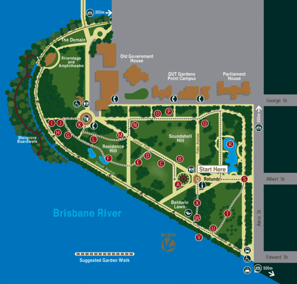
A map of the botanic garden in brisbane...This gives me a 'green' feeling. check the colors: some soft greens and ochre. some harder details by the red. paths in soft yellow. nice contrast with the blue sea. No dark colors, no fluorescent-like colors. Most shapes are soft, rounded. the trees are strong shapes.
I suggest you try something with another color-scheme (I can draw you one, if you like?-mind the color-blindness) some rounded forms. I like the upperright stamp, maybe do that a bit larger. remove the heavy black borders and replace them by some transparent softer style...change the dark color of the river to a more healthy looking one. clean up a bit the trees, looks kind of dusty to me. Remove the picture of the roses, it looks also very dark to me. check out http://www.sxc.hu for some large and free of use photography of almost anything (yes, strange url, I know ) you will find some 'lighter' stuff there.
Also, check out 'http://www.brandsoftheworld.com', this site covers a range of brands worldwide. If you search for 'garden' or 'green' or 'ecology' for example, it can give you some inspirational forms and colors...
Well a lot of comment I guess, hope you can live with it....Just my thoughts about changing some looks, feel free to change if you think a bit the same?
good luck!
Dub
I read about the 'green' feel of Portland and the Rose garden, but the feel of the map is just missing this ambient i guess.
This one looks a bit like the industrial Chicago map to me. The heavy, kind of 'steel'-feel color, the dark border with the heavy legend...I don't know, it's very solid...So those roses you put in front...I know why you place them there, but it loses effect because the rest of the map don't have this feel...
Now, I won't be too critical, of course you made some nice improvement and you come up with some advanced gameplay-settings that I love. (well, some aren't that clear right now, but don't worry, you got your GP-stamp
some graphic advice, feel free to do some changes if you like:
lets check this thing out:
A map of the botanic garden in brisbane...This gives me a 'green' feeling. check the colors: some soft greens and ochre. some harder details by the red. paths in soft yellow. nice contrast with the blue sea. No dark colors, no fluorescent-like colors. Most shapes are soft, rounded. the trees are strong shapes.
I suggest you try something with another color-scheme (I can draw you one, if you like?-mind the color-blindness) some rounded forms. I like the upperright stamp, maybe do that a bit larger. remove the heavy black borders and replace them by some transparent softer style...change the dark color of the river to a more healthy looking one. clean up a bit the trees, looks kind of dusty to me. Remove the picture of the roses, it looks also very dark to me. check out http://www.sxc.hu for some large and free of use photography of almost anything (yes, strange url, I know
Also, check out 'http://www.brandsoftheworld.com', this site covers a range of brands worldwide. If you search for 'garden' or 'green' or 'ecology' for example, it can give you some inspirational forms and colors...
Well a lot of comment I guess, hope you can live with it....Just my thoughts about changing some looks, feel free to change if you think a bit the same?
good luck!
Dub


-

DubWarrior
- Posts: 173
- Joined: Sun May 03, 2009 6:09 am
- Location: Belgium

Re: Portland: Rose City [D, GP] (v 22, pg 8 - Please comment)
![]() by lostatlimbo on Thu Feb 18, 2010 7:57 pm
by lostatlimbo on Thu Feb 18, 2010 7:57 pm
Thank you for your input and the helpful links. I've been going for something a little flashier with the feel of a tourist's guide to the city extolling its virtues over its literal geography, but you make some interesting suggestions I'll mull over.
I actually started this map a good 7 months before Chicago - complete with the MAX & Transit Center (*cough*The Loop*cough*) bonus.
(hell, even the bridges look like an earlier version)
DubWarrior wrote:This one looks a bit like the industrial Chicago map to me.
I actually started this map a good 7 months before Chicago - complete with the MAX & Transit Center (*cough*The Loop*cough*) bonus.
(hell, even the bridges look like an earlier version)
-
lostatlimbo
- Posts: 1386
- Joined: Wed Mar 28, 2007 3:56 pm
- Location: Portland, OR
Re: Portland: Rose City [D, GP] (v 22, pg 8 - Please comment)
![]() by Industrial Helix on Sat Feb 20, 2010 11:23 am
by Industrial Helix on Sat Feb 20, 2010 11:23 am
I think Dubwarrior hit the nail on the head with that post and I agree completely. I'm looking forward to the next iteration of this map!
Sketchblog [Update 07/25/11]: http://indyhelixsketch.blogspot.com/
Living in Japan [Update 07/17/11]: http://mirrorcountryih.blogspot.com/
Russian Revolution map for ConquerClub [07/20/11]: viewtopic.php?f=241&t=116575
Living in Japan [Update 07/17/11]: http://mirrorcountryih.blogspot.com/
Russian Revolution map for ConquerClub [07/20/11]: viewtopic.php?f=241&t=116575
-

Industrial Helix
- Posts: 3462
- Joined: Mon Jul 14, 2008 6:49 pm
- Location: Ohio


Re: Portland: Rose City [D, GP] (v 22, pg 8 - Please comment)
![]() by RedBaron0 on Mon Feb 22, 2010 11:36 pm
by RedBaron0 on Mon Feb 22, 2010 11:36 pm
I agree as well, and these are the things myself and thenobodies have been discussing.
There are a lot of things that can create a more complete feeling for this map. The green would be an excellent addition considering Portland is America's greenest city.
Some of the attractions are just little icons on the map, if the attraction is a rose Garden, make the territory more "gardeny" You've got territories with mountains and "bluffs" in them and I just don't see it... There is a bit of relief in your territories with the bevels and shadowing but nothing to represent the different types of terrain you are talking about. The USS Blueback? I had to look it up to figure out what it is, I knew it was obviously a Navy ship, but the otherwise generic jellybean shape of the ship never hinted at the fact that the Blueback is a Barbel class submarine.
Okay, I see where you're coming from too. My point to though is the things being suggested are just cosmetic changes. A layer of texture beneath at 30% opacity or so, alter the colors of the territories a bit, and your attractions, for lack of a better term, should attract our attention. Everything else is generally solid and ready to go. All these changes do is bring the entire map together and tie it together in a nice neat green bow.
There are a lot of things that can create a more complete feeling for this map. The green would be an excellent addition considering Portland is America's greenest city.
Some of the attractions are just little icons on the map, if the attraction is a rose Garden, make the territory more "gardeny" You've got territories with mountains and "bluffs" in them and I just don't see it... There is a bit of relief in your territories with the bevels and shadowing but nothing to represent the different types of terrain you are talking about. The USS Blueback? I had to look it up to figure out what it is, I knew it was obviously a Navy ship, but the otherwise generic jellybean shape of the ship never hinted at the fact that the Blueback is a Barbel class submarine.
lostatlimbo wrote:Honestly, everyone I've shown it to who actually lives here loves it - including myself. I've got a lot of positive feedback here and spent uncountable hours tweaking and re-thinking this map for something that looks clean, playable and Portland-esque.
I've seen plenty of maps in worse shape pass through without so much scrutiny. I get that there isn't a great deal of community interest in a smaller US city, but I just wanted to put something on the site that is A) unique, B) enjoyable to play and look at and C) captures the Portland I know - and this is about as close as it gets.
In short - I've done all the shakeups and re-vamps I'm going to do. I'll gladly make Ian's gameplay changes and I'm open to any minor tweaks and adjustments, but I've already spent far too much time working on what feels like a dead end. This could go on for years (I've eclipsed one already) and I doubt I'd ever make the right people happy.
Okay, I see where you're coming from too. My point to though is the things being suggested are just cosmetic changes. A layer of texture beneath at 30% opacity or so, alter the colors of the territories a bit, and your attractions, for lack of a better term, should attract our attention. Everything else is generally solid and ready to go. All these changes do is bring the entire map together and tie it together in a nice neat green bow.
-
RedBaron0
- Posts: 2657
- Joined: Sun Aug 19, 2007 12:59 pm
- Location: Pennsylvania
Re: Portland: Rose City [D, GP] (v 22, pg 8 - Please comment)
![]() by jpshuz on Thu Feb 25, 2010 1:42 am
by jpshuz on Thu Feb 25, 2010 1:42 am
Nice job of trying to keep Portland "Simple", it is anything but simple... LOL... Looks good so far, & I agree, Hard to add more to it, there's too much here already... LOL... keep up the good work & let me know when it's in play!!!
-

jpshuz
- Posts: 6
- Joined: Sun Jan 24, 2010 4:30 pm
Re: Portland: Rose City [D, GP] (v 22, pg 8 - Please comment)
![]() by RedBaron0 on Sun Mar 07, 2010 11:29 am
by RedBaron0 on Sun Mar 07, 2010 11:29 am
There has been no update since the last fortnightly review. If there is no update by the mapmaker by the next fortnightly review in roughly 2 weeks this map will be considered stalled and moved to the Recycling bin.
-
RedBaron0
- Posts: 2657
- Joined: Sun Aug 19, 2007 12:59 pm
- Location: Pennsylvania
Re: Portland: Rose City [D, GP] (v 22, pg 8 - Please comment)
![]() by lostatlimbo on Sat Mar 20, 2010 2:30 pm
by lostatlimbo on Sat Mar 20, 2010 2:30 pm
Sorry. Just been short on time lately. Hopefully I'll have some more time to work on this next month.
-
lostatlimbo
- Posts: 1386
- Joined: Wed Mar 28, 2007 3:56 pm
- Location: Portland, OR
Re: Portland: Rose City [D, GP] (v 22, pg 8 - Please comment)
![]() by thenobodies80 on Wed Apr 07, 2010 3:41 am
by thenobodies80 on Wed Apr 07, 2010 3:41 am
[Moved]
It would appear that development of this map has stalled. If the mapmaker wants to continue with the map, then one of the Foundry Moderators will be able to help put the thread back into the Foundry system, after an update has been made.
It would appear that development of this map has stalled. If the mapmaker wants to continue with the map, then one of the Foundry Moderators will be able to help put the thread back into the Foundry system, after an update has been made.
-

thenobodies80
- Posts: 5400
- Joined: Wed Sep 05, 2007 4:30 am
- Location: Milan


Re: Portland: Rose City [D, GP] (v 22, pg 8 - Please comment)
![]() by flexmaster33 on Fri Apr 09, 2010 3:36 pm
by flexmaster33 on Fri Apr 09, 2010 3:36 pm
Any notations for PGE Park or the Rose Garden?
Just a minor thought...I've thought this map has looked good for quite some time and can't wait to get a chance to play it. Once it's approved I'll put together a Portland tourney of some sort
good job lost
Just a minor thought...I've thought this map has looked good for quite some time and can't wait to get a chance to play it. Once it's approved I'll put together a Portland tourney of some sort
good job lost
Current tourneys -- 2023-24 College Basketball, Arms Race! Best of Five, Conquer the World, 2024 Major League Soccer
High rank: Major. Place: 1,150. Points: 2,093
High rank: Major. Place: 1,150. Points: 2,093
-

flexmaster33
- Posts: 5172
- Joined: Wed Aug 01, 2007 12:24 pm
- Location: Portland, OR


Re: Portland: Rose City [D, GP] (v 22, pg 8 - Please comment
![]() by lostatlimbo on Sat Nov 27, 2010 3:16 am
by lostatlimbo on Sat Nov 27, 2010 3:16 am
23rd Draft
Major re-design
Major re-design
- Click image to enlarge.
- Click image to enlarge.

-
lostatlimbo
- Posts: 1386
- Joined: Wed Mar 28, 2007 3:56 pm
- Location: Portland, OR
Re: Rose City: Portland [D, GP] Resurrected - new design
![]() by natty dread on Sat Nov 27, 2010 7:25 am
by natty dread on Sat Nov 27, 2010 7:25 am
Nice!
-
natty dread
- Posts: 12877
- Joined: Fri Feb 08, 2008 8:58 pm
- Location: just plain fucked
Re: Rose City: Portland [D, GP] Resurrected - new design
![]() by Industrial Helix on Sat Nov 27, 2010 10:44 am
by Industrial Helix on Sat Nov 27, 2010 10:44 am
Impressive update, let's move this one over to the graphics workshop.
Sketchblog [Update 07/25/11]: http://indyhelixsketch.blogspot.com/
Living in Japan [Update 07/17/11]: http://mirrorcountryih.blogspot.com/
Russian Revolution map for ConquerClub [07/20/11]: viewtopic.php?f=241&t=116575
Living in Japan [Update 07/17/11]: http://mirrorcountryih.blogspot.com/
Russian Revolution map for ConquerClub [07/20/11]: viewtopic.php?f=241&t=116575
-
Industrial Helix
- Posts: 3462
- Joined: Mon Jul 14, 2008 6:49 pm
- Location: Ohio
Re: Rose City: Portland [D, GP] Resurrected - new design
![]() by Teflon Kris on Sun Nov 28, 2010 8:37 am
by Teflon Kris on Sun Nov 28, 2010 8:37 am
Glad to see this map back - athough sad to see the Bike Lanes lose their killer neutral feature.
-

Teflon Kris
- Posts: 4236
- Joined: Sun Jul 13, 2008 4:39 pm
- Location: Lancashire, United Kingdom


Re: Rose City: Portland [D, GP] Resurrected - new design
![]() by Victor Sullivan on Sun Nov 28, 2010 4:49 pm
by Victor Sullivan on Sun Nov 28, 2010 4:49 pm
-Sully
Beckytheblondie: "Don't give us the dispatch, give us a mustache ride."
Scaling back on my CC involvement...
Scaling back on my CC involvement...
-

Victor Sullivan
- Posts: 6010
- Joined: Mon Feb 08, 2010 8:17 pm
- Location: Columbus, OH


Re: Rose City: Portland [D, GP] Resurrected - new design
![]() by Victor Sullivan on Sun Nov 28, 2010 4:52 pm
by Victor Sullivan on Sun Nov 28, 2010 4:52 pm
I do think the MAX Transit portion needs to be a little more specific - Can you attack other territories along the same bus route? Which territories are required to get the MAX Transit bonus? Also, are the bike routes territories? Or can you just attack any of the territories it's touching via another bike route?
-Sully
-Sully
Beckytheblondie: "Don't give us the dispatch, give us a mustache ride."
Scaling back on my CC involvement...
Scaling back on my CC involvement...
-
Victor Sullivan
- Posts: 6010
- Joined: Mon Feb 08, 2010 8:17 pm
- Location: Columbus, OH
Who is online
Users browsing this forum: No registered users
|
|||||||
| Conquer Club is not associated with RISK online in any way. Copyright © 2006-2024 by Big Wham LLC | |||||||