14th Draft update:
Dropped auto deploy idea.
Upped N bonus by 1.
Changed "NW Ind." to "NW Industrial"
I toned down the textured elements of map - parks, bridges, waterways in an effort to minimize the visual clash. I did leave some texture in Forest Park, because I want it to be evident that the entire territory is a park, but I made it look more like a NW territory. I also lowered the bridges to make them look level and not looming over the map.
Does this address most of the graphic concerns at this point?
see below for more recent update
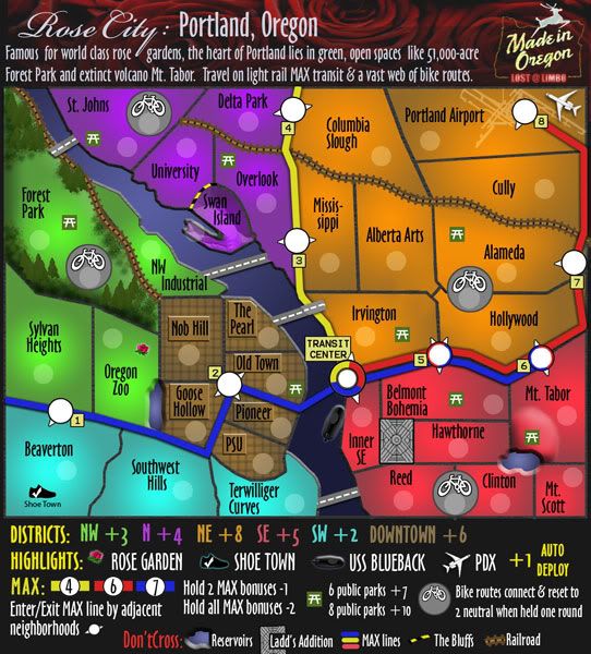
Portland [Quenched]
Moderator: Cartographers
Re: Portland: Rose City (v 14, pg 6) graphics changes
![]() by lostatlimbo on Thu Jun 18, 2009 12:45 am
by lostatlimbo on Thu Jun 18, 2009 12:45 am
Last edited by lostatlimbo on Mon Jun 22, 2009 8:14 pm, edited 1 time in total.
-

 lostatlimbo
- Posts: 1386
- Joined: Wed Mar 28, 2007 3:56 pm
- Location: Portland, OR


Re: Portland: Rose City (v 14, pg 6) graphics changes
![]() by iancanton on Fri Jun 19, 2009 3:54 pm
by iancanton on Fri Jun 19, 2009 3:54 pm
i think the highlights won't be held that often, since people usually don't like spreading their forces. u could make them more attractive by increasing the highlights bonus to +5 (or give up the attempt and leave it at +4). i'm not sure about the graphics concerns but, now that the bike lane neutrals are down to 2, the gameplay looks good.

ian.
ian.

-

iancanton
- Foundry Foreman

- Posts: 2423
- Joined: Fri Jun 01, 2007 5:40 am
- Location: europe


Re: Portland: Rose City (v 14, pg 6) graphics changes
![]() by lostatlimbo on Fri Jun 19, 2009 8:05 pm
by lostatlimbo on Fri Jun 19, 2009 8:05 pm
iancanton wrote:i'm not sure about the graphics concerns but, now that the bike lane neutrals are down to 2, the gameplay looks good.
ian.
Woo-hoo!
Last edited by lostatlimbo on Fri Jun 19, 2009 8:13 pm, edited 1 time in total.
-
lostatlimbo
- Posts: 1386
- Joined: Wed Mar 28, 2007 3:56 pm
- Location: Portland, OR
Re: Portland: Rose City [D, GP] (v 14, pg 7) park changes
![]() by lostatlimbo on Fri Jun 19, 2009 8:12 pm
by lostatlimbo on Fri Jun 19, 2009 8:12 pm
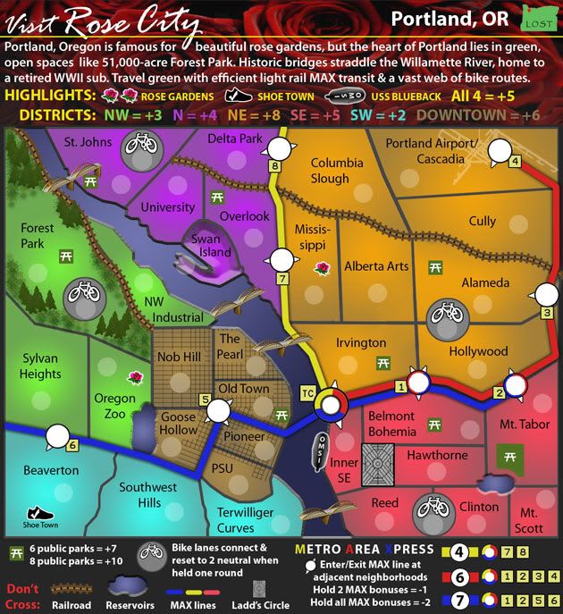
15th Draft update:
Toned down Forest Park texture more and added trees.
Converted parks into park bench icons to better match look of map.
Upped Highlights bonus by 1.
Toned down Forest Park texture more and added trees.
Converted parks into park bench icons to better match look of map.
Upped Highlights bonus by 1.
- Click image to enlarge.
-
lostatlimbo
- Posts: 1386
- Joined: Wed Mar 28, 2007 3:56 pm
- Location: Portland, OR
Re: Portland: Rose City [D, GP] (v 15, pg 7) new park icons!
![]() by AndyDufresne on Tue Jun 23, 2009 10:37 pm
by AndyDufresne on Tue Jun 23, 2009 10:37 pm
I really like what you've done with the Forest---good work. I think it fits that map perfectly now. The picnic icons I'm not terribly fond of...perhaps a simple tree would work as well. But in any case, I would say what you have currently do indeed fit better with the theme of the map you have going, so good work as well.
Now, just to get rid of those bridges...I keed I keed.
Things really look terrific, and the gameplay does't look to shabby either.
--Andy
Now, just to get rid of those bridges...I keed I keed.
Things really look terrific, and the gameplay does't look to shabby either.
--Andy
-

AndyDufresne
- Posts: 24919
- Joined: Fri Mar 03, 2006 8:22 pm
- Location: A Banana Palm in Zihuatanejo


Re: Portland: Rose City [D, GP] (v 15, pg 7) new park icons!
![]() by oaktown on Tue Jun 23, 2009 11:20 pm
by oaktown on Tue Jun 23, 2009 11:20 pm
What I like: just about everything. This just keeps getting better visually, and you've brought the individual elements together beautifully. It's clean and easy on the eye. The bonuses work (even the flex ones) and the neutral resets on the bike lanes is a nice touch. Nice map lost. 
What I don't like: the only thing on this map that I think doesn't work with the overall image would be the rose photo behind the top legend. The color of the roses would be less out of place if it were tied in with something on the map itself, but mostly I don't like that it's a photograph on a map of fun hand made artwork.
Andy make a joke about the bridges so maybe there's a story behind them that I'm unaware of, but they also don't fit in for me - they are too 3-D for a map that is stylistically flat (in a very good way). And it's weird that some have vertical uprights and some not... if you just said on the last page that they're still a work in progress just tell me to shove it and keep on working.

-

oaktown
- Posts: 4451
- Joined: Sun Dec 03, 2006 9:24 pm
- Location: majorcommand


Re: Portland: Rose City [D, GP] (v 15, pg 7) new park icons!
![]() by iancanton on Thu Jun 25, 2009 3:04 am
by iancanton on Thu Jun 25, 2009 3:04 am
can u adjust the boundaries between alberta arts, alameda, hollywood and irvington so that it's clear as to what borders what? now that the ponds no longer look like oil slicks, i have to agree with oaktown.
ian.
oaktown wrote:What I like: just about everything.
ian.
-
iancanton
- Foundry Foreman
- Posts: 2423
- Joined: Fri Jun 01, 2007 5:40 am
- Location: europe
Re: Portland: Rose City [D, GP] (v 15, pg 7) new park icons!
![]() by Frito Bandito on Thu Jun 25, 2009 4:20 pm
by Frito Bandito on Thu Jun 25, 2009 4:20 pm
Where is the Sam Adams pinata? or maybe a blow up doll?
-
Frito Bandito
- Posts: 659
- Joined: Thu Nov 27, 2008 3:55 am
- Location: Orygone


Re: Portland: Rose City [D, GP] (v 15, pg 7) new park icons!
![]() by lostatlimbo on Sun Jul 05, 2009 11:04 pm
by lostatlimbo on Sun Jul 05, 2009 11:04 pm
iancanton wrote:now that the ponds no longer look like oil slicks, i have to agree with oaktown.oaktown wrote:What I like: just about everything. Nice map lost.
AndyDufresne wrote:Things really look terrific, and the gameplay does't look to shabby either.
Thanks all!
16th Draft update:
- Click image to enlarge.
oaktown wrote:What I don't like: the only thing on this map that I think doesn't work with the overall image would be the rose photo behind the top legend.
Agreed. It was meant as a placeholder that I never got around to replacing. I think I like the black with the Made In Oregon sign.
oaktown wrote:Andy make a joke about the bridges so maybe there's a story behind them that I'm unaware of, but they also don't fit in for me - they are too 3-D for a map that is stylistically flat (in a very good way).
I've been resisting on this one, because I quite liked the look of the other bridges and didn't find them all that out of place, but I've finally thrown in the towel on this fight and gone with a basic, flat bridge. The benefit here is that it allowed me to add some land bridges over the MAX line. I noticed certain areas were getting too closed off since you have to go through the MAX only to get between NE and SE or NE and N. The two bridges I added alleviate the MAX bottleneck, but shouldn't affect bonus structure.
iancanton wrote:can u adjust the boundaries between alberta arts, alameda, hollywood and irvington so that it's clear as to what borders what?
Oops! Forgot to change that back after moving the Bike Route.
-
lostatlimbo
- Posts: 1386
- Joined: Wed Mar 28, 2007 3:56 pm
- Location: Portland, OR
Re: Portland: Rose City [D, GP] (v 15, pg 7) new park icons!
![]() by iancanton on Mon Jul 13, 2009 2:00 pm
by iancanton on Mon Jul 13, 2009 2:00 pm
lostatlimbo wrote:some land bridges over the MAX line. I noticed certain areas were getting too closed off since you have to go through the MAX only to get between NE and SE or NE and N. The two bridges I added alleviate the MAX bottleneck, but shouldn't affect bonus structure.
i'm not a fan of these. when using the bike lanes to attack a bonus, u're likely to lose 4 troops to the neutrals, plus 2 left behind on the bike lanes, making 6 in total. since this is already such an open map, after u add the extra two bridges, it's hard to see the bike lanes being used at all, other than in escalating games. that said, the gameplay certainly isn't broken.
ian.
-
iancanton
- Foundry Foreman
- Posts: 2423
- Joined: Fri Jun 01, 2007 5:40 am
- Location: europe
Re: Portland: Rose City [D, GP] (v 17, pg 7) what's next?
![]() by lostatlimbo on Sun Jul 19, 2009 5:07 pm
by lostatlimbo on Sun Jul 19, 2009 5:07 pm
Okay, fair point. Land bridges are gone.
Anything else I need to tweak on here? I guess I keep fiddling with it and adding stuff because it feels like this map is kind of just stuck. Is there anything to be done to move this onward or is it doomed to lack of community interest?
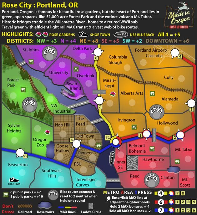
17th Draft update:
Dropped new land bridges.
Anything else I need to tweak on here? I guess I keep fiddling with it and adding stuff because it feels like this map is kind of just stuck. Is there anything to be done to move this onward or is it doomed to lack of community interest?
17th Draft update:
Dropped new land bridges.
- Click image to enlarge.

-
lostatlimbo
- Posts: 1386
- Joined: Wed Mar 28, 2007 3:56 pm
- Location: Portland, OR
Re: Portland: Rose City [D, GP] (v 17, pg 7) what's next?
![]() by ghirrindin on Sun Jul 19, 2009 5:26 pm
by ghirrindin on Sun Jul 19, 2009 5:26 pm
Are St. John's and Forest Park connected? If so, perhaps you should place the bridge on top of the impassable rail line to make that less confusing.
-

ghirrindin
- Posts: 129
- Joined: Sat Jan 12, 2008 9:34 pm
- Location: Urbana, IL


Re: Portland: Rose City [D, GP] (v 17, pg 7) what's next?
![]() by Teflon Kris on Sat Aug 15, 2009 11:37 am
by Teflon Kris on Sat Aug 15, 2009 11:37 am
I'm glad you got rid of the land bridges - as per ian's point- the Bike Lanes are more likely to be a feature now.
Revisiting the map afresh I think the only uncertainty a player would experience is the bridge border discussed above.
Nice work
Revisiting the map afresh I think the only uncertainty a player would experience is the bridge border discussed above.
Nice work
-

Teflon Kris
- Posts: 4236
- Joined: Sun Jul 13, 2008 4:39 pm
- Location: Lancashire, United Kingdom


Re: Portland: Rose City [D, GP] (v 17, pg 7) what's next?
![]() by neanderpaul14 on Mon Aug 17, 2009 11:36 pm
by neanderpaul14 on Mon Aug 17, 2009 11:36 pm
Wow just noticed this map this looks great I really like the bike routes which reset to neutrals after each turn.
However I do miss the old style bridges you had on the first versions I thought those were great looking.
However I do miss the old style bridges you had on the first versions I thought those were great looking.

High score: 2724/#163 on scoreboard/COLONEL
-

neanderpaul14
- Posts: 1216
- Joined: Wed Aug 06, 2008 3:52 pm
- Location: "Always mystify, mislead and surprise the enemy if possible." - Thomas J. Jackson


Re: Portland: Rose City [D, GP] (v 17, pg 7) what's next?
![]() by samuelc812 on Thu Aug 20, 2009 9:13 pm
by samuelc812 on Thu Aug 20, 2009 9:13 pm
Hey mate,
Just letting you know i'll be stamping this map for graphics.
I'll be back a little later on to nitpick
Cheers,
Sam
Just letting you know i'll be stamping this map for graphics.
I'll be back a little later on to nitpick
Cheers,
Sam
-

samuelc812
- Posts: 2215
- Joined: Sun Dec 30, 2007 6:56 am


Re: Portland: Rose City [D, GP] (v 17, pg 7) what's next?
![]() by samuelc812 on Sun Sep 06, 2009 9:17 pm
by samuelc812 on Sun Sep 06, 2009 9:17 pm
Sorry it took me so long, but i'm here now . I have a few nitpicks that i think will improve the map, i don't think you're too far from getting the graphics stamp.
Anyway that's all i've got for now, i hope it helps, keep up the good work and a graphics stamp will not be too far away
~Sam
- Forest looks great, really suits the design of the map, well done.
- I think the heading could be a little more appealing, it's called Rose City so maybe a fancy font with roses weaved in and out of the letters might look nice.
- Swan Island looks like it's been punched in or something? Why doesn't it look like the rest of the mainland?
- USS Blueback i think could look more like a ship and less like a black blob with a white outline. See cairnswk's Pearl Harbor map for an example of how the ship could look from an aerial view. Also what does OMSI stand for?
- Are the train tracks supposed to just stop? I know they are just impassables and nothing more. However it seems a bit strange, perhaps putting a train station at the end to signal the end of the train track. In real life train tracks don't just cut-off in odd places. Just a though, you don't have to if you don't want to.
- I think the park benches look nice. However i think the bike routes could look a little better, more so the icons, could have a better picture of a bike. But that is just a personal opinion.
- In the Downtown bonus, the lines are not evenly across. e.g. Nob Hill has some lines all bunched up to the right and more spaced out to the left, just looks a little strange, if it was all the same it would look a lot nicer. Also PSU doesn't have any lines on it?
- Also what is the point of having a bridge from St.Johns to Forest Park if it's blocked by a Railroad track?
- What is the picture on Portland Airport/Cascadia, it looks a little out of place?
Anyway that's all i've got for now, i hope it helps, keep up the good work and a graphics stamp will not be too far away
~Sam
-
samuelc812
- Posts: 2215
- Joined: Sun Dec 30, 2007 6:56 am
Re: Portland: Rose City [D, GP] (v 17, pg 7) what's next?
![]() by lostatlimbo on Mon Sep 07, 2009 4:26 pm
by lostatlimbo on Mon Sep 07, 2009 4:26 pm
Hi Sam, thanks for the in-depth look - responses below
samuelc812 wrote:Sorry it took me so long, but i'm here now
- Forest looks great, really suits the design of the map, well done.
Thanks!- I think the heading could be a little more appealing, it's called Rose City so maybe a fancy font with roses weaved in and out of the letters might look nice.
I'll play around with that. I was going for a guide book look with this version.- Swan Island looks like it's been punched in or something? Why doesn't it look like the rest of the mainland?
Swan Island is a land island - a long cliff separates it from University & Overlook in reality. Earlier, I had made the "Bluffs" impassable, so that Swan Island was only accessible from NW Industrial, but I found it to difficult to illustrate this impassable on the map, so I dropped it, but left the visual effect for accuracy. Now that I think about it, maybe I'll bring back the impassable element.- USS Blueback i think could look more like a ship and less like a black blob with a white outline. See cairnswk's Pearl Harbor map for an example of how the ship could look from an aerial view. Also what does OMSI stand for?
The USS Blueback isn't a ship - its a submarine. The visual is supposed to illustrate a sub just barely peeking out of the water. The white outline helps to differentiate it from the dark blue water and also to tie it in visually with the rose gardens and Shoe Town as a bonus group.
OMSI stands for Oregon Museum Science & Industry - which hosts the Blueback and is a riverside attraction in its own right. Maybe I'll drop the OMSI part since it is confusing and too big for further explanation on the map.- Are the train tracks supposed to just stop? I know they are just impassables and nothing more. However it seems a bit strange, perhaps putting a train station at the end to signal the end of the train track. In real life train tracks don't just cut-off in odd places. Just a though, you don't have to if you don't want to.
I'll try to blend these in better somehow. They kind of just disperse in industrial areas.- I think the park benches look nice. However i think the bike routes could look a little better, more so the icons, could have a better picture of a bike. But that is just a personal opinion.
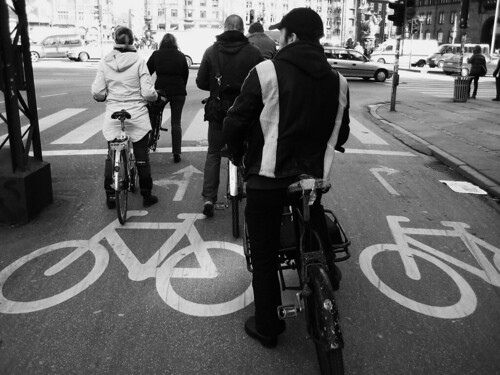
These represent the images you see in a bike lane. Something like this: http://farm4.static.flickr.com/3128/2368678922_95b56d33b7.jpg- In the Downtown bonus, the lines are not evenly across. e.g. Nob Hill has some lines all bunched up to the right and more spaced out to the left, just looks a little strange, if it was all the same it would look a lot nicer. Also PSU doesn't have any lines on it?
This was just another visual touch to roughly illustrate how the blocks get longer in downtown NW, but I have no problem making it more uniform.
PSU is a university campus, so no roads there.- Also what is the point of having a bridge from St.Johns to Forest Park if it's blocked by a Railroad track?
I'll fix this. The old bridge clearly connected the two, but these new bridges don't look right to me (I hate the Irvington overlap) and I haven't figured out how to fix this yet.- What is the picture on Portland Airport/Cascadia, it looks a little out of place?
That is the airport.
Anyway that's all i've got for now, i hope it helps, keep up the good work and a graphics stamp will not be too far away
~Sam
-
lostatlimbo
- Posts: 1386
- Joined: Wed Mar 28, 2007 3:56 pm
- Location: Portland, OR
Re: Portland: Rose City [D, GP] (v 18, pg 8)
![]() by lostatlimbo on Mon Sep 21, 2009 12:51 am
by lostatlimbo on Mon Sep 21, 2009 12:51 am
I elected to leave the Downtown streets as is, because I like the authenticity and adding train stations or warehouse where the train tracks end seemed to only add clutter, so I left them as was, but I fixed or improved some of the other things you mentioned.
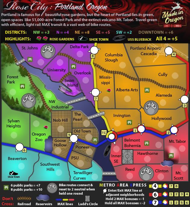
18th Draft update:
Fixed bridge connections
Added train track impassable and softened edge of Swan Island.
Added contour to Mt Tabor (volcano) and Forest Park
Toned down highlights for other Attractions bonuses.
Added more detail to USS Blueback submarine.
Added rose background and fancy title font back into header.
- Click image to enlarge.
-
lostatlimbo
- Posts: 1386
- Joined: Wed Mar 28, 2007 3:56 pm
- Location: Portland, OR
Re: Portland: Rose City [D, GP] (v 18, pg 8)
![]() by MrBenn on Fri Oct 02, 2009 12:03 pm
by MrBenn on Fri Oct 02, 2009 12:03 pm
This map is vastly superior to some of your earlier drafts - you've done a really good job here.
The only things that I would pick up on are as follows:
1. The railroad border between Swan Island and University looks a bit out of place, given that it is so short and doesn't connect to/with anything else. I think you could quite easily lose that as an impassable without any detriment to gameplay - the other option would be to link the railroad to another track, but that would be really difficult on the eye.
2. There appears to be a slight inconsistency with the thickness of you territory border lines, and personally I think they're a little too thick.
3. The lakes at Goose Hollow and Clinton appear to be raised up from the ground rather than sunken in. On the subject of strange bevels, the Picnic table at Mt Tabor looks strangely out of place... I get that it's supposed to be on a hill, but it might be more in keeping with the rest of the map to flatten it out again
4. At first glance, the blue MAX line looks like a river in the Beaverton area - is there any chance you could add a drop shadow in the same way as you have done with the road/bridges? I think the real concern is that the dedge by Beaverton is a bit fuzzy, and not as crisp as I'd expect it to be.
5. The MAX station numbering doesn't appear to be very logical... Is that how they're numbered in real life? If not, then I'd suggest renaming them as follows: 8->1, 7->2, 4->3, 3->4, 2->5, 1->6, 5->7, 6->8. You've also not labeled TC anywhere - I'm guessing it's inferred by the circle symbol - but it might be worth adding TC to the legend too
6. My final thought, is that the road/bridge between Terwilliger Curves and Reed might look a bit better if it was angled up slightly, to be vaguely orientated with the other bridges - this is more for consistency than anything
As I said at the beginning of this post; the map is looking really good now.
I don;t think yiou're too far from getting the graphics stamp now

PB: 2661 | He's blue... If he were green he would die | No mod would be stupid enough to do that
-

MrBenn
- Posts: 6880
- Joined: Wed Nov 21, 2007 9:32 am
- Location: Off Duty


Re: Portland: Rose City [D, GP] (v 18, pg 8)
![]() by Astoria on Fri Oct 09, 2009 6:22 pm
by Astoria on Fri Oct 09, 2009 6:22 pm
Amazing job, mate!
Love the way you made logo of the map with Made in Oregon and your nick inside.
I liked previous bridges more too. But well at least we can see them in real and hopefully play P-town map in here very soon.
Love the way you made logo of the map with Made in Oregon and your nick inside.
I liked previous bridges more too. But well at least we can see them in real and hopefully play P-town map in here very soon.
-

Astoria
- Posts: 24
- Joined: Fri Jun 29, 2007 2:34 am
- Location: Silicon Valley

Re: Portland: Rose City [D, GP] (v 18, pg 8)
![]() by lostatlimbo on Fri Oct 30, 2009 5:41 pm
by lostatlimbo on Fri Oct 30, 2009 5:41 pm

MrBenn wrote:This map is vastly superior to some of your earlier drafts - you've done a really good job here.
Thanks
The only things that I would pick up on are as follows:
1. The railroad border between Swan Island and University looks a bit out of place, given that it is so short and doesn't connect to/with anything else. I think you could quite easily lose that as an impassable without any detriment to gameplay - the other option would be to link the railroad to another track, but that would be really difficult on the eye.
I dropped the railroad, but would like to keep this true to life, so I replaced it with the cautionary retainers you see along the bluffs between University & Swan Island (or any sharp, precarious drop).
2. There appears to be a slight inconsistency with the thickness of you territory border lines, and personally I think they're a little too thick.
This would require a complete re-draw of the map, essentially from the beginning. I simply do not have enough time to do something like this at the moment or in the forseeable future. I'm not opposed to it, but its going to take a while.
3. The lakes at Goose Hollow and Clinton appear to be raised up from the ground rather than sunken in. On the subject of strange bevels, the Picnic table at Mt Tabor looks strangely out of place... I get that it's supposed to be on a hill, but it might be more in keeping with the rest of the map to flatten it out again
I tried to sink the reservoirs a little bit more. Does that help? If I do another draft, I may add a border or something around the edges to make them look less lake-like and more reservoir-ish.
I also toned down the Mt. Tabor volcano. I left some contour, because I talk about Mt. Tabor in the intro and it is one of Portland's unique attributes, so I like the idea of displaying it visually.
4. At first glance, the blue MAX line looks like a river in the Beaverton area - is there any chance you could add a drop shadow in the same way as you have done with the road/bridges? I think the real concern is that the dedge by Beaverton is a bit fuzzy, and not as crisp as I'd expect it to be.
I tweaked these a little. Better?
5. The MAX station numbering doesn't appear to be very logical... Is that how they're numbered in real life? If not, then I'd suggest renaming them as follows: 8->1, 7->2, 4->3, 3->4, 2->5, 1->6, 5->7, 6->8. You've also not labeled TC anywhere - I'm guessing it's inferred by the circle symbol - but it might be worth adding TC to the legend too
I did re-order these, but a little differently than you suggested. This makes more sense in Portland terms as the Yellow MAX line was a later addition to the others.
As to the legend, I added the "TC", but then dropped that part altogether to make some more space down there. I think the MAX bonus is explanatory enough with the colors alone. If you disagree, I'll try to squeeze it back in somehow.
6. My final thought, is that the road/bridge between Terwilliger Curves and Reed might look a bit better if it was angled up slightly, to be vaguely orientated with the other bridges - this is more for consistency than anything
Done
As I said at the beginning of this post; the map is looking really good now.
I don;t think yiou're too far from getting the graphics stamp now
-
lostatlimbo
- Posts: 1386
- Joined: Wed Mar 28, 2007 3:56 pm
- Location: Portland, OR
Re: Portland: Rose City [D, GP] (v 19, pg 8)
![]() by Industrial Helix on Mon Nov 16, 2009 9:29 am
by Industrial Helix on Mon Nov 16, 2009 9:29 am
A better font would do wonders for this map. The font you currently have is just way to plain and doesn't do the map justice. Perhaps something a little more scrolly?
Sketchblog [Update 07/25/11]: http://indyhelixsketch.blogspot.com/
Living in Japan [Update 07/17/11]: http://mirrorcountryih.blogspot.com/
Russian Revolution map for ConquerClub [07/20/11]: viewtopic.php?f=241&t=116575
Living in Japan [Update 07/17/11]: http://mirrorcountryih.blogspot.com/
Russian Revolution map for ConquerClub [07/20/11]: viewtopic.php?f=241&t=116575
-

Industrial Helix
- Posts: 3462
- Joined: Mon Jul 14, 2008 6:49 pm
- Location: Ohio


Re: Portland: Rose City [D, GP] (v 19, pg 8)
![]() by lostatlimbo on Sun Jan 10, 2010 7:24 pm
by lostatlimbo on Sun Jan 10, 2010 7:24 pm
Hi all - new draft coming soon. Will try some different fonts.
-
lostatlimbo
- Posts: 1386
- Joined: Wed Mar 28, 2007 3:56 pm
- Location: Portland, OR
Re: Portland: Rose City [D, GP] (v 20, pg 8)
![]() by lostatlimbo on Mon Jan 11, 2010 2:45 am
by lostatlimbo on Mon Jan 11, 2010 2:45 am
20th Draft
Tried to make this one less flat.
Found a different font I like.
Moved around the Legend.
Re-did the Downtown street grid.
Re-arranged Max stop numbers
Added the airport as a Highlight and dropped a rose garden.
Perhaps it is too late in the process, but I wanted to float the idea of the "Highlights" starting neutral and then being +1 auto-deploy when owned. Among other benefits, it makes it impossible for a player to start with the SW or NW bonuses. Thoughts on this change?
- Click image to enlarge.
-
lostatlimbo
- Posts: 1386
- Joined: Wed Mar 28, 2007 3:56 pm
- Location: Portland, OR
Re: Portland: Rose City [D, GP] (v 20, pg 8 - new font)
![]() by RedBaron0 on Mon Jan 11, 2010 5:18 pm
by RedBaron0 on Mon Jan 11, 2010 5:18 pm
Showed up at just the right time...
Myself and thenobodies80 noticed no new updates for this map since 10/30/09 and was about to issue the 1 review warning before being sent to the Recycling Bin. But with lostatlimbo posting a new update just today we can say he'll be continuing production.
Get some updates and community feedback into this map and you'll get a graphical review from us next fortnight.


-

RedBaron0
- Posts: 2657
- Joined: Sun Aug 19, 2007 12:59 pm
- Location: Pennsylvania


Who is online
Users browsing this forum: No registered users
|
|||||||
| Conquer Club is not associated with RISK online in any way. Copyright © 2006-2024 by Big Wham LLC | |||||||