Conquer Club

Gilgamesh; Coordinates on pg 20

Care to peruse completed maps? Take a stroll through the Atlas.

Moderator: Cartographers

Forum rules
Please read the Community Guidelines before posting.

Re: Gilgamesh; staggered mntns, pg 14

Postby oaktown on Wed Jun 10, 2009 10:58 pm

Click image to enlarge.
image

Small version for .44. The only significant change still to come is that I may want to make all of the army blobs a big bigger - once I get the coordinates done and play with them I'll have a better sense of whether or not they will work as-is.

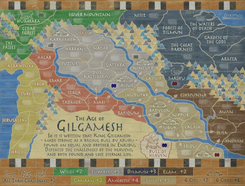
iancanton wrote:as a matter of good form, can u put a gp in the title and something about the start positions in the first post? putting n3 on babylon to mark the position of the fixed starting neutral on each future update will also be helpful for anyone who hasn't been following this thread closely.

First post amended. I was putting the neutral and start info on past versions, but once the gameplay seemed to finally check out I was posting clean versions for the graphics people.

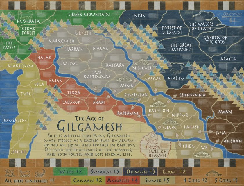
In adding info to the first post it occurred to me that I crunched the numbers wrong and as the map currently stands there will be 15 territories per player in 1v1 games... this is because the third starting postion goes back into the mix, leaving 29 territories to be split between Player 1, Player 2, and Mr. Neutral. 39 Ć· 3 = 13 + 2 = 15. This is easily fixed by adding another pre-set neutral to the code, and another preset neutral doesn't effect any other game type since 43 isn't divisible by anything anyway.

Since we were going to start every game type with a neutral, this just allows us to put it in what we consider to be the least offensive place on the map... I was thinking Nagar, Tuttul, or Harran, since that region is likely to fall later than most anyway. It reduces the odds that somebody will have to slog through a neutral early to earn a bonus.

Another option would be to restore the 6th city in Karkemish (or elsewhere in Subartu) and make it the neutral. We could make the bonuses +2 for four cities and +4 for 6, and it would restore the balance of 3 cities in each of the large central regions. Since two are starting neutral it would remain impossible for somebody to pick up all four to begin 2 or 3 player games.
Image
User avatar
Captain oaktown
 
Posts: 4451
Joined: Sun Dec 03, 2006 9:24 pm
Location: majorcommand

Re: Gilgamesh; GP, question on pg 14

Postby MrBenn on Thu Jun 11, 2009 3:32 am

oaktown wrote:Another option would be to restore the 6th city in Karkemish (or elsewhere in Subartu) and make it the neutral. We could make the bonuses +2 for four cities and +4 for 6, and it would restore the balance of 3 cities in each of the large central regions. Since two are starting neutral it would remain impossible for somebody to pick up all four to begin 2 or 3 player games.

Sounds good to me...
Image
PB: 2661 | He's blue... If he were green he would die | No mod would be stupid enough to do that
User avatar
Lieutenant MrBenn
 
Posts: 6880
Joined: Wed Nov 21, 2007 9:32 am
Location: Off Duty

Re: Gilgamesh; GP, question on pg 14

Postby oaktown on Sat Jun 13, 2009 9:17 am

Click image to enlarge.
image


Yes, yet another gameplay change related to numbers on this map. As noted above, with 44 territories we were looking at each player in a 1v1 game starting with 15, which has the effect of giving a one army/turn advantage to the player that draws the first move. So I've added a neutral in Karkemish, which allows us to replace the city there without problems.

With the two neutral starts there will now be 42 starting territories distributed in 4+ player games.
Image
User avatar
Captain oaktown
 
Posts: 4451
Joined: Sun Dec 03, 2006 9:24 pm
Location: majorcommand

Re: Gilgamesh; GP, gameplay tweak pg 14

Postby the.killing.44 on Sun Jun 14, 2009 11:03 am

Long time coming :)
Image

=D> Let's get this show on the road.

.44
User avatar
Captain the.killing.44
 
Posts: 4724
Joined: Thu Oct 23, 2008 7:43 pm
Location: now tell me what got two gums and knows how to spit rhymes

Re: Gilgamesh; GP, gameplay tweak pg 14

Postby MrBenn on Sun Jun 14, 2009 1:01 pm

This map has been ready for the next stage for a while now ;-)

If anybody has any further gameplay/graphical niggles, speak now, or forever hold your peace ;-)
Image
PB: 2661 | He's blue... If he were green he would die | No mod would be stupid enough to do that
User avatar
Lieutenant MrBenn
 
Posts: 6880
Joined: Wed Nov 21, 2007 9:32 am
Location: Off Duty

Re: Gilgamesh; GP, gameplay tweak pg 14

Postby LED ZEPPELINER on Sun Jun 14, 2009 1:46 pm

all i can really say right now is that i think you should add one more mountain to the mountain range left of the legend on the bottom. It looks to uniform to me how the last 2 mountains are evenly spaced from the center one, and are on the same line. just a thought
sailorseal wrote:My big boy banana was out the whole time :D
AndyDufresne wrote:
AndyDufresne wrote:Many Happy Bananas to everyone, lets party...with Bananas.
--Andy
Forever linked at the hip's-banana! (That sounds strange, don't quote me.)
Sergeant LED ZEPPELINER
 
Posts: 1088
Joined: Tue Nov 25, 2008 10:09 pm

Re: Gilgamesh; GP, gameplay tweak pg 14

Postby oaktown on Sun Jun 14, 2009 7:29 pm

mountain to be added... thanks for the stamps and all of the help on this map. It's been a long time in the making.

Sending out the review shout-out now.
Image
User avatar
Captain oaktown
 
Posts: 4451
Joined: Sun Dec 03, 2006 9:24 pm
Location: majorcommand

Re: Gilgamesh; GP, gameplay tweak pg 14

Postby whitestazn88 on Mon Jun 15, 2009 1:03 am

forge it
Lieutenant whitestazn88
 
Posts: 3128
Joined: Mon Feb 05, 2007 2:59 pm
Location: behind you

Re: Gilgamesh; GP, gameplay tweak pg 14

Postby porkenbeans on Tue Jun 16, 2009 4:38 pm

OK, so I will tell you honestly what I think about the graphics. First off, I will let you know up front, that I have not read every post, but I did skim every page. I am only interested in the graphics, so that is all that I have scrutinized.
Your first few versions back in Jan. and Feb. are much better, in that they are NOT washed out like the later versions are. If you choose to go with the washed out style, I would recommend that you loose the brick. A washed out style needs to be less cluttered.
I like the brick, and think that it is a definite plus for this map. It looks great on the early versions with more color. The text and bonus areas are much easier to distinguish as well.
Like I said, The washed out map needs to be far less cluttered and simple, so as to be kind on the eyes. I would need to see it de-cluttered to say which way is best for this map. But of all the versions that are posted, I prefer the earlier ones.
PS. I think your first instincts were right, and maybe you have been swayed by the peanut gallery. Your maps are some of CCs' best. You have the talent, and should not second guess yourself so readily.
Image
User avatar
Lieutenant porkenbeans
 
Posts: 2546
Joined: Mon Sep 10, 2007 4:06 pm

Re: Gilgamesh; GP, gameplay tweak pg 14

Postby Echospree on Tue Jun 16, 2009 5:02 pm

Your first few versions back in Jan. and Feb. are much better, in that they are NOT washed out like the later versions are. If you choose to go with the washed out style, I would recommend that you loose the brick. A washed out style needs to be less cluttered.


I completely disagree. I feel the washed-out style with the bricks is an interesting look, and extremely appropriate to the feeling of an Ancient Literature.

That said, Ancient Mesopotamian art would have been quite brightly coloured when it was first made, compared to the washed-out look it would have now. So I wouldn't be opposed so a brighter style, but I think the washed-out version looks much nicer.
User avatar
Major Echospree
 
Posts: 169
Joined: Wed Feb 11, 2009 3:03 pm

Re: Gilgamesh; GP, gameplay tweak pg 14

Postby porkenbeans on Tue Jun 16, 2009 6:40 pm

Echospree wrote:
Your first few versions back in Jan. and Feb. are much better, in that they are NOT washed out like the later versions are. If you choose to go with the washed out style, I would recommend that you loose the brick. A washed out style needs to be less cluttered.


I completely disagree. I feel the washed-out style with the bricks is an interesting look, and extremely appropriate to the feeling of an Ancient Literature.

That said, Ancient Mesopotamian art would have been quite brightly colored when it was first made, compared to the washed-out look it would have now. So I wouldn't be opposed so a brighter style, but I think the washed-out version looks much nicer.
I do NOT think that you are quite understanding me. I do NOT have anything against the washed out look, but if you go look at The old weathered and washed out looking maps, they are very uncluttered, with wide open blank areas. This is for a good reason, and that is because with everything so lightly colored, it is hard to read unless it is less cluttered.
As for the brick, I said that I liked it, and if you go look at the earlier versions of this map, you will see that it is bolder, and looks much better than the current version. As a matter of fact I did not even notice it right away. It was not until I scrolled back, that it even became clear that it was there. With it washed out so much, it just disappears into a mat of confusing texture. Compare with the March 13th.
Image
User avatar
Lieutenant porkenbeans
 
Posts: 2546
Joined: Mon Sep 10, 2007 4:06 pm

Re: Gilgamesh; GP, gameplay tweak pg 14

Postby MrBenn on Tue Jun 16, 2009 6:48 pm

Actually, I'd be inclined to agree with pork here - I marginally prefer the colours as they were before the 'washed-out' version you posted on May 24th... It's all a matter of personal taste now :P :twisted:
Image
PB: 2661 | He's blue... If he were green he would die | No mod would be stupid enough to do that
User avatar
Lieutenant MrBenn
 
Posts: 6880
Joined: Wed Nov 21, 2007 9:32 am
Location: Off Duty

Re: Gilgamesh; GP, gameplay tweak pg 14

Postby oaktown on Tue Jun 16, 2009 6:50 pm

i can go either way... I should note that the "bricks" are actually supposed to be tiles as on the Ishtar Gates, and thus would have been very brightly colored when new. However, they've been made to look a bit weathered on this map, so less vibrant colors are also appropriate.

Given that either way works thematically, what do people like the looks of better: bright or dull?

Bright (an older version):
Click image to enlarge.
image


Dull (lastest version):
Click image to enlarge.
image
Image
User avatar
Captain oaktown
 
Posts: 4451
Joined: Sun Dec 03, 2006 9:24 pm
Location: majorcommand

Re: Gilgamesh; GP, gameplay tweak pg 14

Postby MrBenn on Tue Jun 16, 2009 6:56 pm

oaktown wrote:Given that either way works thematically, what do people like the looks of better: bright or dull?

Brighter background with slightly paler text than the bright white :P
Image
PB: 2661 | He's blue... If he were green he would die | No mod would be stupid enough to do that
User avatar
Lieutenant MrBenn
 
Posts: 6880
Joined: Wed Nov 21, 2007 9:32 am
Location: Off Duty

Re: Gilgamesh; GP, gameplay tweak pg 14

Postby Echospree on Tue Jun 16, 2009 7:06 pm

porkenbeans wrote:
Echospree wrote:
Your first few versions back in Jan. and Feb. are much better, in that they are NOT washed out like the later versions are. If you choose to go with the washed out style, I would recommend that you loose the brick. A washed out style needs to be less cluttered.


I completely disagree. I feel the washed-out style with the bricks is an interesting look, and extremely appropriate to the feeling of an Ancient Literature.

That said, Ancient Mesopotamian art would have been quite brightly colored when it was first made, compared to the washed-out look it would have now. So I wouldn't be opposed so a brighter style, but I think the washed-out version looks much nicer.
I do NOT think that you are quite understanding me. I do NOT have anything against the washed out look, but if you go look at The old weathered and washed out looking maps, they are very uncluttered, with wide open blank areas. This is for a good reason, and that is because with everything so lightly colored, it is hard to read unless it is less cluttered.
As for the brick, I said that I liked it, and if you go look at the earlier versions of this map, you will see that it is bolder, and looks much better than the current version. As a matter of fact I did not even notice it right away. It was not until I scrolled back, that it even became clear that it was there. With it washed out so much, it just disappears into a mat of confusing texture. Compare with the March 13th.


Okay, to make sure I understand what you were saying.

I think what you were saying was that the washed-out look in combination with the bricks doesn't look good. Is that correct? I'm saying that I think the washed-out look with the brick looks better than the brighter version with the brick.

This is definitely down to just a matter of taste now, so oaktown can decide for himself, or put up a quick poll to gauge interest in either version.
User avatar
Major Echospree
 
Posts: 169
Joined: Wed Feb 11, 2009 3:03 pm

Re: Gilgamesh; GP, gameplay tweak pg 14

Postby saaimen on Tue Jun 16, 2009 7:19 pm

Indeed, I agree with Echospree on this one.
To me, the bricks shouldn't look all 20th-century and all ;) Which they do on the brighter version.

If you compare the 'duller' version with what was in the Centerscape competition, I think you'd realize we've come a long way in 'brightness' :D

OR, can the colours of the bonus regions be kept bright, but with the less defined/more weathered bricks? I bet not, but I'm not a graphics pro.
ImageImage
Winner of "As Easy As 1, 2, 3! - Africa I", "Championship Series: British Isles",
"1v1 Battle to Rule Doodle Earth 2", "Connect 4 (Restarted)" and "Blind Fold Buddy - BeNeLux"
Sergeant 1st Class saaimen
 
Posts: 476
Joined: Thu Nov 29, 2007 10:04 pm

Re: Gilgamesh; GP, gameplay tweak pg 14

Postby sailorseal on Tue Jun 16, 2009 7:26 pm

Is there a middle ground between the two you can find? I don't really like either.

Also could you darken the text below the Gilgamesh title, its hard to read either way, not that it matters.
User avatar
Cook sailorseal
 
Posts: 2735
Joined: Sun May 25, 2008 1:49 pm
Location: conquerclub.com

Re: Gilgamesh; GP, gameplay tweak pg 14

Postby MrBenn on Wed Jun 17, 2009 1:12 am

sailorseal wrote:Is there a middle ground between the two you can find? I don't really like either.

What specifically don't you like? The colours, or the map itself? Remember, specifics are a lot more helpful than vague bland thoughtless comments :roll:

sailorseal wrote:Also could you darken the text below the Gilgamesh title, its hard to read either way, not that it matters.

Do you really find that text hard to read? It is deliberately slightly lighter than the text of the title, and is 'generic backstory waffle' that is non-essential. Having it darker would probably make it stand out too much. The text colour fits the aesthetic of the map as it is.
Image
PB: 2661 | He's blue... If he were green he would die | No mod would be stupid enough to do that
User avatar
Lieutenant MrBenn
 
Posts: 6880
Joined: Wed Nov 21, 2007 9:32 am
Location: Off Duty

Re: Gilgamesh; GP, gameplay tweak pg 14

Postby AndyDufresne on Wed Jun 17, 2009 12:00 pm

I like the duller version as well---adds to the thematic element of ancient times.


--Andy
User avatar
Corporal 1st Class AndyDufresne
 
Posts: 24919
Joined: Fri Mar 03, 2006 8:22 pm
Location: A Banana Palm in Zihuatanejo

Re: Gilgamesh; GP, gameplay tweak pg 14

Postby sailorseal on Wed Jun 17, 2009 12:04 pm

MrBenn wrote:
sailorseal wrote:Is there a middle ground between the two you can find? I don't really like either.

What specifically don't you like? The colours, or the map itself? Remember, specifics are a lot more helpful than vague bland thoughtless comments :roll:

sailorseal wrote:Also could you darken the text below the Gilgamesh title, its hard to read either way, not that it matters.

Do you really find that text hard to read? It is deliberately slightly lighter than the text of the title, and is 'generic backstory waffle' that is non-essential. Having it darker would probably make it stand out too much. The text colour fits the aesthetic of the map as it is.

I am sorry I think I was clearly referring to the two map versions above and the question was brightness, a middle ground, not as bright as one but brighter then the other
User avatar
Cook sailorseal
 
Posts: 2735
Joined: Sun May 25, 2008 1:49 pm
Location: conquerclub.com

Re: Gilgamesh; GP, gameplay tweak pg 14

Postby oaktown on Wed Jun 17, 2009 5:30 pm

sailorseal wrote:Is there a middle ground between the two you can find? I don't really like either.

I got what you meant. ;)

sailorseal wrote:Also could you darken the text below the Gilgamesh title, its hard to read either way, not that it matters.

I think that what I like about the brighter version is that visual elements are more defined, and some of the text is especially easier to read. Now that I have them side by side I'll see what I can do to keep the weathered look but bring some elements out more.

Edit... turned the dust screens down and touch and upped the opacity of the explanatory text, added a mountain, couple other little tweaks. It looked like I'd brightened things up more before I saved to jpg, so this will be hard to get just right.

Click image to enlarge.
image
Image
User avatar
Captain oaktown
 
Posts: 4451
Joined: Sun Dec 03, 2006 9:24 pm
Location: majorcommand

Re: Gilgamesh; GP, gameplay tweak pg 14

Postby lostatlimbo on Thu Jun 18, 2009 12:58 am

MrBenn wrote:
oaktown wrote:Given that either way works thematically, what do people like the looks of better: bright or dull?

Brighter background with slightly paler text than the bright white :P


I'm with Mr Benn on this one. The brighter version brings out the texture in the tiles - especially in the blue and brown areas. I barely notice this on the washed out version, but on the brighter version, the marble texture pops out more (thusly making them look more like tiles than the bricks they keep getting mistaken for)
User avatar
Sergeant 1st Class lostatlimbo
 
Posts: 1386
Joined: Wed Mar 28, 2007 3:56 pm
Location: Portland, OR

Re: Gilgamesh; GP, GFX

Postby oaktown on Thu Jun 18, 2009 1:06 am

I kinda like how it looks brighter myself... I'll keep playing around. Keep in mind the original inspiration...

Image
Image
User avatar
Captain oaktown
 
Posts: 4451
Joined: Sun Dec 03, 2006 9:24 pm
Location: majorcommand

Re: Gilgamesh; GP, GFX

Postby porkenbeans on Fri Jun 19, 2009 2:26 pm

Thanks Oak,
glad to be of help. The controversy about bright verses faded, is an interesting one. It is true that, as we view these ancient works today, they are faded. But, they only became that way over time. I had an idea that you might want to try. See what it looks like with VERY bright and vivid colors, (the way the original artists intended) but, find a few areas to chip away the paint. This would show how it would have looked 2,000 years ago, and at the same time, give it an err of age. 8-)
Image
User avatar
Lieutenant porkenbeans
 
Posts: 2546
Joined: Mon Sep 10, 2007 4:06 pm

Re: Gilgamesh; GP, GFX

Postby porkenbeans on Fri Jun 19, 2009 2:30 pm

I just noticed the tiled lion painting. If you notice the areas that are showing cracks in the paint, You could chip away some of those "blocks" of paint to see what I am suggesting.
Image
User avatar
Lieutenant porkenbeans
 
Posts: 2546
Joined: Mon Sep 10, 2007 4:06 pm

PreviousNext

Return to The Atlas

Who is online

Users browsing this forum: No registered users