OakUm, your oceans are in the wrong place.

-End of the semester; my brain is friiiiiiied
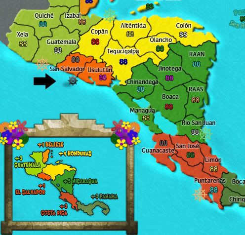
I like the basic idea of the post symbols - now that the attack dots are gone I see that it'll be important to make the port symbols and sea routes stand out to make it impossible to miss them. The wheels with the light strokes get lost over the sea for me. Dark stroke will be necessary - the wheel in the legend is the best in my opinion.
-I agree that the dark strokes/outer glow stand out better, I'll update with them throughout the map =)
You are aware that the sea routes to the islands are gone?
-Accidently hit ALL the sea route layers, instead of just the larger ones; oopsie.
There are some little spacing points that I see - Orange Walk and The Cayes look bunched; the "Atlantic Sea Route looks like it is more a part of the mini map than the main map; and I like how the wheel on the south coast of Canal seems to be more on land than on sea.
-All things I can fix rather easily

The map is coming along nicely, Igo... glad to see you're back at it!

Thanks
RJCompass is washed out. It looks like you found that image on google, then pasted it onto this map, then desaturated (or used a darker layer blend) to remove the background. It still doesn't fit with the map
-Found it on google, removed the BG, fixed some outline problems, color overlay and some other changes. I've kind of grown to like it, though am open for suggestions on how to better fill that giant open space if most people would like something else better over the compass.
Would you consider droping the helms all together, and just adding sea routes, like you had it earlier in the previous versions? Or in the Italy map? I just think the Pacific and Atlantic Sea Routes in the middle of the ocean are a bit confusing. I've added an alternate wheel just to show you a different style. I added a little shadow on the ground to make it "pop" more.
-I/quite a few people like the additional attack routes as a new gameplay feature- makes it interest past a straightforward map and avoids a lot of bunching up the center like on Indochina (nowhere near as much, but it could end up similar).
-I do like the larger shadow on your helm, though it may be a bit too strong to fit the rest of the map. I'm looking into fixing them up to make them look better in the next version.
Consider using a black outline/stroke on your lakes. It may help. (not sure)
-I've tried it; it kind of screws with the bevel/lighting a bit too much.
Is there a way to keep your legend seperated from the rest of the map, like maybe in a subset box or some type of border around it? I think the map would look a bit better if that were cleaned up a bit. See my example. Not saying this is the greatest, but it cleans up that area more.
-I do like the idea of separating the minimap from the main map somehow (one of the issues I pointed out). I'm not sure your suggestion would fit regarding size, though. I'll see what I can do!
-Regardless of whether or not I use it on this map, I will definitely check out the .psd to get some tips on how to make awesome mini-maps


](./images/smilies/eusa_wall.gif "Brick wall")
