Page 3 of 35
Re: Japan - 6th revision pg4

Posted:
Fri Jul 03, 2009 10:00 amby barterer2002
You could also use the flag (Either the current one or one of the historical ones)
Re: Japan - 6th revision pg4
Posted:
Sat Jul 04, 2009 12:38 amby RedBaron0
The current flag:

is kinda on the bland side, even if I could find something spiffy with the flag fluttering in the breeze over near a famous landmark. The other famous flag:
the Japanese naval ensign from WWII may evoke bad feelings on a racial level. Besides at this point a flag I don't think fits in the graphical theme.
Another possibility, how about a bonsai tree?
Re: Japan - 6th revision pg4
Posted:
Sat Jul 04, 2009 1:16 amby ender516
RedBaron0 wrote:The current flag:
is kinda on the bland side, even if I could find something spiffy with the flag fluttering in the breeze over near a famous landmark. The other famous flag:
the Japanese naval ensign from WWII may evoke bad feelings on a racial level. Besides at this point a flag I don't think fits in the graphical theme.
Another possibility, how about a bonsai tree?
A bonsai would be archetypically Japanese, provided it did not just look like a tree. I suppose the carefully scupted branches would get the point across.
If you still want to think about flags, Wikipedia has a
List of Japanese flags which gives a wider range of banners, though not many of them make me think of Japan immediately, with the exception of the Imperial banners with the gold chrysanthemum on a red field.
Re: Japan - 6th revision pg4
Posted:
Sat Jul 04, 2009 1:55 amby RedBaron0
Yeah I saw them, I think most folks wouldn't recognize any of the other flags, even if they represent the Imperial family. Even some of the other symbols are too easily confused with other things, like the cherry blossoms. I kinda knew in the back of my mind that there is a Japanese connection there, but the first thing that springs to mind, and would for most Americans, is the cherry blossoms that bloom around Washington DC. The chrysanthemum is another symbol of Japan, and is an overall Asian flower, but mums tend to be giving as gifts on Easter and Mother's Day too...
Re: Japan - 7th revision pg5
Posted:
Sat Jul 04, 2009 5:31 amby RedBaron0
- Click image to enlarge.
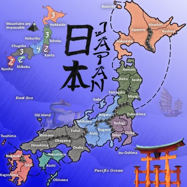
Okay, 4th of July, and I've got a Japan update for y'all!
Added the blue dragon and the Torii gate for graphical accents. Added better highlights to the text and a bit to the main country outline. Also took the mountains and made sure there isn't any question (I hope) to which territory connects to which. I also smudged areas around the mountains to give them a more blended look.
I don't know if I need any more graphical accents, but the junk is beginning to look to me to be a smidgen out of place, and almost ghost-like. Do you guys think I should turn up the opacity?
I'd like to slide back towards any gameplay issues there might be. There's still issues, I think, with bonus values, and a territory or two may need to be added and/or subtracted, possibly. Still, feel free to give suggestions on graphics, I know I need to put the territory circles on, with any luck, as long as there are no major issues with this version, the circles will be on the next version. With the territories generally very light colors I can work with circles that are darker which should give good contrast to the army numbers.
Re: Japan - 7th revision pg5
Posted:
Sat Jul 04, 2009 8:43 amby lancehoch
Current bonus structure:
Hokkaido__3
Tohoku____3
Kanto______2
Hokuriku___4
Chukogu___3
Shikoku____2
Kyushu_____2
I think that Chukogi should be upped to 5 since it has the most territories and is defending against the most points of contact with other bonus regions. I also think that Tohoku should be increased to 4 since it has more territories than Hokkaido (6 vs 5), it has more border territories (3 vs 2), and it is defending against more points of contact with other bonus regions (4 vs 2).
Re: Japan - 7th revision pg5
Posted:
Mon Jul 06, 2009 4:40 amby RedBaron0
After running the numbers through the bonus calculators the numbers are coming up pretty close to what is already presented. The only difference is Hokkaido, the calculators suggest 2 instead of 3. For a smaller map, having higher bonus values may have a detrimental affect to game play if 1 player can gain control of a high bonus region the game is over. Perhaps I should look to merge 2 bonus regions for a larger region that might consitute a 6 or 7 bonus value, say Kanto with Tohoku or Hokuriku. Also looking at the connection between bonus regions they are the same going in both directions in almost all cases.
Should I look to move territory connections so you get 2 or 3 connections into just one territory?
Re: Japan - 7th revision pg5
Posted:
Mon Jul 06, 2009 7:25 amby sailorc
(sorry more on the graphical side) the Torii gate should be toned down a bit. it looks too solid.
also, I do think Hokkaido should have only 2 bonus. it only has 2 borders, which wouldn't be too difficult to hold
Re: Japan - 7th revision pg5
Posted:
Mon Jul 06, 2009 1:12 pmby oaktown
The trouble with the gate is that it looks like a photo, while everything else is hand-drawn. You should one way or the other across the map, and not mix conflicting styles. So if you want the gate, redraw it to look like the mountains.
Same goes with the boat, now that I look at it. In fact I'd stay away from any images you find online - apart from having copyright concerns, they just don't fit the look of the map.
Re: Japan - 7th revision pg5
Posted:
Tue Jul 07, 2009 6:50 amby lancehoch
RedBaron0 wrote:Should I look to move territory connections so you get 2 or 3 connections into just one territory?
Do you mean that you will add connections or remove them? Right now I think you are at the limit for the fewest connections. If someone grabs one end of the island, they can move one or two territories at a time and crawl across to the other end. Also, the mountains remove any chance of attacking diagonally, so it is easier to defend territories once they are behind your line.
Re: Japan - 7th revision pg5
Posted:
Tue Jul 07, 2009 11:54 amby RedBaron0
Definitely more connection seem to be needed, because I see what you're saying lance, hold 2 territories at certain spots along the map and affectedly you can gain control of the entire map north or south.
I guess the main thing is, there is going to have to be less mountains, a lot less, especially at the choke points.
Re: Japan - 8th revision pg5
Posted:
Wed Jul 08, 2009 3:44 amby RedBaron0
- Click image to enlarge.
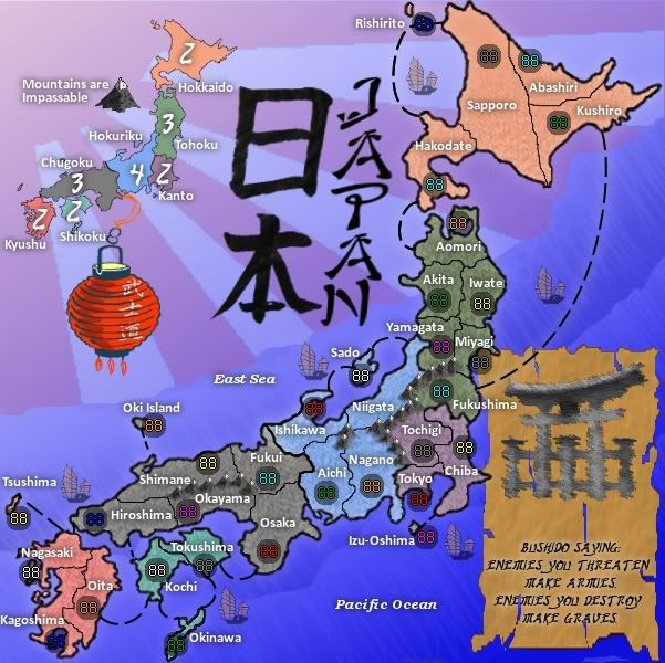
Okay, a lot to cover in this version.
Gameplay changes:
Mountains removed from within Kyushu, Tohoku, and Hokkaido. Mountains separating Chugoku and Hohuriku have also been deleted. Only bonus value changed for the moment is Hokkiado from 3 to 2.
In future update I'm thinking about adding a connection between Osaka and Izu-Oshima. This would do at least 2 things: One - Chugoku would easily warrant a 4 bonus value, and would allow for players to attack north to south (and visa versa)within the span of 8 territories (from Kagoshima to Kushiro) and hitting at least 1 territory in each bonus except one. (Hokuriku)
Graphical changes:
Flipped the background left to right and added to the background a partial rising sun emblem. (similar to the Japanese naval ensign) After looking around I've seen the image a lot of places, on a lot of merchandise, and if the community accepts the usage on the map I'll use it, so I wanted to gage that.
Added a Japanese hanging lantern for graphical eye pleasing. (kanji text on the lantern represent "Bushido") I've made the lantern basically hang off the bonus mini-map.
The junk has bee replaced with several smaller versions (carefully redrawn by myself) for the same reason as the lantern. I do want to be careful in added too much graphical nick-nacks that don't have anything to do with gameplay, I can easily see them be confused with a sea territory, so I may want to erase a couple of them.
I finally added the army circles, and I already see that a few will need to be moved. They did not look that bad when I put them there in the first place, but I always seem to lose some color after uploading, even in jpeg format.
Parchment paper added with a redrawn version of the gate that has a kinda charcoal look now and fits being on a piece of parchment. I've added a quote to the parchment to at least be a placeholder. That space may eventually hold instructions and my own personal signature for the map. I do like that quotation though...

Enemies you threaten make armies.
Enemies you destroy make graves.
So, please discuss the changes and the proposed changes, also I've got a couple of questions for the Incubator crew on pg. 1. All input is greatly appreciated!!!
Re: Japan - 8th revision pg5
Posted:
Wed Jul 08, 2009 5:53 amby 00iCon
That latest one was an awesome change. I like how the gradient matches Japan's shape. But the red on the ensign doesn't blend in, perhaps a shades-of-blue background? so change the red on the flag to blue.
Plus the dragon looked good, you could have moved it to the bottom edge.
Re: Japan - 8th revision pg5
Posted:
Wed Jul 08, 2009 7:48 amby ender516
00iCon wrote:That latest one was an awesome change. I like how the gradient matches Japan's shape. But the red on the ensign doesn't blend in, perhaps a shades-of-blue background? so change the red on the flag to blue.
Plus the dragon looked good, you could have moved it to the bottom edge.
If the flag were changed from red to blue it might blend in so much, it would be unrecognizable. I suppose you can try it and see, but I doubt it will be an improvement. I wouldn't expect a flag to blend in anyway.
On the other hand, I kinda miss the dragon too.
Gameplay changes seem like the right thing to do.
Overall, a good update.
Re: Japan - 8th revision pg5
Posted:
Wed Jul 08, 2009 12:36 pmby sailorc
great update. I love the parchment. maybe u could change the font so it's easier to read? the flag improves the map a ton I think
Re: Japan - 8th revision pg5
Posted:
Fri Jul 10, 2009 12:01 amby Mr Pink
I think the flag looks fine, and considering it is still in use by the Japanese Self Defense navy, I don't see how it could cause offence.
I'd be more concerned about the bushido quote and the hanging lantern which seem to clutter the map unnecessarily.
Just my thoughts.
Mr.P.
Re: Japan - 8th revision pg5
Posted:
Fri Jul 10, 2009 1:33 amby Industrial Helix
Well, the actual mpa of Japan looks great. I like the color and the mountains, the gameplay looks pretty good as well. But i think the map has some serious clutter going on, lantern, arch, bushido saying (which is awesome but I think it needs to fit in better), and the many boats (which I know I recommended, but I'll elaborate in below).
The boat, on the whole, is a good addition. I thought it made the sea look like the sea. But now the sea is kind of torn between being a flag or the sea. So then that indecision needs to be resolves as well.
The problem with the lantern, parchment, ships and arch is that they have no unifying characteristics. I'd say pick one and run with it. If you want to run with lanterns, put in a few more lanterns and get rid of the rest. Work them in with the title and use them to coordinate with the red sunset background. If you want to do the arch, then cut the lantern and work the arch in more prominently.
In regards to the arch, I don't like the photoshop filter you used on it. It kind of looks tacky.
The Bushido saying is quite cool, but the parchment is too much I think. If you want to go with a Japanese text theme (similar to the oaktown approach) then parchment might be something you want to expand on but you're gonna have to make it more prominent and encompassing of more of the map, I think. Right now its just kind of hanging out down in the corner.
As for the sea and the flag. I think what you're going for can be done quite well, but you're going to have to play with it. Someone mentioned removing some of the blue from over the flag, this is good. Maybe you could make the flag area something like a rules area, then use the sea to surround the islands and give them a setting. Might even be able to fit the quote in the flag area as well.
As for the ships, I think they're good to give the sea area some life... but you're going to have to find a balance between too few and too many. I thought the single ship worked great actually.
Hope this helps! You're making great progress on this map.
Re: Japan - 8th revision pg5
Posted:
Fri Jul 10, 2009 3:59 amby RedBaron0
Good feedback guys. From your suggestions, I'll tell you what I'm thinking about doing in the next update which will most likely get done tomorrow night sometime.
Graphics:
The "wave" background should constitute the majority of the background. I put the flag up there in the top corner since the wave design only filled about 60% of the background, the top corner was basically blank. So I figure I should get the background to fill in more of the background texture. The flag can be used still, but needs to be a smaller addition. Maybe a fluttering flag behind the mini-map, but nothing too static. I should also pick a overall graphical theme. Couple knick-knacks here and there, a boat, perhaps bring the dragon back, but say the major (ie larger images) are all lanterns of some sort. I'm thinking the red hanging lantern stays on the image somewhere, maybe more in conjunction with the title than the mini map, and say I get a number of floating lanterns representing the Toro Nagashi ceremony, its a funeral ceremony. (Remember Karate Kid II, where they floated the lanterns down the river after Mr. Miyagi's father died) Say I color the various lanterns to the 8 basic colors of the CC armies (red, green, blue, yellow, pink, cyan, orange, gray) floating down the east coast at various sizes, shapes and, with a little kanji text on the lantern. (I'd probably find the symbol(s) for that color and use that)
Gameplay:
Draw a connection between Osaka and Izu-Oshima, and adjust bonuses accordingly. Reposition army circles for better clarity.
Anything else pressing?
Re: Japan - 8th revision pg5
Posted:
Fri Jul 10, 2009 4:07 amby Balsiefen
I agree with Helix on all that.
I like the ships, I think you should try to keep them.
I think people are seeing the map as more cluttered than it is (though the lamp should probably go) because of the textures you are using. The texture for your territories is ever so slightly migraine inducing so I'd suggest making it lighter or, preferably, replacing it with something which isn't as bitty.
Gameplay-wise, you're pretty good. However, Shikoku is disproportionately easy for a 2 bonus (3 terr, 2 bord as oppose to kanto's 4 terr 3 bord) I would suggest changing the oita-kochi sea route to oita-okinawa to give it 3 borders.
also, at the moment a player can hold a 7 bonus with 2 boarders at fukui and osaka. I know this is inevitable with your map shape and part of the gameplay but I would still suggest adding another sea route (perhaps from okinawa)
Even better would be to add connecting ports similar to Philippines to get more movement around the map and make sure no-one can sit at one end and expand without ever increasing the number of borders they have to defend. I'm not sure exactly where you would want to place them but three or four around the map (especially in the smaller continents) would help gameplay a lot, though I suggest you make them territories which already have boarders so you don't change gameplay too much. Actually, your ships would make good symbols for the ports which'll give them a use apart from decorative.
Re: Japan - 9th revision pg6
Posted:
Sat Jul 11, 2009 6:33 amby RedBaron0
Alright it's off to bed for me, here's the update:
- Click image to enlarge.
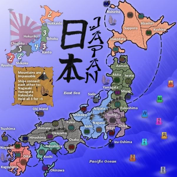
Adjusted a few bonus values to reflect the addition of the "ships" and the extra connection.
Adjusted some army circles, I probably need to move Ishikawa too, but other than that I think I'm good...
Removed the hanging lantern.
Added clearer, smaller Japanese naval ensign.
Added instructions on parchment paper.
Added floating lanterns with shadow ripple effect.
This should cover everyone's concerns to this point. I didn't re-add the dragon, yet since it would make clutter. I want to gauge the floating lanterns before adding it back. I still have to think about the texture behind the territories, but it's bedtime, so many thanks for your input!
!
Posted:
Sun Jul 12, 2009 1:01 pmby Industrial Helix
Nice update! I really like what you did with the flag and the minimap, I think it works quite well. The rules on the paper is also nice, though I think the dark marks or tears in the middle need to be lightened and I'm gonna suggest maybe putting a drop shadow in to make it look less like its tacked on there.
The lanterns... I could go either way. It's a better approach than before, but there's some problems with it I think. I wasn't entirely sure what they were when I saw the update, I was confused if they were boats cause they were on the sea and then I started thinking maybe they were lanterns. Then I wasn't sure if it was a playable item either. It's well put together, i think, the little white waves of air work nicely with it and the color helps break up some of that monotonous blue. On the other hand, I think there needs to be some adjustments to them if you're going to run with it.
The ships as a playable item seem unnecessary to me, I think you have more than enough playable areas on the map to work with that adding ships isn't really going to make it any better. Plus it conflicts with the dotted line approach to sea travel. I think it ought to be one or the other, dotted lines or ships. In which case the dotted lines work best in my opinion. I think as far as terrs. attacking terrs. that the map graphics should make it obvious, as opposed to having to read the rules to know that they're playable in the game and where they attack to and from. Personally, I'm in favor of moving the ships back to a decorative item.
The text about the ships is worded a bit strangely. If you want to keep the ships playable, you're going to have to find a better way to say what's there. If not, no big deal.
Otherwise, yeah, looks good. I wonder if there might be a better way to integrate the words Pacific Ocean and East Sea better into the background. Maybe change them to a different shade of blue, change the font, make it bigger. Something to experiment with I guess.
Re: Japan - 9th revision pg6
Posted:
Sun Jul 12, 2009 10:06 pmby lancehoch
I agree with Helix, the ships don't look great as a playable item. The other thing about the ships is that they are positioned awkwardly. The one in the south looks like it could be more for Kagoshima than for Nagasaki. The one in the north looks like it could belong to any one of three territories. The one in the middle looks like it is more for Akita than for Yamagata. I like the new positioning of the flag and the rest of the gameplay looks good to my untrained eye. As to the colors, I kinda like the washed out color, but I am not sure of the color you were actually trying to get.
Re: Japan - 9th revision pg6
Posted:
Mon Jul 13, 2009 12:02 amby RedBaron0
I kinda just picked 3 territories that seemed the most logical for this boat/port connection. I do see that fit awkwardly in each spot.
Alright, how about this for an idea then, I put back the one boat pretty much in the center of the map. I make that a territory, call it "East Sea" or "Sea of Japan" (The name of the sea is disputed between Japan, and both North and South Korea. I've been using "East Sea" to this point, but I may switch as I read about the dispute. Sea of Japan is currently the reconized name by the UN) The junk represents that territory and would connect via dashed line to Nagasaki, Yamagata, and Hakodate. +1 bonus holding the territory always starts a neutral 3.
I'll probably will have to make the title a bit smaller and reposition it.
I'll see what I can do with the "Pacific Ocean" and I think I might have found a use for my Bushido quote by putting it with the floating lanterns.
The washed out, lighter colors is the direction I was going in, if you look at the earliest versions, the colors were much stronger.(and didn't have texture)
Re: Japan - 9th revision pg6
Posted:
Mon Jul 13, 2009 2:17 amby oaktown
Hmm, the ships... I think you were better off without them. I really think this map will be most successful if you keep it simple - in terms of both gameplay and graphics. In Japan you have a geographic region that is both visually stunning and very challenging from a practical design point of view. Work with the land, and don't throw anything else in there that could be confusing like long range attacks and routes that need a special explanation in the legend.
Bonus regions look pretty good, but as you proceed think about which region you'd like to start in when playing this map and consider whether or not that bonus is too high. Shikoku is by far the best +2 region, and kanto is a much more powerful +3 than its neighbor which has two more territories it has to take to score a bonus.
Connections could be a bit more clear... Tochigi and Fukushima could have the mountain protrude between them to avoid any possible misread.
Overall I think it's coming along nicely, but it's still not particularly 'Japanese' looking. The bits you've added are indeed Japanese - like the flag - but they rather than adding to the overall look they're just creating more to distract the eye. It could be the colors? Right now they aren't very zen. Your feng shui is all off.

Re: Japan - 9th revision pg6
Posted:
Mon Jul 13, 2009 2:57 amby cairnswk
oaktown wrote:Hmm, the ships... I think you were better off without them. I really think this map will be most successful if you keep it simple - in terms of both gameplay and graphics. In Japan you have a geographic region that is both visually stunning and very challenging from a practical design point of view. Work with the land, and don't throw anything else in there that could be confusing like long range attacks and routes that need a special explanation in the legend...
RedBaron0, i agree with oaktown on the ships.
I've skimmed the thread and see people are in favour of the flag as a added touch.
Can i suggest that perhaps you identify the period of your map, and then look
here to see if there is any specific flag that would be better than the current flag. From the inclusion of the "junks" as a graphic enhancement, perhaps the current flag is out of it's historical context.
Just a suggestion
