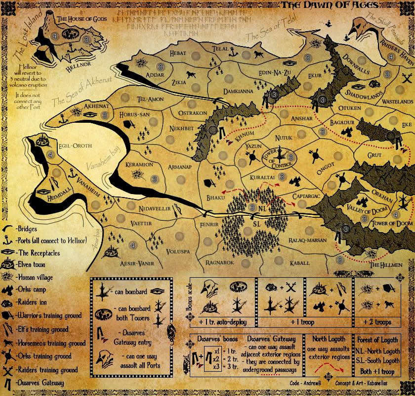
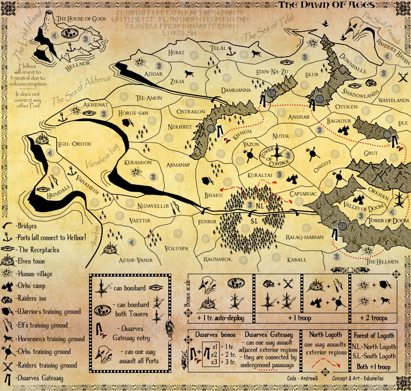
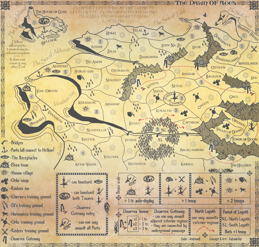
Re: The Dawn Of Ages - Version 8
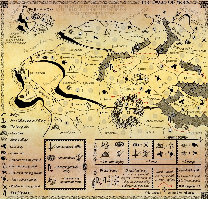
Version 8,
-Font change
-Added 1 more region (to reach a easier dividable number - 32 distributable regions now)
-Change 'Mount doom' to 'Valley of Doom'
-Added some art and some location names
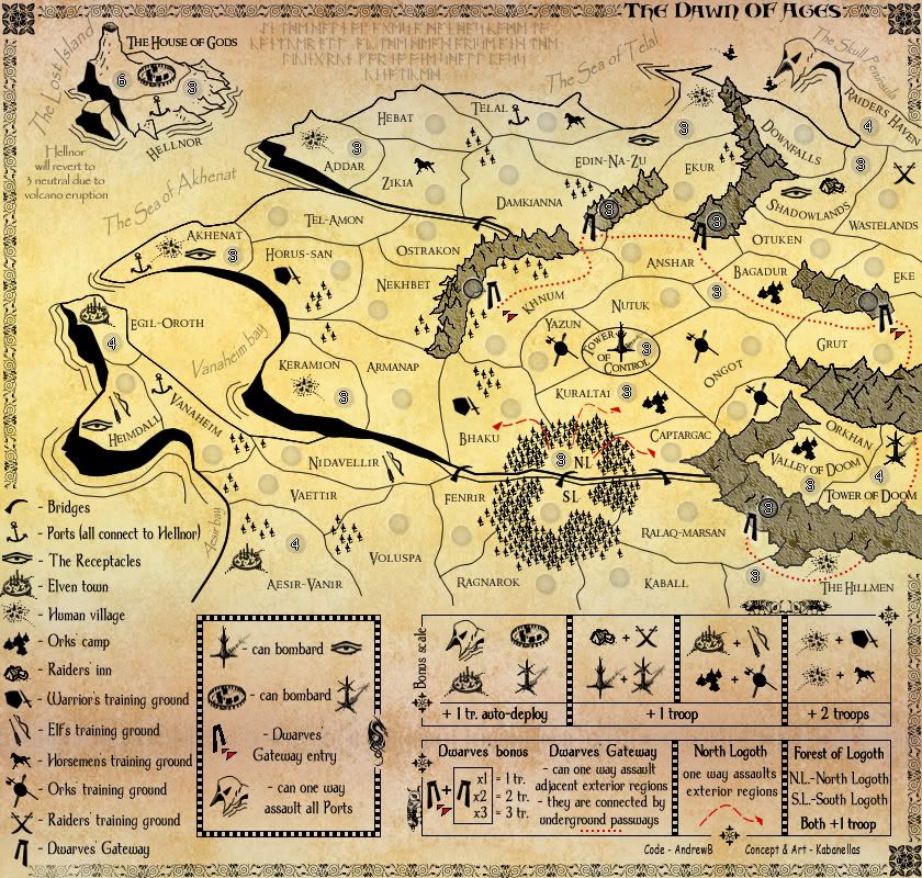
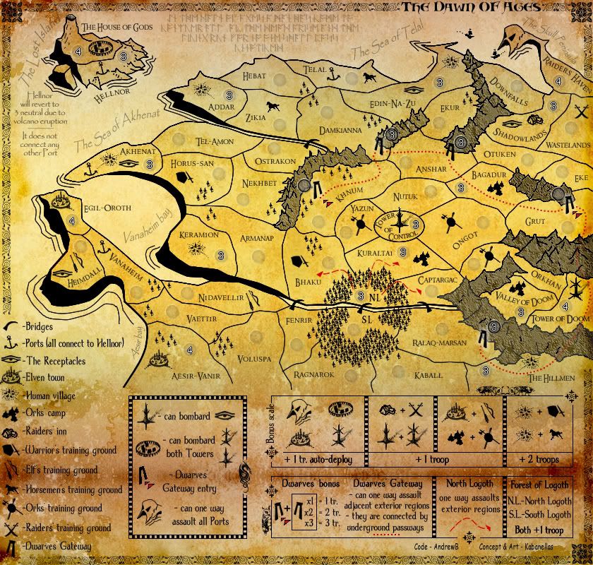
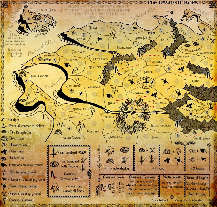
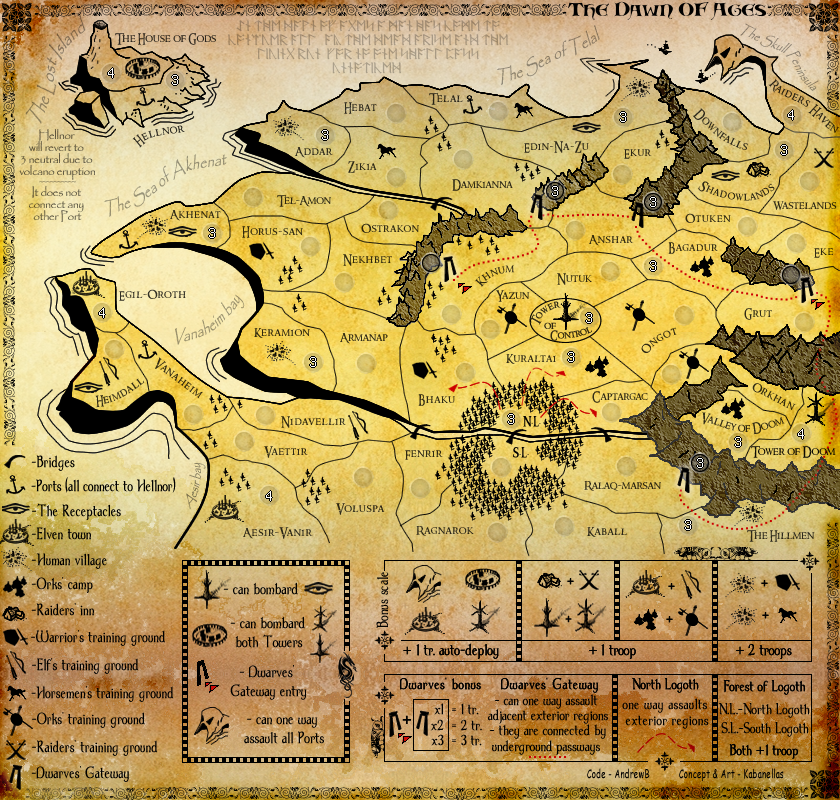
-Font change
-Added 1 more region (to reach a easier dividable number - 32 distributable regions now)
-Change 'Mount doom' to 'Valley of Doom'
-Added some art and some location names
- Click image to enlarge.