I vote for Oaktowns...it's pretty sweet. I was in a rush, but couldn't figure out the A,B,C deal...which letter goes with OT's??
Nice work to all...very impressive!
Official Brazil REVAMP competition [Done! - RJbeals wins]
Moderator: Cartographers
Re: Official Brazil REVAMP competition [Round 2]
![]() by General Guster on Thu Jul 31, 2008 7:13 pm
by General Guster on Thu Jul 31, 2008 7:13 pm
-
 General Guster
- Posts: 26
- Joined: Thu Aug 24, 2006 7:33 pm


Re: Official Brazil REVAMP competition [Round 2]
![]() by oaktown on Thu Jul 31, 2008 10:12 pm
by oaktown on Thu Jul 31, 2008 10:12 pm
General Guster wrote:I vote for Oaktowns...it's pretty sweet. I was in a rush, but couldn't figure out the A,B,C deal...which letter goes with OT's??
You're right, it isn't clear from the first post... gim?
-

oaktown
- Posts: 4451
- Joined: Sun Dec 03, 2006 9:24 pm
- Location: majorcommand


Re: Official Brazil REVAMP competition [Round 2]
![]() by Marino_1 on Thu Jul 31, 2008 11:23 pm
by Marino_1 on Thu Jul 31, 2008 11:23 pm
I can't tell which maps I need to vote from....
I'd like to vote, but I've no idea which are the "votable" maps...
Please help!
I'd like to vote, but I've no idea which are the "votable" maps...
Please help!
-

Marino_1
- Posts: 59
- Joined: Thu Oct 18, 2007 7:07 pm
- Location: Toronto, I think... Sometimes I get confused.


Re: Official Brazil REVAMP competition [Round 2]
![]() by edbeard on Thu Jul 31, 2008 11:39 pm
by edbeard on Thu Jul 31, 2008 11:39 pm
gimil wrote:Round 2 - The Final!
A:
Rjbeals
- Click image to enlarge.
B:
oaktown
- Click image to enlarge.
C:
Widowmakers
- Click image to enlarge.
========================================

-

edbeard
- Posts: 2501
- Joined: Thu Mar 29, 2007 12:41 am


Re: Official Brazil REVAMP competition [Round 2]
![]() by whitestazn88 on Thu Jul 31, 2008 11:49 pm
by whitestazn88 on Thu Jul 31, 2008 11:49 pm
did you just bump the pictures for everyones sakes? i might be missing something that you said
-
whitestazn88
- Posts: 3128
- Joined: Mon Feb 05, 2007 2:59 pm
- Location: behind you


Re: Official Brazil REVAMP competition [Round 2]
![]() by edbeard on Thu Jul 31, 2008 11:52 pm
by edbeard on Thu Jul 31, 2008 11:52 pm
Marino_1 wrote:I can't tell which maps I need to vote from....
I'd like to vote, but I've no idea which are the "votable" maps...
Please help!
-
edbeard
- Posts: 2501
- Joined: Thu Mar 29, 2007 12:41 am
Re: Official Brazil REVAMP competition [Round 2]
![]() by jako on Fri Aug 01, 2008 8:57 am
by jako on Fri Aug 01, 2008 8:57 am
i just used common sense and figured that the first 1 must be A and then second is b, etc....
however, i guess not everyone thinks like that and gimil has updated teh first post to show what is A,B,C so people shouldnt be confused anymore.
however, i guess not everyone thinks like that and gimil has updated teh first post to show what is A,B,C so people shouldnt be confused anymore.

Time to retire this much loved sig of mine with a new clan.
-

jako
- Posts: 1022
- Joined: Sun Jun 03, 2007 4:50 am
- Location: A lost soul with no-one to stalk.
Re: Official Brazil REVAMP competition [Round 2]
![]() by DragonCharmer84 on Fri Aug 01, 2008 9:22 am
by DragonCharmer84 on Fri Aug 01, 2008 9:22 am
Hm. The maps are nice but not particularly accurate to real-world geography.
-
DragonCharmer84
- Posts: 3
- Joined: Fri Jan 04, 2008 2:11 pm


Re: Official Brazil REVAMP competition [Round 2]
![]() by jiminski on Fri Aug 01, 2008 9:29 am
by jiminski on Fri Aug 01, 2008 9:29 am
DragonCharmer84 wrote:Hm. The maps are nice but not particularly accurate to real-world geography.
bahhhhh humbug.

-

jiminski
- Posts: 5422
- Joined: Tue Feb 20, 2007 3:30 pm
- Location: London


Re: Official Brazil REVAMP competition [Round 2]
![]() by InkL0sed on Fri Aug 01, 2008 9:35 am
by InkL0sed on Fri Aug 01, 2008 9:35 am
Just one more vote to 400...
-

InkL0sed
- Posts: 2370
- Joined: Sat Jun 23, 2007 4:06 pm
- Location: underwater


Re: Official Brazil REVAMP competition [Round 2]
![]() by Marino_1 on Fri Aug 01, 2008 10:13 am
by Marino_1 on Fri Aug 01, 2008 10:13 am
Thanks.
My vote is in.
My vote is in.
-
Marino_1
- Posts: 59
- Joined: Thu Oct 18, 2007 7:07 pm
- Location: Toronto, I think... Sometimes I get confused.
Re: Official Brazil REVAMP competition [Round 2]
![]() by mibi on Fri Aug 01, 2008 12:40 pm
by mibi on Fri Aug 01, 2008 12:40 pm
Rj, your mini-map is totally redundant. I know you threw it in there to use up some space but take a lesson from Oakeys map and add some culture!
-

mibi
- Posts: 3350
- Joined: Thu Mar 01, 2007 8:19 pm
- Location: The Great State of Vermont
Re: Official Brazil REVAMP competition [Round 2]
![]() by RjBeals on Fri Aug 01, 2008 12:44 pm
by RjBeals on Fri Aug 01, 2008 12:44 pm
mibi wrote:Rj, your mini-map is totally redundant. I know you threw it in there to use up some space but take a lesson from Oakeys map and add some culture!
Thanks.

-

RjBeals
- Posts: 2506
- Joined: Mon Nov 20, 2006 5:17 pm
- Location: South Carolina, USA


Re: Official Brazil REVAMP competition [Round 2]
![]() by Mjinga on Fri Aug 01, 2008 2:38 pm
by Mjinga on Fri Aug 01, 2008 2:38 pm
DragonCharmer84 wrote:Hm. The maps are nice but not particularly accurate to real-world geography.
It's the first thing I'm gonna whinge about when RJ wins.
Reputation cleared.  Never let it be said that Team CC don't investigate fairly.
Although they take bloody forever to do it...
Although they take bloody forever to do it...
-
Mjinga
- Posts: 251
- Joined: Fri Sep 14, 2007 2:36 pm


Re: Official Brazil REVAMP competition [Round 2]
![]() by oaktown on Fri Aug 01, 2008 2:52 pm
by oaktown on Fri Aug 01, 2008 2:52 pm
Mjinga wrote:DragonCharmer84 wrote:Hm. The maps are nice but not particularly accurate to real-world geography.
It's the first thing I'm gonna whinge about when RJ wins.I've only not been saying anything because it's useless to try and fix them all in the voting rounds.
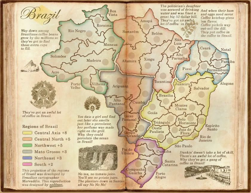
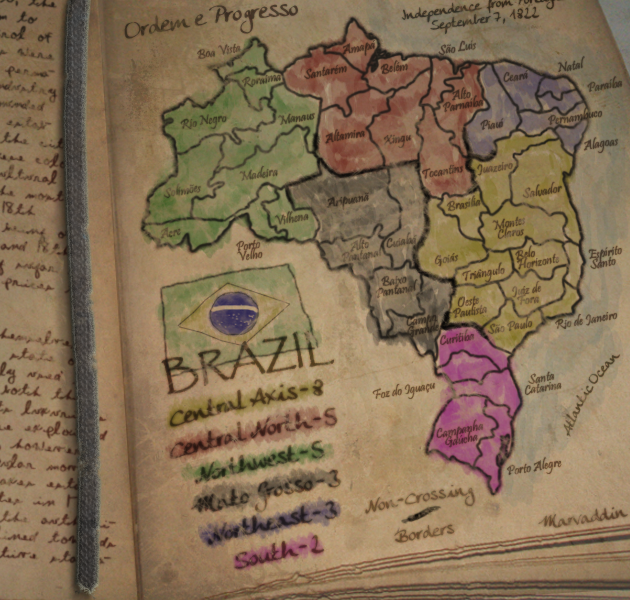
Actually, we have no control over the geography. The rules of the competition were that the map was to stay true to marvaddin's original, which has long been known for it's, um, geographic anomalies.
-
oaktown
- Posts: 4451
- Joined: Sun Dec 03, 2006 9:24 pm
- Location: majorcommand
Re: Official Brazil REVAMP competition [Round 2]
![]() by Marvaddin on Fri Aug 01, 2008 2:57 pm
by Marvaddin on Fri Aug 01, 2008 2:57 pm
Hey, all.
I just didnt reply earlier because Im in a trip, meeting my girlfriend (Brazilian HOT woman, like Patroclus would say, lolololol). Im even having some problems to connect to the net here where I am. But, lets talk about whats important.
Im very impressed, mostly by entries A and B. Congratz to you all. (And to me, I got a vote, lol!)
In fact, I would vote to A, but I didnt do it because I dont want to show acceptance to some things about this one. RJ, like I said before, I intend to use the veto "super"-powers to the tilt, and this because a simple reason: Im not minimally convinced its necessary. It doesnt change too much the map proportions like it did to Portugal and Italy (and even doing that, its not something people from a country would love; I saw some of the reactions in the Portuguese forum, and I agree to them). See, you can decrease or remove the square around the map, put the image borders nearer to the map, decrease even the map a bit, because in most territories we have free space. Im sure you can do it without the tilt.
About the colours in the title, and the lack of national symbol, well, if your map really wins, we can discuss it properly. Like someone said, we have now 2 legends. I love the minimap, but I know we need have the continent names. How about putting them in the minimap, having some free space to the flag? Well, eliminating the tilt we will anyway have some free space in the bottom right corner. And the title, well, I can live with that, but before we can see what are the options having green and yellow only, or with blue. If this one is really the best... well, we will see.
A little suggestion: although I like the background, Brazil is not a big jungle like some people think. We have cities with +10M people, factories, etc. What you think about having the jungle in one side of the background (W side, preferently) and other things (like even the ocean) in the other?
Beyond that, some mispelled names, and the letters "p" and "g" being a bit alike, I loved the map! Congratulations!
Oak, your map is also great, it really remembers a book. Main problems: some of the side notes have wrong info (like Rio having 1 million people, lol, its more like 5-10 millions) that we would need to correct, and the northeast colour in the map doesnt meet the colour in the legend. And what do you mean by geographic anomalies? lol
Like someone said, entry C was better before the changes. Very good, but my last option in this poll. Congrats anyway, WM.
Thats it for now. I will probably be at home next sunday or monday. Then I can be more helpfull to the discussion if needed.

-

Marvaddin
- Posts: 2545
- Joined: Thu Feb 09, 2006 5:06 pm
- Location: Belo Horizonte, Brazil

Re: Official Brazil REVAMP competition [Round 2]
![]() by Bones2484 on Fri Aug 01, 2008 3:02 pm
by Bones2484 on Fri Aug 01, 2008 3:02 pm
Well, with such large changes you'd like to A who knows it that would still be everyone's favorite?
I can completely understand the "tilt-veto" and rotating the map wouldn't change the feel of the map (and there is no reason for the minimap)... but everything else you mentioned definitely would be a large graphic overhaul.
I can completely understand the "tilt-veto" and rotating the map wouldn't change the feel of the map (and there is no reason for the minimap)... but everything else you mentioned definitely would be a large graphic overhaul.
Last edited by Bones2484 on Fri Aug 01, 2008 3:04 pm, edited 1 time in total.
-

Bones2484
- Posts: 2307
- Joined: Mon Sep 17, 2007 11:24 am
- Location: Los Angeles, CA (G1)


Re: Official Brazil REVAMP competition [Round 2]
![]() by oaktown on Fri Aug 01, 2008 3:03 pm
by oaktown on Fri Aug 01, 2008 3:03 pm
Marvaddin wrote: Main problems: some of the side notes have wrong info (like Rio having 1 million people, lol, its more like 5-10 millions) that we would need to correct
well, this map is set in 1900 - when there were just 1 million people. i stand by my map.
-
oaktown
- Posts: 4451
- Joined: Sun Dec 03, 2006 9:24 pm
- Location: majorcommand
Re: Official Brazil REVAMP competition [Round 2]
![]() by ZeakCytho on Fri Aug 01, 2008 3:07 pm
by ZeakCytho on Fri Aug 01, 2008 3:07 pm
oaktown wrote:Mjinga wrote:DragonCharmer84 wrote:Hm. The maps are nice but not particularly accurate to real-world geography.
It's the first thing I'm gonna whinge about when RJ wins.
Actually, we have no control over the geography. The rules of the competition were that the map was to stay true to marvaddin's original, which has long been known for it's, um, geographic anomalies.
I believe it was clarified back in the first few pages that changing territory borders and names was fine as long as the gameplay stayed the same, much like the Germany revmap.
-

ZeakCytho
- Posts: 1251
- Joined: Wed Sep 12, 2007 4:36 pm


Re: Official Brazil REVAMP competition [Round 2]
![]() by oaktown on Fri Aug 01, 2008 3:14 pm
by oaktown on Fri Aug 01, 2008 3:14 pm
ZeakCytho wrote:I believe it was clarified back in the first few pages that changing territory borders and names was fine as long as the gameplay stayed the same, much like the Germany revmap.
right, but my biggest question about the geography of this map has always been the location of impassables... they aren't based on anything that actually exists.
Changing territory borders would change the way the map plays - you can tweak them, but you can't add/eliminate attack routes.
Anyway, the map plays pretty well, so why would we want to mess with those things?
-
oaktown
- Posts: 4451
- Joined: Sun Dec 03, 2006 9:24 pm
- Location: majorcommand
Re: Official Brazil REVAMP competition [Round 2]
![]() by ZeakCytho on Fri Aug 01, 2008 3:19 pm
by ZeakCytho on Fri Aug 01, 2008 3:19 pm
oaktown wrote:ZeakCytho wrote:I believe it was clarified back in the first few pages that changing territory borders and names was fine as long as the gameplay stayed the same, much like the Germany revmap.
right, but my biggest question about the geography of this map has always been the location of impassables... they aren't based on anything that actually exists.
Changing territory borders would change the way the map plays - you can tweak them, but you can't add/eliminate attack routes.
Anyway, the map plays pretty well, so why would we want to mess with those things?
No, keep the gameplay the same but change the names of the territories so they more accurately reflect the actual areas. Many of the territories are not placed where they are in reality, and the borders are off. It's possible to make it more accurate without changing gameplay at all. See the entry Mjinga did (D) from round 1.
-
ZeakCytho
- Posts: 1251
- Joined: Wed Sep 12, 2007 4:36 pm
Re: Official Brazil REVAMP competition [Round 2]
![]() by GrimReaper. on Fri Aug 01, 2008 6:22 pm
by GrimReaper. on Fri Aug 01, 2008 6:22 pm
ENTRY A!

When the first Atom bomb test was complete a colleague of Oppenheimer said: "What an Awesome and Foul display of Power." a moment later he added, "Now we are all sons of bitches"
-

GrimReaper.
- Posts: 913
- Joined: Mon Jul 07, 2008 10:15 pm
- Location: everywhere


Re: Official Brazil REVAMP competition [Round 2]
![]() by RjBeals on Fri Aug 01, 2008 6:53 pm
by RjBeals on Fri Aug 01, 2008 6:53 pm
Jeez...
Marv - because I like you so much, I'm willing to listen. I can start working (well if I win) on tilting the map back to true north. I don't agree, but what can you do. It's not as simple as just rotating though. I may have to redraw borders.
The background I can also adjust, if needed. Your background is all green, and I kind of liked it, which is why I went in the "rain forest" direction.
But - let's see what happens, and we'll go from there. Thanks for all the feedback, and I'm glad you like it.
-
RjBeals
- Posts: 2506
- Joined: Mon Nov 20, 2006 5:17 pm
- Location: South Carolina, USA
Re: Official Brazil REVAMP competition [Round 2]
![]() by jiminski on Fri Aug 01, 2008 7:07 pm
by jiminski on Fri Aug 01, 2008 7:07 pm
Marvaddin wrote:Hey, all.
I just didnt reply earlier because Im in a trip, meeting my girlfriend (Brazilian HOT woman, like Patroclus would say, lolololol). Im even having some problems to connect to the net here where I am. But, lets talk about whats important.
Im very impressed, mostly by entries A and B. Congratz to you all. (And to me, I got a vote, lol!)
In fact, I would vote to A, but I didnt do it because I dont want to show acceptance to some things about this one. RJ, like I said before, I intend to use the veto "super"-powers to the tilt, and this because a simple reason: Im not minimally convinced its necessary. It doesnt change too much the map proportions like it did to Portugal and Italy (and even doing that, its not something people from a country would love; I saw some of the reactions in the Portuguese forum, and I agree to them). See, you can decrease or remove the square around the map, put the image borders nearer to the map, decrease even the map a bit, because in most territories we have free space. Im sure you can do it without the tilt.
About the colours in the title, and the lack of national symbol, well, if your map really wins, we can discuss it properly. Like someone said, we have now 2 legends. I love the minimap, but I know we need have the continent names. How about putting them in the minimap, having some free space to the flag? Well, eliminating the tilt we will anyway have some free space in the bottom right corner. And the title, well, I can live with that, but before we can see what are the options having green and yellow only, or with blue. If this one is really the best... well, we will see.
A little suggestion: although I like the background, Brazil is not a big jungle like some people think. We have cities with +10M people, factories, etc. What you think about having the jungle in one side of the background (W side, preferently) and other things (like even the ocean) in the other?
Beyond that, some mispelled names, and the letters "p" and "g" being a bit alike, I loved the map! Congratulations!
Oak, your map is also great, it really remembers a book. Main problems: some of the side notes have wrong info (like Rio having 1 million people, lol, its more like 5-10 millions) that we would need to correct, and the northeast colour in the map doesnt meet the colour in the legend. And what do you mean by geographic anomalies? lol
Like someone said, entry C was better before the changes. Very good, but my last option in this poll. Congrats anyway, WM.
Thats it for now. I will probably be at home next sunday or monday. Then I can be more helpfull to the discussion if needed.
Marv! you are a top man! and your original map was beautiful.
As Oak said above, the data is not true due to it being a retro-map. Yellowing pages faded pastel illustration. Perfection of its genre; it makes me feel like a 9 year old lad, flicking through gnarled text-books in youthful curiosity.
regarding RJ's: in my opinion (sometimes humble, sometimes not) your requests are not correct.
Please allow the map to stand ... even slightly askew ... as it is
All of the colour is somehow evocative of the lush, vibrant perception of Brazil (one look at the map and you can hear the rhythmic tease of Samba).. correct or not.
And let us face it, the populated areas would pale into insignificance if we were to juxtapose them against the unpopulated areas from a satellites view.
respectfully yours, jim
-
jiminski
- Posts: 5422
- Joined: Tue Feb 20, 2007 3:30 pm
- Location: London
Re: Official Brazil REVAMP competition [Round 2]
![]() by Kaplowitz on Fri Aug 01, 2008 7:26 pm
by Kaplowitz on Fri Aug 01, 2008 7:26 pm
I like it tilted, not because of the room, but because of the fact the map is a square- which is awesome.

-

Kaplowitz
- Posts: 3088
- Joined: Tue May 01, 2007 5:11 pm
Who is online
Users browsing this forum: No registered users
|
|||||||
| Conquer Club is not associated with RISK online in any way. Copyright © 2006-2024 by Big Wham LLC | |||||||