Re: Official: Central America Competition - VOTE!
waseemalim wrote:hmm... why do we have so many island versions of central America? Does that bother anyone else?
Only 4 is an island...1, 2, 3, and 5 all show Mexico and Colombia.
Conquer Club, a free online multiplayer variation of a popular world domination board game.
https://www.conquerclub.com/forum/
https://www.conquerclub.com/forum/viewtopic.php?f=467&t=75431
waseemalim wrote:hmm... why do we have so many island versions of central America? Does that bother anyone else?
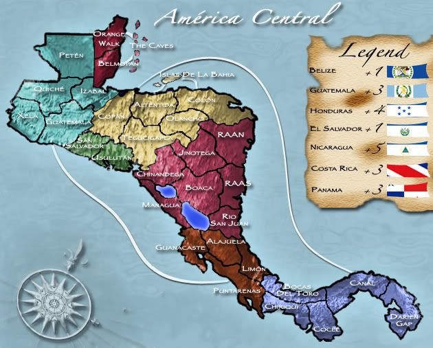
Freyja wrote:All but #3 misspelled Tegucigalpa. ._.

The Neon Peon wrote:I am surprised I was the first to vote for #4. In my opinion, a simple color change will do for it, best graphics style of them all in my opinion.
daydream wrote:also, theres a territory called colon
bryguy wrote:i just realized that all the entries left out cuba and jamaica....
