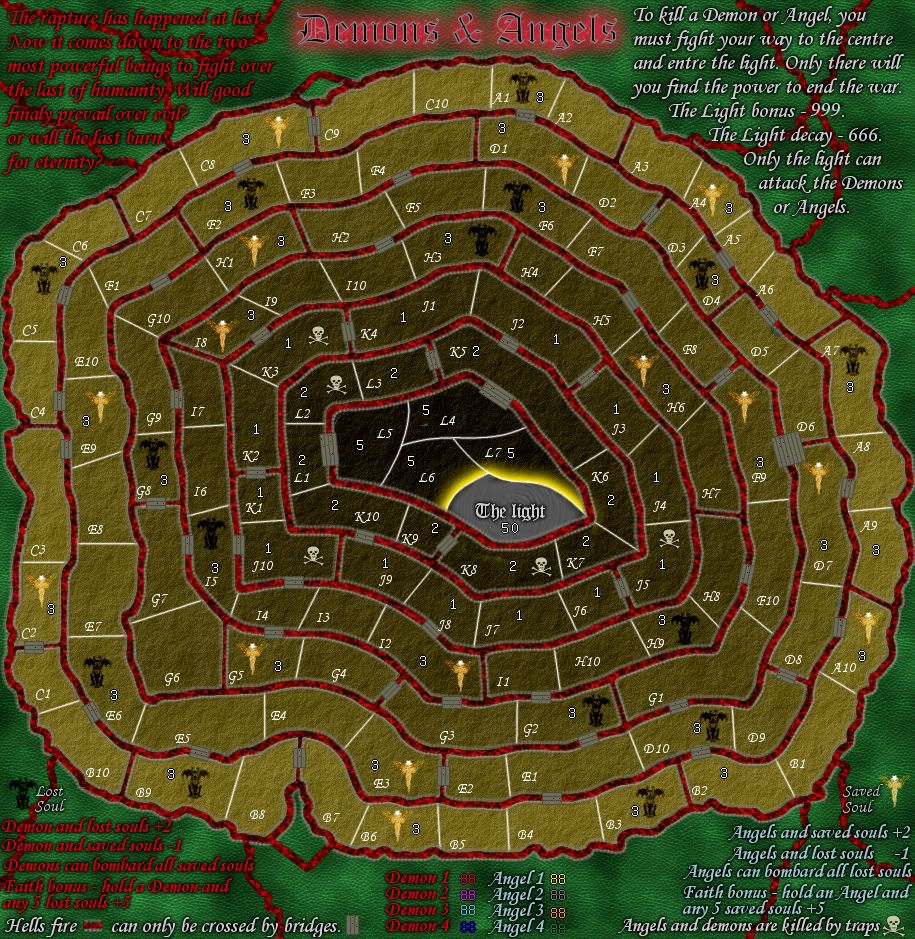
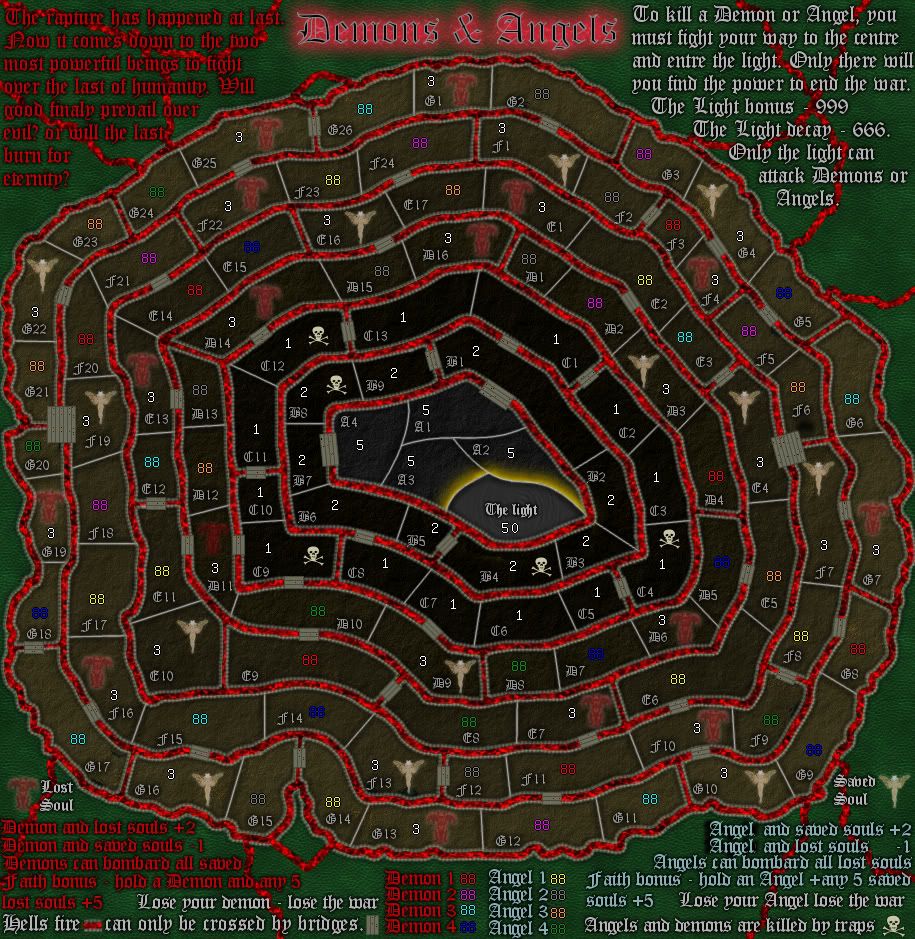
koontz1973 wrote:I know the colours are garish, I wanted that as a look.
Well, want something else...
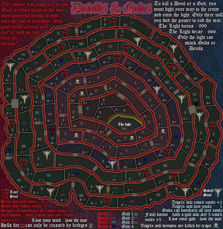
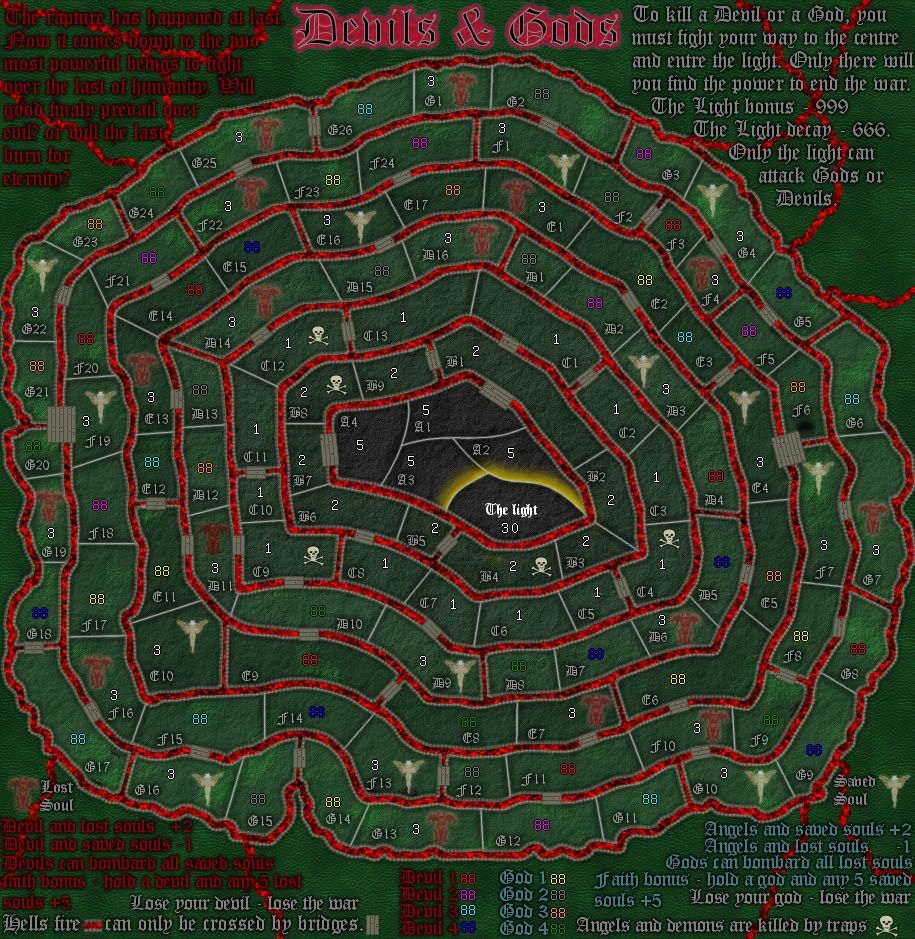
koontz1973 wrote:God knows what a battleground between the devils and gods minions would look like so some ley way here can be granted.
Sure, but what that means is you get to use your imagination on the graphics... it doesn't mean you can use it as an excuse for sloppy work.
koontz1973 wrote:For the colours, I chose red and blue as they naturally fit together but these can be refined. Any suggestions?
Yes. Ditch the red and blue. Go for a dark, ominous background, like something from a heavy metal album cover. Give it a gothic feel, instead of the disco fever you have now... You already have gothic fonts, just make the rest of the map fit them.
For the background, maybe something like black/very dark grey marble?
koontz1973 wrote:The angels and devil at the top I kind of like so will keep them for now. They are just pencil drawing on different layer modes to give the difference.
Keep them, but ditch the pixelation. I believe you have a dissolve mode somewhere in there, scrap that. It's not really useful for anything, it just results in pixelation.
If you go for a dark background, you could have give the angel & devil a sort of glowy look, like they're drawn with thin, glowy lines. Like they're set with silver and gold maybe? Something like that... just throwing ideas here.
koontz1973 wrote:The walls, I mean, how do you draw something that does not exist. I understand the whipped cream reference even though the colour is bloody weird for cream but I wanted an organic feel to it. No straight lines, sort of like an alien hive. Strange but familiar somehow.
It's kind of like spoiled cream maybe?
Anyway... I get what you're going for, but maybe you could scrap the walls alltogether, and just have the regions as sort of cavities, maybe make them look like they're impressed on the background, if you know what I mean... sort of like the army circles on my yugoslavia map.
Or, if you don't like that idea, just do the walls, but go easier on the bevels and such... make them fit in the general theme of the map.
koontz1973 wrote:The icons are pasted effects. I said that previous post and asked for solutions.
Try drawing something yourself, and make it in consistent style with the rest of the map - as soon as you figure out what that style is, I mean. The icons are the least of the concerns for now, I think you should first get the rest of the map in order and then figure out how to fit the icons in them.