Page 5 of 6

Re: Paris - V7 (9/19) (pgs. 1 & 7) - FEEDBACK PLEASE!!

PostPosted: Sat Sep 29, 2012 2:57 pm
by Dukasaur
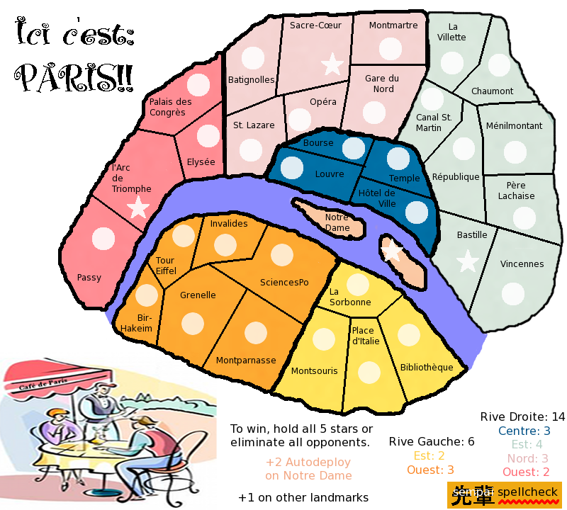
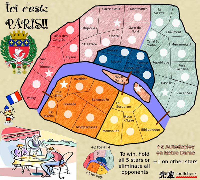
I like the concept. The lines and textures need some work, as others have noted, but that's just graphic tweaking. The important part, the concept, is a solid and cohesive whole. Terts are named after key landmarks and important areas that a foreigner will recognise, instead of naming them after obscure residential districts that would be meaningful to a local but just mumbo-jumbo to a foreigner. This is, in my opinion, a very important thing in making a map that feels right to play on.

Re: Paris - V7 (9/19) (pgs. 1 & 7) - FEEDBACK PLEASE!!

PostPosted: Tue Oct 02, 2012 12:32 am
by sempaispellcheck
This has taken a little longer than I thought it would - and I was a lot busier this weekend than I thought I'd be. Will try to get V8 up ASAP.

Re: Paris - V8 (Oct. 4) (pgs. 1 & 8) - FEEDBACK PLEASE!!

PostPosted: Fri Oct 05, 2012 12:30 am
by sempaispellcheck
Version 8:
Large - 800x720
Click image to enlarge.
image


Changes: Removed tabac sign, changed title font, map colors, made more room for river and islands, made islands larger.

Still to do: Bonus area and territory borders need fixing, there should be something in the background, landmark illustrations, impassables, box legend in, other things I can't think of - but you guys will. :D

Re: Paris - V8 (Oct. 4) (pgs. 1 & 8) - FEEDBACK PLEASE!!

PostPosted: Fri Oct 05, 2012 2:09 am
by Flapcake
Hi sempaispellcheck,

I havent visit your map in a while, I can se that you have been working with the theme alot ;)

Now my 5 cents, what I think you need to start with is, get the border lines smooten out, also at "Bourse" the line overlapping in to "Temple"
What I meen with smooten out is that the thicker outerlines are to pixilated and rough, use the brush with feathers (1 or 2) the pensil are to hard and makes jagged lines.

Its not critique, its just if you smooten the lines you get a better view and a anchor point, you got nice colours and I like the picture, get some soul of Paris in there 8-)

Keep up the spirit.
Flaps

Re: Paris - V8 (Oct. 4) (pgs. 1 & 8) - FEEDBACK PLEASE!!

PostPosted: Fri Oct 05, 2012 12:21 pm
by sempaispellcheck
Flapcake wrote:Hi sempaispellcheck,

I havent visit your map in a while, I can se that you have been working with the theme alot ;)

Now my 5 cents, what I think you need to start with is, get the border lines smooten out, also at "Bourse" the line overlapping in to "Temple"
What I meen with smooten out is that the thicker outerlines are to pixilated and rough, use the brush with feathers (1 or 2) the pensil are to hard and makes jagged lines.

Its not critique, its just if you smooten the lines you get a better view and a anchor point, you got nice colours and I like the picture, get some soul of Paris in there 8-)

Keep up the spirit.
Flaps


Good to see you back! :D
Thank you, as always, for all your comments - I need all the critiquing I can get.

I know I need to work with the borders - this was somewhat hastily "finished" to keep it in the Drafting Room (hence the overlap).
The brush with feathering is a good idea - I hadn't thought of it. Let me play with that and see what happens.

sempai

Re: Paris - V8 (Oct. 4) (pgs. 1 & 8) - FEEDBACK PLEASE!!

PostPosted: Fri Oct 05, 2012 4:20 pm
by ManBungalow
Are the graphics like this just to get the gameplay sorted out or is this the visual direction you want to take ?

Re: Paris - V8 (Oct. 4) (pgs. 1 & 8) - FEEDBACK PLEASE!!

PostPosted: Fri Oct 05, 2012 6:56 pm
by Winged Cat
You say "hold all 5 stars", but I only count 4.

How do you cross the river?

Are the stars the landmarks? That needs to be made clearer.

Re: Paris - V8 (Oct. 4) (pgs. 1 & 8) - FEEDBACK PLEASE!!

PostPosted: Fri Oct 05, 2012 7:16 pm
by sempaispellcheck
ManBungalow wrote:Are the graphics like this just to get the gameplay sorted out or is this the visual direction you want to take ?

This is my first experience with any kind of graphics software. If you have any advice, tips, tricks, etc., please share, as I need all the help I can get, graphically speaking (though that's probably obvious).

Winged Cat wrote:You say "hold all 5 stars", but I only count 4.

The circle on "Tour Eiffel" should be a star. I'll fix that

Winged Cat wrote: How do you cross the river?

By bridge. I removed the bridges when I made the river wider and forgot to add them back in.

Winged Cat wrote:Are the stars the landmarks? That needs to be made clearer.

Yes, they are - but I guess I could just say "+1 on other stars."

Re: Paris - V8 (Oct. 4) (pgs. 1 & 8) - FEEDBACK PLEASE!!

PostPosted: Fri Oct 05, 2012 11:47 pm
by koontz1973
sempai, thanks for the update and do not worry about this yet, even though you seem to of gone in the wrong direction this time. Remember, this is not going to happen overnight and without using the programme you have, you will not get better at it. Please practice and not just on things you want, but go though everything.

I see you did not like the paper I gave you, that's fine, but go find one that works for you.
Border lines, we went through this a while back and you have some nice ones. Time to dig that out and redo the lot.
Shape of bonuses, why has everything become so jagged. But that could just be black lines causing this.
Title, is that a font or a jpeg, if it is a jpeg, lose it and find a font. If it is a font, you need to turn you anti settings on in gimp. This will make it smooth.

Right now I am thinking a mini map would be far better looking and easier to understand than the text block you have. We can get to this later.

I like the cartoon, it fills that corner up, see if you can find similar ones.
I like the new colours.

Re: Paris - V8 (Oct. 4) (pgs. 1 & 8) - FEEDBACK PLEASE!!

PostPosted: Mon Oct 08, 2012 3:05 pm
by ManBungalow
sempaispellcheck wrote:
ManBungalow wrote:Are the graphics like this just to get the gameplay sorted out or is this the visual direction you want to take ?

This is my first experience with any kind of graphics software. If you have any advice, tips, tricks, etc., please share, as I need all the help I can get, graphically speaking (though that's probably obvious).

If you're using GIMP software, I think I can help with just about any feature you'll be using.

And if you're trying to achieve a specific effect, send me a PM or post in this thread for others to have input on.

A fundamental pointer is to maximise your use of layers. A layer for the background. A layer for the water. One for the borders. Another for the region colouring. One more for the army circles. etc. But not necessarily in that order.

Re: Paris - V8 (Oct. 4) (pgs. 1 & 8) - FEEDBACK PLEASE!!

PostPosted: Sat Oct 13, 2012 11:29 am
by Swimmerdude99
Sorry to throw this out there if its already been said... but where is the 5th star? it says hold all 5 to win, I only see 4 :/

Re: Paris - V8 (Oct. 4) (pgs. 1 & 8) - FEEDBACK PLEASE!!

PostPosted: Sat Oct 13, 2012 12:12 pm
by sempaispellcheck
swimmerdude99 wrote:Sorry to throw this out there if its already been said... but where is the 5th star? it says hold all 5 to win, I only see 4 :/

It should be on Tour Eiffel - instead of the circle that's there.
I was in a bit of a rush to get an update up to keep it in the Drafting Room. Sorry about that.

Re: Paris - V8 (Oct. 4) (pgs. 1 & 8) - FEEDBACK PLEASE!!

PostPosted: Sat Oct 13, 2012 10:55 pm
by koontz1973
sempai, never rush this, if you need more time, send me a PM and we can talk about it. If not, then you can always pick it up when you do have time later.

Re: Paris - V8 (Oct. 4) (pgs. 1 & 8) - FEEDBACK PLEASE!!

PostPosted: Sun Nov 04, 2012 11:24 am
by koontz1973
[Moved]

It would appear that development of this map has stalled. If the mapmaker wants to continue with the map, then one of the Foundry Moderators will be able to help put the thread back into the Foundry system, after an update has been made. ;-)

Re: Paris - V9 (Jan. 1) (pgs. 1 & 8) - FEEDBACK PLEASE!!

PostPosted: Tue Jan 01, 2013 3:50 pm
by sempaispellcheck
What better way to say "Bonne année!" (heh, that rhymed) than with a much needed retooling of my Paris map? Behold:

VERSION 9!!
Large - 800x720
Click image to enlarge.
image


Changes: Added 5th star and bridges back in, redid bonus area borders, erased overlap in territory borders (the borders themselves may still need fixing, but they seem OK for now, at least), fixed title font, added minimap to explain bonuses, added cartoon and Paris coat of arms to fill empty space, found "parchment"-type texture for background (the "paper" texture koontz gave me, with a slight change in color), went back to original "oil paint" texture for land area (because I like it), added an impassable (Canal St. Martin - between the territ of the same name and Gare du Nord).

Still to do: Landmark illustrations, improve bridges (how?).

Questions: Do I need more impassables? (if so, where and what kind?) Do the territory borders need redoing?

Re: Paris - V9 (Jan. 1) (pgs. 1 & 8) - FEEDBACK PLEASE!!

PostPosted: Fri Jan 04, 2013 12:29 am
by cairnswk
Why did you change?

Re: Paris - V9 (Jan. 1) (pgs. 1 & 8) - FEEDBACK PLEASE!!

PostPosted: Fri Jan 04, 2013 1:15 am
by sempaispellcheck
Why did I change what?

Re: Paris - V9 (Jan. 1) (pgs. 1 & 8) - FEEDBACK PLEASE!!

PostPosted: Fri Jan 04, 2013 2:29 am
by Dukasaur
I like the bright colours. The borders between territories look kind-of primitive, though. I think they could use more complexity, something that suggests the chaotic way borders between neighbourhoods actually evolve.

Re: Paris - V9 (Jan. 1) (pgs. 1 & 8) - FEEDBACK PLEASE!!

PostPosted: Fri Jan 04, 2013 8:02 am
by cairnswk
sempaispellcheck wrote:Why did I change what?

well i assume you've changed something, problem is i can't see the previous versions, thus at present i can't comment. :roll:

Re: Paris - V9 (Jan. 1) (pgs. 1 & 8) - FEEDBACK PLEASE!!

PostPosted: Fri Jan 04, 2013 10:59 pm
by sempaispellcheck
cairnswk wrote:
sempaispellcheck wrote:Why did I change what?

well i assume you've changed something, problem is i can't see the previous versions, thus at present i can't comment. :roll:

Sorry! Didn't realize making a folder on my Photobucket for all my drafts would mess with the links. :oops:
Fixed now.

Re: Paris - V9 (Jan. 1) (pgs. 1 & 8) - FEEDBACK PLEASE!!

PostPosted: Fri Jan 04, 2013 11:02 pm
by sempaispellcheck
Dukasaur wrote:I like the bright colours. The borders between territories look kind-of primitive, though. I think they could use more complexity, something that suggests the chaotic way borders between neighbourhoods actually evolve.

Glad you like the colors - Paris is (or, at least, can be) a colorful city, and I want the map to reflect that.
What you say about the territory borders makes a lot of sense. I'll play with them a bit and see what happens - I'll probably try for something more in line with the "accepted" borders first and see how that comes out.

Re: Paris - V9 (Jan. 1) (pgs. 1 & 8) - FEEDBACK PLEASE!!

PostPosted: Fri Jan 04, 2013 11:34 pm
by cairnswk
Dukasaur wrote:I like the bright colours. The borders between territories look kind-of primitive, though. I think they could use more complexity, something that suggests the chaotic way borders between neighbourhoods actually evolve.

sampai...these are just ideas to muck around with in your head.
I have to agree with Dukasaur...i think you've got a theme going there with the colours and the bottom left image being the same colours...bright but yes they work.
Yes the borders need work...what is happening on border near Gard du Nord...it's blue and not black...deliberate?

if you're going to use the Paris shield, see of you can get a better version and not so big...its very washed out and pixelly because it's been up-sized.

Perhaps a different softer background for the terts...pencil stroke if OK, but its very all the same way if you get what i mean.

See the bottom fringe around the cafe awning. See if you can create something like that to sit all legend stuff in...it would work in with that picture element.

i think this is the best you've produced so far. and it's heading in a better direction now. :)

Re: Paris - V9 (Jan. 1) (pgs. 1 & 8) - FEEDBACK PLEASE!!

PostPosted: Sat Jan 05, 2013 1:14 am
by sempaispellcheck
cairnswk wrote:I have to agree with Dukasaur...i think you've got a theme going there with the colours and the bottom left image being the same colours...bright but yes they work.

Glad to hear it - that makes my life a little easier.

cairnswk wrote:Yes the borders need work...what is happening on border near Gard du Nord...it's blue and not black...deliberate?

Yes - that's the Canal St. Martin - an impassable.

cairnswk wrote:if you're going to use the Paris shield, see of you can get a better version and not so big...its very washed out and pixelly because it's been up-sized.

OK. I'll see what I can dig up.

cairnswk wrote:Perhaps a different softer background for the terts...pencil stroke if OK, but its very all the same way if you get what i mean.

I'm not sure I do. Can you explain a little more? (I apologize if I seem stupid, but...I guess I kind of am, as far as this sort of thing is concerned).

cairnswk wrote:See the bottom fringe around the cafe awning. See if you can create something like that to sit all legend stuff in...it would work in with that picture element.

You mean for the minimap - as opposed to just having it against the background? OK, I can work with that.

cairnswk wrote:i think this is the best you've produced so far. and it's heading in a better direction now. :)

Thank you! That's what I thought when I looked at it, and I'm very glad you agree.

Re: Paris - V9 (Jan. 1) (pgs. 1 & 8) - FEEDBACK PLEASE!!

PostPosted: Sat Jan 05, 2013 9:41 pm
by cairnswk
sempaispellcheck...a suggestion present for you to jog your mind to re-arrange the elements...
notice also the treatment i gave the fill on the territories...it just lessens the intensity of the strokes which are still there but not so pronounced :)

Image

Re: Paris - V9 (Jan. 1) (pgs. 1 & 8) - FEEDBACK PLEASE!!

PostPosted: Mon Jan 07, 2013 1:19 pm
by sempaispellcheck
Thanks for the suggestions, cairns! Not sure that's exactly what I want, but a lot of good ideas and a lot for me to play with.
For example, I do think lessening the texture is good, but I don't think I want to lessen it quite that much. :P I'll play around with it and see what I see.
I'm going away for 2 weeks, and I won't be able to work on it while I'm gone, but I'll get cracking on Version 10 once I get back.

Thanks again!
sempai