Re: Paris- V3 (4/17) (pgs. 1 & 2) - FEEDBACK PLEASE!!
DoomYoshi -
You are amazing. That is EXACTLY what I'm looking for. Thank you so much.
You are amazing. That is EXACTLY what I'm looking for. Thank you so much.
Conquer Club, a free online multiplayer variation of a popular world domination board game.
https://www.conquerclub.com/forum/
https://www.conquerclub.com/forum/viewtopic.php?f=63&t=168212
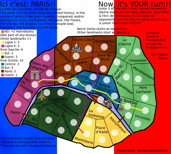
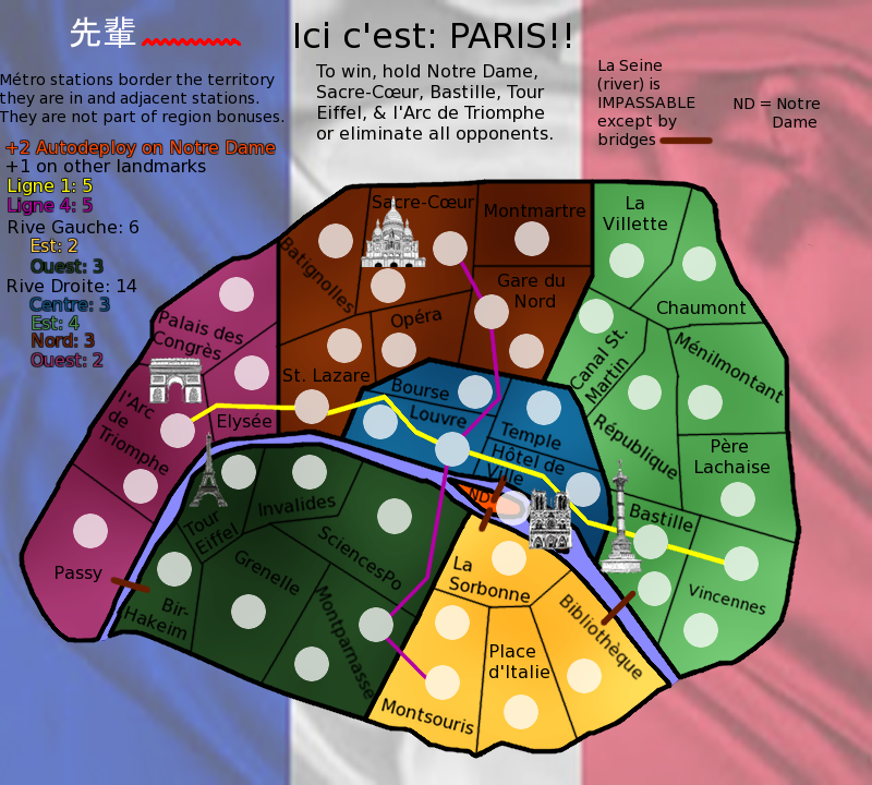
koontz1973 wrote:isaiah40 idea of using the same thing as Flapcake on Denmark should really bring the map to life.Not with the water or on a small scale, but covering the whole of the maps background. (Look at the style)
sempaispellcheck wrote:Oh! My apologies, isaiah, I misunderstood you. I'll find a better flag.
The images were the best I could find. I'll look some more and find better ones.
I'm assuming you mean the text at the top? Aw, I liked it. I thought it was funny.Oh well. I can cut it.
isaiah40 wrote:koontz1973 wrote:isaiah40 idea of using the same thing as Flapcake on Denmark should really bring the map to life.Not with the water or on a small scale, but covering the whole of the maps background. (Look at the style)
No, I meant on the small scale like on Denmark. If you do have it covering the whole background, then you will need to subdue it so that it is barely visible. Just enough that you can see it, and just enough that it doesn't detract from the playable area.
koontz1973 wrote:Why not draw them yourself. That way you do not have copyright to deal with.
isaiah40 wrote:If you do have it covering the whole background, then you will need to subdue it so that it is barely visible. Just enough that you can see it, and just enough that it doesn't detract from the playable area.
koontz1973 wrote:Why not something like nattys London with an image as well?
happy2seeyou wrote:the wording on the top is hard to pay attention to.
happy2seeyou wrote:Maybe the flag could be lighter, like the state flags in the "Great Lakes" map (flags are more muted but still seen).
happy2seeyou wrote:Also, maybe fix the legend on the side a lil.
happy2seeyou wrote:Great job so far though
sempaispellcheck wrote:happy2seeyou wrote:Also, maybe fix the legend on the side a lil.
How? Can you be a bit more specific?
happy2seeyou wrote:ND with the auto bonus doesn't need to be explained that it is not apart of any other bonus.
happy2seeyou wrote:Do you really have to state what places start as a neutral?
sempaispellcheck wrote:happy2seeyou wrote:ND with the auto bonus doesn't need to be explained that it is not apart of any other bonus.happy2seeyou wrote:Do you really have to state what places start as a neutral?
I did that so that people in the foundry would know, but I guess I can just put that stuff in the first post.
Good suggestions, man. Thank you for those - I should have some fun working on them.


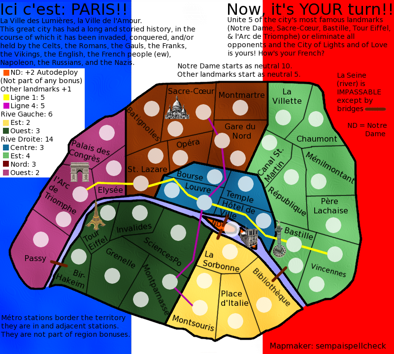
Flapcake wrote:it's pretty obvious that your flag is a photo you've tried to adapt, I do not think it's pretty good, too vague and poor colors, a flag is something a nation are proud of and you certainly have to make it as nicely as possible to give it the credit it deserve.
Flapcake wrote:I have created a flag (you can use it as it is if you want or remodel it, its yours for free) just to give you an idea on how smoot you need to make your images, im also thinking about your icons/sigths.
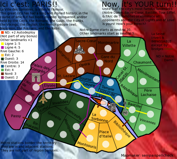
sempaispellcheck wrote:Should I just leave the graphics to someone else? I REALLY want to do this myself, but if you guys feel it would be better to have someone else do it, I could be OK with that.
I'm just getting a little frustrated.
sempaispellcheck wrote:
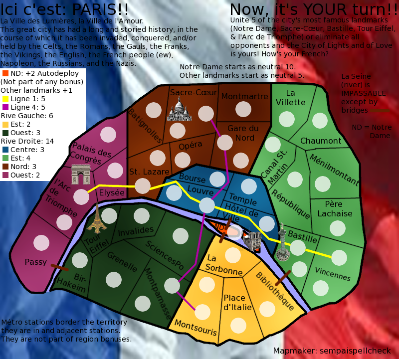
OK, starting to feel like I'm being pulled in different directions here.