Needs more impassables, because none of those bonuses can easily be taken on a map this size.
For instance, look at how many access points each bonus on the London map has.
Paris - V10 (May 28) (pgs. 1 & 9) - FEEDBACK PLEASE!!
Moderator: Cartographers
-
 ManBungalow
- Posts: 3431
- Joined: Sun Jan 13, 2008 7:02 am
- Location: On a giant rock orbiting a star somewhere


Re: Paris - V6 (5/2) (pgs. 1 & 4) - FEEDBACK PLEASE!!
![]() by koontz1973 on Mon Jun 04, 2012 10:49 pm
by koontz1973 on Mon Jun 04, 2012 10:49 pm
[Moved]
If the mapmaker wants to continue with the map, then one of the Foundry Moderators will be able to help put the thread back into the Foundry system, after an update has been made.
koontz
If the mapmaker wants to continue with the map, then one of the Foundry Moderators will be able to help put the thread back into the Foundry system, after an update has been made.
koontz

-

koontz1973
- Posts: 6960
- Joined: Thu Jan 01, 2009 10:57 am


Re: Paris - V6 (5/2) (pgs. 1 & 4) - FEEDBACK PLEASE!!
![]() by sempaispellcheck on Tue Jun 05, 2012 6:16 am
by sempaispellcheck on Tue Jun 05, 2012 6:16 am
Sorry for the delay, all. I've got a lot of work to do on this, and I'm busy with a lot of other stuff atm. I'll get an update in here as soon as I can, though.

-

sempaispellcheck
- Posts: 2852
- Joined: Fri Sep 10, 2010 10:31 pm
- Location: Among the clouds and the skyscrapers, saving the world.


Re: Paris - V6 (5/2) (pgs. 1 & 4) - FEEDBACK PLEASE!!
![]() by koontz1973 on Tue Jun 05, 2012 6:51 am
by koontz1973 on Tue Jun 05, 2012 6:51 am
Not to worry, know you have stuff going on. Just want to clear the decks as such.
-
koontz1973
- Posts: 6960
- Joined: Thu Jan 01, 2009 10:57 am
Re: Paris - V6 (5/2) (pgs. 1 & 4) - FEEDBACK PLEASE!!
![]() by thehippo8 on Sun Jun 17, 2012 2:48 am
by thehippo8 on Sun Jun 17, 2012 2:48 am
You may want to rethink the title ... I misread it as Incest: Paris ... 

-

thehippo8
- Posts: 1025
- Joined: Fri Feb 19, 2010 5:32 pm


Re: Paris - V6 (5/2) (pgs. 1 & 4) - FEEDBACK PLEASE!!
![]() by sempaispellcheck on Tue Sep 18, 2012 11:27 pm
by sempaispellcheck on Tue Sep 18, 2012 11:27 pm
I am proud to announce that, now that I'm back in my dorm - and have time on my hands again, I have gotten back to work on this map.
Version 7 should hit the site Wednesday afternoon - probably between 13:00:00 and 14:00:00 CC Time.
Version 7 should hit the site Wednesday afternoon - probably between 13:00:00 and 14:00:00 CC Time.
-
sempaispellcheck
- Posts: 2852
- Joined: Fri Sep 10, 2010 10:31 pm
- Location: Among the clouds and the skyscrapers, saving the world.
Re: Paris - V7 (9/19) (pgs. 1 & 7) - FEEDBACK PLEASE!!
![]() by sempaispellcheck on Wed Sep 19, 2012 9:24 pm
by sempaispellcheck on Wed Sep 19, 2012 9:24 pm
Finally - the wait is over!
Ladies and gentlemen...Version 7!!
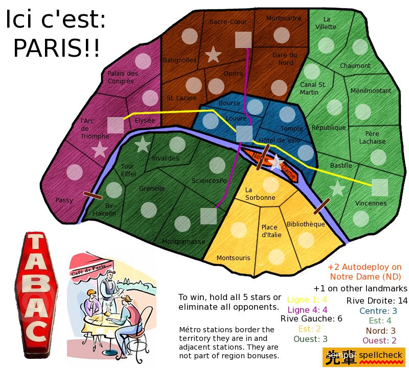
Notre Dame starts as neutral 10, other 4 landmarks start as neutral 5.
Changes: Basically everything - completely different look for all non-playable areas. Moved things around, took out flag background and landmark illustrations for the time being, different kinds of army circles - squares for métro stations, stars for landmarks, took out a few (somewhat redundant) métro stations, added clipart of a café and a tabac sign.
Still to do: Background, landmark illustrations, impassables, box legend in, fix up pictures - cafe/tabac sign (?), other things I can't think of - but you guys will.
What do you think? How can I make it better?
Ladies and gentlemen...Version 7!!
- Click image to enlarge.
Notre Dame starts as neutral 10, other 4 landmarks start as neutral 5.
Changes: Basically everything - completely different look for all non-playable areas. Moved things around, took out flag background and landmark illustrations for the time being, different kinds of army circles - squares for métro stations, stars for landmarks, took out a few (somewhat redundant) métro stations, added clipart of a café and a tabac sign.
Still to do: Background, landmark illustrations, impassables, box legend in, fix up pictures - cafe/tabac sign (?), other things I can't think of - but you guys will.
What do you think? How can I make it better?
Last edited by sempaispellcheck on Fri Jan 04, 2013 10:58 pm, edited 1 time in total.
-
sempaispellcheck
- Posts: 2852
- Joined: Fri Sep 10, 2010 10:31 pm
- Location: Among the clouds and the skyscrapers, saving the world.
Re: Paris - V7 (9/19) (pgs. 1 & 7) - FEEDBACK PLEASE!!
![]() by koontz1973 on Wed Sep 19, 2012 11:49 pm
by koontz1973 on Wed Sep 19, 2012 11:49 pm
sempai, [moved] back for you.
sempai, the following may sound harsh but please remember, I am here to help and even though my words may sound harsh, everything is going to help you in the end.
It looks like crap.
Here are a few things you can do very quickly to make this map look a 100 times better very quickly.
Remove the tabac sign.
Make the cartoon fill the whole corner. In fact, that cartoon is the only thing that works. Look at it and use it. Here is how.
Colours, the colours are nice so replace the ones you have on the map with these.
Map texture, remove it and replace it with a paper one all over the map. Here is one you can use. Just copy and paste, tile it so it fits everywhere.
Using the paper and the colours from the cartoon will give you a map that looks a lot better.
Territ lines. The lines for the territs are nice and thin and work. The ones around the bonus areas are huge and horrible. Go back and redo them. I do not know what settings you used for the territ lines but you need to copy that but make the lines slightly thicker.
Title. Here is a font for you to use. http://www.dafont.com/boingo.font?fpp=50 That will make the title a lot better.
Map itself. Move the two bonuses south of the river down to make the river a lot wider. Notre Dame can then get drawn bigger so the name and star fit inside the territ.
Lose the metros. A paris metro map is being made now and it adds nothing to this one apart from confusion.
sempai, as I said, some harsh words here, but it is all meant in a way to help you. Please do not be offended and we can get this ready to move to the next level together.
koontz
What do you think? How can I make it better?
sempai, the following may sound harsh but please remember, I am here to help and even though my words may sound harsh, everything is going to help you in the end.
What do you think?
It looks like crap.
How can I make it better?
Here are a few things you can do very quickly to make this map look a 100 times better very quickly.
Remove the tabac sign.
Make the cartoon fill the whole corner. In fact, that cartoon is the only thing that works. Look at it and use it. Here is how.
Colours, the colours are nice so replace the ones you have on the map with these.
Map texture, remove it and replace it with a paper one all over the map. Here is one you can use.
Just copy and paste, tile it so it fits everywhere.Using the paper and the colours from the cartoon will give you a map that looks a lot better.
Territ lines. The lines for the territs are nice and thin and work. The ones around the bonus areas are huge and horrible. Go back and redo them. I do not know what settings you used for the territ lines but you need to copy that but make the lines slightly thicker.
Title. Here is a font for you to use. http://www.dafont.com/boingo.font?fpp=50 That will make the title a lot better.
Map itself. Move the two bonuses south of the river down to make the river a lot wider. Notre Dame can then get drawn bigger so the name and star fit inside the territ.
Lose the metros. A paris metro map is being made now and it adds nothing to this one apart from confusion.
sempai, as I said, some harsh words here, but it is all meant in a way to help you. Please do not be offended and we can get this ready to move to the next level together.
koontz
-
koontz1973
- Posts: 6960
- Joined: Thu Jan 01, 2009 10:57 am
Re: Paris - V7 (9/19) (pgs. 1 & 7) - FEEDBACK PLEASE!!
![]() by sempaispellcheck on Thu Sep 20, 2012 7:34 am
by sempaispellcheck on Thu Sep 20, 2012 7:34 am
koontz1973 wrote:sempai, [moved] back for you.
Thank you kindly!
koontz1973 wrote:sempai, the following may sound harsh but please remember, I am here to help and even though my words may sound harsh, everything is going to help you in the end.
Don't worry, koontz, I know that. Say what you think about the map. I won't be offended - I promise.
koontz1973 wrote:It looks like crap.
Yeah, it does.
To be honest, I kind of threw this draft together just to make sure I got something up and the map wouldn't be abandoned.
koontz1973 wrote:Here are a few things you can do very quickly to make this map look a 100 times better very quickly.
Remove the tabac sign.
OK.
koontz1973 wrote:Make the cartoon fill the whole corner. In fact, that cartoon is the only thing that works. Look at it and use it...the colours are nice so replace the ones you have on the map with these.
That's a good idea! I can do that.
koontz1973 wrote:Map texture, remove it and replace it with a paper one all over the map. Here is one you can use.
But I liked my oil paint texture.
koontz1973 wrote:Using the paper and the colours from the cartoon will give you a map that looks a lot better.
If you say so.
koontz1973 wrote:Territ lines. The lines for the territs are nice and thin and work. The ones around the bonus areas are huge and horrible. Go back and redo them. I do not know what settings you used for the territ lines but you need to copy that but make the lines slightly thicker.
OK. So, thinner bonus area borders, slightly thicker territory borders - but not so much that they could be confused. Got it.
koontz1973 wrote:Title. Here is a font for you to use. http://www.dafont.com/boingo.font?fpp=50 That will make the title a lot better.
Awesome! Thanks!
koontz1973 wrote:Map itself. Move the two bonuses south of the river down to make the river a lot wider. Notre Dame can then get drawn bigger so the name and star fit inside the territ.
Oh, so that's what you meant! Sorry, I didn't realize that "you have room" meant "you can make room" - and of course, I never would have thought of it myself.
koontz1973 wrote:Lose the metros. A paris metro map is being made now and it adds nothing to this one apart from confusion.
OK. I wouldn't mind that. I have seen Qyu's map, by the way, and I do like it. I keep forgetting to post in his thread.
koontz1973 wrote:sempai, as I said, some harsh words here, but it is all meant in a way to help you. Please do not be offended and we can get this ready to move to the next level together.
At this stage, harsh words are what I (and this map) need. Thank you so much for all your help, guidance, advice, and support. And don't worry - nothing you could say about this map would offend me personally.
To Version 8!!
sempai
-
sempaispellcheck
- Posts: 2852
- Joined: Fri Sep 10, 2010 10:31 pm
- Location: Among the clouds and the skyscrapers, saving the world.
Re: Paris - V7 (9/19) (pgs. 1 & 7) - FEEDBACK PLEASE!!
![]() by koontz1973 on Thu Sep 20, 2012 9:48 am
by koontz1973 on Thu Sep 20, 2012 9:48 am
The oil texture works but it does not fit the map. Now if you wanted to make the map like an oil painting, then so be it, but the cartoon is what works now and cartoons are drawn on paper. If you need help on anything, post here as I always look in when I log on or send me a PM.
-
koontz1973
- Posts: 6960
- Joined: Thu Jan 01, 2009 10:57 am
Re: Paris - V7 (9/19) (pgs. 1 & 7) - FEEDBACK PLEASE!!
![]() by sempaispellcheck on Thu Sep 20, 2012 1:14 pm
by sempaispellcheck on Thu Sep 20, 2012 1:14 pm
koontz1973 wrote:The oil texture works but it does not fit the map. Now if you wanted to make the map like an oil painting, then so be it, but the cartoon is what works now and cartoons are drawn on paper. If you need help on anything, post here as I always look in when I log on or send me a PM.
It's not really a cartoon, per se - it's meant to look like it was painted.
Maybe a canvas-type texture for the background and such?
-
sempaispellcheck
- Posts: 2852
- Joined: Fri Sep 10, 2010 10:31 pm
- Location: Among the clouds and the skyscrapers, saving the world.
Re: Paris - V7 (9/19) (pgs. 1 & 7) - FEEDBACK PLEASE!!
![]() by koontz1973 on Thu Sep 20, 2012 10:23 pm
by koontz1973 on Thu Sep 20, 2012 10:23 pm
The cartoon may of been painted but if it was, it is water colour and not oil.
-
koontz1973
- Posts: 6960
- Joined: Thu Jan 01, 2009 10:57 am
Re: Paris - V7 (9/19) (pgs. 1 & 7) - FEEDBACK PLEASE!!
![]() by sannemanrobinson on Fri Sep 21, 2012 3:05 am
by sannemanrobinson on Fri Sep 21, 2012 3:05 am
I like the cartoon and different shaped army circles (square, circle, star). Although you are planning to drop the square..
About the territory borders, it looks more natural to use the ink to instead of straight lines.
About the territory borders, it looks more natural to use the ink to instead of straight lines.
-
sannemanrobinson
- Posts: 255
- Joined: Mon Dec 20, 2010 6:35 am


Re: Paris - V7 (9/19) (pgs. 1 & 7) - FEEDBACK PLEASE!!
![]() by koontz1973 on Mon Sep 24, 2012 12:01 pm
by koontz1973 on Mon Sep 24, 2012 12:01 pm
sempai, any word of an update in the near future. Just want to see how it is coming along.
-
koontz1973
- Posts: 6960
- Joined: Thu Jan 01, 2009 10:57 am
Re: Paris - V7 (9/19) (pgs. 1 & 7) - FEEDBACK PLEASE!!
![]() by sempaispellcheck on Mon Sep 24, 2012 12:21 pm
by sempaispellcheck on Mon Sep 24, 2012 12:21 pm
Hoping to get one up next weekend. I've been busy - as always.
-
sempaispellcheck
- Posts: 2852
- Joined: Fri Sep 10, 2010 10:31 pm
- Location: Among the clouds and the skyscrapers, saving the world.
Re: Paris - V7 (9/19) (pgs. 1 & 7) - FEEDBACK PLEASE!!
![]() by Dukasaur on Sat Sep 29, 2012 2:57 pm
by Dukasaur on Sat Sep 29, 2012 2:57 pm
I like the concept. The lines and textures need some work, as others have noted, but that's just graphic tweaking. The important part, the concept, is a solid and cohesive whole. Terts are named after key landmarks and important areas that a foreigner will recognise, instead of naming them after obscure residential districts that would be meaningful to a local but just mumbo-jumbo to a foreigner. This is, in my opinion, a very important thing in making a map that feels right to play on.
“Life is a shipwreck, but we must not forget to sing in the lifeboats.”
― Voltaire
― Voltaire
-

Dukasaur
- Community Coordinator

- Posts: 27025
- Joined: Sat Nov 20, 2010 4:49 pm
- Location: Beautiful Niagara


 3
3


 2
2


Re: Paris - V7 (9/19) (pgs. 1 & 7) - FEEDBACK PLEASE!!
![]() by sempaispellcheck on Tue Oct 02, 2012 12:32 am
by sempaispellcheck on Tue Oct 02, 2012 12:32 am
This has taken a little longer than I thought it would - and I was a lot busier this weekend than I thought I'd be. Will try to get V8 up ASAP.
-
sempaispellcheck
- Posts: 2852
- Joined: Fri Sep 10, 2010 10:31 pm
- Location: Among the clouds and the skyscrapers, saving the world.
Re: Paris - V8 (Oct. 4) (pgs. 1 & 8) - FEEDBACK PLEASE!!
![]() by sempaispellcheck on Fri Oct 05, 2012 12:30 am
by sempaispellcheck on Fri Oct 05, 2012 12:30 am
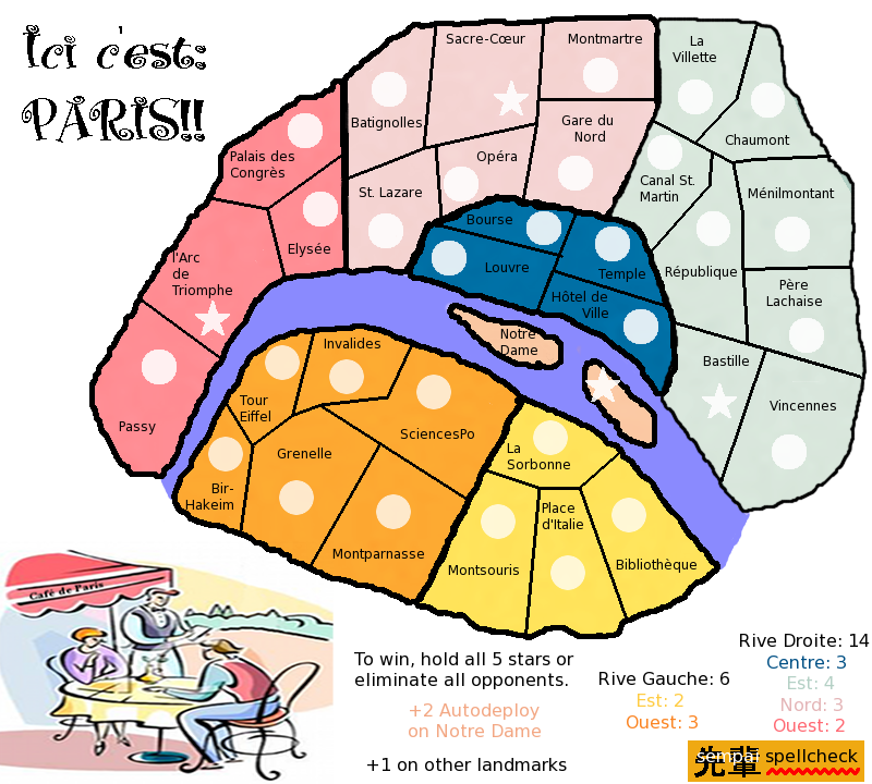
Version 8:
Large - 800x720
Changes: Removed tabac sign, changed title font, map colors, made more room for river and islands, made islands larger.
Still to do: Bonus area and territory borders need fixing, there should be something in the background, landmark illustrations, impassables, box legend in, other things I can't think of - but you guys will.
Large - 800x720
- Click image to enlarge.
Changes: Removed tabac sign, changed title font, map colors, made more room for river and islands, made islands larger.
Still to do: Bonus area and territory borders need fixing, there should be something in the background, landmark illustrations, impassables, box legend in, other things I can't think of - but you guys will.
Last edited by sempaispellcheck on Fri Jan 04, 2013 10:58 pm, edited 1 time in total.
-
sempaispellcheck
- Posts: 2852
- Joined: Fri Sep 10, 2010 10:31 pm
- Location: Among the clouds and the skyscrapers, saving the world.
Re: Paris - V8 (Oct. 4) (pgs. 1 & 8) - FEEDBACK PLEASE!!
![]() by Flapcake on Fri Oct 05, 2012 2:09 am
by Flapcake on Fri Oct 05, 2012 2:09 am
Hi sempaispellcheck,
I havent visit your map in a while, I can se that you have been working with the theme alot
Now my 5 cents, what I think you need to start with is, get the border lines smooten out, also at "Bourse" the line overlapping in to "Temple"
What I meen with smooten out is that the thicker outerlines are to pixilated and rough, use the brush with feathers (1 or 2) the pensil are to hard and makes jagged lines.
Its not critique, its just if you smooten the lines you get a better view and a anchor point, you got nice colours and I like the picture, get some soul of Paris in there
Keep up the spirit.
Flaps

-
Flapcake
- Posts: 756
- Joined: Tue Jan 11, 2011 8:22 am
- Location: beyond the unknown


Re: Paris - V8 (Oct. 4) (pgs. 1 & 8) - FEEDBACK PLEASE!!
![]() by sempaispellcheck on Fri Oct 05, 2012 12:21 pm
by sempaispellcheck on Fri Oct 05, 2012 12:21 pm
Flapcake wrote:Hi sempaispellcheck,
I havent visit your map in a while, I can se that you have been working with the theme alot
Now my 5 cents, what I think you need to start with is, get the border lines smooten out, also at "Bourse" the line overlapping in to "Temple"
What I meen with smooten out is that the thicker outerlines are to pixilated and rough, use the brush with feathers (1 or 2) the pensil are to hard and makes jagged lines.
Its not critique, its just if you smooten the lines you get a better view and a anchor point, you got nice colours and I like the picture, get some soul of Paris in there
Keep up the spirit.
Flaps
Good to see you back!
Thank you, as always, for all your comments - I need all the critiquing I can get.
I know I need to work with the borders - this was somewhat hastily "finished" to keep it in the Drafting Room (hence the overlap).
The brush with feathering is a good idea - I hadn't thought of it. Let me play with that and see what happens.
sempai
-
sempaispellcheck
- Posts: 2852
- Joined: Fri Sep 10, 2010 10:31 pm
- Location: Among the clouds and the skyscrapers, saving the world.
Re: Paris - V8 (Oct. 4) (pgs. 1 & 8) - FEEDBACK PLEASE!!
![]() by ManBungalow on Fri Oct 05, 2012 4:20 pm
by ManBungalow on Fri Oct 05, 2012 4:20 pm
Are the graphics like this just to get the gameplay sorted out or is this the visual direction you want to take ?

-
ManBungalow
- Posts: 3431
- Joined: Sun Jan 13, 2008 7:02 am
- Location: On a giant rock orbiting a star somewhere
Re: Paris - V8 (Oct. 4) (pgs. 1 & 8) - FEEDBACK PLEASE!!
![]() by Winged Cat on Fri Oct 05, 2012 6:56 pm
by Winged Cat on Fri Oct 05, 2012 6:56 pm
You say "hold all 5 stars", but I only count 4.
How do you cross the river?
Are the stars the landmarks? That needs to be made clearer.
How do you cross the river?
Are the stars the landmarks? That needs to be made clearer.
-

Winged Cat
- Posts: 129
- Joined: Mon Aug 11, 2008 7:51 pm


Re: Paris - V8 (Oct. 4) (pgs. 1 & 8) - FEEDBACK PLEASE!!
![]() by sempaispellcheck on Fri Oct 05, 2012 7:16 pm
by sempaispellcheck on Fri Oct 05, 2012 7:16 pm
ManBungalow wrote:Are the graphics like this just to get the gameplay sorted out or is this the visual direction you want to take ?
This is my first experience with any kind of graphics software. If you have any advice, tips, tricks, etc., please share, as I need all the help I can get, graphically speaking (though that's probably obvious).
Winged Cat wrote:You say "hold all 5 stars", but I only count 4.
The circle on "Tour Eiffel" should be a star. I'll fix that
Winged Cat wrote: How do you cross the river?
By bridge. I removed the bridges when I made the river wider and forgot to add them back in.
Winged Cat wrote:Are the stars the landmarks? That needs to be made clearer.
Yes, they are - but I guess I could just say "+1 on other stars."
-
sempaispellcheck
- Posts: 2852
- Joined: Fri Sep 10, 2010 10:31 pm
- Location: Among the clouds and the skyscrapers, saving the world.
Re: Paris - V8 (Oct. 4) (pgs. 1 & 8) - FEEDBACK PLEASE!!
![]() by koontz1973 on Fri Oct 05, 2012 11:47 pm
by koontz1973 on Fri Oct 05, 2012 11:47 pm
sempai, thanks for the update and do not worry about this yet, even though you seem to of gone in the wrong direction this time. Remember, this is not going to happen overnight and without using the programme you have, you will not get better at it. Please practice and not just on things you want, but go though everything.
I see you did not like the paper I gave you, that's fine, but go find one that works for you.
Border lines, we went through this a while back and you have some nice ones. Time to dig that out and redo the lot.
Shape of bonuses, why has everything become so jagged. But that could just be black lines causing this.
Title, is that a font or a jpeg, if it is a jpeg, lose it and find a font. If it is a font, you need to turn you anti settings on in gimp. This will make it smooth.
Right now I am thinking a mini map would be far better looking and easier to understand than the text block you have. We can get to this later.
I like the cartoon, it fills that corner up, see if you can find similar ones.
I like the new colours.
-
koontz1973
- Posts: 6960
- Joined: Thu Jan 01, 2009 10:57 am
Re: Paris - V8 (Oct. 4) (pgs. 1 & 8) - FEEDBACK PLEASE!!
![]() by ManBungalow on Mon Oct 08, 2012 3:05 pm
by ManBungalow on Mon Oct 08, 2012 3:05 pm
sempaispellcheck wrote:ManBungalow wrote:Are the graphics like this just to get the gameplay sorted out or is this the visual direction you want to take ?
This is my first experience with any kind of graphics software. If you have any advice, tips, tricks, etc., please share, as I need all the help I can get, graphically speaking (though that's probably obvious).
If you're using GIMP software, I think I can help with just about any feature you'll be using.
And if you're trying to achieve a specific effect, send me a PM or post in this thread for others to have input on.
A fundamental pointer is to maximise your use of layers. A layer for the background. A layer for the water. One for the borders. Another for the region colouring. One more for the army circles. etc. But not necessarily in that order.
-
ManBungalow
- Posts: 3431
- Joined: Sun Jan 13, 2008 7:02 am
- Location: On a giant rock orbiting a star somewhere
Return to Melting Pot: Map Ideas
Who is online
Users browsing this forum: No registered users
|
|||||||
| Conquer Club is not associated with RISK online in any way. Copyright © 2006-2024 by Big Wham LLC | |||||||