koontz1973 wrote:sempai, [moved] back for you.
Thank you kindly!

koontz1973 wrote:sempai, the following may sound harsh but please remember, I am here to help and even though my words may sound harsh, everything is going to help you in the end.
Don't worry, koontz, I know that. Say what you think about the map. I won't be offended - I promise.
koontz1973 wrote:It looks like crap.
Yeah, it does.

To be honest, I kind of threw this draft together just to make sure I got something up and the map wouldn't be abandoned.
koontz1973 wrote:Here are a few things you can do very quickly to make this map look a 100 times better very quickly.
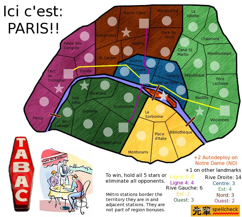
Remove the tabac sign.
OK.
koontz1973 wrote:Make the cartoon fill the whole corner. In fact, that cartoon is the only thing that works. Look at it and use it...the colours are nice so replace the ones you have on the map with these.
That's a good idea! I can do that.
koontz1973 wrote:Map texture, remove it and replace it with a paper one all over the map. Here is one you can use.

Just copy and paste, tile it so it fits everywhere.
But I liked my oil paint texture.
Oh well, I'm sure I'll grow to love this one, too.
koontz1973 wrote:Using the paper and the colours from the cartoon will give you a map that looks a lot better.
If you say so.
koontz1973 wrote:Territ lines. The lines for the territs are nice and thin and work. The ones around the bonus areas are huge and horrible. Go back and redo them. I do not know what settings you used for the territ lines but you need to copy that but make the lines slightly thicker.
OK. So, thinner bonus area borders, slightly thicker territory borders - but not so much that they could be confused. Got it.
Awesome! Thanks!
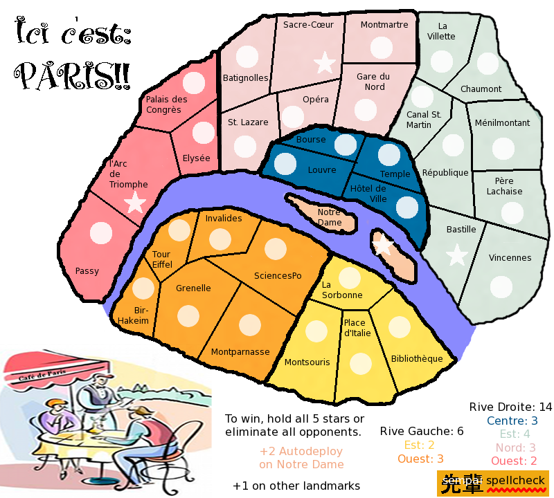
koontz1973 wrote:Map itself. Move the two bonuses south of the river down to make the river a lot wider. Notre Dame can then get drawn bigger so the name and star fit inside the territ.
Oh, so
that's what you meant! Sorry, I didn't realize that "you have room" meant "you can make room" - and of course, I never would have thought of it myself.

koontz1973 wrote:Lose the metros. A paris metro map is being made now and it adds nothing to this one apart from confusion.
OK. I wouldn't mind that. I have seen
Qyu's map, by the way, and I do like it. I keep forgetting to post in his thread.
koontz1973 wrote:sempai, as I said, some harsh words here, but it is all meant in a way to help you. Please do not be offended and we can get this ready to move to the next level together.
At this stage, harsh words are what I (and this map) need. Thank you so much for all your help, guidance, advice, and support. And don't worry - nothing you could say about this map would offend me personally.
To Version 8!! sempai