Page 3 of 10

PostPosted: Tue Aug 08, 2006 4:19 pm
by Fireside Poet
Font #5 in my book is the best one.

PostPosted: Tue Aug 08, 2006 7:52 pm
by sully800
I like font #2 and #5.

I also think the attack routes are a bit too faint. And the curves make them even more confusing. All the curving routes bettween the lesser antilles is very hard to follow I think. Why not just use straight lines?

PostPosted: Wed Aug 09, 2006 9:23 am
by happysadfun
maritovw wrote:i'm using the local language to write the name of each territory and continent, i like it better that way... but if everyone else thinks i should put them all in english, i can do that too... just lemme know what you all think :wink:

i've just added a new update of the map, so check it out and speak!

i have one question though, what should be the size of the circles?? and, is this size the same on both maps (small and large) or should it be smaller in the small map?


if the title of the map ends up in english, put the continents in english. if it ends up in spanish, keep them the same.

PostPosted: Wed Aug 09, 2006 2:30 pm
by fluffybunnykins
I vote Nueva Espana
and fonts 1 or 5
2 is too comic book to be on an olde world map
3 is too uptight & unflamboyant for this area of the world & hard to read, too
4 is just too informal for a map of this stature, it's also kind of a title font, rather than a 'body text' one...
just my opinions though
Personally, I really like the curved routes, again I think they add to the theme, but I do think they could be in a clearer colour, and maybe the gaps and/or dashes could be shorter too. That might also help the clarity...

PostPosted: Wed Aug 09, 2006 3:18 pm
by ChiefManyFeet
Font 5 and keep the curves baby...

And maybe making the curves the same white as the font would help...

PostPosted: Wed Aug 09, 2006 5:25 pm
by Marvaddin
Im with fluffy, fonts 1 or 5 (1 is better to me).
Yeah, the routes suck. Make them clearer. I would suggest complete lines, but smaller gaps could work too.

More little things:
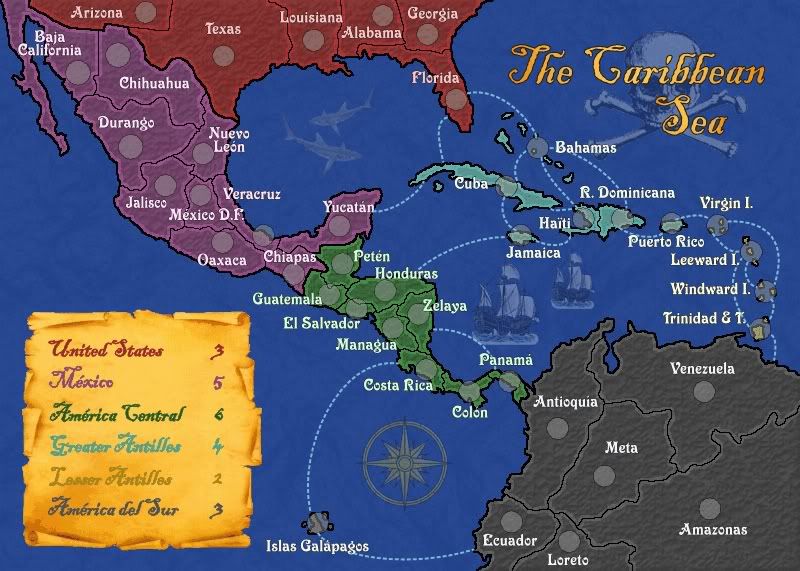
Some continents have many borders... mainly central america and greater antilles. Maybe you should remove the connection betwenn Jamaica and Honduras.

Do we really need that country called Mississipi? The name is big, so it doesnt fit well. You could change the name, or merge with another country (this would bring the number of countries to 42 again). If you want maintain the main structure the same, maybe you could split texas.

I still think the names to the little islands are not ok. The names dont need be exact. You can change some names, using names of the capitals or something alike. For example, how about Dominica instead of R. Dominicana? Or Trinidad instead of Trinidad & Tobago? So you could probably make the names clear, without confusion. For same purpose, you could remove the "DT" of México "DT".

The Bahamas country is confusing. Please delete the smallest non-necessary islands.

The continent bonuses could have an adjustment. If you realy delete the route Jamaica Honduras, bonuses could be:
Small Islands - 2
Bigger Islands - 3
South America and USA - 4
Central America - 5
Mexico 6 (or 7)

Are you planning some final art? Maybe a skull and crossed bones :wink:

PostPosted: Sat Aug 12, 2006 11:20 am
by happysadfun
dominica is a separate country from dominican republic (republica dominicana) not the same. at all. as for fonts, i agree with fluffy and marvaddin

PostPosted: Thu Aug 17, 2006 9:05 pm
by maritovw
i hadn't had time to work on this but, finally, here it is, my latest UPDATE:

Image

things changed:
- removed mississippi (good idea marv)
- changed the attack routes (made them clearer and made the gaps smaller)
- kept font no. 5
- added some images
- deleted some islands in bahamas and drew the big ones together
- attack routes in Bahamas & Lesser Antilles are drawn from the army shadow, not from an island (to avoid confusion)
- changed the title again (in accordance to the poll)


i don't feel like deleting the route between Jamaica and Honduras because without it the map would become too circular...

PostPosted: Thu Aug 17, 2006 9:36 pm
by happysadfun
Great map.

PostPosted: Fri Aug 18, 2006 12:23 am
by reverend_kyle
final forge anyone?

PostPosted: Fri Aug 18, 2006 1:59 am
by Marvaddin
Really, final forge :)

Plus:
1) Lets add something to the space over the legend?? Maybe something aztec. Or a spanish shield?

2) We can use some little adjusts to the bonuses. Mexico have same number of borders and routes of Central America, and 1 more country, but a smaller bonus. I suggested already some changes, maybe you can think about.

3) How about change the position of some names? If you move Zelaya a bit down, you can move Honduras a bit far from Peten. And Jamaica a bit to the left, so you can put Haiti under the circle and connect the routs to that Haiti "arm". Well, I dont know if this would make it looks better, maybe you could test.

4) The border countries of SA are all connected to exactly one country. And in fact the expansion from SA is pretty easy... maybe you could add a route between Venezuela and, hmmm... Puerto Rico? (Or other country?)

5) Im a bit worried. Will be easy to realize Virgin Islands belong to Lesser Antilles with the numbers over it? Maybe an island out of the circle could be useful.

Great map, cant wait to play :D

PostPosted: Fri Aug 18, 2006 2:02 am
by reverend_kyle
Marvaddin wrote:Really, final forge :)


5) Im a bit worried. Will be easy to realize Virgin Islands belong to Lesser Antilles with the numbers over it? Maybe an island out of the circle could be useful.

Great map, cant wait to play :D


Discworld has a huge problem like that.. I agree.

PostPosted: Fri Aug 18, 2006 2:32 am
by gavin_sidhu
beautiful map.

PostPosted: Fri Aug 18, 2006 4:26 am
by Fireside Poet
Image

Something with Blackbeard for the legend background (like the skull and crossbones) would be fantastic! (opinions are nearly worthless tho) -- great map and excellent work.

PostPosted: Fri Aug 18, 2006 7:03 am
by ChiefManyFeet
Your map is beatiful...I can't wait to play. :D

PostPosted: Fri Aug 18, 2006 6:04 pm
by Evil Pope
This map kicks ass.. Sorry, I don't really have anything else to add..

PostPosted: Fri Aug 18, 2006 7:11 pm
by AndyDufresne
                  Final Forge


---The Caribbean Map has reached the ‘Final Forge’ Stage. I've revived this thread from the pits of the Foundry furnace and have examined the contents. Nearly every major concern has been addressed. If there are any other current concerns, please make your voice heard. There will be two days for you to post any objections; if no one has posted any protest after two days the map will be deemed finished with the 'Foundry Brand' of approval and will be submitted for live play. If after two days there is still discussion going on it may continue until said discussion has reached the conclusion that the map has reached its final and polished version.

Post questions and concerns if any.


--Andy

PostPosted: Fri Aug 18, 2006 7:13 pm
by AndyDufresne
And to start things off, I notice that a few of the army shadow circles seem to have different proportions, or at least to my eyes.

---Take Durango and Texas. The circles visually look different in size. As do a few others.

Edit: I checked and they seem to be different sizes.


--Andy
(P.S. Nice to finally put another map in Final Forge)

PostPosted: Fri Aug 18, 2006 7:20 pm
by happysadfun
AndyDufresne wrote:And to start things off, I notice that a few of the army shadow circles seem to have different proportions, or at least to my eyes.

---Take Durango and Texas. The circles visually look different in size. As do a few others.


--Andy
(P.S. Nice to finally put another map in Final Forge)


They look like that but they really aren't. i checked

PostPosted: Fri Aug 18, 2006 7:58 pm
by gavin_sidhu
Love the map, but the sharks look like their floating in the sky to me...

PostPosted: Fri Aug 18, 2006 8:01 pm
by happysadfun
gavin_sidhu wrote:Love the map, but the sharks look like their floating in the sky to me...

I didn't notice the sharks, but yes. Now that i see them they do look like flying sharks. But what's wrong with that?

PostPosted: Fri Aug 18, 2006 10:16 pm
by maritovw
AndyDufresne wrote:I notice that a few of the army shadow circles seem to have different proportions


hmmm... you seem to be right... Baja California, Durango and Chihuahua are larger... i'm correcting that in the next update...

Marvaddin wrote:1)... 5)

1) i was thinking about adding something there, and maybe i can change the flying sharks...

2) maybe changing Mexico's to 6? what do you think?

3) good catch, i'm changing that

4) yeah, i had noticed that... i think i will add the route between Venezuela and Puerto Rico

5) (same as no. 3)


i'll also work on the small version...

PostPosted: Sun Aug 20, 2006 10:17 pm
by Marvaddin
Oh, well, little movement here in last days...

I agree with your other bonuses, but I would give Mexico a 7. Adding one more route, you can give South America a 4.

PostPosted: Mon Aug 21, 2006 4:07 pm
by maritovw
does anyone have another comment/idea?? cause i don't feel like making lots of little updates to change only a small thing... i'd prefer updating many things at once

PostPosted: Mon Aug 21, 2006 5:54 pm
by happysadfun
You could make the border between El S and Managua clearer.