Page 3 of 12

PostPosted: Thu Jan 24, 2008 1:24 pm
by Tieryn
Image

Taken Hands out,

I need to do something for better bonuses, but that's them for now if you can match the colours up, and see if they look appropriate. Check the draft below if you want a better idea of how things connect. I'll do up better connection parts tomorrow.. Might even re-do the colouring on the territories to give more room and hence make the font a little bigger... I think I will do this actually.. but tomorrow... Night folks

Image

PostPosted: Thu Jan 24, 2008 9:09 pm
by Tieryn
Redone all the colouring of keys, I think it looks much better with this outer glow than before... Easier to see links.

Image

PostPosted: Thu Jan 24, 2008 9:13 pm
by InkL0sed
Tieryn wrote:
InkL0sed wrote:I don't like the way you're going about the coloring and stuff... I think it would look cool if the connections were bridges or something, since the keys look like little islands.


If I did little bridges as connections, I could make the impassable borders rivers perhaps? :P (After spilling coke on the keyboard maybe? :P)


I like it :lol:

PostPosted: Thu Jan 24, 2008 10:28 pm
by Tieryn
Image

Fixed up impassables, added in one and two way attack arrows. Standardised key sizes for basic keys (14 wide, so will centre the 12px 88 nicely)

Still need to find a nice way to list bonuses, and also give instructions. Will work on that a bit later, how's it looking so far?

PostPosted: Thu Jan 24, 2008 10:29 pm
by tenio
i dont know but maybe holding teh shift key and like some of the numbers can be a bonus

(or you can make them hold both shift keys)


also I use Ctrl Escape Alot

PostPosted: Thu Jan 24, 2008 10:33 pm
by Tieryn
I was hoping for conditional borders, ie, you could attack from 8* to the * on the numpad -ONLY- if you were holding a shift key, but unfortunately not possible with current XML

PostPosted: Thu Jan 24, 2008 11:56 pm
by edbeard
I dunno.

I'm not feeling this idea at all. What are you going to call the continents? The colour they are? How are people who can't tell the colours apart suppose to play it then?

Impassables are arbritrarily drawn in for the most part, which isn't a good idea.


Some things to consider:

1. Does every key need to be a territory?

You could make 'home row' a territory. make the numpad a territory. I dunno.

2. How are you going to fit army counts onto this?

right now they're going to overlap and cover up the names of your territories. you have to fit 888 at the minimum because of the colourblind letters many people use.

3. I had more but I can't remember and honestly the more I look at the map, the more I dislike it. sorry.

PostPosted: Fri Jan 25, 2008 12:07 am
by Unit_2
BTW the map is 601 X 341 not 600 X 340

PostPosted: Fri Jan 25, 2008 12:36 am
by Tieryn
edbeard wrote:I dunno.

I'm not feeling this idea at all. What are you going to call the continents? The colour they are? How are people who can't tell the colours apart suppose to play it then?

Impassables are arbritrarily drawn in for the most part, which isn't a good idea.


The continents will be "Left Pinky" "Left Ring" "Left Middle" "Left Index" and other for right hand, they're listed on page 1.

The impassables are not arbitrary - they follow the rule "Letters can only attack other keys on the same finger, and the space bar", but this is not true for numbers, or most other characters (exception for ,< .> and /? which count as letters)

edbeard wrote:2. How are you going to fit army counts onto this?

right now they're going to overlap and cover up the names of your territories. you have to fit 888 at the minimum because of the colourblind letters many people use.


This is definately a valid point, and I had aimed for fitting 88 (as this is the small map). The large map will easily fit 888, but there is no way (unless I alter top/bottom/top/bottom for where I write the armies, but that will look ugly) I can fit 888 inside these current boundaries, but other map circles, made to fit 88, are in use in other maps... It could be done but the armies would overlap the outer glow of the borders. Only really need another 3 pixels on each side, and the borders are more than that.

edbeard wrote:1. Does every key need to be a territory?

You could make 'home row' a territory. make the numpad a territory. I dunno.


I haven't come up with any other logical way to implement this that wouldn't drastically reduce gameplay, and it's a map that I would want to play, and in playing a keyboard map, I'd be disappointed if every key was not a territory.

PostPosted: Fri Jan 25, 2008 1:50 am
by Tieryn
Okay, I've added in something to show the bonuses nicely, I think I still need to write the names of the continents in tho...

Image

What do people think? is that readable?

PostPosted: Fri Jan 25, 2008 2:23 am
by edbeard
Tieryn wrote:other map circles, made to fit 88, are in use in other maps


it's not so much about the circles themselves, that's really just getting 2 digit armies centered. It's more about overlapping.

And, I'm not sure if this is true for other maps that were put up for play earlier, but all maps that go through the process now are required to be able to have three digit armies that don't overlap

PostPosted: Fri Jan 25, 2008 3:09 am
by Tieryn
It will fit them, but I'll need to make some adjustments to the glow to let them fit in.

Image

Updated with continent names

PostPosted: Fri Jan 25, 2008 4:25 am
by Tieryn
As it currently stands, the keys are 14px wide with a 5px border. They need to be 24px wide. With armies at the moment there would be 1px between armies... not enough methinks... There's 33 pixels around the edge I could scrimp, and some in the middle, to give enough space between keys, and I could make the keyfaces wider at the base? (dont know whether that would look any good... )

Although now I've recounted the pixels in the 888 - they only need to be 12px high, so maybe could have alternating heights (tho I suspect that would look bodgy).

I'll rework this over the weekend and see if I can't squeeze any more space out of it.

PostPosted: Fri Jan 25, 2008 5:01 am
by MrBenn
To be honest, I don't like the way this map is going. Your image looks squashed and distorted (which it has to be to fit in the small map), and the colour scheme is getting more and more lurid, which I don't like.

At the moment the legend is the same size as the playable area of the map, and there is too much text there (in my opinion)...

The gameplay issues are perhaps more important than fancy graphics at the moment, and on previous keyboard/typewriter threads, these are the bits that caused the map development to falter.

My suggestion would be to go back to your base image, and think more about continent groupings. I know you are using keys associated with particular typing fingers, but I don't know many people who type like that... my fingers wander over the keyboard randomly (I think I use 3 fingers from each hand), and I suspect most people develop their typing ability from a one/two-finger approach.

The impassable borders follow on from this, and don't appear to make much sense. If you're going to have impassables, perhpas have a pencil on the keyboard between the QWERTY and ASDFG rows or something? Try and think creatively.

Space is your biggest issue. Do you need to include the Number Pad Cursor Keys etc? If you just had the QWERTY bit and the Function Keys there would still be over 70 territores, and you'd have more room to fit things in nicely.

I'd also recommend slowing down your updates a bit, and seeing how much genuine feedback your map is getting. Based on the posts on the 'topic review' for this thread, you're posting twice as much as everybody else put together. Don't rush your development - wait to see if people are getting behind your idea, before spending lots of time doing things that might not be appreciated - you have to remember that this is an idea that has been suggested many times before, and it needs to be done right. (Which is why it's on Colemans list!)

PostPosted: Fri Jan 25, 2008 5:23 am
by Tieryn
Cheeres Benn, very good advice. I'm just on holidays at the moment, and have only just got photoshop again, so even if this doesn't go anywhere, brushing up my skills has been worth it, and I've learned a lot along the way, so regardless of where this goes, it hasn't been time wasted.

I like the idea of dropping it back to just the QWERTY, and leaving out the numpad/direction arrows... It would definately give me a lot more space to work with, and take out some of the more complex rules and pathways (although I liked some of them).

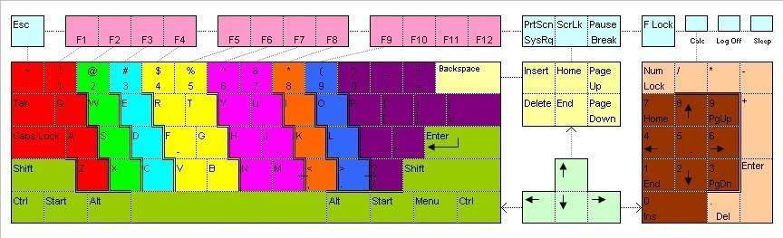
Regardless of the way people "actually" type (and I'm the same, while I type close to the proper way, I hardly do it completely right), it's still a real world application to the keyboard that provides a distinct separation of the keys, based on a generally accepted (and historically accurate :P) format, and I think it provides a good source of continent separation (if maybe not a good reason to have the impassable borders there).

I'll try strip it back a bit, but I'm still a fan of the impassables along that concept, (if not the actual implementation that they currently stand in). I'd certainly think there should at least be one between TGB and YHN, as however you type, most people keep their hands on the right sides of the keyboard (even if they aren't using the correct fingering), and something like a pencil could provide a good break, (perhaps chewed a bit, to allow some gaps through it?), and also perhaps a spilled can of (non-brand specific) cola creating impassable streams of cola through the keyboard...

PostPosted: Fri Jan 25, 2008 10:59 am
by InkL0sed
I don't know about that "most people use a one/two finger approach" assertion... seems to me that most people I know type the proper way, including myself.

Just saying.

PostPosted: Fri Jan 25, 2008 11:10 am
by MrBenn
I didn't say that most people used a 1/2 finger typing style, but that most people develop their typing style from a 1/2 finger approach....

... I suspect that relatively few people can do 'proper' touch-typing.

PostPosted: Fri Jan 25, 2008 2:07 pm
by InkL0sed
MrBenn wrote:I didn't say that most people used a 1/2 finger typing style, but that most people develop their typing style from a 1/2 finger approach....

... I suspect that relatively few people can do 'proper' touch-typing.


But that's what I meant: most people I know do type "properly." Not that it matters. Carry on.

PostPosted: Fri Jan 25, 2008 4:29 pm
by tenio
ya take out the arrows, numpad and the scroll lock area

PostPosted: Sun Jan 27, 2008 12:47 am
by Tieryn
MrBenn wrote:I didn't say that most people used a 1/2 finger typing style, but that most people develop their typing style from a 1/2 finger approach....

... I suspect that relatively few people can do 'proper' touch-typing.


I'd suspect that a majority of professional typers (data entry/secretaries/receptionists) probably have done typing training and thus use close to a proper approach. I know I've certainly done some, both in school, and on random typing tutors of my own free will to improve my typing speed.

Regardless of whether people do it or not, it's still the generally accepted breakdown of key/finger ownership, and regardless of whether people "use" it, they should at lease -know- it. Who knows, maybe we'll help educate people to type better after they play on this map? :P

PostPosted: Sun Jan 27, 2008 9:02 am
by Tieryn
Image

Image

Okay, brought it back to just the keys and functions keys.

Separated left and right control keys. Going to leave Esc/Backspace/Space either as their own continent (or more likely) no continent.

The keys are now 24px wide (with larger keys being an even number of px) so 888's will fit in, and be centred - as shown

I've added in the impassables I had before - along the principle of "letters can only attack other keys on the same finger, and the space bar." Numbers can attack adjacent numbers. Not sure exactly how to work this on the right of the keyboard with the keys that aren't letters. Also need to add in links from number to F-key (1-F1, 2-F2, etc)

I am going to add in some one ways, such as from Caps Lock to Q and A (caps lock can attack adjacent letters?) and a left from < and a right from >, as they make sense to me from the keys :P.

Any other thoughts so far?

PostPosted: Sun Jan 27, 2008 12:33 pm
by InkL0sed
I really like this version, I have to say. Good work.

PostPosted: Sun Jan 27, 2008 3:07 pm
by Tieryn
I'm going to make one button the "conquer" button... I'm thinking either Menu or Escape... Probably Escape, and give it a bonus or something? What do people think??

Press any key to conquer? :P

PostPosted: Sun Jan 27, 2008 7:59 pm
by Tieryn
I've added some circuitry up the top to show the function key links... It's still a little messy and needs some work, and I need to find a nice way to make it look like a "cut" into the keyboard, can anyone more experienced than me suggest any tools I could play around with to try create that effect?

Image

PostPosted: Sun Jan 27, 2008 8:06 pm
by DiM
to be honest i'm not a fan of your current impassables because they are too arbitrary, too artificial.

i'd much rather see either a different gameplay where you get bonuses for spelling words

or if you want classic continents please use impassables like a chewing gum, an eraser, a pen, a cigarette, stuff you'd find on a jeyboard.