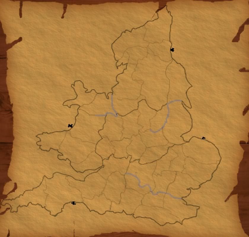
bryguy wrote:1) Something I forgot to mention. The sides are still a little rough. Maybe try saving it, then zooming in to 800% and taking a small fuzzy 3 paintbrush around the edges. Dont do slow, careful motions, but rather fast, semi-careful motions. That way, since its at 800%, if you mess up slightly and cut into it, it should'nt make much of a difference.
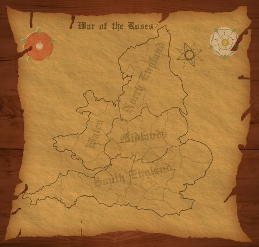
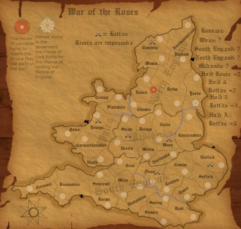
2) Lower the opacity on the flowers. They are to bright and colorful compared to the rest of the map, so lowering the opactiy to 50 or below should help. Also, try playing around with the layer modes.
3) The title is also to bright, and its to blurry. Looks like your using Blackmoor LET, which is a pretty good choice, but maybe try adding some different fonts to your GIMP that may work better. Maybe something like this: http://www.dafont.com/olde-english.font
- Click image to enlarge.
If you cant figure out how to get it into GIMP, just drop me a pm
4) Also, dont rotate it. Make sure its just the right size so that it fits between the top of the red flower and that small hole in the paper right next to the northern tip of england. Also, maybe have the color black, and again lower the opacity to 50% or lower.
5) For a compass, you first need more room for it. Try stretching the width of the parchment some (50-100 pixels) and then you should have more room. And maybe after stretching it center england on it, and center the parchment.
Be sure to save before you try doing any of these things. Its always good to be careful!

1. will get to work on the sides
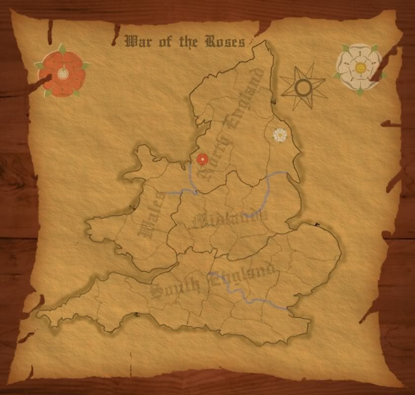
2. the flowers opacity is at 29.8 right now
3. thats the font im using...but will try your suggestion
4. I rotated so it would fit an still be big...will try not to rotate though...
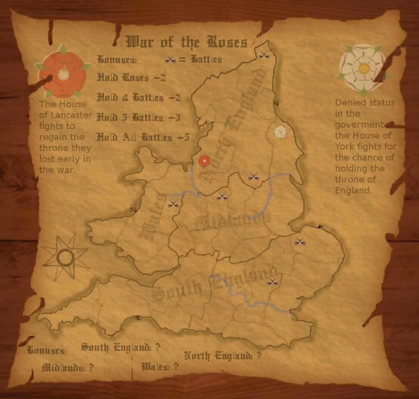
5. Cant really stretch the parchment...My map is already at the limits for size... 840 * 800


