Page 4 of 7

Re: An Ancient Greek Revamp

PostPosted: Wed Aug 27, 2008 8:28 pm
by Bones2484
I understand this is your map, Mr K, but you've basically told half the people who have offered their thoughts to f*ck off. It might help to learn to take criticism better as that is the entire point of this section of the forums. Do you honestly want input, or are you here to basically wait for someone to tell you it looks perfect and everything you do is amazing?

Anyways... as for your question about the legend. I like the background... but is there a way to make it look like the text is "carved into" the background like it's a tablet? I think that would be cool and fit in perfect with Ancient Greece.

Re: An Ancient Greek Revamp

PostPosted: Wed Aug 27, 2008 10:41 pm
by Mr. K
Bones2484 wrote:I understand this is your map, Mr K, but you've basically told half the people who have offered their thoughts to f*ck off. It might help to learn to take criticism better as that is the entire point of this section of the forums. Do you honestly want input, or are you here to basically wait for someone to tell you it looks perfect and everything you do is amazing?

Wrong, I told lanyards to f*ck off. And for good reason. Honestly, did you read anything I said? Apparently not a word. I'll say it again, i'll try to be clearer.

I appreciate everyone's input, and I request it whole-heartedly. I will take everything into consideration, and I will give it a shot (as I have this entire thread, have a look). The only time I will ask you to kindly shut your mouth is: if you've made your request, I've tried it, didn't like it, explained it in this thread, asked you to move on, and you continually ignore my response. You people are treating me like I don't have respect and am not listening to the community. I find it very disrespectful the way lanyards ignored *my* opinion continually, did not respond to what I said, and just re-stated his complaint, even though I already answered.

I'm also finding it disrespectful that people aren't reading what i'm saying, and are continually saying that I don't listen to the communities' opinions. I never said I wouldn't retry the mountains, which seem to be unanimously disliked. I never shot down any other suggestions either, infact i've continually requested them. The reason I haven't posted an update is because I have less free time now then I did the first two days when I got the bulk of the work done, but I never said "this is done and its my way no changes." This thread sunk and for days had no responses, until I topped it asking for MORE suggestions from the community.

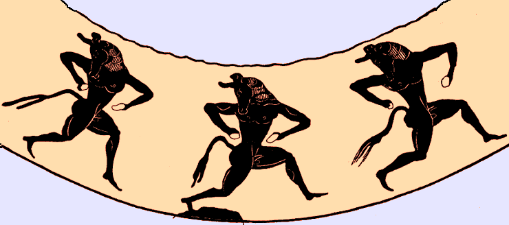
I never asked anyone not to tell me what they think of the mountains, or the water, or the font, or anything else. The only person and the only subject i've asked to stop is that of the minotaurs - and not because I find the minotaurs so overwhelmingly amazing and they MUST be in this map, but because the request was entirely disrespectful and rude and repetitive.

I'm more then happy to continue this thread as it has gone, taking opinions, making changes, and ultimately sending the fresh new and improved map into action. So if you have suggestions, please, make them, I never asked anyone not to. But, if you'd rather continue to ignore what i'm saying (which is what got me upset in the first place), and tell me that i'm NOT listening to the community, when clearly I have been, i'm not opposed to dropping this all together. I'm not as eager to kiss butt as some people may be, getting my map onto conquer club isn't quite the greatest honor I can envision. So for as long as i'm providing this free service to the community, I plan to listen and respect everything every one has to say, but you better believe I expect the same courtesies.

Anyways... as for your question about the legend. I like the background... but is there a way to make it look like the text is "carved into" the background like it's a tablet? I think that would be cool and fit in perfect with Ancient Greece.

That sounds pretty sharp, i'll give it a shot with my next update

Re: An Ancient Greek Revamp

PostPosted: Wed Aug 27, 2008 11:42 pm
by Mjinga
I like this revamp! It already looks better than your old map. :) I love the silhouettes in the land, and the colours that you use. I especially love Asia Minor and Boreia Ellada.

There are some things that I would like to throw out for your consideration, though, since you’re revamping it and all. :) They are:

  • Samos-Lydia: This is my biggest issue with this map. You have no idea how many times I thought there was a connection there and it turned out there wasn’t, and barely avoided disaster. It’s pretty clear in this revamp that they don’t connect, except that the troops will be right on the divide. Is it at all possible to move the army circle off the place where they don’t connect, so as to make it clear?
  • Minotaurs: I actually wouldn’t know they were minotaurs except that I read the comments. They look like dancing devils to me. I’m not opposed to minotaurs on principle, but I do like the boats better. Another thought would be Olympic athletes or spear-wielding types… I do like the energy of the silhouettes, I just have a hard time identifying them as minotaurs. Maybe, if they have to be minotaurs, make them more obviously minotaurs?
  • Mountains: Umm… well, er, these ones don’t look so very great. Maybe try making them like rotated versions of the “C” in Corinth? It might work… or if you have some other idea, try that. Just… please don’t go with these ones.
  • Ocean: I like the ripple effect in the ocean. I think the opacity is a bit high, though. It distracts from the silhouettes on the land a little bit, and since I really like those, I’d rather it didn’t. Maybe turn down the opacity of the ripple-effect a tiny bit?
  • Territ Names: Some are larger than others. I personally would rather they were all the same size. It seems a bit odd to have, for example, the tiny little territ Lemnos with a bigger font size than the bigger territ of Troy.

But overall, two thumbs way, way up! Lukkin’ good. :)

Re: An Ancient Greek Revamp

PostPosted: Thu Aug 28, 2008 12:29 am
by Mr. K
Just for the record, Mjinga's above post is a perfect model for a respectful, helpful post.

* Samos-Lydia: This is my biggest issue with this map. You have no idea how many times I thought there was a connection there and it turned out there wasn’t, and barely avoided disaster. It’s pretty clear in this revamp that they don’t connect, except that the troops will be right on the divide. Is it at all possible to move the army circle off the place where they don’t connect, so as to make it clear?

I really didn't plan on changing the XML at all, but i'm confused about what you mean. Isn't there a currently existing sea-connection between Samos and Lydia? Am I misunderstanding?

* Minotaurs: I actually wouldn’t know they were minotaurs except that I read the comments. They look like dancing devils to me. I’m not opposed to minotaurs on principle, but I do like the boats better. Another thought would be Olympic athletes or spear-wielding types… I do like the energy of the silhouettes, I just have a hard time identifying them as minotaurs. Maybe, if they have to be minotaurs, make them more obviously minotaurs?

I'll give some other graphics another try but i'm pretty partial to the ones that are there. The reason I chose Minotaurs is because the story of the Minotaur takes place on the islands (Krete if I remember right). That particular depiction of the Minotaur reminds me more of a drawing that would come from the islands then from something that would come from the mainland. I don't really know the origin, but thats the feeling I get from it. (original image: http://www.mlahanas.de/Greeks/Mythology ... rDance.gif). Olympic Athletes are a good idea, but sticking them on the islands there doesn't make much sense to me because the Olympic Games aren't known especially for their Island origins. Of course another ship would make sense, but that idea bores me, and I much prefer getting into the mythology instead. The minotaur seems to work perfect in my opinion.

* Mountains: Umm… well, er, these ones don’t look so very great. Maybe try making them like rotated versions of the “C” in Corinth? It might work… or if you have some other idea, try that. Just… please don’t go with these ones.

I'll try some new ones on the next update.

* Ocean: I like the ripple effect in the ocean. I think the opacity is a bit high, though. It distracts from the silhouettes on the land a little bit, and since I really like those, I’d rather it didn’t. Maybe turn down the opacity of the ripple-effect a tiny bit?

I already toned it down a notch since last time, but i'll try even more. But I really do like the pattern, it reminds me a lot of the simplistic depiction of ocean you might see on an old ancient map with sea monsters popping their heads out and so on. So I definitely want to stick with this pattern, but i'll try toning it down another notch.

Also, in regards to the ocean, I put a bit of a lightness around the land to portray a shallower sea around the landmasses, but its starting to bother me. I'm going to tone that down a bit also because it seems to go out to far and too strong. Do people agree?

* Territ Names: Some are larger than others. I personally would rather they were all the same size. It seems a bit odd to have, for example, the tiny little territ Lemnos with a bigger font size than the bigger territ of Troy.

Right, as i've said I'm going to have them all be uniform upon the next update.

Re: An Ancient Greek Revamp

PostPosted: Thu Aug 28, 2008 5:44 am
by barterer2002
Mjinga wrote:
[*]Minotaurs: I actually wouldn’t know they were minotaurs except that I read the comments. They look like dancing devils to me. I’m not opposed to minotaurs on principle, but I do like the boats better. Another thought would be Olympic athletes or spear-wielding types… I do like the energy of the silhouettes, I just have a hard time identifying them as minotaurs. Maybe, if they have to be minotaurs, make them more obviously minotaurs?


I have to say that when I started reading this thread this was exactly my thought as well. My first reaction was the same as lanyards in that I wondered what dancing indians were doing in Greece.

Instead of doing three like that, how about one that clearly shows the bull head. That could work well with ships (although you could make the ship heading towards Thebes have black sails-but that's just a part of the story).

Re: An Ancient Greek Revamp

PostPosted: Thu Aug 28, 2008 1:51 pm
by Mjinga
Mr. K wrote:
Mjinga wrote: * Samos-Lydia: This is my biggest issue with this map. You have no idea how many times I thought there was a connection there and it turned out there wasn’t, and barely avoided disaster. It’s pretty clear in this revamp that they don’t connect, except that the troops will be right on the divide. Is it at all possible to move the army circle off the place where they don’t connect, so as to make it clear?

I really didn't plan on changing the XML at all, but i'm confused about what you mean. Isn't there a currently existing sea-connection between Samos and Lydia? Am I misunderstanding?

This is what I get for writing late at night. :oops: You're right about Samos and Lydia. I meant Lesbos and Mysia. :oops: :oops: I must have just looked at the troop dots and thought it was S-L.

Mr. K wrote:
Mjinga wrote: * Minotaurs: I actually wouldn’t know they were minotaurs except that I read the comments. They look like dancing devils to me. I’m not opposed to minotaurs on principle, but I do like the boats better. Another thought would be Olympic athletes or spear-wielding types… I do like the energy of the silhouettes, I just have a hard time identifying them as minotaurs. Maybe, if they have to be minotaurs, make them more obviously minotaurs?

I'll give some other graphics another try but i'm pretty partial to the ones that are there. The reason I chose Minotaurs is because the story of the Minotaur takes place on the islands (Krete if I remember right). That particular depiction of the Minotaur reminds me more of a drawing that would come from the islands then from something that would come from the mainland. I don't really know the origin, but thats the feeling I get from it. (original image: http://www.mlahanas.de/Greeks/Mythology ... rDance.gif). Olympic Athletes are a good idea, but sticking them on the islands there doesn't make much sense to me because the Olympic Games aren't known especially for their Island origins. Of course another ship would make sense, but that idea bores me, and I much prefer getting into the mythology instead. The minotaur seems to work perfect in my opinion.

I like the minotaurs, and now that I see where they came from, I like them better. The only thing is, I can tell they're minotaurs in the original because I can see the line of the muzzle. It's turning back over the shoulder. In the pure silhouette that can't really be told, and hence it's difficult to tell that they're not devils with slanting heads. An easy fix would be to add a one-pixel wide white line where the muzzle is, in the silhouette. Then they'd be almost the same, but you could tell they were cow heads. :)

Mr. K wrote:I already toned it down a notch since last time, but i'll try even more. But I really do like the pattern, it reminds me a lot of the simplistic depiction of ocean you might see on an old ancient map with sea monsters popping their heads out and so on. So I definitely want to stick with this pattern, but i'll try toning it down another notch.

Also, in regards to the ocean, I put a bit of a lightness around the land to portray a shallower sea around the landmasses, but its starting to bother me. I'm going to tone that down a bit also because it seems to go out to far and too strong. Do people agree?

That's why I like it too. I'm 100% behind you with the decision to stick with the pattern. :)

And yes, I agree with toning down the shallow-coast effect. Don't lose it entirely though; it looks good, just too strong at the moment.

:mrgreen: Can't wait to play on the new one.

Re: An Ancient Greek Revamp

PostPosted: Thu Aug 28, 2008 3:09 pm
by lanyards
Thank you for responding to everything Mr. K. I was in no way trying to be dense or annoy you. And I still don't see how I was anyways. But yes, you completly shot down the idea of not having minotars after the very first update. I didn't like them, you did. You went your own way. I am totaly for having graphics in the water, it is a great way to fill up the empty space. What I am saying is that I don't like the way the ones now look in this certain type of water. Maybe try some other types of water and graphics, and see what everyone likes best.

The mountains look fine in my opinion, although I think the green isn't the way to go. I see were your going with trying to get them to match up with what some of them really do look like, but maybe making it gray or brown like Ed suggested earlier (which wasn't taken care of either if I recall correctly).

Carved text for the legend would be nice. Continue please.

--lanyards

Re: An Ancient Greek Revamp

PostPosted: Thu Aug 28, 2008 3:18 pm
by lanyards
By the way, since you don't like dealing with XML obviosly, I could do it for you if you have trouble with it or something.

--lanyards

Re: An Ancient Greek Revamp

PostPosted: Sun Sep 14, 2008 6:30 pm
by LinK89
I mostly like the color choice

old map was alright

Re: An Ancient Greek Revamp

PostPosted: Tue Sep 16, 2008 5:16 pm
by lanyards
I guess he abandoned it?

--lanyards

Re: An Ancient Greek Revamp

PostPosted: Sat Sep 20, 2008 1:09 am
by wcaclimbing
lanyards wrote:I guess he abandoned it?

--lanyards


well thats disappointing. I hope he keeps working on it....

Re: An Ancient Greek Revamp

PostPosted: Tue Sep 23, 2008 5:53 pm
by Mr. K
Hasn't been abandoned, but I started this revamp in the week between my last week of work and my first week of school, which is why it made so much progress so quickly. Now that i'm back in school I don't really have time to spend on this. I'll get back to it eventually.

Re: An Ancient Greek Revamp

PostPosted: Sun Oct 12, 2008 11:00 am
by pamoa
Great revamp job, keep going.
About mountain the most disturbing is their flat bottom, maybe the bottom should fade a bit in the bg.
Could you post a version with 3 digits armies on it ?

P.S. drop that stupid idea of attending at school ;) , virtual world is the place to be :ugeek: , just joking.

Re: An Ancient Greek Revamp

PostPosted: Mon Oct 27, 2008 5:01 pm
by MrBenn
This map has been moved into retirement.

It would appear that this revamp has stalled, as there have not been any updates for some time.

If the mapmaker wants to continue, then one of the CAs will be able to help put the thread back into the Foundry system ;-)

Mr B

Re: An Ancient Greek Revamp

PostPosted: Sat Jan 09, 2010 4:05 am
by Mr. K
Hey guys. I've been through a couple harddrives since I was working on this, so i'm pretty sure the photoshop files are long gone.


Personally I think the last version I had, while not perfect, is still a huge upgrade from the original. So if you want to use it, you're more than welcome. I suppose I could make some new better mountains layered over the image, but thats about all I can do.

Image

Re: An Ancient Greek Revamp

PostPosted: Sat Jan 09, 2010 9:08 pm
by Industrial Helix
Is anyone jumping on this? I kind of think that the Ancient Greece map needs a revamp pretty bad... Mr K., are you willing to work on this any more and change a few things or are you offering this version as the only alternative?

Re: An Ancient Greek Revamp

PostPosted: Sat Jan 09, 2010 10:35 pm
by Evil DIMwit
Even if the originals have been lost, this new map as it is is leagues better than the old Ancient Greece, IMO.

Re: An Ancient Greek Revamp

PostPosted: Sun Jan 10, 2010 3:51 pm
by captainwalrus
Yes, surely this is worth continuing?

Re: An Ancient Greek Revamp

PostPosted: Sun Jan 10, 2010 11:20 pm
by Mr. K
I'm not really capable of making too many changes to the last iteration of the map. The layered file I was using to make it is long gone I believe, so I theres not much I can do to change it. Also I don't really have the time these days to go through the whole map-making process anymore.

So I'm willing to make a few changes (though i'm limited in what I can change), but basically i'm offering it as is. I remember a lot of people hated these mountains, so I can probably layer some better ones over the current ones.

edit: I saw someone had a good suggestion about making a small line to make the minotaur heads more clear. I can probably manage that without having the original layered version as well.

Re: An Ancient Greek Revamp

PostPosted: Thu Jan 21, 2010 1:03 am
by Mr. K
So.. no then? Personally I think the newest version is leagues ahead of the old one, and I think it's definitely at the point where theres no real HUGE complaints left (other than the mountains, which can be changed).

Re: An Ancient Greek Revamp

PostPosted: Thu Jan 21, 2010 4:18 pm
by captainwalrus
Yeah, the latest version is much better than the current one. Even if it isn't complete, the possibility of swapping the old one with this one should be suggested to lack.

Re: An Ancient Greek Revamp

PostPosted: Tue Feb 02, 2010 4:51 pm
by Mad-elph
No traction on this then?

Re: An Ancient Greek Revamp

PostPosted: Thu Feb 04, 2010 4:33 pm
by Mr. K
I was told I need to provide an actual update for this to get moving, which i'll do hopefully in the next couple weeks.

Re: An Ancient Greek Revamp

PostPosted: Thu Feb 04, 2010 4:58 pm
by captainwalrus
Mr. K wrote:I was told I need to provide an actual update for this to get moving, which i'll do hopefully in the next couple weeks.

That would be great to see.

Re: An Ancient Greek Revamp

PostPosted: Thu Oct 25, 2012 10:04 pm
by Mr. K
Image

Hey everyone. Long ago I lost the layered photoshop file I was working from to make this, so I basically have no ability to make any changes to this. I brought this up before a few years ago and someone told me I still had to make some kind of update in order for it to be even considered? So here we are, I updated the mountains. I just put new better looking ones over top of the old ones.

I really don't have time or the ability to make any changes to this thing, but I think as it stands it is a huge upgrade from my original and I imagine most would agree.. take it or leave it I guess..