Testosterone VS Estrogen (v18)
Moderator: Cartographers
88 posts
• Page 2 of 4 • 1, 2, 3, 4
Re: Testosterone VS Estrogen(New Design with poll)
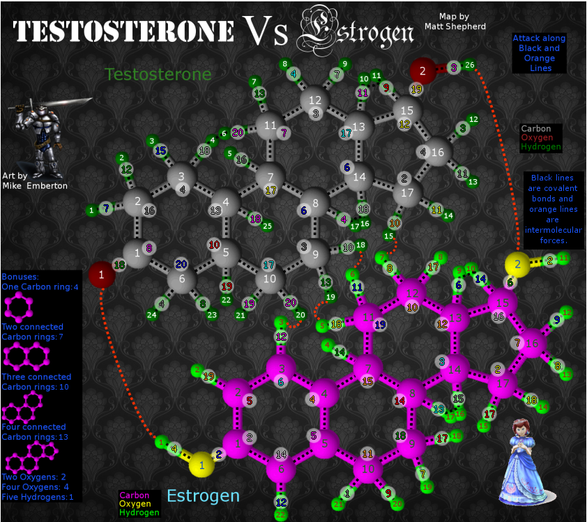
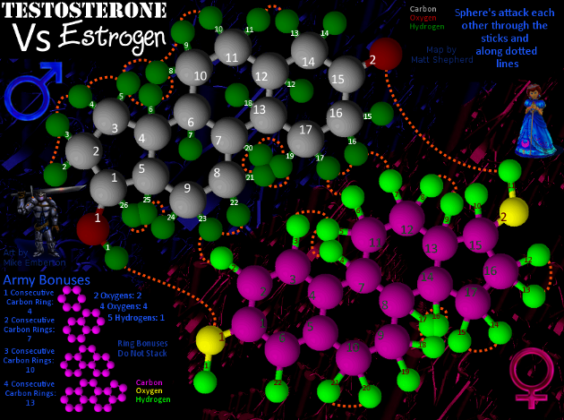
Here's another update to the map:
I got the territory part of the XML complete and checked it with the tester and it showed up great. Now on to the continents and such.
Here's the large map with XML:
I made the army circles 22 pixels across on both large and small to accommodate the numbers better when I move into XML stage.
I added a bit of scientific information for fun. I love learning something when I want to, and its off to the side and barely noticeable, so as not to interfere with gameplay.
I also added a few other attack points between the two molecules, which may make gameplay better.
I changed the bonuses to ones which I think are a bit more fair.
Old Info: 86 Territories
The long orange lines between the molecules are hydrogen bonds. The short ones are hydrophobic interactions and the black lines are covalent bonds.
Let me know if anything needs improving. I am working hard on keeping any updates and taking any advice into account.
Check out my map in the making: Testosterone VS Estrogen
http://www.conquerclub.com/forum/viewtopic.php?f=241&t=85196
http://www.conquerclub.com/forum/viewtopic.php?f=241&t=85196
-

 mattosaurus
- Posts: 72
- Joined: Thu Feb 26, 2009 1:38 pm
- Location: Seattle, WA


Re: Testosterone VS Estrogen(XML version)
oaktown wrote:mattosaurus wrote:At least the title I was going for the contrast between male and female, which is the point of the map...
I get what you were after, but there's nothing feminine about that font. It's decorative, yes, but the gothic serifs are actually very masculine in my opinion. There are better options that would work with the military font in that they would both be more contemporary...
http://www.fontspace.com/category/cute,girly
Maybe that's what bugs me - the elements aren't from the same era. You've got a quasi-futuristic knight in armor, a 1990s-looking 3-D representation of molecules, a mid 20th century stencil font, a 13th century gothic font, an early 20th century background, and a fairy tale princess.
And if you're going to go 3-D with the molecules, it looks odd to have nothing else on the map 3D.
Well I'm a girl and I think the Gothic text is great-- it's lighter, curvier, and more organic. In essence, more feminine-- while the one for testosterone is bold and solid. If you think Gothic is really masculine, perhaps you should go back and study your Abbé Suger and his theory of lux continua.
If you want to talk art and history and combining stark contrasting elements, think of the Palazzo Medici Riccardi in Florence. The bottom has a very solid with thick masonry that presents a very masculine feel while the piano nobile is lighter and more feminine, while the residence floor has the lightest masonry and thin arches. It uses many styles from contemporary to antiquity, yet you don't hear people complaining about Michelozzo's design...
In fact, take the High Renaissance. Can you say combining antiquity and contemporary? It's the epitome of that.
And having the molecules being the most 3-D is what makes the molecule stand out. The game is about the molecules. They shouldn't blend in with everything else in my opinion.
Art-nouveau? Organic themes have been seen since the beginning of art. There has always been an organic quality to art throughout history. I find it makes a great aesthetic contrast between the linear qualities of the molecules.
By the way, almost every girl at some point wanted to be a fairy tale princess. Why do you think Disney princess movies sell so well?
And obviously guys like the whole soldier/ warrior conquer deal, judging by the name of the website...
-

 gonffthethief
- Posts: 4
- Joined: Tue Apr 28, 2009 4:19 pm
Re: [Poll]Testosterone VS Estrogen(New Design)
[Moved]
It would appear that development of this map has stalled. If the mapmaker wants to continue with the map, then one of the Foundry Moderators will be able to help put the thread back into the Foundry system, after an update has been made.
It would appear that development of this map has stalled. If the mapmaker wants to continue with the map, then one of the Foundry Moderators will be able to help put the thread back into the Foundry system, after an update has been made.

PB: 2661 | He's blue... If he were green he would die | No mod would be stupid enough to do that
-

 MrBenn
- Posts: 6880
- Joined: Wed Nov 21, 2007 9:32 am
- Location: Off Duty


Re:Testosterone VS Estrogen(New Design)
OK, so now we have two very different versions of the map that needs to be voted on. Based on the last comment, I've changed a lot of things around, starting basically from scratch. Now in this poll we're going for basic design, as neither map is completely finished. Also, there are two version of the new map: with army circles and without. So vote away!
Last edited by mattosaurus on Mon Jun 22, 2009 2:44 pm, edited 1 time in total.
-

 mattosaurus
- Posts: 72
- Joined: Thu Feb 26, 2009 1:38 pm
- Location: Seattle, WA


Re: Testosterone VS Estrogen (V9)
[moved] back to the drafting room.
Of the three images, I prefer the top two (what are the differences between them?); although the concept of the map really doesn't have a great deal of appeal for me.
The image feels incredibly busy, and the colour-scheme distracts from the playable area... It's good to see that you've put a bit of thought into attack routes between the two halves of the map - your primary focus should be on gaining support from the wider community, and putting your thoughts into how the gameplay will pan out (with a view to ensuring balanced gameplay).

PB: 2661 | He's blue... If he were green he would die | No mod would be stupid enough to do that
-

 MrBenn
- Posts: 6880
- Joined: Wed Nov 21, 2007 9:32 am
- Location: Off Duty


Re: Testosterone VS Estrogen
mibi wrote:Finally a Testosterone VS Estrogen map. I have been waiting for this since I got bored with classic.
..."ditto" here !!!
Matt ... don't lose hope... you're original artwork is the envy of many, but for this author... it is something to marvel at !!!
Maybe somehow you could tone-down the brightness on your impressive Graphics ability... but nonetheless: Great graphics bud !!!
I - like "mibi" in the above quote- can't wait to play on this !!! I hope the silent majority like myself get "outta the closet and speak up" !
Having said my peace... take care and have a great summer !
luxCRUSADER.
-

 luxCRUSADER
- Posts: 89
- Joined: Wed Feb 11, 2009 10:47 pm
- Location: Toronto, Canada


Re: Testosterone VS Estrogen (V9)
So we have an update to the New Design finally. I've been pretty busy, but I'm back. Here's the update to the new look. XML coming soon.
Check out my map in the making: Testosterone VS Estrogen
http://www.conquerclub.com/forum/viewtopic.php?f=241&t=85196
http://www.conquerclub.com/forum/viewtopic.php?f=241&t=85196
-

 mattosaurus
- Posts: 72
- Joined: Thu Feb 26, 2009 1:38 pm
- Location: Seattle, WA


Re: Testosterone VS Estrogen (V10)
So in this draft I muted the background and changed a few other minor details. I really like this one a ton better. I hope you all like it better. Any comments are always appreciated.
Check out my map in the making: Testosterone VS Estrogen
http://www.conquerclub.com/forum/viewtopic.php?f=241&t=85196
http://www.conquerclub.com/forum/viewtopic.php?f=241&t=85196
-

 mattosaurus
- Posts: 72
- Joined: Thu Feb 26, 2009 1:38 pm
- Location: Seattle, WA


Re: Testosterone VS Estrogen (V10 With Poll, please vote)
Ahoy Mattosaurus,
I think you have a novel idea in regards to gameplay---the "army bonuses" as you term them. So I commend you on that. However, I think your achievements in the gameplay dept are hampered by the the current theme, and visuals, you have going. Testosterone and Estrogen don't quite scream appealing map theme.
But what if you took your general idea of gameplay, and applied it to something more befitting---say trying to control/harness chain reactions and interactions between molecules and elements, which then can be "used on your enemy" (I.E. your bonus deployment").
Anyways, I think you've got an idea, I'm just not sure this current execution is the best one.
--Andy
-

 AndyDufresne
- Posts: 24919
- Joined: Fri Mar 03, 2006 8:22 pm
- Location: A Banana Palm in Zihuatanejo


Re: Testosterone VS Estrogen (V10 With Poll, please vote)
I agree with Andy about the bonuses, but I would like to see a clarification regarding whether a 5-carbon ring can be a bonus on its own or part of the two- and three-ring bonuses, or it does it only come into the four-ring bonus.
I disagree with Andy about the theme. The struggle of male versus female is timeless.
I'm not sure what the background imagery is supposed to convey, and I'm not sure how well the male and female figures go with the rest of the picture. I don't think they necessarily have to be 3-D, but they do seem a bit flat compared to the molecules. The molecules stand out from the background as they should, but they appear to be resting on the background, while the figures seem a bit like flat pictures floating in front of the background. Perhaps the traditional astrological symbols for Mars (the shield and arrow ♂) and Venus (hand mirror ♀) would make good gender indicators.
-

 ender516
- Posts: 4455
- Joined: Wed Dec 17, 2008 6:07 pm
- Location: Waterloo, Ontario


Re: Testosterone VS Estrogen (V10 & 11 With Poll, please vote)
So in this draft I muted the background and changed a few other minor details. I really like this one a ton better. I hope you all like it better. Any comments are always appreciated.
Sorry about the layout of the poll. The poll wouldn't accept any answers unless I had at least four, so I put the options in there several times.
So I added a symbol of man and woman as requested. I can leave it as is, switch out the pictures of the man and woman for the symbols, or have both in there as in the example. Will start a new poll soon on this.
Check out my map in the making: Testosterone VS Estrogen
http://www.conquerclub.com/forum/viewtopic.php?f=241&t=85196
http://www.conquerclub.com/forum/viewtopic.php?f=241&t=85196
-

 mattosaurus
- Posts: 72
- Joined: Thu Feb 26, 2009 1:38 pm
- Location: Seattle, WA


Re: Testosterone VS Estrogen (V10 With Poll, please vote)
ender516 wrote:I
I disagree with Andy about the theme. The struggle of male versus female is timeless.
I agree, though I think with the current graphics, it does nothing to this actual theme. The map could be labeled "Atom Wars" for all I know.
--Andy
-

 AndyDufresne
- Posts: 24919
- Joined: Fri Mar 03, 2006 8:22 pm
- Location: A Banana Palm in Zihuatanejo


Re: Testosterone VS Estrogen (V10 & 11 With Poll, please vote)
AndyDufresne wrote:ender516 wrote:I
I disagree with Andy about the theme. The struggle of male versus female is timeless.
I agree, though I think with the current graphics, it does nothing to this actual theme. The map could be labeled "Atom Wars" for all I know.
--Andy
So should I give some kind of story on the map? Would that give it more personal appeal, or would it just be unneeded fluff? Most people don't readily recognize the structures for these common steroids, but I guess that's one reason for it, for some education. We have plenty of maps that teach us history, but precious few that teach us anything about science. I know "learning" isn't really why we're here, but hey, I enjoy molecular structures, and this at least has a theme familiar enough to have an appeal. I could try to explain things better on the map, but i tried a bit and it just confused the map. So any idea as to how i can improve graphics or layout or the name in order to make it more apparent that the Male vs Female is the theme? I tried to do that with fonts and colors, but if you have a way to make it clearer that would be great.
Check out my map in the making: Testosterone VS Estrogen
http://www.conquerclub.com/forum/viewtopic.php?f=241&t=85196
http://www.conquerclub.com/forum/viewtopic.php?f=241&t=85196
-

 mattosaurus
- Posts: 72
- Joined: Thu Feb 26, 2009 1:38 pm
- Location: Seattle, WA


Re: Testosterone VS Estrogen (V10 & 11 With Poll, please vote)
Maybe adjust the background itself so that while it's still muted, each part of the background implies the theme of the"side" it's on. I.e. make the estrogen-side background a dull pink.
-

 Echospree
- Posts: 169
- Joined: Wed Feb 11, 2009 3:03 pm


Re: Testosterone VS Estrogen (V10 & 11 With Poll, please vote)
Maybe turn the Testosterone into a vague man shape and Estrogen into a vague women shape
-

 sailorseal
- Posts: 2735
- Joined: Sun May 25, 2008 1:49 pm
- Location: conquerclub.com


Re: Testosterone VS Estrogen (V10 & 11 With Poll, please vote)
sailorseal wrote:Maybe turn the Testosterone into a vague man shape and Estrogen into a vague women shape
Do you mean the molecules or the words?
Check out my map in the making: Testosterone VS Estrogen
http://www.conquerclub.com/forum/viewtopic.php?f=241&t=85196
http://www.conquerclub.com/forum/viewtopic.php?f=241&t=85196
-

 mattosaurus
- Posts: 72
- Joined: Thu Feb 26, 2009 1:38 pm
- Location: Seattle, WA


Re: Testosterone VS Estrogen (V10, 11 & 12 W/ Poll)
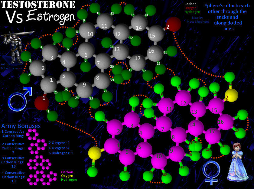
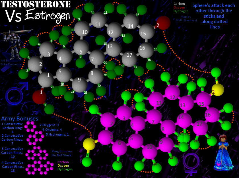
Here's a third Edition, with a pinkish background for the Female side and with the color of the Female symbol changed to match. I also added a statement that ring bonuses do not stack. Here it is:
Check out my map in the making: Testosterone VS Estrogen
http://www.conquerclub.com/forum/viewtopic.php?f=241&t=85196
http://www.conquerclub.com/forum/viewtopic.php?f=241&t=85196
-

 mattosaurus
- Posts: 72
- Joined: Thu Feb 26, 2009 1:38 pm
- Location: Seattle, WA


Re: Testosterone VS Estrogen (V10, 11 & 12 W/ Poll)
So in this draft I muted the background and changed a few other minor details. I really like this one a ton better. I hope you all like it better. Any comments are always appreciated.
Sorry about the layout of the poll. The poll wouldn't accept any answers unless I had at least four, so I put the options in there several times.
So I added a symbol of man and woman as requested. I can leave it as is, switch out the pictures of the man and woman for the symbols, or have both in there as in the example. Will start a new poll soon on this.
Here's a third Edition, with a pinkish background for the Female side and with the color of the Female symbol changed to match. I also added a statement that ring bonuses do not stack. Here it is:
Check out my map in the making: Testosterone VS Estrogen
http://www.conquerclub.com/forum/viewtopic.php?f=241&t=85196
http://www.conquerclub.com/forum/viewtopic.php?f=241&t=85196
-

 mattosaurus
- Posts: 72
- Joined: Thu Feb 26, 2009 1:38 pm
- Location: Seattle, WA


Re: Testosterone VS Estrogen (Lucky 13? W/ Poll)
It's nice to see how you are incorporating suggestions so quickly (especially some of mine). I like the idea of the pink-toned background for the estrogen half of the map, but the colours you are actually using for that and the female symbol ♀ are a bit too purple in my view. Maybe something closer to a baby pink would be more effective. More like this rather than this.
Also, if you restart your poll about "Would you play this map?", try these as four answers: "Definitely", "Probably", "Probably not", and "Definitely not". You could also add "On the fence" in the middle.
Also, if you restart your poll about "Would you play this map?", try these as four answers: "Definitely", "Probably", "Probably not", and "Definitely not". You could also add "On the fence" in the middle.
-

 ender516
- Posts: 4455
- Joined: Wed Dec 17, 2008 6:07 pm
- Location: Waterloo, Ontario


Re: Testosterone VS Estrogen (Lucky 13? W/ Poll)
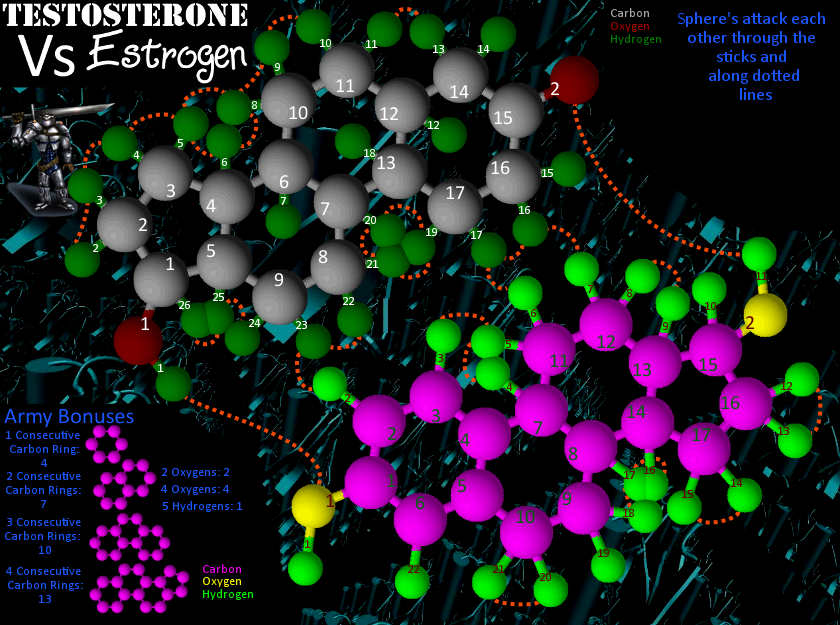
So I did a bit of tweaking on this one that I think makes the whole thing a ton better. I made the pink on Estrogen darker and a bit redder, I made some fonts bigger, mainly so they would be legible on the small map, darkened a few other colors to fit the theme, and rearranged some peripheral images and such to fit better and put more focus on the male and female symbols. So What do you think?
Large Image:
Small image:
Large Image:
Small image:
Check out my map in the making: Testosterone VS Estrogen
http://www.conquerclub.com/forum/viewtopic.php?f=241&t=85196
http://www.conquerclub.com/forum/viewtopic.php?f=241&t=85196
-

 mattosaurus
- Posts: 72
- Joined: Thu Feb 26, 2009 1:38 pm
- Location: Seattle, WA


Re: Testosterone VS Estrogen (Lucky 13? W/ Poll)
I'm still not fond of the shade of pink on the background or the colour of the female symbol, but I like the visual balance of all the graphical elements.
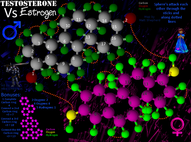
Now as to the bonuses. Keep in mind I am not commenting on the values of them here, just the way they are described. First, I think the legend should drop the word "Army". You could replace it with "Structure", perhaps, or just say "Bonuses".
Now a question: does the 5-carbon ring (testosterone carbons 1 through 5, or estrogen carbons 13 through 17) count for a bonus just as any of the other 6-carbon (benzene) rings do, or does it only count as part of the biggest bonus? If it does, you may need to add more examples, showing the 5-carbon ring on its own and conjoined to one and two benzene rings.
Next the terminology: I don't think "consecutive" is quite the word you want, either "complete" or "conjoined" might be better, and the meaning of "Ring Bonuses Do Not Stack" isn't immediately clear to me. Here at CC, when I hear the word "stack", I think of troops being deployed without attacking and building up a stronghold. May I suggest the following wording for the legend, which should make clear what I think you plan the bonus scheme to be (I am marking this as code to get the fixed width font):
I don't think that leaves any room for doubt about what the bonuses would be. Two separate carbon rings would count 4 each, naturally.
As far as the fonts go, I can see the numbers on the small image, so well done.
Good work on the speedy updates!
Now as to the bonuses. Keep in mind I am not commenting on the values of them here, just the way they are described. First, I think the legend should drop the word "Army". You could replace it with "Structure", perhaps, or just say "Bonuses".
Now a question: does the 5-carbon ring (testosterone carbons 1 through 5, or estrogen carbons 13 through 17) count for a bonus just as any of the other 6-carbon (benzene) rings do, or does it only count as part of the biggest bonus? If it does, you may need to add more examples, showing the 5-carbon ring on its own and conjoined to one and two benzene rings.
Next the terminology: I don't think "consecutive" is quite the word you want, either "complete" or "conjoined" might be better, and the meaning of "Ring Bonuses Do Not Stack" isn't immediately clear to me. Here at CC, when I hear the word "stack", I think of troops being deployed without attacking and building up a stronghold. May I suggest the following wording for the legend, which should make clear what I think you plan the bonus scheme to be (I am marking this as code to get the fixed width font):
- Code: Select all
     1 Complete Carbon Ring:  4
  Connect a 2nd Carbon Ring: +3 = 7
  Connect a 3rd Carbon Ring: +3 = 10
Connect the 4th Carbon Ring: +3 = 13
I don't think that leaves any room for doubt about what the bonuses would be. Two separate carbon rings would count 4 each, naturally.
As far as the fonts go, I can see the numbers on the small image, so well done.
Good work on the speedy updates!
-

 ender516
- Posts: 4455
- Joined: Wed Dec 17, 2008 6:07 pm
- Location: Waterloo, Ontario


Re: Testosterone VS Estrogen (v14 W/ Poll)
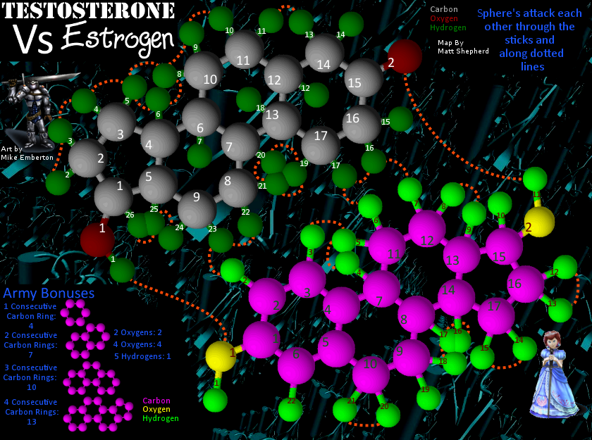
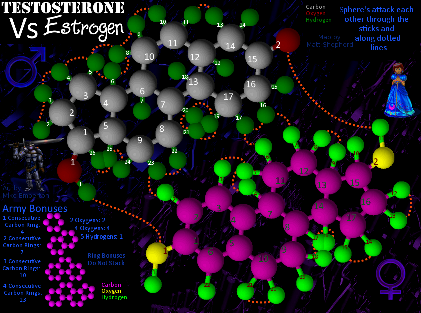
Here's a new update. Cleaned up a few graphics and changed the background colors for the female side and symbol. I like it even more than the last one. Keep the comments coming.
Here's the large one:
And here's the small version:
Here's the large one:
And here's the small version:
Check out my map in the making: Testosterone VS Estrogen
http://www.conquerclub.com/forum/viewtopic.php?f=241&t=85196
http://www.conquerclub.com/forum/viewtopic.php?f=241&t=85196
-

 mattosaurus
- Posts: 72
- Joined: Thu Feb 26, 2009 1:38 pm
- Location: Seattle, WA


Re: Testosterone VS Estrogen (v15)
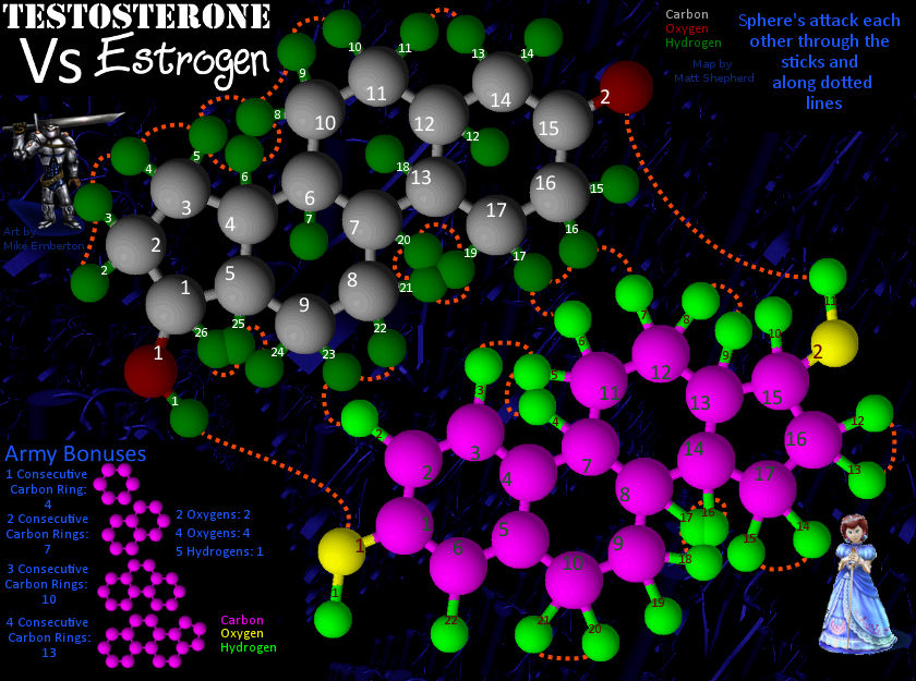
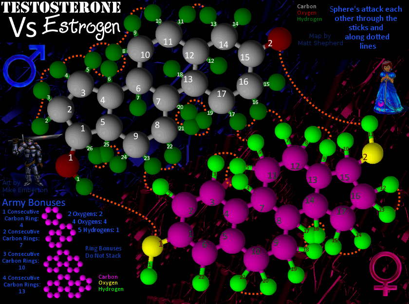
Here's an update taking into account recent comments made by ender516. I also did a couple things on my own.
I made the female color a bit pinker and the symbol too.
I also blended the blue and the pink to make it a bit less stark.
The way the bonuses were stated was changed to clarify better what is meant.
So here they are, starting with the large:
Small:
I made the female color a bit pinker and the symbol too.
I also blended the blue and the pink to make it a bit less stark.
The way the bonuses were stated was changed to clarify better what is meant.
So here they are, starting with the large:
Small:
Check out my map in the making: Testosterone VS Estrogen
http://www.conquerclub.com/forum/viewtopic.php?f=241&t=85196
http://www.conquerclub.com/forum/viewtopic.php?f=241&t=85196
-

 mattosaurus
- Posts: 72
- Joined: Thu Feb 26, 2009 1:38 pm
- Location: Seattle, WA


Re: [Poll]Testosterone VS Estrogen (v13,14,15)
These graphics are really coming along. The new pink is a big improvement in my eyes, much more girly, as it should be. It is very gratifying to see you accepting my suggestions so readily.
-

 ender516
- Posts: 4455
- Joined: Wed Dec 17, 2008 6:07 pm
- Location: Waterloo, Ontario


Re: [Poll]Testosterone VS Estrogen (v13,14,15)
At this point, I've had three tries to come up with a color for the girl side background. So we're going to vote on them. We'll start with the pinkest and go to the purplest and see what you all think.
Again, my poll maker is acting very strange, so this was the best I could come up with as far as getting all the options there.
Pink
Magenta
Violet
Again, my poll maker is acting very strange, so this was the best I could come up with as far as getting all the options there.
Pink
Magenta
Violet
Check out my map in the making: Testosterone VS Estrogen
http://www.conquerclub.com/forum/viewtopic.php?f=241&t=85196
http://www.conquerclub.com/forum/viewtopic.php?f=241&t=85196
-

 mattosaurus
- Posts: 72
- Joined: Thu Feb 26, 2009 1:38 pm
- Location: Seattle, WA


88 posts
• Page 2 of 4 • 1, 2, 3, 4
Return to Melting Pot: Map Ideas
Who is online
Users browsing this forum: No registered users

