Conquer Club

Baltic Crusades

Care to peruse completed maps? Take a stroll through the Atlas.

Moderator: Cartographers

Forum rules
Please read the Community Guidelines before posting.

Re: Baltic Crusades

Postby theBastard on Wed Feb 17, 2010 3:51 pm

Sir. Ricco wrote:I like the water color. It balances out the overall look of things.


thanks, yes now it looks better. more natural...

Sir. Ricco wrote:Does the land route connect the starting and ending points?


I only think about this. if there will be land routes they will work as sea routes, so yes they connect towns. but this take importance of castles, which "secure" bridges....

I will see what Industrial Helix will says.
User avatar
Corporal 1st Class theBastard
 
Posts: 994
Joined: Sat Jan 09, 2010 9:05 am

Re: Baltic Crusades

Postby Industrial Helix on Wed Feb 17, 2010 4:59 pm

The trade routes seem like a pretty cool idea. I say keep it for now and work out the details later.

Ok, so let's talk advanced Graphics. We're going to give it that worn look that you mentioned I had on my maps. The first thing you need to do is find an image of a piece of worn paper off a search engine, make sure it is LARGE and bigger than your map. Then save it to your desk top and open it in Photoshop. Select all, Ctrl+A and use the move tool to drag it from it's window to the window with your map. Move the layer towards the bottom. Now go back to your region color layers and turn down the opacity. For start, bring it down to 50% on all of them and then tweak them as necessary until they're about equal in apparent opacity.

Next, you're images are getting pixelated... Make sure that you save these jpgs as a large file. you're cutting yourself short when you save as a small file.

In the space next to Passable/Impassable in the lower right legend, you should list the trade route and sea route as connecting.

Lastly, the font needs to go. Even increased in size it's too unreadable. There are a number of names I can't make out. Use the trick I posted a link to so you can make the changes quick and find a clear font that works with the theme of the map.
Sketchblog [Update 07/25/11]: http://indyhelixsketch.blogspot.com/
Living in Japan [Update 07/17/11]: http://mirrorcountryih.blogspot.com/
Russian Revolution map for ConquerClub [07/20/11]: viewtopic.php?f=241&t=116575
User avatar
Cook Industrial Helix
 
Posts: 3462
Joined: Mon Jul 14, 2008 6:49 pm
Location: Ohio

Re: Baltic Crusades

Postby theBastard on Wed Feb 17, 2010 5:18 pm

about trade routes, hm I think if we (I) can hold importance of castles it needs any idea. maybe between two towns connected with trade route could be one castle, so who hold castle also have control of trade route...

about fonts, I used about 20 Gothic/Medieval types but no one was fine. this one is the best, I think.
Click image to enlarge.
image
User avatar
Corporal 1st Class theBastard
 
Posts: 994
Joined: Sat Jan 09, 2010 9:05 am

Re: Baltic Crusades

Postby theBastard on Wed Feb 17, 2010 7:44 pm

I maybe confused layers or gruop layers which are not the same, do not know but for some parts of map I can not set lower opacity. I will tomorow start on new version (and I will better mark layers :D ).

Helix, what do you think, is better to have more different bonuses or not to do game too complicated?
User avatar
Corporal 1st Class theBastard
 
Posts: 994
Joined: Sat Jan 09, 2010 9:05 am

Re: Baltic Crusades

Postby Industrial Helix on Wed Feb 17, 2010 11:16 pm

You're going to redo it? You might want to hold off on that. Editing layers is a good way to tackle problems without having to redo everything.

Layers are the individual colors or words or lines or shapes, ect.

Folders are what layers go into. They each have little buttons at the bottom of the layer menu... which if you don't have out its menu at the top, Windows -> Layer.

This link kind of goes through the bits and pieces of layers, give it a brief look cause I'm not entirely sure what you're asking me: http://www.photoshopcafe.com/tutorials/layers/intro.htm
Sketchblog [Update 07/25/11]: http://indyhelixsketch.blogspot.com/
Living in Japan [Update 07/17/11]: http://mirrorcountryih.blogspot.com/
Russian Revolution map for ConquerClub [07/20/11]: viewtopic.php?f=241&t=116575
User avatar
Cook Industrial Helix
 
Posts: 3462
Joined: Mon Jul 14, 2008 6:49 pm
Location: Ohio

Re: Baltic Crusades

Postby theBastard on Fri Feb 19, 2010 6:21 am

I finished it. I like it, so I will wait for your opinion.

I have two questions:
about cs2: is possible to use "clone stamp tool" in csS. so I "take" colour from one layer and draw another?

about map/gameplay: I think about more bonuse, for example mark some castles/regions and who holds them he will give bonus as Polish/Lithuania commontwealth or Teutonic state (united Teutonic Order with Livonian Sword Brethren). and I can add there also any "bonuses" with -1 unit.

game idea - starting positions will be castles and towns. I did game for 5 players (3 castles, 1 town as starting position for each player), but we can have 6 players (2 castles, 1 town for each one) or 8 players (2 castles, 1 town - but here I must do one more castle). as I wrote, my idea is to build game on auto-deploy units - but maybe it is not good idea, just I want have castles important.

Click image to enlarge.
image


size 630 x 600
Click image to enlarge.
image
User avatar
Corporal 1st Class theBastard
 
Posts: 994
Joined: Sat Jan 09, 2010 9:05 am

Re: Baltic Crusades

Postby Industrial Helix on Fri Feb 19, 2010 10:37 am

Wow... looking great! If you fixed that font we'd be in real good shape.

In the meantime, you need to submit your design brief:

Map Name: <name>
Link to Thread: <link>
Mapmaker(s): <up to two cartographers>
Map Size: <approximate territory counts>
Your aims/design style: <influences/themes etc>
Uniqueness: <what sets the map apart>
Relevant Experience: <about the cartographer(s)>

Then post it here: viewtopic.php?f=63&t=105502

I'll post the next step in graphics when I get some more time.
Sketchblog [Update 07/25/11]: http://indyhelixsketch.blogspot.com/
Living in Japan [Update 07/17/11]: http://mirrorcountryih.blogspot.com/
Russian Revolution map for ConquerClub [07/20/11]: viewtopic.php?f=241&t=116575
User avatar
Cook Industrial Helix
 
Posts: 3462
Joined: Mon Jul 14, 2008 6:49 pm
Location: Ohio

Re: Baltic Crusades

Postby theBastard on Fri Feb 19, 2010 10:49 am

Industrial Helix wrote:Wow... looking great!


thanks. but the result is also your job.

Industrial Helix wrote:If you fixed that font we'd be in real good shape.


you still think they are not redable? I could add them more opacity.

Industrial Helix wrote:In the meantime, you need to submit your design brief:

Map Name: <name>
Link to Thread: <link>
Mapmaker(s): <up to two cartographers>
Map Size: <approximate territory counts>
Your aims/design style: <influences/themes etc>
Uniqueness: <what sets the map apart>
Relevant Experience: <about the cartographer(s)>

Then post it here: viewtopic.php?f=63&t=105502

I'll post the next step in graphics when I get some more time.


more graphics? uf o.k. I´m looking forward.
User avatar
Corporal 1st Class theBastard
 
Posts: 994
Joined: Sat Jan 09, 2010 9:05 am

Re: Baltic Crusades

Postby theBastard on Fri Feb 19, 2010 5:01 pm

I think, this is the maximum what I´m able to do. if we can have "old" style of fonts, we must go with this. I think they are redable, but maybe only because I read them several days and know them...
Click image to enlarge.
image


EDIT: when I look at map, the fonts are good visible. the problem is that this is "old" style and people do not know them, I think.

EDIT2: here is map with bigger fonts
Click image to enlarge.
image
User avatar
Corporal 1st Class theBastard
 
Posts: 994
Joined: Sat Jan 09, 2010 9:05 am

Re: Baltic Crusades

Postby Industrial Helix on Sat Feb 20, 2010 12:22 pm

The font, even increased in size, is still too hard to read. Try a few out that you think are possible fonts, break away from old style if necessary. Try Times Roman, it's very legible and has a tad of flair.

Why are some names capitalized and some not?

You ought to be working on the large map, not the small. Restrict all work to the large map, when you go tot he graphic workshop, then shrink it to make the small.

Lastly, you need to clean up your sea and land lines. Here's how:

New layer, name it sea links.

Click on Brush, set size to about 5 px and color what ever you want the sea lane to be.

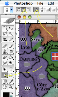
Select the pen tool and make sure the settings match mine:
Click image to enlarge.
image


Use the pen tool and click where one sea lane starts. Now click where it ends and hold down the click. Pull away from where you clicked and notice how the line bends, move it up and down and see how it affects the shape? Let go of the mouse when you think you have a curve that fits and doesn't run into many obstacles.

Now, go back to the starting point and either right click or ctrl Click (not sure for windows) and get the little menu. It's the same menu as when you made the shapes. Click stroke path and viola, you have a perfect curved line.

Now bring that little menu up again, right click or ctrl click, and select delete path. This will delete the pen shape and leave the brush shape.

Now since your land lines are over land, a bright solid line is going to be distracting and too bulky. Let's got for something more subtle. Start a new layer and name it "Land connections"

Go to brush, 5 px in size and make the color white.

Now, go up to the menus at the top and click WINDOW menu. Go on down to Brushes and click. This gives you a new window.

Click image to enlarge.
image


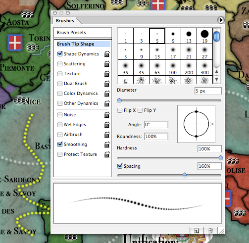
In the brushes window, select "Brush Tip Shape" and then down in the right corner is a slider thing that says spacing, go on and up that to about 160. You've got dotted lines.

Now, get out your pen tool and make your starting point, and then your ending point. Curve it just right, stroke with brush and it will make a line like last time, but dotted.

Delete the pen line and go over to your the layer "Land Connections" and lower the opacity until you can see it, but its not so glaring.

If white isn't a good color for this, change it via the same way you changed the the sea.


I just looked at your design brief and you ought to go edit it. Scroll up and take a look at the Design Brief for Japan: Sengoku Gidai. That is what a Design Brief should look like. Make sure you're answering the almighty question of the CC foundry: Yes, my idea could be a map, but should it?

What does your map offer that no other map does? There are a bunch of castle maps and maps with towns, this is not a unique feature. Just because a map has an image, doesn't make it special. It's how the images interact with each other that counts, the gameplay. You should be striving to replicate the political and war relations between Hanseatic towns and the Castles, not their images, and translate this into CC gameplay. You also need to answer what you want players to experience when playing this map, do you wan them see the complex political order of the Medieval Period? Or do you want them to see the logistics and dynamics of waging a Crusade? Perhaps a little of both or something entirely different.

Next for uniqueness, you need to say more than a "maybe." When you say maybe it looks like you don't know what you're doing. Talk about the medieval political structure of town and castles, that's unique right? Talk about the geograpahic area, Baltic... well, there is a Baltic map in production. Say specifically what makes yours different. Time period.... we'll we've got one Crusade map and another almost ready to go. Why do we need another? What experience does your map offer that is different than those other maps? Yes, its a different historical area and time, but you need to say what it brings to CC other than a page in a history book.

When you've given your Design Brief a make over, post it here and I'll take a look at it to make sure its what the mods want to see. Also, I can tweak your English too ;)

I'm looking forward to the next version of this map. It's come a look way and I think when its done it will be quite fun.
Sketchblog [Update 07/25/11]: http://indyhelixsketch.blogspot.com/
Living in Japan [Update 07/17/11]: http://mirrorcountryih.blogspot.com/
Russian Revolution map for ConquerClub [07/20/11]: viewtopic.php?f=241&t=116575
User avatar
Cook Industrial Helix
 
Posts: 3462
Joined: Mon Jul 14, 2008 6:49 pm
Location: Ohio

Re: Baltic Crusades

Postby theBastard on Sat Feb 20, 2010 1:20 pm

Industrial Helix wrote:The font, even increased in size, is still too hard to read. Try a few out that you think are possible fonts, break away from old style if necessary. Try Times Roman, it's very legible and has a tad of flair.


I find another old style, when they will be not good I will go with Times Roman. you used them on Italia and Germany maps, yes?

Industrial Helix wrote:Why are some names capitalized and some not?


the names of regions are capitalized and names of towns and castles are not. I thought that it could helps to differentiate regions and settlements. and I saw this on many old maps.

Industrial Helix wrote:You ought to be working on the large map, not the small. Restrict all work to the large map, when you go tot he graphic workshop, then shrink it to make the small.


I´m working on the large map, I post small only for you, how fonts looks.

Industrial Helix wrote:Lastly, you need to clean up your sea and land lines. Here's how:


uf, this looks as work for longer time :) I will work on it. (I never thought that it is so much work to do one map :)

Industrial Helix wrote:I just looked at your design brief and you ought to go edit it. Scroll up and take a look at the Design Brief for Japan: Sengoku Gidai. That is what a Design Brief should look like. Make sure you're answering the almighty question of the CC foundry: Yes, my idea could be a map, but should it?

What does your map offer that no other map does? There are a bunch of castle maps and maps with towns, this is not a unique feature. Just because a map has an image, doesn't make it special. It's how the images interact with each other that counts, the gameplay. You should be striving to replicate the political and war relations between Hanseatic towns and the Castles, not their images, and translate this into CC gameplay. You also need to answer what you want players to experience when playing this map, do you wan them see the complex political order of the Medieval Period? Or do you want them to see the logistics and dynamics of waging a Crusade? Perhaps a little of both or something entirely different.

Next for uniqueness, you need to say more than a "maybe." When you say maybe it looks like you don't know what you're doing. Talk about the medieval political structure of town and castles, that's unique right? Talk about the geograpahic area, Baltic... well, there is a Baltic map in production. Say specifically what makes yours different. Time period.... we'll we've got one Crusade map and another almost ready to go. Why do we need another? What experience does your map offer that is different than those other maps? Yes, its a different historical area and time, but you need to say what it brings to CC other than a page in a history book.


yes, but with my poor english it will be not easy...

Industrial Helix wrote:When you've given your Design Brief a make over, post it here and I'll take a look at it to make sure its what the mods want to see. Also, I can tweak your English too ;)


thanks. and yes tweak my terrible English :)

Industrial Helix wrote:I'm looking forward to the next version of this map. It's come a look way and I think when its done it will be quite fun.


it could run several times. btw, I´ve started working on 2 new maps...
User avatar
Corporal 1st Class theBastard
 
Posts: 994
Joined: Sat Jan 09, 2010 9:05 am

Re: Baltic Crusades

Postby Industrial Helix on Sun Feb 21, 2010 9:38 pm

theBastard wrote:
it could run several times. btw, I´ve started working on 2 new maps...


Hold off on those, you haven't even gotten this one approved for a design brief yet. Plus, there are a ton of things you're going to learn taking these maps though the process that its better to just start you next map knowing. And lastly, there is a 2 map limit.
Sketchblog [Update 07/25/11]: http://indyhelixsketch.blogspot.com/
Living in Japan [Update 07/17/11]: http://mirrorcountryih.blogspot.com/
Russian Revolution map for ConquerClub [07/20/11]: viewtopic.php?f=241&t=116575
User avatar
Cook Industrial Helix
 
Posts: 3462
Joined: Mon Jul 14, 2008 6:49 pm
Location: Ohio

Re: Baltic Crusades

Postby theBastard on Mon Feb 22, 2010 1:49 pm

do not be afraid, I am working on Baltic Crusade map. but I have one idea, I hope today I will be able to realize it and show it to you.
please could you tell me if all regions of "Duchy" must be connected or one region could stay alone?
User avatar
Corporal 1st Class theBastard
 
Posts: 994
Joined: Sat Jan 09, 2010 9:05 am

Re: Baltic Crusades

Postby Industrial Helix on Tue Feb 23, 2010 11:14 am

Do you mean connected by the trade routes? It doesnt really matter, it's up to your decision whether or not you want a region connected or not based on the historical maps or books you're looking at. If a Castle or Town isn't connected or if a whole duchy isn't connected, that's not a problem.
Sketchblog [Update 07/25/11]: http://indyhelixsketch.blogspot.com/
Living in Japan [Update 07/17/11]: http://mirrorcountryih.blogspot.com/
Russian Revolution map for ConquerClub [07/20/11]: viewtopic.php?f=241&t=116575
User avatar
Cook Industrial Helix
 
Posts: 3462
Joined: Mon Jul 14, 2008 6:49 pm
Location: Ohio

Re: Baltic Crusades

Postby theBastard on Wed Feb 24, 2010 5:10 am

I thought the "Duchy" regions, baseless if connected with trade routes or not. for example three regions will be in Germany one in Russia... but if I good understand your question it is possible. thanks.

how did you so nice stripes in Venezia?
User avatar
Corporal 1st Class theBastard
 
Posts: 994
Joined: Sat Jan 09, 2010 9:05 am

Re: Baltic Crusades

Postby Industrial Helix on Wed Feb 24, 2010 8:27 am

For the stripes in Venezia I just used the line tool, bumped it up to like 20 px and made a line in one color on a layer, copied the layer and then pasted it in a new layer. Hit Hue/Saturation and changed the color to my liking. Then I merged the two line layers and copied them, pasted and repeat until I had a fairly big block of stripes. Then I put the stripes layer underneath my borders layer and carefully erased the edges so that it only filled Venezia.
Sketchblog [Update 07/25/11]: http://indyhelixsketch.blogspot.com/
Living in Japan [Update 07/17/11]: http://mirrorcountryih.blogspot.com/
Russian Revolution map for ConquerClub [07/20/11]: viewtopic.php?f=241&t=116575
User avatar
Cook Industrial Helix
 
Posts: 3462
Joined: Mon Jul 14, 2008 6:49 pm
Location: Ohio

Re: Baltic Crusades

Postby theBastard on Wed Feb 24, 2010 8:28 am

and what do you think about this? ech town, castle, fort are region. if you think it should be I will continue on this map rather as previous...
Click image to enlarge.
image
User avatar
Corporal 1st Class theBastard
 
Posts: 994
Joined: Sat Jan 09, 2010 9:05 am

Re: Baltic Crusades

Postby natty dread on Wed Feb 24, 2010 9:04 am

Ok... between Zemgale, Selija, Samogitia and Aukstaitija there's a 4-way border. You'll need to change that, it makes it difficult to figure out which areas attack which.
Image
User avatar
Sergeant 1st Class natty dread
 
Posts: 12877
Joined: Fri Feb 08, 2008 8:58 pm
Location: just plain fucked

Re: Baltic Crusades

Postby MrBenn on Wed Feb 24, 2010 3:47 pm

It's really interesting to see your skills developing.

I'd encourage you to focus on getting something presentable (it doesn;t need to be perfect) so that people can start to get a better idea for how you plan things to work; then it'll be worth looking towards getting a design brief together - this will help to give you continued focus for the map as things develop ;-)
Image
PB: 2661 | He's blue... If he were green he would die | No mod would be stupid enough to do that
User avatar
Lieutenant MrBenn
 
Posts: 6880
Joined: Wed Nov 21, 2007 9:32 am
Location: Off Duty

Re: Baltic Crusades

Postby theBastard on Wed Feb 24, 2010 5:54 pm

to natty_dread, this is only idea map, if you look at previous version, you can see trees on the borders which are impassable. and thanks for support.

to MrBenn, thanks for kind words, which are for Industrial Helix also, I think :)

the idea is done, on 99%. I am working on map now, and I hope in the last version there will be everything.
User avatar
Corporal 1st Class theBastard
 
Posts: 994
Joined: Sat Jan 09, 2010 9:05 am

Re: Baltic Crusades

Postby natty dread on Wed Feb 24, 2010 5:56 pm

I like the castles as separate territories. You should go with that.
Image
User avatar
Sergeant 1st Class natty dread
 
Posts: 12877
Joined: Fri Feb 08, 2008 8:58 pm
Location: just plain fucked

Re: Baltic Crusades

Postby theBastard on Thu Feb 25, 2010 10:18 am

I finished it. not 100% finished yet, but I believe that Helix has new graphic gimmickry for me ;)
the size of army circles must be 21 x 21 pixels.
Click image to enlarge.
image


here is version with old style fonts.
Click image to enlarge.
image
User avatar
Corporal 1st Class theBastard
 
Posts: 994
Joined: Sat Jan 09, 2010 9:05 am

Re: Baltic Crusades

Postby Industrial Helix on Thu Feb 25, 2010 6:28 pm

Wow... I really have to say that your graphic skills have come quite a long way from that first draft you posted. The latest looks pretty damn good, save for a few details.

The next and maybe last trick you need to learn for this map is how to add glow, dropshadow, stroke, ect. to your layers. And this is real simple...

Find the layer you want to alter. In this case, we're going to pick the rivers because they need to stand out a little more. Select your rivers layer.

Next, move the cursor so that it isn't on the layer name, but still on the little block that represents the layer. Now double click.

This should bring up an effects layer where you can do all sorts of things to your layers.

In this case, because I'm not sure which will work best, click on stroke at the very bottom. This should have added a red line around your rivers... now red isn't the color we want, lets try something like dark brown and shrinking the line to something like 2 or 3 px. You can also lower the opacity if you like, which is like what you did to your colors to make the background texture show through.

Is the stroke not working? Go back to the little list to the left and deselect the little box. It should be gone now and your rivers are like they were before. Move on up to "Outer Glow" and select that. Make the color a muddy brown, like muddy banks of the river. I like my Blend mode (located just above the color) set to multiply. Set it to multiply if it isn't already. The "Size" slider will make the glow bigger or smaller, the "Spread" slider will make it more or less diffused. Try something that is tight to the river, something that illustrates the banks of the river and makes them stand out a little bit.

This, I think, should be the last general graphics lesson. You've got the tools and the know-how to make the map that you see in your mind, which I think is clear by the latest version. Congrats, let's take it to the Final Forge! Finish your draft and post a revised design brief, or pm it to me, and I'll make sure your english is good and point out what you need to address better.
Sketchblog [Update 07/25/11]: http://indyhelixsketch.blogspot.com/
Living in Japan [Update 07/17/11]: http://mirrorcountryih.blogspot.com/
Russian Revolution map for ConquerClub [07/20/11]: viewtopic.php?f=241&t=116575
User avatar
Cook Industrial Helix
 
Posts: 3462
Joined: Mon Jul 14, 2008 6:49 pm
Location: Ohio

Re: Baltic Crusades

Postby theBastard on Fri Feb 26, 2010 4:16 am

Industrial Helix wrote:Wow... I really have to say that your graphic skills have come quite a long way from that first draft you posted. The latest looks pretty damn good, save for a few details.


yes, and you show me the right way :)

Industrial Helix wrote:This, I think, should be the last general graphics lesson. You've got the tools and the know-how to make the map that you see in your mind, which I think is clear by the latest version.


I´m working on one new...

Industrial Helix wrote:Congrats, let's take it to the Final Forge!


thanks. I can take it to Final Forge myself? I thought that game makers sort maps which one is good...

Industrial Helix wrote:Finish your draft and post a revised design brief, or pm it to me, and I'll make sure your english is good and point out what you need to address better.


your last graphic tips works fine, but the design brief will be hard work for me. I will work on it, damned with my English :D
User avatar
Corporal 1st Class theBastard
 
Posts: 994
Joined: Sat Jan 09, 2010 9:05 am

Re: Baltic Crusades

Postby natty dread on Fri Feb 26, 2010 6:11 am

the size of army circles must be 21 x 21 pixels.


22x22

thanks. I can take it to Final Forge myself? I thought that game makers sort maps which one is good...


No, you make the map, then foundry mods move it to gameplay workshop, then graphics workshop, then final forge.

damned with my English :D


wonder if you'll be a new qwert... :D (lack of english skills never stopped him from making great maps)
Image
User avatar
Sergeant 1st Class natty dread
 
Posts: 12877
Joined: Fri Feb 08, 2008 8:58 pm
Location: just plain fucked

PreviousNext

Return to The Atlas

Who is online

Users browsing this forum: No registered users