Okay then
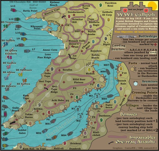
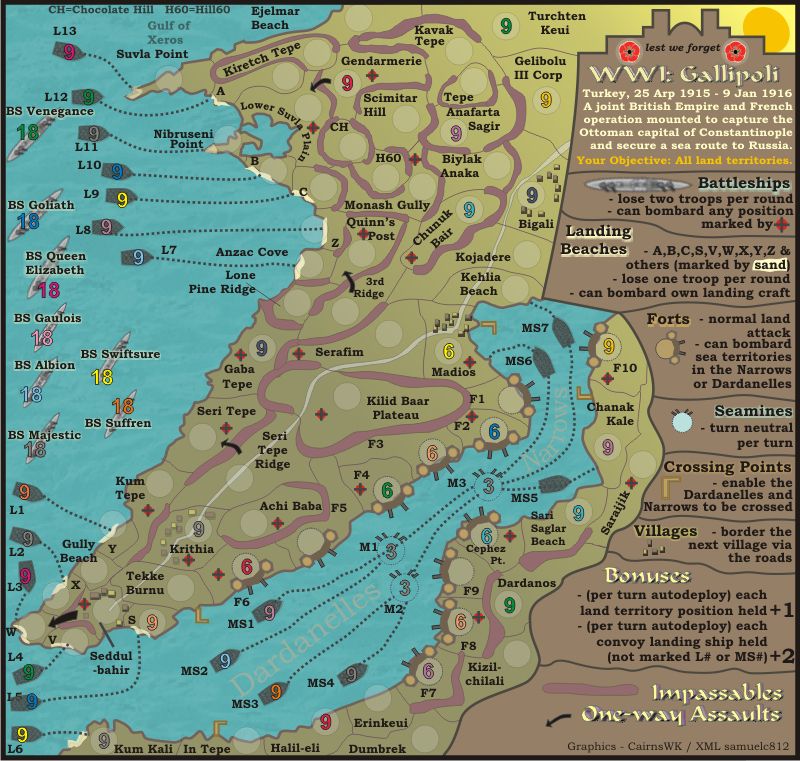
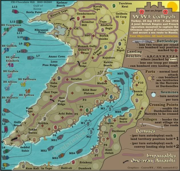
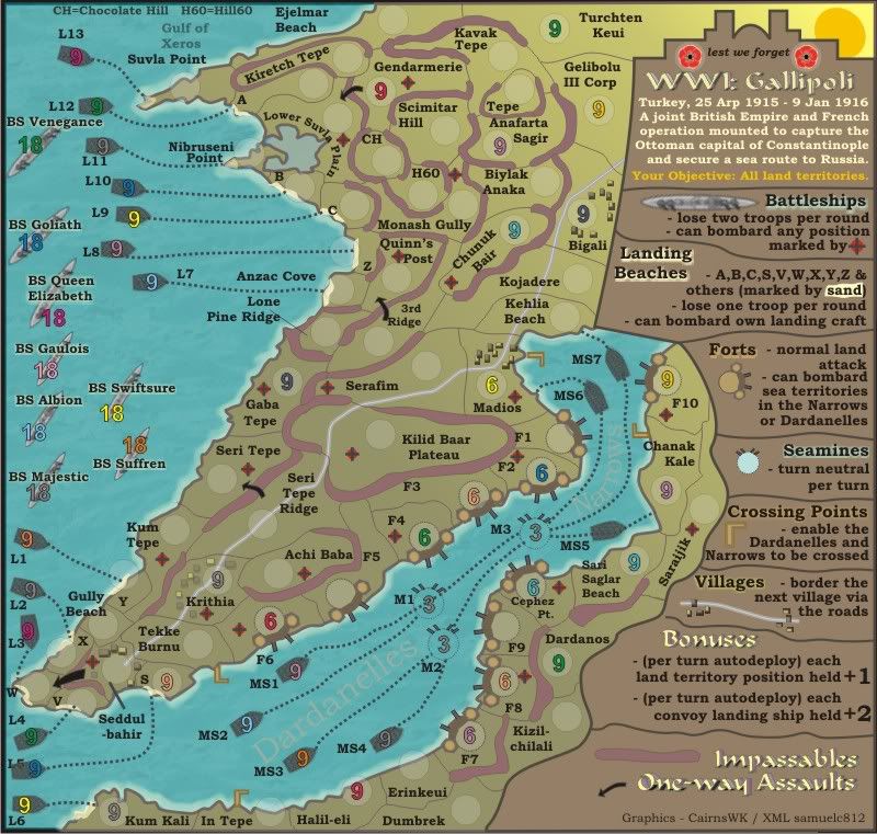
 Legend
The squiggly lines I was referring to are the ones that separate the sections of the legend. Now that I look at it more I think it does fit the rest of the map.
"turn neutral per turn" sounds a bit awkward with the double usage of both kinds of "turn." Perhaps if we used something like "turn back to neutral per round" it would be better? (By the by it's per round not turn, though I know what you were implying.)
As stated in PM, the blur of the battleship at the top is a bit unnerving to the eye…
The rest looks nice, the convoy landing ships are the L# and MS#, correct?
Impassable BordersHmm, after looking at the landscape of the area I can only really suggest sand dunes or rocky cliff-type walls…
RoadPretty good, just a small thought but a black or dark brown stroke would be more apparent and road-like? Also, though it is pretty obvious, it could be better both from a gameplay and graphic perspective to have some sort of "checkpoint" where the villages meet the towns, if it's only something that looks like a bridge? I don't think "checkpoint" is the right word for it but just something to note that there is a connection
 Seamine & Fort Icons
Forts look good, they're both subject to the same question — why are the lines dotted? Also, I noticed that the seamines you have on the legend are filled in with a light blue whilst the map's ones are transparent — I think the light blue ones look better. As an added bonus, the fill would cover up the dotted lines that currently run through the circles and under the numbers, looking a bit unpleasing to the eye…
MiscellaneousPerhaps it's better to scrap "Gulf of Xeros" as it makes some confusion about tert names?
What's the, as thenobodies put it, egg doing in the top right?

Maybe there could be a way to make "Dardanelles" and "The Narrows" stand out a tiny bit more without increasing the opacity (thinking along the lines of darker stroke, dark outer glow, etc.)?
The bottom left arrow seems to have put on a bit of weight…
Speaking of that corner, perhaps if we moved the "V" to the other side of the circle and moved the V-W border to the right it would improve the clarity of the currently cluttered region?
Does N. Point border Lower Suvla Plain? The shaded color of that cove is misleading…
Graphics are pretty good, I'm intrigued by your latest PM (cue suspense…)
Let's get a gameplay guy in here
.44