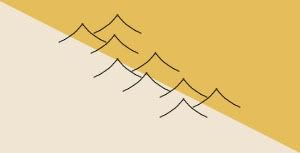
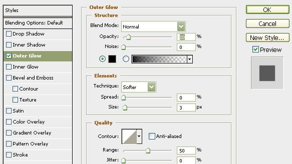
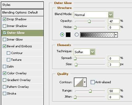
RjBeals wrote:try a little black outer glow. It does wonders to make the icons stand out. See image below. The only difference between the right from left is outer glow.
Again, courtesy of Rj
.44
Moderator: Cartographers
![]() by the.killing.44 on Sun Feb 22, 2009 8:31 pm
by the.killing.44 on Sun Feb 22, 2009 8:31 pm
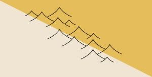
RjBeals wrote:try a little black outer glow. It does wonders to make the icons stand out. See image below. The only difference between the right from left is outer glow.


![]() by LED ZEPPELINER on Mon Feb 23, 2009 10:04 pm
by LED ZEPPELINER on Mon Feb 23, 2009 10:04 pm
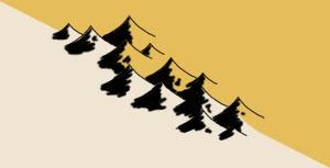
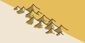
RjBeals wrote:This tutorial is not what I intended - but I'll post it anyway. These mountains sort of came
out abstract and sort of water-color painting style. But I'll post my screenshots and psd
anyway. I just sort of created these as I went.
I started with a background layer. I added a new layer and drew a curved line.
I duplicated that layer, then flipped horizontal, then positioned to make the mountain.
Then I duplicated that layer 9 times, and positioned those mountains so...
Then I added a few smaller mountains.
Then I adjusted the background colors so they were not a hard edge.
Normally a map wouldn't have a hard diagonal line for a border. Also, I didn't add the actual
border along the colors. I forgot, so it looks a little strange with the mountain borders.
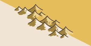
So here I took a 4 or 5 pixel brush and just painted black along the sides of the mountains.
I was being a little quick with my strokes so it would look a little natural. I actually like them
at this point. It looks like a pen and ink style map. Maybe in the Japanese tradition. (New Layer)
And.. looking back, I didn't need to adjust those backgrounds pattern, cause the black covered them anyway.
But instead I added a color to that layer. A brownish color, which is meant to blend into the
color scheme of those 2 map background colors.
I also did something similar to add highlights. This is another new layer. I dropped the opacity also.
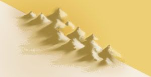
Okay here's where things take a turn. I didn't like the hard borders so I hid the border layer.
The mountains looked okay without. But I wanted them to blend into the map more, so I used
the smudge tool. I just smudged all the edges down to give the effect you see below.
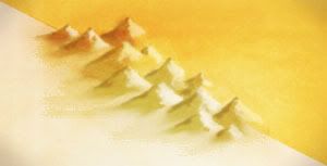
I also added another black shadow layer, which was just a thick brush along the shadow side
of the mountains, lots of gaussian blur, blend as overlay, and opacity real low - like 10 or 20.
Of course, to give it something special I added the grungy overlay to the whole thing.
I'm noticing that many of the newer maps in production have this effect, and they are
looking A+! Anyway - here's what I came up with. Not necessarily great for CC maps, but kind
of cool nevertheless.
Here's the file (zipped PSD CS3): http://www.rjbeals.com/files/mount-rjb.zip


![]() by captainwalrus on Sun Jun 21, 2009 11:32 am
by captainwalrus on Sun Jun 21, 2009 11:32 am


![]() by ManBungalow on Sun Jun 21, 2009 11:35 am
by ManBungalow on Sun Jun 21, 2009 11:35 am
captainwalrus wrote:does anyone have a good tutorial for mountains in GIMP?


![]() by the.killing.44 on Sun Jun 21, 2009 2:04 pm
by the.killing.44 on Sun Jun 21, 2009 2:04 pm
ManBungalow wrote:captainwalrus wrote:does anyone have a good tutorial for mountains in GIMP?
I was about to ask the same question.
![]() by wcaclimbing on Sun Jun 21, 2009 2:11 pm
by wcaclimbing on Sun Jun 21, 2009 2:11 pm
wcaclimbing wrote:how to make realistic terrain (Oasis, Winter):
1. put all your terrain color on one layer. No textures, no shadows, no highlights, just green and brown and whatever colors you need to paint the land. Use different brushes and different opacities to get a good mix of color. Real terrain isn't just flat green. It has bits of brown and grey and black and tan and everything else. Get in just a bit of those colors and things will look much more realistic.
2. Add texture to your land using different textured layers above your terrain color layer. I've found that setting the layers to 'overlay' and using a very low opacity works well. But try out other settings also, you might find one that works better.
3. Use more overlay layers, paint in light/dark spots on that layer. The overlay will make it look more natural. make high parts of the terrain lighter, lower parts darker. Keep your brushes at low opacity so your highlights and shadows don't get too extreme as you paint them in. Build them up gradually with lots of low opacity strokes. An alternative to this would be to copy in different rock textures from your favorite stock image site (I like http://www.cgtextures.com/). Set those to overlay. Just don't over-do it or you'll have a mess of texture that doesn't look real.
4. add water in another layer above all your terrain and texture layers. Use more overlays to make believable slopes down to the water.
These are the most extreme basics. This will give you a good base to work with, but its up to the artist to make it look good.
just remember: DO NOT use built-in filters and effects to make your land look like it has hills and textures in it. That just makes it come out looking fake and too perfect to be real. Stick to overlaying texture images and painting by hand and things will look much more believable. The only exception to this rule is the 'Sandstone' option in the photoshop 'texturizer' filter. That one works well. But be sure to add your own stuff to it. Sandstone looks very boring by itself.


![]() by captainwalrus on Sun Jun 21, 2009 8:42 pm
by captainwalrus on Sun Jun 21, 2009 8:42 pm
![]() by bryguy on Sun Jun 21, 2009 9:12 pm
by bryguy on Sun Jun 21, 2009 9:12 pm
the.killing.44 wrote:ManBungalow wrote:captainwalrus wrote:does anyone have a good tutorial for mountains in GIMP?
I was about to ask the same question.
viewtopic.php?f=127&t=73566&start=15#p1316716
Part 8.
.44

![]() by bryguy on Sun Jun 21, 2009 9:13 pm
by bryguy on Sun Jun 21, 2009 9:13 pm
wcaclimbing wrote:Just posting something I wrote out for Bryguy a few days ago.wcaclimbing wrote:how to make realistic terrain (Oasis, Winter):
1. put all your terrain color on one layer. No textures, no shadows, no highlights, just green and brown and whatever colors you need to paint the land. Use different brushes and different opacities to get a good mix of color. Real terrain isn't just flat green. It has bits of brown and grey and black and tan and everything else. Get in just a bit of those colors and things will look much more realistic.
2. Add texture to your land using different textured layers above your terrain color layer. I've found that setting the layers to 'overlay' and using a very low opacity works well. But try out other settings also, you might find one that works better.
3. Use more overlay layers, paint in light/dark spots on that layer. The overlay will make it look more natural. make high parts of the terrain lighter, lower parts darker. Keep your brushes at low opacity so your highlights and shadows don't get too extreme as you paint them in. Build them up gradually with lots of low opacity strokes. An alternative to this would be to copy in different rock textures from your favorite stock image site (I like http://www.cgtextures.com/). Set those to overlay. Just don't over-do it or you'll have a mess of texture that doesn't look real.
4. add water in another layer above all your terrain and texture layers. Use more overlays to make believable slopes down to the water.
These are the most extreme basics. This will give you a good base to work with, but its up to the artist to make it look good.
just remember: DO NOT use built-in filters and effects to make your land look like it has hills and textures in it. That just makes it come out looking fake and too perfect to be real. Stick to overlaying texture images and painting by hand and things will look much more believable. The only exception to this rule is the 'Sandstone' option in the photoshop 'texturizer' filter. That one works well. But be sure to add your own stuff to it. Sandstone looks very boring by itself.
![]() by bryguy on Sun Jun 21, 2009 10:07 pm
by bryguy on Sun Jun 21, 2009 10:07 pm
![]() by el-presidente on Tue Jul 28, 2009 4:36 pm
by el-presidente on Tue Jul 28, 2009 4:36 pm

![]() by bryguy on Wed Jul 29, 2009 10:35 am
by bryguy on Wed Jul 29, 2009 10:35 am
el-presidente wrote:I guess I'm just really bad with that sort of thing, but I couldn't get any of those to work. I couldn't get any of the new filters or anything.
![]() by MrBenn on Fri Nov 20, 2009 8:00 am
by MrBenn on Fri Nov 20, 2009 8:00 am
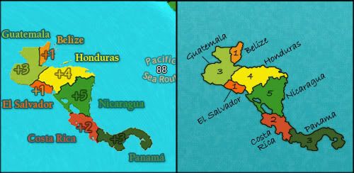
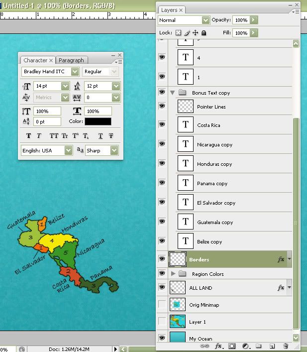
RjBeals wrote:LG asked if I would try and help with the mini-map. Here's something I threw together this morning...
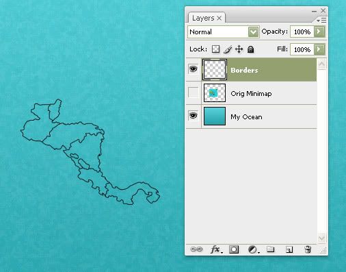
I start with a 1-pixel black round hard brush. Have the satellite map graphic on it’s own bottom layer. Zoom in a good bit and start tracing the borders. The “curviness” of the coastline is your call.
I’ve lowered the opacity of the base maps layer to about 35% - enough so I can see the image, but my new borders will stand out more.
I use a standard mouse. Try to move it your arm/wrist smoothly when tracing.
Also in Photoshop, you can move the canvas by holding the spacebar and moving your mouse. It helps when you’re zoomed in real close.
- Click image to enlarge.
- Click image to enlarge.
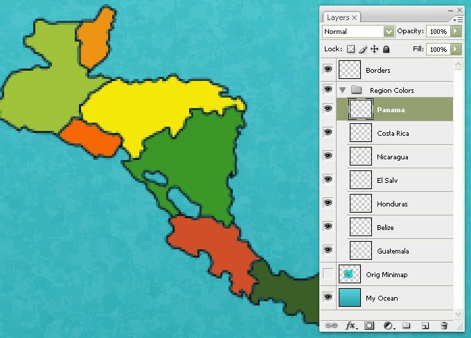
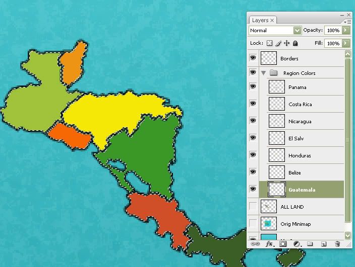
Next I’ll start a new layer for each of the bonus regions colors. You can either use a paint brush to color the regions, or the magic wand selection tool. I used the magic wand for this example. You can use the eye-dropper tool to match the big maps colors, or if you have a color pallet made, use that.
- Click image to enlarge.
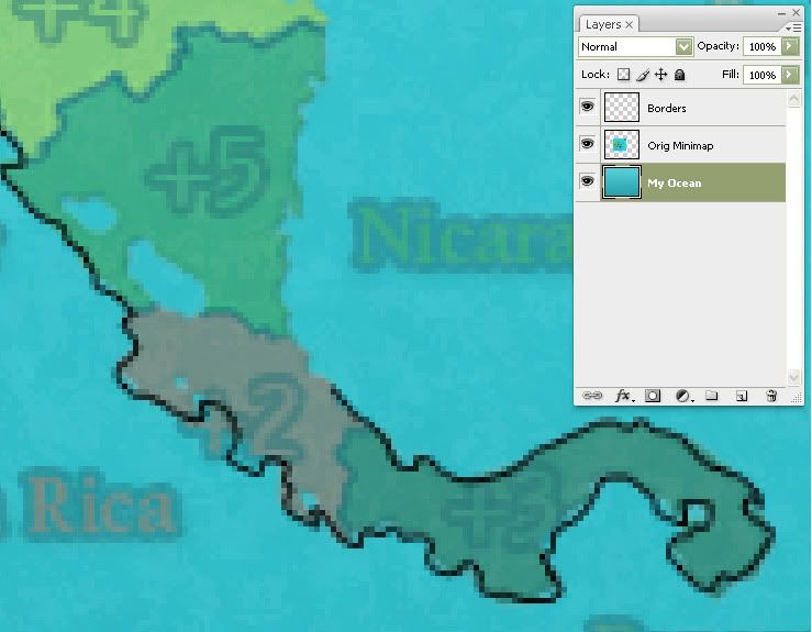
Now I have all my regions colored and on separate layers. I’m now going to ctrl-shift select all those layers so I end up with all the lands selected (First image below, before expanding by 1-pixel). Then I will go to Select > Modify > Expand by 1 pixel. It may be under a different drop-down menu, but you should find "expand" somewhere under the select menu. I will make a new layer and call it ALL LAND. I will fill this with a dark green. This layer is underneath the other color layers. I also add a very slight outer glow to this layer. This will give a well defined coast line and help the map stand out from the oceans.
- Click image to enlarge.
- Click image to enlarge.
That gives you your land. Next just play around with the font until you’re happy. I normally like crisp black text. I found it hard to position the text horizontally, so I tilted it all and liked how it looked.
- Click image to enlarge.


![]() by squishyg on Tue Oct 26, 2010 5:04 pm
by squishyg on Tue Oct 26, 2010 5:04 pm

Robinette wrote:Kaskavel wrote:Seriously. Who is the female conqueror of CC?
Depends on what metric you use...
The coolest is squishyg


![]() by RedFlyingGolf on Tue Oct 26, 2010 5:17 pm
by RedFlyingGolf on Tue Oct 26, 2010 5:17 pm
squishyg wrote:using the tutorial i made my own avatar! it took me over an hour...but its a start!

![]() by squishyg on Tue Oct 26, 2010 10:00 pm
by squishyg on Tue Oct 26, 2010 10:00 pm
RedFlyingGolf wrote:squishyg wrote:using the tutorial i made my own avatar! it took me over an hour...
Everybody starts somewhere
--
Here is a VERY good tutorial on how to make a good mountain:
http://www.cartographersguild.com/showt ... ns-in-Gimp
All credit to the author.
Robinette wrote:Kaskavel wrote:Seriously. Who is the female conqueror of CC?
Depends on what metric you use...
The coolest is squishyg
![]() by RedFlyingGolf on Sat Oct 30, 2010 10:50 am
by RedFlyingGolf on Sat Oct 30, 2010 10:50 am
squishyg wrote:RedFlyingGolf wrote:squishyg wrote:using the tutorial i made my own avatar! it took me over an hour...
Everybody starts somewhere
--
Here is a VERY good tutorial on how to make a good mountain:
http://www.cartographersguild.com/showt ... ns-in-Gimp
All credit to the author.
Thanks! Anyone else know of any good tutorials for GIMP newbies? I really need help understanding the basics as this is the first graphics program I've ever worked with.
Users browsing this forum: No registered users
|
|||||||
| Conquer Club is not associated with RISK online in any way. Copyright © 2006-2024 by Big Wham LLC | |||||||