The Citadel [Quenched]
Moderator: Cartographers
Re: The Citadel Map V5 (Pg1+4) Graphical Touchups
![]() by Unit_2 on Tue Apr 01, 2008 10:04 pm
by Unit_2 on Tue Apr 01, 2008 10:04 pm
That is really nice, but you might want to change the text from Italic to normul.

-

 Unit_2
- Posts: 1834
- Joined: Sun Jan 14, 2007 12:59 pm
- Location: Pennsylvania, U.S.A, North America, Earth, Milky Way, Universe.


Re: The Citadel Map V5 (Pg1+4) Graphical Touchups
![]() by CatfishJohnson on Tue Apr 01, 2008 10:08 pm
by CatfishJohnson on Tue Apr 01, 2008 10:08 pm
and not just normal, normal with a U
-

CatfishJohnson
- Posts: 137
- Joined: Tue Feb 19, 2008 3:47 pm
- Location: Michigan


Re: The Citadel Map V4 (Pg1+3) Texturized
![]() by cairnswk on Wed Apr 02, 2008 3:14 pm
by cairnswk on Wed Apr 02, 2008 3:14 pm
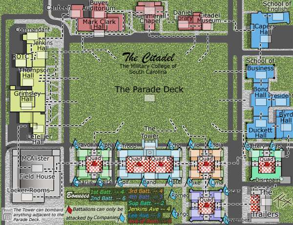
TaCKtix, thanks for contacting me via PM. i've read through the thread and I have a few observations, and i am going to be blunt about your map. Please forgive, but i have to be for you to benefit.
As to why not a lot of people are commenting, I have the same problem, with commenting in general being quite slow at the moment....we've lost some controversial figureheads who don't comment so much anymore and i think this has caused some downturn. Plus the number of maps in progress now means so much more for people to comment on, and not every map made is going to be for everyone.
I would be very careful making statements like this with your first map. You obviously have some skills in graphics but don't be so arrogant as to think you won't have to change things because if a lot of commentors want the change, and you aren't prepared to make those changes it will hold your map up. Also it may give people the impression of "why should i comment because this guy is not going to take any notice of my requests". Keep a little humility about your replies, you need people to help progress your map, not push them away.
For me, your version 5 hurts my eyes completely...there is so much going on on the map that i find it very difficult to take in and decipher upon initial viewing.
1. i find that while the texture of the grass is good, its too glaring and contrasting with everything else, and for me conflicts with attack lines. can you reduce the opacity to tone it down?
2. you have a lot of black everything - font, outlines, ashphalt, and everything has a glow. can you not use the colours on the buildings like in regular maps with continents to distinguish them
3. the checker pattern - everytime i see this map i expect Mel Brooks and Madelaine Kahn to break out in the Hitler Rap and wait on the "tables" serving Bratwurst, bread and beer. It really does remind me of a Bavarian outdoor Cafe, with Heidi in her short skirt serving tables and the Oompah Band boys playing in the corner.....in short it doesn't look like a "plan" of buildings with that pattern. best advice there....change it.
4. why have you got the blue flags in the background of the army shadows? you won't see them when there are numbers sitting over the top of them when gameplay is underway. you need to come up with something alternative to that....maybe keep the flags but place them outside the army circles, or move the army circles.
5. i appreciate what you've tried to do with the attack lines, with the white edging around the black dashes. because a lot of the map is light gray, this doesn't work well for me coz there are such a lot of other black lines separating terts...it is very confusing. Perhaps follow the example of CCU map and have the paths between buildings as attack/connection lines. Field House doesn't look too bad, but the rest with attack lines, grey buildings and grey side path areas...my nightmare! Sorry.
6. the title and bonus areas need severe work. not only can i hardly read it on that grass background, but it's also too small. look as some of already quenched maps and see that legend and titles need to be very distinguishable from the rest of the map. give the legend a defined area of its own with the flavour of the map.
I hope this helps. While it may feel like an attack on your work, it will help to better the map and design, and might create more interest for you. I'll return later to see what you've come up with.
As to why not a lot of people are commenting, I have the same problem, with commenting in general being quite slow at the moment....we've lost some controversial figureheads who don't comment so much anymore and i think this has caused some downturn. Plus the number of maps in progress now means so much more for people to comment on, and not every map made is going to be for everyone.
TaCktiX wrote:Version 5
Things that are NOT changing, so don't ask:
I would be very careful making statements like this with your first map. You obviously have some skills in graphics but don't be so arrogant as to think you won't have to change things because if a lot of commentors want the change, and you aren't prepared to make those changes it will hold your map up. Also it may give people the impression of "why should i comment because this guy is not going to take any notice of my requests". Keep a little humility about your replies, you need people to help progress your map, not push them away.
- Attack line look (simple, easy to understand as is)
- The continent names being on the map instead of in a secluded section
Discussion Points:
- Aren't the bonuses nice and easy to understand now? Are the values good?
- Are territory names now clear?
- Good color changes to Avenue of Remembrance and Lee Avenue?
For me, your version 5 hurts my eyes completely...there is so much going on on the map that i find it very difficult to take in and decipher upon initial viewing.
1. i find that while the texture of the grass is good, its too glaring and contrasting with everything else, and for me conflicts with attack lines. can you reduce the opacity to tone it down?
2. you have a lot of black everything - font, outlines, ashphalt, and everything has a glow. can you not use the colours on the buildings like in regular maps with continents to distinguish them
3. the checker pattern - everytime i see this map i expect Mel Brooks and Madelaine Kahn to break out in the Hitler Rap and wait on the "tables" serving Bratwurst, bread and beer. It really does remind me of a Bavarian outdoor Cafe, with Heidi in her short skirt serving tables and the Oompah Band boys playing in the corner.....in short it doesn't look like a "plan" of buildings with that pattern. best advice there....change it.
4. why have you got the blue flags in the background of the army shadows? you won't see them when there are numbers sitting over the top of them when gameplay is underway. you need to come up with something alternative to that....maybe keep the flags but place them outside the army circles, or move the army circles.
5. i appreciate what you've tried to do with the attack lines, with the white edging around the black dashes. because a lot of the map is light gray, this doesn't work well for me coz there are such a lot of other black lines separating terts...it is very confusing. Perhaps follow the example of CCU map and have the paths between buildings as attack/connection lines. Field House doesn't look too bad, but the rest with attack lines, grey buildings and grey side path areas...my nightmare! Sorry.
6. the title and bonus areas need severe work. not only can i hardly read it on that grass background, but it's also too small. look as some of already quenched maps and see that legend and titles need to be very distinguishable from the rest of the map. give the legend a defined area of its own with the flavour of the map.
I hope this helps. While it may feel like an attack on your work, it will help to better the map and design, and might create more interest for you. I'll return later to see what you've come up with.

* Pearl Harbour * Waterloo * Forbidden City * Jamaica * Pot Mosbi
-

cairnswk
- Posts: 11510
- Joined: Sat Feb 03, 2007 8:32 pm
- Location: Australia


Re: The Citadel Map V4 (Pg1+3) Texturized
![]() by TaCktiX on Wed Apr 02, 2008 5:46 pm
by TaCktiX on Wed Apr 02, 2008 5:46 pm
cairnswk wrote:TaCKtix, thanks for contacting me via PM. i've read through the thread and I have a few observations, and i am going to be blunt about your map. Please forgive, but i have to be for you to benefit.
As to why not a lot of people are commenting, I have the same problem, with commenting in general being quite slow at the moment....we've lost some controversial figureheads who don't comment so much anymore and i think this has caused some downturn. Plus the number of maps in progress now means so much more for people to comment on, and not every map made is going to be for everyone.TaCktiX wrote:Version 5
Things that are NOT changing, so don't ask:
I would be very careful making statements like this with your first map. You obviously have some skills in graphics but don't be so arrogant as to think you won't have to change things because if a lot of commentors want the change, and you aren't prepared to make those changes it will hold your map up. Also it may give people the impression of "why should i comment because this guy is not going to take any notice of my requests". Keep a little humility about your replies, you need people to help progress your map, not push them away.
Yeah, I suppose I just got a little bugged out with all of the "change this, no change it back to that" feedback.
cairnswk wrote:- Attack line look (simple, easy to understand as is)
- The continent names being on the map instead of in a secluded sectionDiscussion Points:
- Aren't the bonuses nice and easy to understand now? Are the values good?
- Are territory names now clear?
- Good color changes to Avenue of Remembrance and Lee Avenue?
For me, your version 5 hurts my eyes completely...there is so much going on on the map that i find it very difficult to take in and decipher upon initial viewing.
1. i find that while the texture of the grass is good, its too glaring and contrasting with everything else, and for me conflicts with attack lines. can you reduce the opacity to tone it down?
Opacity will be applied.
cairnswk wrote:2. you have a lot of black everything - font, outlines, ashphalt, and everything has a glow. can you not use the colours on the buildings like in regular maps with continents to distinguish them
I suppose I'll colorize the buildings. Shouldn't take me long, but I liked the idea that I was re-creating campus down to a T.
3. the checker pattern - everytime i see this map i expect Mel Brooks and Madelaine Kahn to break out in the Hitler Rap and wait on the "tables" serving Bratwurst, bread and beer. It really does remind me of a Bavarian outdoor Cafe, with Heidi in her short skirt serving tables and the Oompah Band boys playing in the corner.....in short it doesn't look like a "plan" of buildings with that pattern. best advice there....change it.
Those are the quadrangles at the center of each battalion. They really are that boldly red and white, but I'll see if I can wash out the color a little bit to make it not stand out so much. Removing the quads would cut the heart and soul of the map out, sadly.
4. why have you got the blue flags in the background of the army shadows? you won't see them when there are numbers sitting over the top of them when gameplay is underway. you need to come up with something alternative to that....maybe keep the flags but place them outside the army circles, or move the army circles.
I'll move the flags. Thank goodness I saved the flag picture. Putting them next to the company shouldn't be that hard to pull off, and I won't have to kill myself trying to clarify what a company and what a battalion is.
5. i appreciate what you've tried to do with the attack lines, with the white edging around the black dashes. because a lot of the map is light gray, this doesn't work well for me coz there are such a lot of other black lines separating terts...it is very confusing. Perhaps follow the example of CCU map and have the paths between buildings as attack/connection lines. Field House doesn't look too bad, but the rest with attack lines, grey buildings and grey side path areas...my nightmare! Sorry.
6. the title and bonus areas need severe work. not only can i hardly read it on that grass background, but it's also too small. look as some of already quenched maps and see that legend and titles need to be very distinguishable from the rest of the map. give the legend a defined area of its own with the flavour of the map.
Colorizing the continents and removing the pure sanctity of the Parade Deck (read: title and information will go on it now). I set out that little bonus box at the bottom (on actual campus the Mess Hall is located there) intending for it to be enough, but I suppose not. I'll mess around with where titles and stuff are and make it "bigger."
I hope this helps. While it may feel like an attack on your work, it will help to better the map and design, and might create more interest for you. I'll return later to see what you've come up with.
I WANT sharp criticism. This is the Foundry after all. If my maps don't go through a crucible of harsh criticism I won't feel like I've earned the Quench.
-

TaCktiX
- Posts: 2392
- Joined: Mon Dec 17, 2007 8:24 pm
- Location: Rapid City, SD


Re: The Citadel Map V5 (Pg1+4) Graphical Touchups
![]() by CatfishJohnson on Wed Apr 02, 2008 9:10 pm
by CatfishJohnson on Wed Apr 02, 2008 9:10 pm
So the question is how will 6 look like
-
CatfishJohnson
- Posts: 137
- Joined: Tue Feb 19, 2008 3:47 pm
- Location: Michigan
Re: The Citadel Map V5 (Pg1+4) Graphical Touchups
![]() by mibi on Wed Apr 02, 2008 10:44 pm
by mibi on Wed Apr 02, 2008 10:44 pm
I WANT sharp criticism. This is the Foundry after all. If my maps don't go through a crucible of harsh criticism I won't feel like I've earned the Quench.
This map looks like someone pulled a beta version of CCU out of the garbage and proceeded to regurgitate botched photoshop tutorials all over it. Not only is this map an insult to the sighted community but the game play has been done before and done better, which completely removes any real reason for this map to exist, except for those among us who are military fetishists with low standards and I wouldn't even want those commendable souls to be condemned to a gaming experience so 3rd, 4th, and 5th rate as this reiterated graphical compost heap of bad taste.
My advice, take this map back to the drawing board, take the drawing board back to Ikea, and exchange it for one of those nifty couches so at least one of us will rest easy knowing something this reckless will never get into live play.
Last edited by mibi on Thu Apr 03, 2008 8:16 am, edited 1 time in total.
-

mibi
- Posts: 3350
- Joined: Thu Mar 01, 2007 8:19 pm
- Location: The Great State of Vermont

Re: The Citadel Map V5 (Pg1+4) Graphical Touchups
![]() by CatfishJohnson on Wed Apr 02, 2008 11:06 pm
by CatfishJohnson on Wed Apr 02, 2008 11:06 pm
heh, nice man, i like how u wait to dis people after they have been given GOOD critisim, i mean so is ur life focused solely on being a dick and trashing people, i personally think ur iraq map sucks ballz so yeah, just saying, u trash a lot, its kinda sad..:\
-
CatfishJohnson
- Posts: 137
- Joined: Tue Feb 19, 2008 3:47 pm
- Location: Michigan
Re: The Citadel Map V5 (Pg1+4) Graphical Touchups
![]() by TaCktiX on Wed Apr 02, 2008 11:12 pm
by TaCktiX on Wed Apr 02, 2008 11:12 pm
mibi wrote:I WANT sharp criticism. This is the Foundry after all. If my maps don't go through a crucible of harsh criticism I won't feel like I've earned the Quench.
This map looks like someone pulled a beta version of CCU out of the garbage and proceeded to regurgitate botched photoshop tutorials all over it. Not only is this map and insult to the sighted community but the game play has been done before and done better, which completely removes any real reason for this map to exist, except for those among us who are military fetishists with low standards and I wouldn't even want those commendable souls to be condemned to a gaming experience so 3rd, 4th, and 5th rate as this reiterated graphical compost heap of bad taste.
My advice, take this map back to the drawing board, take the drawing board back to Ikea, and exchange it for one of those nifty couches so at least one of us will rest easy knowing something this reckless will never get into live play.
Yep, my map is now legitimate. Mibi thrashed the ever-living crap out of it. *gets back to work on Version 6*
-
TaCktiX
- Posts: 2392
- Joined: Mon Dec 17, 2007 8:24 pm
- Location: Rapid City, SD
Re: The Citadel Map V5 (Pg1+4) Graphical Touchups
![]() by mibi on Wed Apr 02, 2008 11:19 pm
by mibi on Wed Apr 02, 2008 11:19 pm
CatfishJohnson wrote:heh, nice man, i like how u wait to dis people after they have been given GOOD critisim, i mean so is ur life focused solely on being a dick and trashing people, i personally think ur iraq map sucks ballz so yeah, just saying, u trash a lot, its kinda sad..:\
I actually wait until a map reaches a maximum velocity of crappiness before I 'trash' it. My criticism is often only constructive in relation to the grand scheme of things. I usually save the minutia for something that might actually have a chance at live play.
Also, feel free to comment in the Iraq thread, I am eager to know how I can reduce the ballz sucking aspect.
-
mibi
- Posts: 3350
- Joined: Thu Mar 01, 2007 8:19 pm
- Location: The Great State of Vermont
Re: The Citadel Map V5 (Pg1+4) Graphical Touchups
![]() by CatfishJohnson on Thu Apr 03, 2008 12:22 am
by CatfishJohnson on Thu Apr 03, 2008 12:22 am
I honestly dont care when u do it, ur still a dick, people put their heart and effort into something and then u flat out Skull**** it so yeah, just saying man, if u give critisizim put some meat beyond it rather then it was regurgitated and ate again or whatever which is obviously where your people skills went so yeah, ive seen terrorists that had more respect to the people they blow up then u do to others so yeah, im dont sorry tactix that this happend on ur threat, the map is tight, little things but good, this guy just needed to be told shit so yeah sorry again, and sorry admins for wasting ur time probably deleting this...
-
CatfishJohnson
- Posts: 137
- Joined: Tue Feb 19, 2008 3:47 pm
- Location: Michigan
Re: The Citadel Map V5 (Pg1+4) Graphical Touchups
![]() by mibi on Thu Apr 03, 2008 8:21 am
by mibi on Thu Apr 03, 2008 8:21 am
TaCktiX wrote:mibi wrote:I WANT sharp criticism. This is the Foundry after all. If my maps don't go through a crucible of harsh criticism I won't feel like I've earned the Quench.
This map looks like someone pulled a beta version of CCU out of the garbage and proceeded to regurgitate botched photoshop tutorials all over it. Not only is this map and insult to the sighted community but the game play has been done before and done better, which completely removes any real reason for this map to exist, except for those among us who are military fetishists with low standards and I wouldn't even want those commendable souls to be condemned to a gaming experience so 3rd, 4th, and 5th rate as this reiterated graphical compost heap of bad taste.
My advice, take this map back to the drawing board, take the drawing board back to Ikea, and exchange it for one of those nifty couches so at least one of us will rest easy knowing something this reckless will never get into live play.
Yep, my map is now legitimate. Mibi thrashed the ever-living crap out of it. *gets back to work on Version 6*
lol, it's nothing personal of course. You have the right attitude though, and just might be capable of seeing this through. Good luck.
-
mibi
- Posts: 3350
- Joined: Thu Mar 01, 2007 8:19 pm
- Location: The Great State of Vermont
Re: The Citadel Map V5 (Pg1+4) Graphical Touchups
![]() by benny profane on Thu Apr 03, 2008 9:13 am
by benny profane on Thu Apr 03, 2008 9:13 am
sorry, but i don't see any significant difference between this and CCU.
what is the reason for this map?
what is the reason for this map?
-

benny profane
- Posts: 248
- Joined: Sat Jun 16, 2007 4:00 pm
- Location: Brooklyn, NY


Re: The Citadel Map V5 (Pg1+4) Graphical Touchups
![]() by TaCktiX on Thu Apr 03, 2008 9:56 am
by TaCktiX on Thu Apr 03, 2008 9:56 am
Personal reasons: I think my college campus (not some fabricated pseudo-campus) is unique in many ways. I also have a ton of friends at this school, most of which think doing this map is one of the coolest things they've seen at this school. One thing they appreciate that I know most Foundry visitors will not is how close I am to the actual look of campus (bird's eye view, of course). If you see it on the map, that's virtually where it is in actuality, and that ring of authenticity CCU frankly lacks.
One thing I WISH I could do that map size constraints have kept me from is doing the entirety of campus to full justice. I had to cut it down to purely around the Deck so that it would fit within 600 pixels. With it cut down, it looks scarily like CCU if you're looking for similarities.
On that vein though, it's CCU on steroids in structure. Everything connects to everything else. I think the furthest degree of separation possible from one side of the map to the other is 6 territories (Avenue of Remembrance to 4th Battalion Quad). The Quad with only 6 territories connecting, most easily blockaded against it? Try 13 on the Parade Deck. Continents with one or two chokepoints? Not on this map. It's the sheer overdrive connections that I think will end up separating this map out from CCU and others, not the military college theme.
By the way, my To Do list for Version 6:
- Colorize continents
- Drop nearly all glow around the map
- Move company flags and army circles around to become clearer to understand
- Resize bonuses and unique features so they're readable without a magnifying glass
- Some other things I'm forgetting
Done already:
- Changed opacity of grass, asphalt, and sidewalks
- Moved the title of the map to the Parade Deck
-
TaCktiX
- Posts: 2392
- Joined: Mon Dec 17, 2007 8:24 pm
- Location: Rapid City, SD
Re: The Citadel Map V5 (Pg1+4) Graphical Touchups
![]() by benny profane on Thu Apr 03, 2008 10:47 am
by benny profane on Thu Apr 03, 2008 10:47 am
your points are valid (except i don't agree that this is "CCU on steroids")...
but, in my opinion, the differences are insufficient to truly make this map stand apart.
sorry i can't be of more help.
good luck.
but, in my opinion, the differences are insufficient to truly make this map stand apart.
sorry i can't be of more help.
good luck.
-
benny profane
- Posts: 248
- Joined: Sat Jun 16, 2007 4:00 pm
- Location: Brooklyn, NY
Re: The Citadel Map V5 (Pg1+4) Graphical Touchups
![]() by CatfishJohnson on Fri Apr 04, 2008 1:15 am
by CatfishJohnson on Fri Apr 04, 2008 1:15 am
i think that it is, i mean its gameplay is alot different and it isnt genaric, like OMFG u took the parking lot, it adds realizom and personality into it which makes in, imo, worthy of play fo sho
-
CatfishJohnson
- Posts: 137
- Joined: Tue Feb 19, 2008 3:47 pm
- Location: Michigan
Re: The Citadel Map V5 (Pg1+4) Graphical Touchups
![]() by TaCktiX on Fri Apr 04, 2008 10:39 am
by TaCktiX on Fri Apr 04, 2008 10:39 am
Version 6
Updates: (and I know I'm forgetting some)
- Removed all glow on the map
- Recolored all territories their continent color
- Moved the title of the map to the Parade Deck
- Enlarged and moved Bonuses and unique features
- Moved Company flags to be immediately behind Company names
- Added text to Quads
- Changed all army circles to army squares
- Renamed President's Office to President
- Removed all continent names from the map (aside from Bonuses)
- Tidied up attack routes
- Altered Support Battalion bonus to 2
- Altered 4th Battalion bonus to 3
- Faded the background so it's not competing for readability
- Switched continent colors of Lee Avenue and the Avenue of Remembrance (Summerall Chapel's roof is red)
-
TaCktiX
- Posts: 2392
- Joined: Mon Dec 17, 2007 8:24 pm
- Location: Rapid City, SD
Re: The Citadel Map V6 (Pg1+5) Graphical Overhaul
![]() by CatfishJohnson on Fri Apr 04, 2008 3:06 pm
by CatfishJohnson on Fri Apr 04, 2008 3:06 pm
damn nice, looks purdy meow
-
CatfishJohnson
- Posts: 137
- Joined: Tue Feb 19, 2008 3:47 pm
- Location: Michigan
Re: The Citadel Map V6 (Pg1+5) Graphical Overhaul
![]() by mibi on Fri Apr 04, 2008 7:34 pm
by mibi on Fri Apr 04, 2008 7:34 pm
You need to address the serious readability issues before you go any further.
-
mibi
- Posts: 3350
- Joined: Thu Mar 01, 2007 8:19 pm
- Location: The Great State of Vermont
Re: The Citadel Map V6 (Pg1+5) Graphical Overhaul
![]() by TaCktiX on Fri Apr 04, 2008 7:36 pm
by TaCktiX on Fri Apr 04, 2008 7:36 pm
Yes, I need some help resolving that. I know I've got the map space to have it readable, but I need some good suggestions as to what I should use to buffer text. What you see there is a 50% opacity white box erased to form-fit with the letters, and that doesn't work in all cases. Any tips?
-
TaCktiX
- Posts: 2392
- Joined: Mon Dec 17, 2007 8:24 pm
- Location: Rapid City, SD
Re: The Citadel Map V6 (Pg1+5) Graphical Overhaul
![]() by Kaplowitz on Sat Apr 05, 2008 10:31 am
by Kaplowitz on Sat Apr 05, 2008 10:31 am
I think you should get rid of the red and white checkered places. Maybe lose the realism for the readability, at least just to see how it looks.

-

Kaplowitz
- Posts: 3088
- Joined: Tue May 01, 2007 5:11 pm


Re: The Citadel Map V5 (Pg1+4) Graphical Touchups
![]() by naranie on Sat Apr 05, 2008 12:13 pm
by naranie on Sat Apr 05, 2008 12:13 pm
TaCktiX wrote:Version 6
That map is nice and cool!
-

naranie
- Posts: 3
- Joined: Mon Mar 05, 2007 5:04 pm
Re: The Citadel Map V6 (Pg1+5) Graphical Overhaul
![]() by gimil on Sun Apr 06, 2008 9:50 am
by gimil on Sun Apr 06, 2008 9:50 am
TaCktiX wrote:Yes, I need some help resolving that. I know I've got the map space to have it readable, but I need some good suggestions as to what I should use to buffer text. What you see there is a 50% opacity white box erased to form-fit with the letters, and that doesn't work in all cases. Any tips?
Why not reduce the big green field in the middle
What do you know about map making, bitch?
Top Score:2403
natty_dread wrote:I was wrong
Top Score:2403
-

gimil
- Posts: 8599
- Joined: Sat Mar 03, 2007 12:42 pm
- Location: United Kingdom (Scotland)


Re: The Citadel Map V6 (Pg1+5) Graphical Overhaul
![]() by TaCktiX on Sun Apr 06, 2008 7:31 pm
by TaCktiX on Sun Apr 06, 2008 7:31 pm
gimil wrote:Why not reduce the big green field in the middle
The entire map is to-scale. The rest of the map keys off of the size of the "big green field in the middle" and I'd have to resize every other building (exacerbating the readability problem, not fixing it) if I messed with the Deck.
I'm going to release a couple beta Version 7's tomorrow, one eliminating the red and white on the quads entirely (not preferred, makes a big huge empty space), one putting them under heavy wash-out (like 33-50% opacity, compared with their 100% now). I'm also going to go whole-hog on the white opacity boxes instead of form-fitting them, which creates more problems than it solves. And maybe a few font size increases. I kept them all the same after the overhaul, and there's plenty of space to make them larger now.
-
TaCktiX
- Posts: 2392
- Joined: Mon Dec 17, 2007 8:24 pm
- Location: Rapid City, SD
Re: The Citadel Map V5 (Pg1+4) Graphical Touchups
![]() by RjBeals on Mon Apr 07, 2008 1:25 pm
by RjBeals on Mon Apr 07, 2008 1:25 pm
TaCktiX wrote:
I'm glad that you're sticking through with this map Tac, but I'm not really getting it so far. I appreciate that you've attended this school and have strong personal feeling for it, but the rest of the world could probably care less. That's kind of why I abandoned my Charleston, SC map. I love the city, and thought it would make a great map, but as much as I love it, most people have never heard of it. I just couldn't get the support.
On the other hand, you seem to have more buzz around this map than I had with mine. And you're taking the constructive critisism pretty well. So that's good. But here's my 2 cents.
- I think the grass has to be toned down some, or if you would prefer, take it out from the background behind the legend and the text on the field. It's just too distracting (overall).
- It took me a while to find where the tower was. Is there a way you could make it stand out a little more?
- The whole bottom 1/3 of the screen looks very confusing. The checkerboard pattern doesn't help either. There are too many flags / dotted-lines and hard to read words that don't have any kind of flow. I wouldn't stand a chance at this map without bob script help.
- The red flags ontop of the checkerboard don't work. When you put armies on top of this, it will be way too confusing.
- so does the parade deck get an autodeploy bonus every turn? It should.
- Your other buildings look fine, with good colors and good use of shadows, and walkways.
- try bringing your building name font down a bit. It looks a little too big now. Use a plain font like tahoma or arial. You may want to take the anti-aliasing off and just make it like 8pt. italic with 1 pt. white stroke / or something very plain. I kind of don't like how some names are larger font than others, even when the words still are overlapping the building outlines.

-

RjBeals
- Posts: 2506
- Joined: Mon Nov 20, 2006 5:17 pm
- Location: South Carolina, USA


Re: The Citadel Map V5 (Pg1+4) Graphical Touchups
![]() by TaCktiX on Mon Apr 07, 2008 1:44 pm
by TaCktiX on Mon Apr 07, 2008 1:44 pm
RjBeals wrote:TaCktiX wrote:
I'm glad that you're sticking through with this map Tac, but I'm not really getting it so far. I appreciate that you've attended this school and have strong personal feeling for it, but the rest of the world could probably care less. That's kind of why I abandoned my Charleston, SC map. I love the city, and thought it would make a great map, but as much as I love it, most people have never heard of it. I just couldn't get the support.
On the other hand, you seem to have more buzz around this map than I had with mine. And you're taking the constructive critisism pretty well. So that's good. But here's my 2 cents.
Whether it be stubbornness or patience, only time will tell.
RjBeals wrote:I think the grass has to be toned down some, or if you would prefer, take it out from the background behind the legend and the text on the field. It's just too distracting (overall).
I think I'm going to opt for Black 50% Opacity boxes with white text around the entire map. That way it's clearly readable universally. I'd like to replace the legend background, but I have no idea what to put there that would be "appropriate" to the map theme. Ideas shoot them my way.
RjBeals wrote:It took me a while to find where the tower was. Is there a way you could make it stand out a little more?
Behold the upcoming power of Stroke! Or something similar to highlight it. My earlier worry was making sure people could tell "hey, this is part of 2nd and can be attacked 4 ways (both Quads, Echo, F-Troop).
RjBeals wrote:The whole bottom 1/3 of the screen looks very confusing. The checkerboard pattern doesn't help either. There are too many flags / dotted-lines and hard to read words that don't have any kind of flow. I wouldn't stand a chance at this map without bob script help.
The entire thing follows the same adjacency rules, they're just weird. Note on my upcoming version 7 I'm going to alternately eliminate the quads for solid color or tone them down significantly. You'll see the results of both when I post it.
RjBeals wrote:The red flags ontop of the checkerboard don't work. When you put armies on top of this, it will be way too confusing.
The box for the armies is BELOW the red flag. Suppose that's not exactly apparent as it is right now.
RjBeals wrote:so does the parade deck get an autodeploy bonus every turn? It should.
Why should it? It's a territory that can access the rest of the map with ease. Holding it is a privilege all its own. By that argument the people who keep on accusing me of copying CCU should be advocating there be a +1 auto-deploy to the Quad on that map.
RjBeals wrote:Your other buildings look fine, with good colors and good use of shadows, and walkways.
Virtually satellite-accurate.
RjBeals wrote:try bringing your building name font down a bit. It looks a little too big now. Use a plain font like tahoma or arial. You may want to take the anti-aliasing off and just make it like 8pt. italic with 1 pt. white stroke / or something very plain. I kind of don't like how some names are larger font than others, even when the words still are overlapping the building outlines.
A few of the territory names are cramped for space (namely President). The Company names need to be enlarged. In Versions 5 and before, they had to be that small to fit at all, but Version 6 liberated me of a ton of space, so expect a few "bigger" names. Aside from those, all territories are universally 3 point type.
RjBeals wrote:But good luck with the map. We need a good South Carolina map on CC !!
American Civil War and USA don't count? Bummer...
-
TaCktiX
- Posts: 2392
- Joined: Mon Dec 17, 2007 8:24 pm
- Location: Rapid City, SD
Who is online
Users browsing this forum: No registered users
|
|||||||
| Conquer Club is not associated with RISK online in any way. Copyright © 2006-2024 by Big Wham LLC | |||||||