[Abandoned] - Second Punic War
Moderator: Cartographers
65 posts
• Page 2 of 3 • 1, 2, 3
Re: ROMA: Secundum Bellum Punicum (218-202 A.C.)
![]() by Ruben Cassar on Sat Jun 28, 2008 6:34 am
by Ruben Cassar on Sat Jun 28, 2008 6:34 am
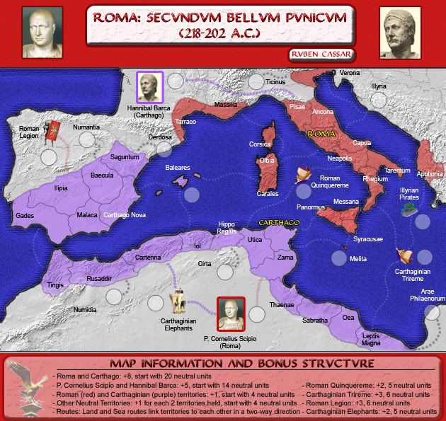
Version 1.10 - Added bonuses and map information section, toned down colour of red background


-

 Ruben Cassar
- Posts: 2160
- Joined: Thu Nov 16, 2006 6:04 am
- Location: Civitas Invicta, Melita, Evropa


Re: ROMA: Second Punic War - Vote in Sea Poll - map on pg. 1 & 2
![]() by Ruben Cassar on Sat Jun 28, 2008 9:53 am
by Ruben Cassar on Sat Jun 28, 2008 9:53 am
As promised here is the poll on the sea colour.
SEA COLOUR POLL
Version 1.10 A
Version 1.10 B
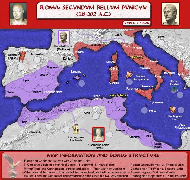
Version 1.10 C
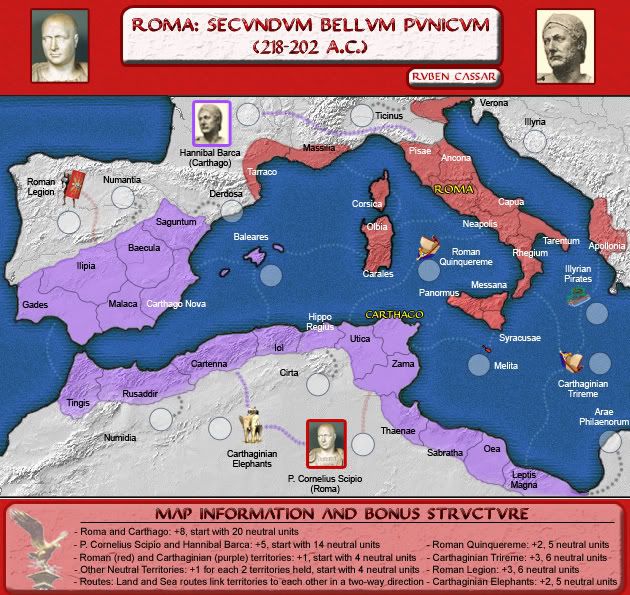
SEA COLOUR POLL
Version 1.10 A
Version 1.10 B
Version 1.10 C
-
Ruben Cassar
- Posts: 2160
- Joined: Thu Nov 16, 2006 6:04 am
- Location: Civitas Invicta, Melita, Evropa
Re: ROMA: Second Punic War - Vote in Sea Poll - map on pg. 1 & 2
![]() by Kaplowitz on Sat Jun 28, 2008 10:21 am
by Kaplowitz on Sat Jun 28, 2008 10:21 am
I love C!

-

Kaplowitz
- Posts: 3088
- Joined: Tue May 01, 2007 5:11 pm


Re: ROMA: Second Punic War - Vote in Sea Poll - map on pg. 1 & 2
![]() by gimil on Sat Jun 28, 2008 10:55 am
by gimil on Sat Jun 28, 2008 10:55 am
C is the winner for me!
What do you know about map making, bitch?
Top Score:2403
natty_dread wrote:I was wrong
Top Score:2403
-

gimil
- Posts: 8599
- Joined: Sat Mar 03, 2007 12:42 pm
- Location: United Kingdom (Scotland)


Re: ROMA: Second Punic War - Vote in Sea Poll - map on pg. 1 & 2
![]() by dittoeevee8888 on Sat Jun 28, 2008 1:01 pm
by dittoeevee8888 on Sat Jun 28, 2008 1:01 pm
I hate C! It's too dull for me (I wouldn't call it Aquamarine but whatever). A and B are both fine for me though. (B preferred)
Too bad I'm the only one voting for B in the 4 people poll so far.
Too bad I'm the only one voting for B in the 4 people poll so far.
-

dittoeevee8888
- Posts: 1107
- Joined: Tue Jan 29, 2008 6:06 pm


Re: ROMA: Second Punic War - Vote in Sea Poll - map on pg. 1 & 2
![]() by ZeakCytho on Sat Jun 28, 2008 5:27 pm
by ZeakCytho on Sat Jun 28, 2008 5:27 pm
My vote goes to C.
-

ZeakCytho
- Posts: 1251
- Joined: Wed Sep 12, 2007 4:36 pm

Re: ROMA: Second Punic War - Vote in Sea Poll - map on pg. 1 & 2
![]() by Ruben Cassar on Tue Jul 01, 2008 2:20 pm
by Ruben Cassar on Tue Jul 01, 2008 2:20 pm
Apart from the sea issue...does anyone have other comments to make about the map or gameplay perhaps?
-
Ruben Cassar
- Posts: 2160
- Joined: Thu Nov 16, 2006 6:04 am
- Location: Civitas Invicta, Melita, Evropa
Re: ROMA: Second Punic War - Vote in Sea Poll - map on pg. 1 & 2
![]() by t-o-m on Tue Jul 01, 2008 2:26 pm
by t-o-m on Tue Jul 01, 2008 2:26 pm
could you find a medium between 10 B and 10 C?
that would be absolute perfect for me
that would be absolute perfect for me
-

t-o-m
- Posts: 2916
- Joined: Sat Mar 22, 2008 2:22 pm


Re: ROMA: Second Punic War - Vote in Sea Poll - map on pg. 1 & 2
![]() by Ruben Cassar on Tue Jul 01, 2008 2:35 pm
by Ruben Cassar on Tue Jul 01, 2008 2:35 pm
t-o-m wrote:could you find a medium between 10 B and 10 C?
that would be absolute perfect for me
I said apart from the sea issue Tom! :p
Honestly I think I'm going to stick with C. It's grown on me and the majority prefer it.
-
Ruben Cassar
- Posts: 2160
- Joined: Thu Nov 16, 2006 6:04 am
- Location: Civitas Invicta, Melita, Evropa
Re: ROMA: Second Punic War - Vote in Sea Poll - map on pg. 1 & 2
![]() by RjBeals on Tue Jul 01, 2008 3:15 pm
by RjBeals on Tue Jul 01, 2008 3:15 pm
C all the way for me!

-

RjBeals
- Posts: 2506
- Joined: Mon Nov 20, 2006 5:17 pm
- Location: South Carolina, USA


Re: ROMA: Second Punic War - Vote in Sea Poll - map on pg. 1 & 2
![]() by t-o-m on Tue Jul 01, 2008 3:46 pm
by t-o-m on Tue Jul 01, 2008 3:46 pm
Ruben Cassar wrote:t-o-m wrote:could you find a medium between 10 B and 10 C?
that would be absolute perfect for me
I said apart from the sea issue Tom! :p
hehe sorry - i think that everyone likes C then, but i prefer a mixture
gl on whatever you pick
-
t-o-m
- Posts: 2916
- Joined: Sat Mar 22, 2008 2:22 pm
Re: ROMA: Second Punic War - Vote in Sea Poll - map on pg. 1 & 2
![]() by wcaclimbing on Tue Jul 01, 2008 4:17 pm
by wcaclimbing on Tue Jul 01, 2008 4:17 pm
I voted for light blue (B).
I think it would work best with the colors (red and purple) on the land in the image.
I see that the water is really pixelated. Would you be able to smooth it out some? right now it is really harsh and doesn't really look like water.
I think it would work best with the colors (red and purple) on the land in the image.
I see that the water is really pixelated. Would you be able to smooth it out some? right now it is really harsh and doesn't really look like water.

-

wcaclimbing
- Posts: 5598
- Joined: Fri May 12, 2006 10:09 pm
- Location: In your quantum box....Maybe.


Re: ROMA: Second Punic War - Vote in Sea Poll - map on pg. 1 & 2
![]() by Ruben Cassar on Tue Jul 01, 2008 4:26 pm
by Ruben Cassar on Tue Jul 01, 2008 4:26 pm
Ruben Cassar wrote:Apart from the sea issue...does anyone have other comments to make about the map or gameplay perhaps?
-
Ruben Cassar
- Posts: 2160
- Joined: Thu Nov 16, 2006 6:04 am
- Location: Civitas Invicta, Melita, Evropa
Re: ROMA: Second Punic War - Vote in Sea Poll - map on pg. 1 & 2
![]() by ZeakCytho on Tue Jul 01, 2008 4:29 pm
by ZeakCytho on Tue Jul 01, 2008 4:29 pm
Ruben Cassar wrote:Ruben Cassar wrote:Apart from the sea issue...does anyone have other comments to make about the map or gameplay perhaps?

I think the sea could use some work.
On a more serious note, I think the territory name font is a bit small right now, and you certainly have room to make it larger. I also don't like how some names are black and some are white - maybe pick a single color that's legible on all backgrounds instead?
-
ZeakCytho
- Posts: 1251
- Joined: Wed Sep 12, 2007 4:36 pm
Re: ROMA: Second Punic War - Vote in Sea Poll - map on pg. 1 & 2
![]() by Qwert on Tue Jul 01, 2008 4:32 pm
by Qwert on Tue Jul 01, 2008 4:32 pm
A and B its almost same,well to me.
C is best of these three,but i think that can be more contrast,you know darken away from shore,and lighter close to shore.(beaches)
C is best of these three,but i think that can be more contrast,you know darken away from shore,and lighter close to shore.(beaches)

-

Qwert
- SoC Training Adviser
- Posts: 9262
- Joined: Tue Nov 07, 2006 5:07 pm
- Location: VOJVODINA


Re: ROMA: Second Punic War - Vote in Sea Poll - map on pg. 1 & 2
![]() by wcaclimbing on Tue Jul 01, 2008 4:39 pm
by wcaclimbing on Tue Jul 01, 2008 4:39 pm
Ruben Cassar wrote:Ruben Cassar wrote:Apart from the sea issue...does anyone have other comments to make about the map or gameplay perhaps?

Thats what I get for not reading the thread before I comment...
The land texture isn't working, in my mind. I see that it shows all the mountains and everything, its just too light right now. Maybe adjusting the Levels (in photoshop, at least) would help. Maybe making the light grays a bit darker would help.
-
wcaclimbing
- Posts: 5598
- Joined: Fri May 12, 2006 10:09 pm
- Location: In your quantum box....Maybe.
Re: ROMA: Second Punic War - Vote in Sea Poll - map on pg. 1 & 2
![]() by Ruben Cassar on Tue Jul 01, 2008 4:56 pm
by Ruben Cassar on Tue Jul 01, 2008 4:56 pm
ZeakCytho wrote:
I think the sea could use some work.

On a more serious note, I think the territory name font is a bit small right now, and you certainly have room to make it larger. I also don't like how some names are black and some are white - maybe pick a single color that's legible on all backgrounds instead?
Yes, I will work a bit on the font. I'd like to have it one colour but I don't know if that's possible.
However contrary to what you think I don't have much room to make it larger. Remember I need to have space for the armies as well in those territories. I checked and I think it's as large as it can get. It's still legible though as it is.
-
Ruben Cassar
- Posts: 2160
- Joined: Thu Nov 16, 2006 6:04 am
- Location: Civitas Invicta, Melita, Evropa
Re: ROMA: Second Punic War - Vote in Sea Poll - map on pg. 1 & 2
![]() by Ruben Cassar on Tue Jul 01, 2008 5:00 pm
by Ruben Cassar on Tue Jul 01, 2008 5:00 pm
wcaclimbing wrote:Ruben Cassar wrote:Ruben Cassar wrote:Apart from the sea issue...does anyone have other comments to make about the map or gameplay perhaps?
Thats what I get for not reading the thread before I comment...
The land texture isn't working, in my mind. I see that it shows all the mountains and everything, its just too light right now. Maybe adjusting the Levels (in photoshop, at least) would help. Maybe making the light grays a bit darker would help.
Hmm no worries mate.
Err...I don't know...I kind of like the shade of the land texture as it is now. I'll have to think a bit about this.
-
Ruben Cassar
- Posts: 2160
- Joined: Thu Nov 16, 2006 6:04 am
- Location: Civitas Invicta, Melita, Evropa
Re: ROMA: Second Punic War - Vote in Sea Poll - map on pg. 1 & 2
![]() by Ruben Cassar on Wed Jul 02, 2008 3:42 pm
by Ruben Cassar on Wed Jul 02, 2008 3:42 pm
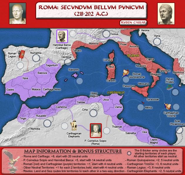
Version 1.11 - Single colour territory font, new info in the bonus and map info section and 8 thicker army circles
-
Ruben Cassar
- Posts: 2160
- Joined: Thu Nov 16, 2006 6:04 am
- Location: Civitas Invicta, Melita, Evropa
Re: ROMA: Second Punic War - Vote in Sea Poll - map on pg. 1 & 2
![]() by oaktown on Wed Jul 02, 2008 3:48 pm
by oaktown on Wed Jul 02, 2008 3:48 pm
poll results:
Which sea colour do you prefer? (Images can be seen on page 1 or page 2)
Version 1.10 A - Dark Blue: 2, 10%
Version 1.10 B - Light Blue: 5, 26%
Version 1.10 C - Aquamarine, 12, 63%
Total votes : 19
Which sea colour do you prefer? (Images can be seen on page 1 or page 2)
Version 1.10 A - Dark Blue: 2, 10%
Version 1.10 B - Light Blue: 5, 26%
Version 1.10 C - Aquamarine, 12, 63%
Total votes : 19
-

oaktown
- Posts: 4451
- Joined: Sun Dec 03, 2006 9:24 pm
- Location: majorcommand

Re: ROMA: Second Punic War - Vote in Sea Poll - map on pg. 1 & 2
![]() by ZeakCytho on Wed Jul 02, 2008 3:51 pm
by ZeakCytho on Wed Jul 02, 2008 3:51 pm
The red background for the top bit of the map (with the title, etc.) is very strong. I don't like the sharp contrast between that and the ocean/land right below it, but maybe others do? Personally, I'd make it a less bold red.
Also, the pictures of people in the title bar (I assume Hannibal and Scipio?) look a bit odd, with one having a white background and the other a grey one. Could you make them constant, preferably both with that grey background? And maybe label the pictures underneath, since you have room.
Someone mentioned this before, and I think I agree now. It looks a bit odd that the sea gets darker closer to land, when real oceans have the opposite effect. I'd keep the deep water the same color it is now and try to lighten the coasts. There's a good chance it will look like crap, though.
Nice job on making the font uniform - it's all legible to me. I'd still like to see it bigger, but you do have some very tight areas, so if you don't think you have room, then keep it as is.
I'm not a huge fan of the purple color used for the Carthaginian territories...is there a specific reason why it's purple? Some other color may work better...maybe green? I like the Roman red.
-
ZeakCytho
- Posts: 1251
- Joined: Wed Sep 12, 2007 4:36 pm
Re: ROMA: Second Punic War - Vote in Sea Poll - map on pg. 1 & 2
![]() by Ruben Cassar on Wed Jul 02, 2008 5:33 pm
by Ruben Cassar on Wed Jul 02, 2008 5:33 pm
ZeakCytho wrote:The red background for the top bit of the map (with the title, etc.) is very strong. I don't like the sharp contrast between that and the ocean/land right below it, but maybe others do? Personally, I'd make it a less bold red.
I toned it down already from the original red. I think I like it as it is.
ZeakCytho wrote:Also, the pictures of people in the title bar (I assume Hannibal and Scipio?) look a bit odd, with one having a white background and the other a grey one. Could you make them constant, preferably both with that grey background? And maybe label the pictures underneath, since you have room.
I think I can make the background similar yes. Hadn't actually thought about that. I can also add the names.
ZeakCytho wrote:Someone mentioned this before, and I think I agree now. It looks a bit odd that the sea gets darker closer to land, when real oceans have the opposite effect. I'd keep the deep water the same color it is now and try to lighten the coasts. There's a good chance it will look like crap, though.
Hmm I am very satisfied with the sea as it is in this new version. The colour and texture are ideal for me and I don't think I will be touching them anymore. Of course I am sure not everyone will like them. It's a matter of personal taste at the end of the day.
ZeakCytho wrote:Nice job on making the font uniform - it's all legible to me. I'd still like to see it bigger, but you do have some very tight areas, so if you don't think you have room, then keep it as is.
Thanks. I'd like it to be bigger as well but I don't think I can. Once I have the XML ready with the army numbers in their appropriate territories I will check if I can increase the size a bit more.
ZeakCytho wrote:I'm not a huge fan of the purple color used for the Carthaginian territories...is there a specific reason why it's purple? Some other color may work better...maybe green? I like the Roman red.
Hmm many of the historical maps I checked out seemed to use red and purple. Romans are most of the time depicted in red. I assume that's because the legions used to wear red. I don't know if the Carthaginians had any specific colour but as I told you many maps depict their territories in purple and I like the colour. Definitely more than green!
Thanks for your comments Zeak. No one has commented on the gameplay so far but I guess that will come at a later stage.
-
Ruben Cassar
- Posts: 2160
- Joined: Thu Nov 16, 2006 6:04 am
- Location: Civitas Invicta, Melita, Evropa
Re: ROMA: Second Punic War - Map on pg. 1 & 3
![]() by Ruben Cassar on Sun Jul 06, 2008 4:12 am
by Ruben Cassar on Sun Jul 06, 2008 4:12 am
Gimil any chance of moving this one to an advanced idea to get a bit more exposure?
I mean I don't like to complain or anything but I think I have all the requirements to get the idea stamp already on this one and I still haven't reached advanced ideas stamp!
I mean I don't like to complain or anything but I think I have all the requirements to get the idea stamp already on this one and I still haven't reached advanced ideas stamp!
-
Ruben Cassar
- Posts: 2160
- Joined: Thu Nov 16, 2006 6:04 am
- Location: Civitas Invicta, Melita, Evropa
Re: ROMA: Second Punic War - Map on pg. 1 & 3
![]() by gimil on Sun Jul 06, 2008 5:48 am
by gimil on Sun Jul 06, 2008 5:48 am
Rubean your such a windge some times!
[adv. idea]
[adv. idea]
What do you know about map making, bitch?
Top Score:2403
natty_dread wrote:I was wrong
Top Score:2403
-
gimil
- Posts: 8599
- Joined: Sat Mar 03, 2007 12:42 pm
- Location: United Kingdom (Scotland)
Re: ROMA: Second Punic War - Map on pg. 1 & 3
![]() by Ruben Cassar on Sun Jul 06, 2008 6:16 am
by Ruben Cassar on Sun Jul 06, 2008 6:16 am
gimil wrote:Rubean your such a windge some times!
[adv. idea]
*pondering what windge means* Gimil...I am still trying to evaluate whether you spell my name wrongly on purpose or whether it's a genuine spelling mistake. I'm sure I will come up with an answer one of these days!
-
Ruben Cassar
- Posts: 2160
- Joined: Thu Nov 16, 2006 6:04 am
- Location: Civitas Invicta, Melita, Evropa
65 posts
• Page 2 of 3 • 1, 2, 3
Who is online
Users browsing this forum: No registered users
|
|||||||
| Conquer Club is not associated with RISK online in any way. Copyright © 2006-2024 by Big Wham LLC | |||||||