Well thanks oaktown. I am honored to be a part of this inaugural test run of the new jury system in the foundry. I think it will be a healthy step in map development and take some of the burden off of the CAs and place it in the hands of others.
When I first saw this map it look very much like it does now. I really like the way it looks overall. For my jury duty, I plan on breaking up the map into individual areas that are as separate as possible. I will list the things I like and the things I feel need to be cleaned up or changed to help enable a good play experience or just to tie up loose ends. Here we go.
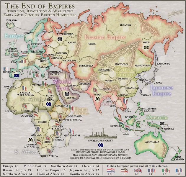
ColorsThe colors are good. The inner glow you have on the different regions stands out well but does not overpower the look of the map. Flags seem easy enough to read and distinguish apart from each other. The legend is lacking in color but I will touch on that in more detail below.
The only things that are directly related to color on the actual map are the inner glows of the Chinese Empire, Southern Africa and So. Asia.
-The Chinese blends too well into the base color of the map. It almost looks like there is not even a glow for that region.
-So. Asia is very close to the Russian Empire color. I am not sure if this will be a problem for colorblind people
-Southern Africa is hard to see and tends to blend in with the background sea color.
Here is a list of the colors you have now:
Red-Russia
Light Red-So. Asia
Orange-Horn
Light Yellow- Chinese
Light Green-AU
Cyan-Europe
Blue-Japan
Purple-Middle East
Brown-N. Africa
Gray-S. Africa
Maybe if you have more variation in the colors it will be easier to distinguish them (especially in the 3 areas I listed above)
Dark Red or Burgundy-So. Asia
Brighter Yellow to help stand out from base land color- Chinese
Darker Gray or Mustard yellow similar to current Chinese-S. Africa
I think that these might help a bit. Plus I don’t think the yellow in Africa will be as bad as China since it is surrounded by gray ocean and not brown mountains.
TextThe region names on the map are easy to read and yet do not overpower the map. They seem to be there when you are looking for them but fade into the background when not interested. The territory names are also very easy to read. However (especially in Europe) some of the black ext blends in with the black territory borders (See Vilno, St. Petersburg, Sweden, etc) Just a suggestion but maybe a slight glow around the text to help break that up might look good. Not a big deal just a suggestion.
TitleI have no complaints on the title. It is simple, easily read, Conveys the purpose, theme and setting for the map. My one question is how you will name this map for the map select screen?
Army CirclesOne of the first things I noticed on the map was how big your army circles were. I measured and I think they are 24 pxl. I first thought that they might not be needed at all but there are some really small territories. I think it is possible to get rid of them 100% by modifying the borders and relocating the flags and text of a few territories.
-Move the Netherlands text and flag up-Room for 88
-Move the Portugal border into Spain a bit- Room for 88
-Move Liberia text down- Room for 88
-On the smaller island territories, just enlarge the land mass a bit- Room for 88
I just think that getting rid of them will help out the maps look. But if that is not possible (for either 88 readability or 88 placements) then I suggest going to a 20 pxl radius circle. It still does the same job as a 24 pxl but is smaller and more easily fits.
LegendThe biggest thing I can say here is that it is too plain. While a player is able to read the text and find the corresponding bonus region on the map, there is still a sense to me that something is lacking. I would suggest adding the color of the bonus region to the text.
This could be done with an outer glow, a colored shape under the bonus value or maybe a colored line behind each name and bonus. Whatever it would turn out to be, I think adding the colors would help visually link the legend and the map.
Borders/MountainsFirst I will talk over the regular black borders. Nothing big here. No major issues and barely any minor ones. The only thing I can see is that the borders up in the Scandinavian area do not touch the other border. Norway/Sweden border does not touch the Finland border and the Finland/St.Petersburg does not touch Norway. Like I said no big deal but I figured I would be thorough. Now onto the mountains.
First off the mountains are an important distinguishing feature that really helps the map out but at the same time I do not like how they look. Don’t get me wrong, I understand the purpose of them and I think that mountains need to be used but the implementation of them just does not feel right. Some of them just look like scars laid over the land (Eastern Russia and Australia). The mountains around China are very nice. I think they look good because they go from mountains to hills to flat land. The colors blend well and the entire image is integrated. The mountains I mentioned above just seen stuff on top of flat land. The ones in eastern Russia look good until the reddish bases don’t blend into the brown base of the map image. Same goes for the AU mountains too. I really think those should just be removed (I posted on that much earlier in the map development)
I would suggest that you take all names and colors and borders off of the map and try to make the mountains look integrated into the base image. Then once they look seamlessly integrated into the look, turn back on your other layers. That way colors and borders will not affect your mountain style.
Also it was mentioned earlier that there is no legend info explaining the mountains are impassable. I think that is needed as well.
Game PlayGame Play looks fine to me. I see no huge problems with it but....those of you who know me best do know that I am not the worlds best GP person. Actually I am not good at all. I can come up with ideas and such but implementation of the final bonuses and borders and such is not my cup of tea. Since that is the case I will not defer judgement to the others in the thread.
Additional CommentsOne last thing and it does not really have to do with any area I discussed above but what is the area to the east of AMUR? It just seems like there is supposed to be another territory there. Visually there seems to be something missing.
Overall the map is great and should be a fun experience. I hope these suggestion/comments help and looking forward to hearing your response.
WM


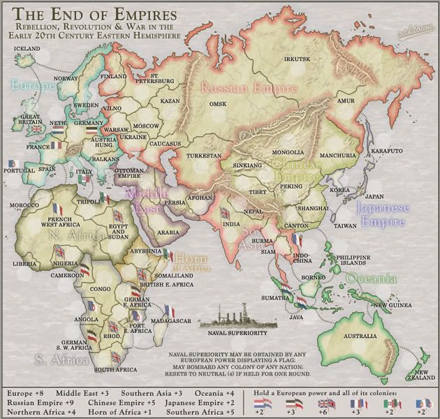


 Let's see how this goes! (I'd still make the S. Africa bonus outline — purple — stand out more by the way).