Now sometimes in the map making process you need to change the color of something or neutralize a certain color or tone down a color. Here are a few tricks to help you accomplish whatever goal you may have
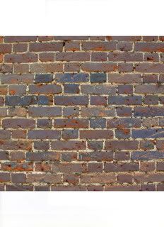
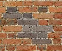
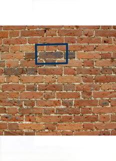
For example purposes I will use a brick wall
- Click image to enlarge.

I have also selected the color blue for it is a more difficult color to do this with and thus will make the tutorial more of a one size fits all.
Step 1:
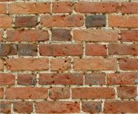
Begin by selecting a image and a color(s) to use
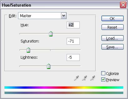
Step 2:
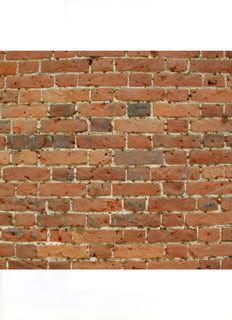
Select a low opacity and the fill tool
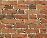
Step 3:
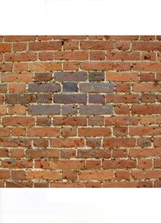
Begin filling
- Click image to enlarge.
Now along the way there are a few common problems you will run into.
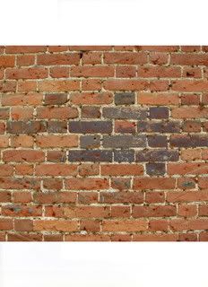
Problem 1:
- Click image to enlarge.
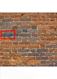
Now sometimes parts of the image are naturally darker and this will mix with your color causing it to appear darker then the area around it.
Unto your fill and tone down the opacity. Then try filling it twice. Never fill more then three times or you will lose the realism affect. This is a trial and error part to see which opacity works best depending on the image.
Problem 2:
- Click image to enlarge.
If the fill appears dotted and does not look realistic. First undo the fill. Then do the same fill with a lower opacity. It should look the same but lighter.
- Click image to enlarge.
Then zoom very far in and select no more then two areas where the fill is most dotted. Return to your old opacity and fill in these parts.
Sometimes a bit dotty can look good to simulate wear:
- Click image to enlarge.
Continue this then sit back and enjoy your beautiful new image, with a Touch of Realism:
- Click image to enlarge.