The Dawn Of Ages - Quenched
Moderator: Cartographers
Re: The Dawn Of Ages - Version 11 - Please comment
![]() by darkangelsguy205 on Thu Sep 03, 2009 2:56 pm
by darkangelsguy205 on Thu Sep 03, 2009 2:56 pm
wahho 100th respond umm it looks fun
-

 darkangelsguy205
- Posts: 606
- Joined: Tue Mar 10, 2009 5:10 pm


Re: The Dawn Of Ages - Version 11 - Please comment
![]() by Kabanellas on Thu Sep 03, 2009 3:02 pm
by Kabanellas on Thu Sep 03, 2009 3:02 pm
Evil DIMwit wrote:Hmm. So Sea Dragon is sort of a mini Lost Island. I guess that makes the Raider zone sort of a mini Tower zone, which might work out fairly nicely.
I think you can put it that way
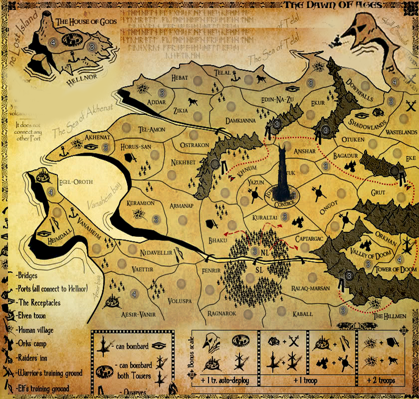
As for the Dwarves' gates they work like this:
i.e. from Ralak-Marsan Gate you can one way assault Ralak-Marsan region, and you can assault (both ways) Grut Gate Entry.
in another example - From Khnum region you can assault (both ways) Khnum Gate Entry but from Damkianna region you can't assault Damkianna Gate because it's not an Entry. On the other hand Damkianna Gate can one way assault Damkianna region.
As for the number circle, I haven't found a better place to put it yet... maybe if I put it close to the 'gate icon' but in the field instead of placing it in the mountain, it could help....
-
Kabanellas
- Posts: 1482
- Joined: Fri Feb 27, 2009 12:21 pm
- Location: Porto, Portugal


Re: The Dawn Of Ages - Version 11 - Please comment
![]() by Evil DIMwit on Thu Sep 03, 2009 5:28 pm
by Evil DIMwit on Thu Sep 03, 2009 5:28 pm
Kabanellas wrote:Evil DIMwit wrote:Hmm. So Sea Dragon is sort of a mini Lost Island. I guess that makes the Raider zone sort of a mini Tower zone, which might work out fairly nicely.
I think you can put it that way
As for the Dwarves' gates they work like this:
i.e. from Ralak-Marsan Gate you can one way assault Ralak-Marsan region, and you can assault (both ways) Grut Gate Entry.
in another example - From Khnum region you can assault (both ways) Khnum Gate Entry but from Damkianna region you can't assault Damkianna Gate because it's not an Entry. On the other hand Damkianna Gate can one way assault Damkianna region.
As for the number circle, I haven't found a better place to put it yet... maybe if I put it close to the 'gate icon' but in the field instead of placing it in the mountain, it could help....
Ah, I see. The way I'd understood it is the dwarven gates assault territories adjacent to either the territories the gates are sitting in or the mountain ranges they're attached to, i.e. Khum's gate could either assault Yazun, Ongot, Bhaku, etc. or Nekhbet, Ostrakon, etc. So maybe I'm just thick, or maybe you could add outwards arrows to clarify, or I don't know.


-

Evil DIMwit
- Posts: 1616
- Joined: Thu Mar 22, 2007 1:47 pm
- Location: Philadelphia, NJ


Re: The Dawn Of Ages - Version 11 - Please comment
![]() by 40kguy on Thu Sep 03, 2009 5:51 pm
by 40kguy on Thu Sep 03, 2009 5:51 pm
looks like a fun map to play on i would play on this map if it gets finished

16:00:18 ‹Pixar› Valentines Day the one day in they year that the V and the D come together
-

40kguy
- Posts: 1772
- Joined: Mon Dec 29, 2008 11:39 am


Re: The Dawn Of Ages - Version 11 - Please comment
![]() by AndrewB on Thu Sep 03, 2009 7:18 pm
by AndrewB on Thu Sep 03, 2009 7:18 pm
Evil DIMwit wrote:Hmm. So Sea Dragon is sort of a mini Lost Island. I guess that makes the Raider zone sort of a mini Tower zone, which might work out fairly nicely.
As for the Dwarven gates: From the circles' positioning it looks like each circle belongs to one of the mountain ranges, rather than just to the gate attached to it. I'm not quite sure what 'adjacent exterior regions' means either -- which territories can each gate attack?
My concern exactly. I had exactly same problem while calculating the bonus the Kabanellas.

-

AndrewB
- Posts: 1814
- Joined: Mon Jun 12, 2006 5:02 pm
- Location: Edmonton, Canada, MST


Re: The Dawn Of Ages - Version 10 Pg7 - Please comment
![]() by AndrewB on Thu Sep 03, 2009 7:45 pm
by AndrewB on Thu Sep 03, 2009 7:45 pm
MrBenn wrote:The graphics on this map are very very good.
The biggest problem I have with it, is that it is overly-complex. By that, I don't mean that it is too complex, but that it is visually confusing - there are too many different symbols, with no obvious connection to help bring the two elements together --essentially I'm concerned that the legend is about half the size of the map
I think there are ways that the map can be made slightly simpler, but still have the same essence of gameplay, and still capture that spirit of Tolkien (which you have done incredibly well)... I'll pop back later to give some more thoughts
I think that one way to reduce the number of symbols is to use the same symbol for all the training grounds. That will get rid off 5 different symbols.
While we are on the same note here, I also find that Elven Town icon and Human Village and HoG are quite similar.
Here is another idea: use different colors for the different races icons, but make All settlement icons and All training grounds Icons the same. (Brown for Orks, Blue for Elves, Green/Yellow for Humans, Purple for Raiders, White for Hog and Red for Towers). And those colors should be quite subtle.
-
AndrewB
- Posts: 1814
- Joined: Mon Jun 12, 2006 5:02 pm
- Location: Edmonton, Canada, MST
Re: The Dawn Of Ages - Version 11 - Please comment
![]() by captainwalrus on Thu Sep 03, 2009 10:05 pm
by captainwalrus on Thu Sep 03, 2009 10:05 pm
I disagree. I think that adding more color would make it look less old parchmenty and more like old parchment that you added lables to and would make it blend worse. I would like to see it stay stylisticly the same. Just my 2/5th of a nickel.
~ CaptainWalrus
-

captainwalrus
- Posts: 1018
- Joined: Sun Nov 11, 2007 3:19 pm
- Location: Finnmark


Re: The Dawn Of Ages - Version 11 - Please comment
![]() by The Neon Peon on Thu Sep 03, 2009 10:19 pm
by The Neon Peon on Thu Sep 03, 2009 10:19 pm
I agree with reducing the amount of icons that are on the map, but I think that simply merging many of them into one is the wrong way of going about it.
Perhaps it would be easier to simply get rid of some icons altogether and add a few more of the ones left over in several spots.
That's my 2.1415926 cents on how to make the change easier.
Perhaps it would be easier to simply get rid of some icons altogether and add a few more of the ones left over in several spots.
That's my 2.1415926 cents on how to make the change easier.
-

The Neon Peon
- Posts: 2342
- Joined: Sat Jun 14, 2008 12:49 pm

Re: The Dawn Of Ages - Version 10 Pg7 - Please comment
![]() by Kabanellas on Fri Sep 04, 2009 6:23 am
by Kabanellas on Fri Sep 04, 2009 6:23 am
AndrewB wrote:I think that one way to reduce the number of symbols is to use the same symbol for all the training grounds. That will get rid off 5 different symbols.
While we are on the same note here, I also find that Elven Town icon and Human Village and HoG are quite similar.
Here is another idea: use different colours for the different races icons, but make All settlement icons and All training grounds Icons the same. (Brown for Orks, Blue for Elves, Green/Yellow for Humans, Purple for Raiders, White for Hog and Red for Towers). And those colours should be quite subtle.
That would raise 2 enormous concerns in my opinion:
1- Using the same symbol for Training Grounds would make Orks' camps, human Villages and elven towns match 10 different symbols, and not the respective ones that they were meant to. I won't have an Orks' Camp matching a TG placed in the other side of the map, like the elven region. It would simple subvert the concept and the gameplay.
2- Using other colours in this map would make it lose the parchment feel that I worked so much to achieve.
-
Kabanellas
- Posts: 1482
- Joined: Fri Feb 27, 2009 12:21 pm
- Location: Porto, Portugal
Re: The Dawn Of Ages - Version 11 - Please comment
![]() by Kabanellas on Fri Sep 04, 2009 6:33 am
by Kabanellas on Fri Sep 04, 2009 6:33 am
To help clarify the Dwarves' Gateways mechanics I'll change the legend from:
"-can one way assault adjacent exterior regions"
to
"-can one way assault the region they're placed in"
or
"-can one way assault the region they're built in"
"-can one way assault adjacent exterior regions"
to
"-can one way assault the region they're placed in"
or
"-can one way assault the region they're built in"
-
Kabanellas
- Posts: 1482
- Joined: Fri Feb 27, 2009 12:21 pm
- Location: Porto, Portugal
Re: The Dawn Of Ages - Version 11 - Please comment
![]() by Rakio on Fri Sep 04, 2009 9:44 am
by Rakio on Fri Sep 04, 2009 9:44 am
At this stage people have to be really dedicated to play this map.
It does some time to figure out everything. Took me at least 3 tries before I even bothered.
I do have to say that graphically it is very neat and unique. Great background parchment texture with clean symbols.
But as other have said, there are too many symbols.
Balance between the artistic graphic view and simple gameplay view will be hard to come if you still want to main the same look and feel of the map in a Tolkien/Fantasy manner.
As you said, colouring and merging of the symbols would ruin it totally.
Im thinking of maybe only have one unique symbol for each race?
Skip the pairings. You could still have the auto-deploy and other special bases. But the numerous forces would have to change. With them the bonus system somewhat too. All would be similar to the dwarfen one.
I hope I provided with something helpful and not straying away from your goal totally.
Havent read all the pages previously. Just taken interest in map making

Discover & Settle - a new land.
A map not in the making currently. Please have a look and comment anyway?
-
Rakio
- Posts: 67
- Joined: Sat Jun 27, 2009 7:46 pm


Re: The Dawn Of Ages - Version 11 - Please comment
![]() by porkenbeans on Fri Sep 04, 2009 11:58 am
by porkenbeans on Fri Sep 04, 2009 11:58 am
Maybe coloring the symbols might not be so disastrous, if the colors were of a faded nature. It would still keep to the theme and look. Outside of that, you may need to loose some symbols. Either way I think that Mr. B was right in that The legend is too large. I am sure that it can be reduced if you put your mind to it. It would be nice to move the map down an inch. Then you could have the needed room to enlarge that kick-ass skull Peninsula graphic. 

-

porkenbeans
- Posts: 2546
- Joined: Mon Sep 10, 2007 4:06 pm


Re: The Dawn Of Ages - Version 11 - Please comment
![]() by Kabanellas on Fri Sep 04, 2009 12:38 pm
by Kabanellas on Fri Sep 04, 2009 12:38 pm
Porken, the centre of the map should be the Tower of Control..... its the natural epicentre of all things there - where all the races confront each other
-
Kabanellas
- Posts: 1482
- Joined: Fri Feb 27, 2009 12:21 pm
- Location: Porto, Portugal
Re: The Dawn Of Ages - Version 11 - Please comment
![]() by porkenbeans on Fri Sep 04, 2009 1:16 pm
by porkenbeans on Fri Sep 04, 2009 1:16 pm
Thats cool, but if you moved everything down, it WOULD be more in the center, than it is now. below is a very crude example of the scale that I suggest. If you could fit the legend in the available space, it would be more about the map and not the over-powering legend. notice that the land has been stretched a bit, and Skull pen. and the island have been enlarged. please forgive the fuzziness, but this is just for scale purposes.Kabanellas wrote:Porken, the centre of the map should be the Tower of Control..... its the natural epicentre of all things there - where all the races confront each other
- Click image to enlarge.
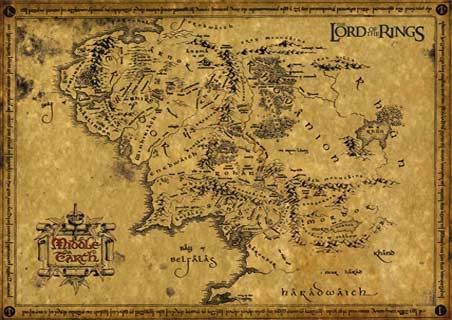
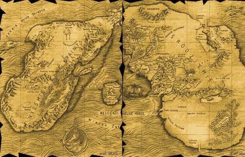
I found this map, thought that you might find it interesting.
- Click image to enlarge.
-
porkenbeans
- Posts: 2546
- Joined: Mon Sep 10, 2007 4:06 pm
Re: The Dawn Of Ages - Version 11 - Please comment
![]() by Blitzaholic on Sun Sep 06, 2009 7:45 am
by Blitzaholic on Sun Sep 06, 2009 7:45 am
porkenbeans wrote:Thats cool, but if you moved everything down, it WOULD be more in the center, than it is now. below is a very crude example of the scale that I suggest. If you could fit the legend in the available space, it would be more about the map and not the over-powering legend. notice that the land has been stretched a bit, and Skull pen. and the island have been enlarged. please forgive the fuzziness, but this is just for scale purposes.Kabanellas wrote:Porken, the centre of the map should be the Tower of Control..... its the natural epicentre of all things there - where all the races confront each other
- Click image to enlarge.
I found this map, thought that you might find it interesting.
- Click image to enlarge.
whoa, thats kinda neat

-

Blitzaholic
- Posts: 23050
- Joined: Wed Aug 09, 2006 11:57 pm
- Location: Apocalyptic Area


Re: The Dawn Of Ages - Version 11 - Please comment
![]() by porkenbeans on Sun Sep 06, 2009 12:43 pm
by porkenbeans on Sun Sep 06, 2009 12:43 pm
Aint it though ? I will try to find a larger version, and post it.Blitzaholic wrote:porkenbeans wrote:Thats cool, but if you moved everything down, it WOULD be more in the center, than it is now. below is a very crude example of the scale that I suggest. If you could fit the legend in the available space, it would be more about the map and not the over-powering legend. notice that the land has been stretched a bit, and Skull pen. and the island have been enlarged. please forgive the fuzziness, but this is just for scale purposes.Kabanellas wrote:Porken, the centre of the map should be the Tower of Control..... its the natural epicentre of all things there - where all the races confront each other
- Click image to enlarge.
I found this map, thought that you might find it interesting.
- Click image to enlarge.
whoa, thats kinda neat
-
porkenbeans
- Posts: 2546
- Joined: Mon Sep 10, 2007 4:06 pm
Re: The Dawn Of Ages - Version 11 - Please comment
![]() by Kabanellas on Sun Sep 06, 2009 3:58 pm
by Kabanellas on Sun Sep 06, 2009 3:58 pm
Thanks Porken, I do appreciate your ideas for the map. But the thing is that I'm quite happy (to say the least) with map positioning right now, and I really can't imagine it done in a different way. Believe me that before the very first map version that I've posted here, I've done a lot of sketching about it.
-
Kabanellas
- Posts: 1482
- Joined: Fri Feb 27, 2009 12:21 pm
- Location: Porto, Portugal
Re: The Dawn Of Ages - Version 11 - Please comment
![]() by porkenbeans on Sun Sep 06, 2009 8:36 pm
by porkenbeans on Sun Sep 06, 2009 8:36 pm
Just throwing shit at the wall to see what sticks. lol. I am sure that not everything that I suggest is going to float your boat. Just glad that I can be helpful. 
-
porkenbeans
- Posts: 2546
- Joined: Mon Sep 10, 2007 4:06 pm
Re: The Dawn Of Ages - Version 11 - Please comment
![]() by Nephilim on Mon Sep 07, 2009 3:17 am
by Nephilim on Mon Sep 07, 2009 3:17 am
wow.....when this gets going, it will be insane! a ton of one way attacking and bombarding......it's one of those maps that will be hard to learn, but once you get it, will be super fun
good luck gents
good luck gents
Liberté, egalité, cash moné
Hey, Fox News: Pedicabo ego vos et irrumabo
My heart beats with unconditional love
But beware of the blackness that it's capable of
Hey, Fox News: Pedicabo ego vos et irrumabo
My heart beats with unconditional love
But beware of the blackness that it's capable of
-

Nephilim
- Posts: 1272
- Joined: Tue Oct 03, 2006 11:16 pm
- Location: ole kantuck


Re: The Dawn Of Ages - Version 11 - Please comment
![]() by Kabanellas on Mon Sep 07, 2009 3:36 am
by Kabanellas on Mon Sep 07, 2009 3:36 am
Nephilim wrote:wow.....when this gets going, it will be insane! a ton of one way attacking and bombarding......it's one of those maps that will be hard to learn, but once you get it, will be super fun
good luck gents
Thanks a lot for your support, I really think it will be fun once you get into it!
-
Kabanellas
- Posts: 1482
- Joined: Fri Feb 27, 2009 12:21 pm
- Location: Porto, Portugal
Re: The Dawn Of Ages - Version 11 - Please comment
![]() by nikola_milicki on Mon Sep 07, 2009 11:50 am
by nikola_milicki on Mon Sep 07, 2009 11:50 am
beautiful maps guys! great work! both maps (the third crusade) have very interesting game play/bonuses and look beautiful, luv the colors! 
-
nikola_milicki
- Posts: 1015
- Joined: Wed Apr 18, 2007 2:17 pm
- Location: CROATIA


Re: The Dawn Of Ages - Version 11 - Please comment
![]() by Evil DIMwit on Mon Sep 07, 2009 6:02 pm
by Evil DIMwit on Mon Sep 07, 2009 6:02 pm
Kabanellas wrote:To help clarify the Dwarves' Gateways mechanics I'll change the legend from:
"-can one way assault adjacent exterior regions"
to
"-can one way assault the region they're placed in"
or
"-can one way assault the region they're built in"
That should clarify it considerably.
porkenbeans wrote:Maybe coloring the symbols might not be so disastrous, if the colors were of a faded nature. It would still keep to the theme and look.
I wouldn't call it disastrous, considering there's already color on the map in the form of Dwarven gate routes and Logoth attack routes. On the other hand, the more color you add the farther the map gets from its original ink-on-parchment aesthetic, so if you can find a solution that doesn't resort to color, give that priority.
-
Evil DIMwit
- Posts: 1616
- Joined: Thu Mar 22, 2007 1:47 pm
- Location: Philadelphia, NJ
Re: The Dawn Of Ages - Version 11 - Please comment
![]() by porkenbeans on Tue Sep 08, 2009 3:12 pm
by porkenbeans on Tue Sep 08, 2009 3:12 pm
Check it out. The mountains on the first one are fricken awesome.
- Click image to enlarge.
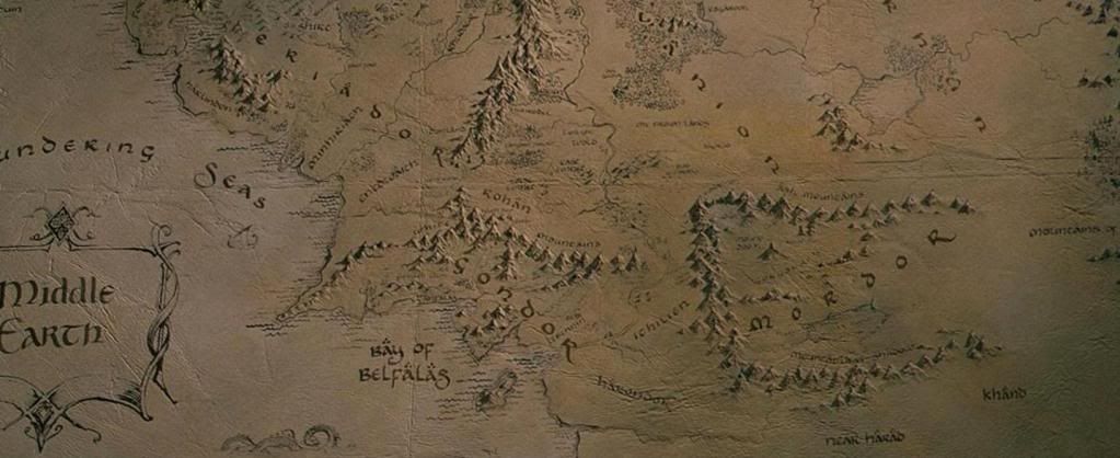
- Click image to enlarge.
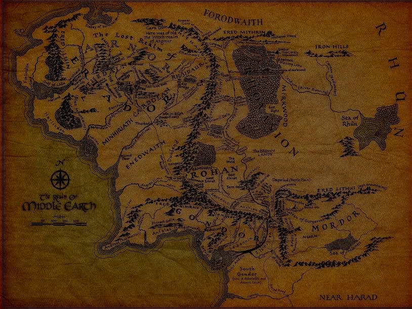
- Click image to enlarge.
-
porkenbeans
- Posts: 2546
- Joined: Mon Sep 10, 2007 4:06 pm
Re: The Dawn Of Ages - Version 11 - Please comment
![]() by Kabanellas on Wed Sep 09, 2009 4:54 am
by Kabanellas on Wed Sep 09, 2009 4:54 am
yes they are!
-
Kabanellas
- Posts: 1482
- Joined: Fri Feb 27, 2009 12:21 pm
- Location: Porto, Portugal
Re: The Dawn Of Ages - Version 11 - Please comment
![]() by Rakio on Wed Sep 09, 2009 5:54 am
by Rakio on Wed Sep 09, 2009 5:54 am
@Kaba
Although I wouldnt say there are anything wrong with your graphics.
Your map is unique and special as it is already.
Although I wouldnt say there are anything wrong with your graphics.
Your map is unique and special as it is already.
Discover & Settle - a new land.
A map not in the making currently. Please have a look and comment anyway?
-
Rakio
- Posts: 67
- Joined: Sat Jun 27, 2009 7:46 pm
Who is online
Users browsing this forum: No registered users
|
|||||||
| Conquer Club is not associated with RISK online in any way. Copyright © 2006-2024 by Big Wham LLC | |||||||