Game Page Layout - new proposal! [First Post]
Moderator: Community Team
Re: Game Page Layout Discussion
![]() by Snorri1234 on Mon Nov 30, 2009 11:24 pm
by Snorri1234 on Mon Nov 30, 2009 11:24 pm
Just buy bigger screens people!
"Some motherfuckers are always trying to ice skate uphill."
Duane: You know what they say about love and war.
Tim: Yes, one involves a lot of physical and psychological pain, and the other one's war.
Duane: You know what they say about love and war.
Tim: Yes, one involves a lot of physical and psychological pain, and the other one's war.
-

 Snorri1234
- Posts: 3438
- Joined: Wed Sep 12, 2007 11:52 am
- Location: Right in the middle of a fucking reptile zoo.


Re: Game Page Layout Discussion
![]() by Robinette on Mon Nov 30, 2009 11:38 pm
by Robinette on Mon Nov 30, 2009 11:38 pm
Snorri1234 wrote:Just buy bigger screens people!
But it's only THIS big..

oh wait... if i look at it this way then maybe i don't need to scroll...


-

Robinette
- Posts: 2944
- Joined: Sat Apr 29, 2006 1:32 pm
- Location: Northern California


Re: Game Page Layout Discussion
![]() by hecter on Mon Nov 30, 2009 11:39 pm
by hecter on Mon Nov 30, 2009 11:39 pm
Snorri1234 wrote:Just buy bigger screens people!
Not really a solution if you're using a laptop.
Not that I care, I'm running 1680x1050, with large maps on, and with the thing on the side and it still seems empty.
In heaven... Everything is fine, in heaven... Everything is fine, in heaven... Everything is fine... You got your things, and I've got mine.

-

hecter
- Posts: 14632
- Joined: Tue Jan 09, 2007 6:27 pm
- Location: Tying somebody up on the third floor


Re: Game Page Layout Discussion
![]() by Zarg78 on Tue Dec 01, 2009 6:22 am
by Zarg78 on Tue Dec 01, 2009 6:22 am
This update is a complete waste of time. You'd be just as well giving them "BOB" as standard. Surely you admin people have better ideas for updates.
Speaking of which, why not have an interactive map where attacks, reinforcements, etc are done by clicking on the map?
Speaking of which, why not have an interactive map where attacks, reinforcements, etc are done by clicking on the map?
Live long and prosper.
Zarg78
-----------------------------------------------------------------------------------------
Broken, bruised, forgotten, sore,
Too fucked up to care any more,
(From Somewhat Damaged by Nine Inch Nails)
Zarg78
-----------------------------------------------------------------------------------------
Broken, bruised, forgotten, sore,
Too fucked up to care any more,
(From Somewhat Damaged by Nine Inch Nails)
-

Zarg78
- Posts: 48
- Joined: Fri Sep 22, 2006 8:14 am
- Location: Aberdeen, Scotland


Re: Game Page Layout Discussion
![]() by MarathonMax on Tue Dec 01, 2009 1:09 pm
by MarathonMax on Tue Dec 01, 2009 1:09 pm
Great add-on but ... if one uses BOB like I do, it does not add anything else, really. Is there a way to disable this? It will however be usefull when I login with my iPhone !
-

MarathonMax
- Posts: 74
- Joined: Tue Dec 16, 2008 2:47 pm


Re: Game Page Layout Discussion
![]() by vodean on Tue Dec 01, 2009 2:41 pm
by vodean on Tue Dec 01, 2009 2:41 pm
new time format is kinky

<NoSurvivors› then vote chuck for being an info whore
-

vodean
- Posts: 948
- Joined: Tue Apr 21, 2009 11:37 pm


Re: Game Page Layout Discussion
![]() by hecter on Tue Dec 01, 2009 5:32 pm
by hecter on Tue Dec 01, 2009 5:32 pm
Zarg78 wrote:This update is a complete waste of time. You'd be just as well giving them "BOB" as standard. Surely you admin people have better ideas for updates.
Speaking of which, why not have an interactive map where attacks, reinforcements, etc are done by clicking on the map?
That's exactly what happened... Giving BOB as standard. Seeing as how BOB is completely third party and all...
In heaven... Everything is fine, in heaven... Everything is fine, in heaven... Everything is fine... You got your things, and I've got mine.
-
hecter
- Posts: 14632
- Joined: Tue Jan 09, 2007 6:27 pm
- Location: Tying somebody up on the third floor
Re: Game Page Layout Discussion
![]() by Qwert on Tue Dec 01, 2009 5:41 pm
by Qwert on Tue Dec 01, 2009 5:41 pm
Make it an option from the Game Settings menu?
Game Page stats "right of the map"; "below the map"; or "off"?
Now this will be good to create,in this way you will solve all people problem.
I will imediatly put this statistic "off",because i dont need that.Ofcourse other people who like can activate this statistic.

-

Qwert
- SoC Training Adviser
- Posts: 9262
- Joined: Tue Nov 07, 2006 5:07 pm
- Location: VOJVODINA


Re: Game Page Layout Discussion
![]() by Bruceswar on Tue Dec 01, 2009 7:44 pm
by Bruceswar on Tue Dec 01, 2009 7:44 pm
hecter wrote:I think the best option would be to have something in game settings that goes something like:
Game Statistics: Horizontal - Vertical - Off
This works for me. I think overall use of the space can be done better. I will have a mock up made later to show what I mean.
Highest Rank: 26 Highest Score: 3480

-

Bruceswar
- Posts: 9713
- Joined: Sun Dec 23, 2007 12:36 am
- Location: Cow Pastures


Re: Game Page Layout Discussion
![]() by Ffraid on Wed Dec 02, 2009 5:30 pm
by Ffraid on Wed Dec 02, 2009 5:30 pm
I saw a post in the announcement thread that I thought should be seen here:
I even went so far as to mock up a rough (Okay, watch-your-fingers-you-might-get-splinters rough but, hey, I'm no artist) layout.
I moved the logout to the upper right since it had to be moved and a lot of web pages put the login\out there. Also, the menus that were moved from the left panel could be made into drop downs and put in the same line as Home, Instructions, etc.
This arrangement allows for less horizontal scrolling. In fact probably the only people that would have to scroll horizontally are those, like me, that have a small screen resolution (1024x768) and use large maps (getting old is playing havoc with my visual acuity).
I have no idea how difficult it would be to program this but lack did ask if there was a completely different solution. The top and left panels seem to be consistent across the entire site, so would it just be a matter of changing it in one place and having it apply to all?
j35t3r.us wrote:Hmmm, it seems like we keep making the screen WIDER...
How about we knock off the Game Menu section on the Left most of the screen and relocate that above the game map and stuff.
I know its a full site redesign or whatever, but with the size of some of the maps paired with people's names/ranks, and now the new statistics addon, I'm thinking we definitely need the FULL VIEW of our screen related to the map/game we're in.
Thoughts?
I even went so far as to mock up a rough (Okay, watch-your-fingers-you-might-get-splinters rough but, hey, I'm no artist) layout.
- Click image to enlarge.

I moved the logout to the upper right since it had to be moved and a lot of web pages put the login\out there. Also, the menus that were moved from the left panel could be made into drop downs and put in the same line as Home, Instructions, etc.
This arrangement allows for less horizontal scrolling. In fact probably the only people that would have to scroll horizontally are those, like me, that have a small screen resolution (1024x768) and use large maps (getting old is playing havoc with my visual acuity).
I have no idea how difficult it would be to program this but lack did ask if there was a completely different solution. The top and left panels seem to be consistent across the entire site, so would it just be a matter of changing it in one place and having it apply to all?
-

Ffraid
- Posts: 217
- Joined: Thu Feb 07, 2008 11:57 am
- Location: UTC - 6 (+1 if we're in DST)

Re: Game Page Layout Discussion
![]() by musicalmaven on Thu Dec 03, 2009 12:33 am
by musicalmaven on Thu Dec 03, 2009 12:33 am
frankly, i like it. i never had any luck getting greasemonkey or bob up, and i wasted a lot of time counting everyone's territories and troops.
i saw bruce's (bruceswar) post and since you guys liked his proposal, let me add that i also play on grand strategy and they have the stats on a separate page and you simply click on the stats button and you get everyone's vital information (territories, men, cards, and a few more stats which i play little attention to).
now if you could only do something about the damned dice. they've always been bad, but lately, its been off the scale.
yes, i know, everyone complains, but i have kept track of my dice rolls and i know that i am well below average, and have never been above average. (and never is the operative word.)
-
musicalmaven
- Posts: 1653
- Joined: Sun Mar 04, 2007 12:08 am


 3
3
Re: Game Page Layout Discussion
![]() by lackattack on Thu Dec 03, 2009 8:51 am
by lackattack on Thu Dec 03, 2009 8:51 am
Thanks for the feedback, I read every post (and I especially appreciate the mockup, Ffraid).
I'll prepare a few mockups of my own based on your feedback and put them to a vote in the coming days...
I'll prepare a few mockups of my own based on your feedback and put them to a vote in the coming days...
-

lackattack
- Posts: 6096
- Joined: Sun Jan 01, 2006 10:34 pm
- Location: Montreal, QC


Re: Game Page Layout Discussion
![]() by RjBeals on Thu Dec 03, 2009 11:08 am
by RjBeals on Thu Dec 03, 2009 11:08 am
AndyDufresne wrote:On a slightly side note, in the next month or two some redesigns may help give some much needed love to the Foundry.
mibi wrote:You forgot to check the CC update conversion chart.
Right around the corner = 3 weeks
Coming soon = 6-8 weeks
one or two months away = 6-9 months
"we are planning" = 12-15 months
"it's on the todo list" = never

-

RjBeals
- Posts: 2506
- Joined: Mon Nov 20, 2006 5:17 pm
- Location: South Carolina, USA


Re: Game Page Layout Discussion
![]() by yeti_c on Thu Dec 03, 2009 1:58 pm
by yeti_c on Thu Dec 03, 2009 1:58 pm
mibi wrote:It's just slightly irratating that we in the map foundry have been limited to what width map we can make, and then Lack goes and tosses in huge width feature.
Indeed... and of course the new extra width added by this update means that the maps are less likely to be given extra width...
Unless, of course, we can get the UI redesigned...
C.

Highest score : 2297
-

yeti_c
- Posts: 9624
- Joined: Thu Jan 04, 2007 9:02 am


Re: Game Page Layout Discussion
![]() by yeti_c on Thu Dec 03, 2009 2:01 pm
by yeti_c on Thu Dec 03, 2009 2:01 pm
Sorry for Double post but...
Now that Javascript is forced on... just implement the "hide menu" code that I wrote for BOB...
That will give you a massive amount of real estate...
Personally I prefer to have the "hide menu" on as the "Game" setting - which means it only happens in the games... and not in the forums.
Which I think is the best mix - but it would be ace if you can code it as selectable.
C.
lackattack wrote:Thanks for the feedback, I read every post (and I especially appreciate the mockup, Ffraid).
I'll prepare a few mockups of my own based on your feedback and put them to a vote in the coming days...
Now that Javascript is forced on... just implement the "hide menu" code that I wrote for BOB...
That will give you a massive amount of real estate...
Personally I prefer to have the "hide menu" on as the "Game" setting - which means it only happens in the games... and not in the forums.
Which I think is the best mix - but it would be ace if you can code it as selectable.
C.
Highest score : 2297
-
yeti_c
- Posts: 9624
- Joined: Thu Jan 04, 2007 9:02 am
Re: Game Page Layout Discussion
![]() by porkenbeans on Thu Dec 03, 2009 2:29 pm
by porkenbeans on Thu Dec 03, 2009 2:29 pm
I have a suggestion that goes to the background and fore ground colors.
My idea is to make the background black, and the text could be white or gold or something.
My reasons for this, is this-
It has been proven that white text over a black background is easier on the eyes, and can actually be read faster and with less eye fatigue than black text on white.
We are used to reading black on white because books have always been printed this way. They are printed this way because, it would cost more, in ink, to do it the other way around.
The pixel world does not use ink, and many that are in the "know" nowadays, are using the white over black instead of the prehistoric black over white.
I can go into the technical reasons, like how the pupil widens and allows more info to the brain. Or how the muscles of the the pupil, have to exert themselves to narrow the pupil, resulting in "eye strain". But suffice it to say, The map will be much easier to read, and will stand out better if the background of the screen was black.

-

porkenbeans
- Posts: 2546
- Joined: Mon Sep 10, 2007 4:06 pm

Re: Game Page Layout Discussion
![]() by vodean on Thu Dec 03, 2009 3:01 pm
by vodean on Thu Dec 03, 2009 3:01 pm
just make BOB standard... it'll make things easier
<NoSurvivors› then vote chuck for being an info whore
-
vodean
- Posts: 948
- Joined: Tue Apr 21, 2009 11:37 pm
Re: Game Page Layout Discussion
![]() by Ffraid on Thu Dec 03, 2009 3:37 pm
by Ffraid on Thu Dec 03, 2009 3:37 pm
porkenbeans wrote:... It has been proven that white text over a black background is easier on the eyes, and can actually be read faster and with less eye fatigue than black text on white....
State your source, because I have never found this to be the case. Whenever I have to read text on web pages that use such a format, I always end up going up to the Edit menu and choosing Select All so that, basically, the text and background colors are reversed.
-
Ffraid
- Posts: 217
- Joined: Thu Feb 07, 2008 11:57 am
- Location: UTC - 6 (+1 if we're in DST)
Re: Game Page Layout Discussion
![]() by porkenbeans on Thu Dec 03, 2009 5:22 pm
by porkenbeans on Thu Dec 03, 2009 5:22 pm
And you have proven what ?Ffraid wrote:porkenbeans wrote:... It has been proven that white text over a black background is easier on the eyes, and can actually be read faster and with less eye fatigue than black text on white....
State your source, because I have never found this to be the case. Whenever I have to read text on web pages that use such a format, I always end up going up to the Edit menu and choosing Select All so that, basically, the text and background colors are reversed.
It is similar to when you go into a low light surrounding. Your eyes take a few moments to adjust. What they are in actuality doing is, relaxing the muscles that operate your pupil. when they are relaxed your pupils are fully open. Its these muscles for lack of a better word, that become fatigued when you are reading.
-
porkenbeans
- Posts: 2546
- Joined: Mon Sep 10, 2007 4:06 pm
Re: Game Page Layout Discussion
![]() by Bruceswar on Thu Dec 03, 2009 7:43 pm
by Bruceswar on Thu Dec 03, 2009 7:43 pm
Here is a mock up I think most people would be OK with... If we cannot get a disable button at least we can move things around...
Please not the names are just for show... That is why the game log is different from the names on the side...
- Click image to enlarge.
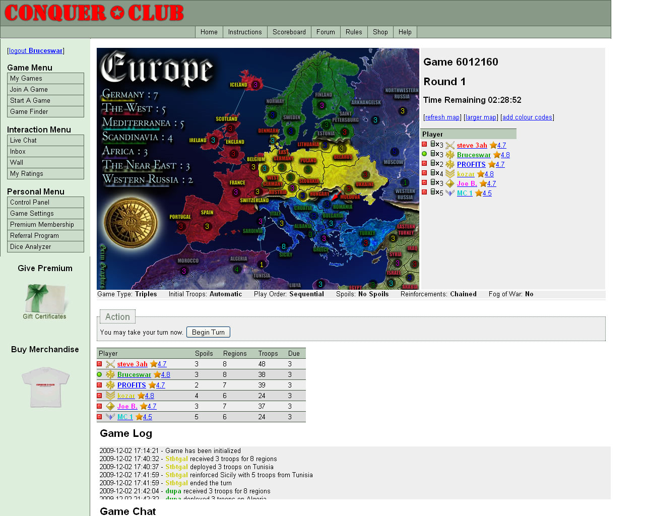
Please not the names are just for show... That is why the game log is different from the names on the side...
Highest Rank: 26 Highest Score: 3480
-
Bruceswar
- Posts: 9713
- Joined: Sun Dec 23, 2007 12:36 am
- Location: Cow Pastures
Re: Game Page Layout Discussion
![]() by The Neon Peon on Thu Dec 03, 2009 7:56 pm
by The Neon Peon on Thu Dec 03, 2009 7:56 pm
Or... We could have the layout be similar to iGoogle in that we can move things around however we wish. That way, everyone would be happy with the placement of the map / log / chat / stats.
Bruce's way also works.
Bruce's way also works.
-

The Neon Peon
- Posts: 2342
- Joined: Sat Jun 14, 2008 12:49 pm


Re: Game Page Layout Discussion
![]() by Woodruff on Thu Dec 03, 2009 8:55 pm
by Woodruff on Thu Dec 03, 2009 8:55 pm
porkenbeans wrote:And you have proven what ?Ffraid wrote:porkenbeans wrote:... It has been proven that white text over a black background is easier on the eyes, and can actually be read faster and with less eye fatigue than black text on white....
State your source, because I have never found this to be the case. Whenever I have to read text on web pages that use such a format, I always end up going up to the Edit menu and choosing Select All so that, basically, the text and background colors are reversed.
It is similar to when you go into a low light surrounding. Your eyes take a few moments to adjust. What they are in actuality doing is, relaxing the muscles that operate your pupil. when they are relaxed your pupils are fully open. Its these muscles for lack of a better word, that become fatigued when you are reading.
Does this mean that you don't have a source, or just that you're intentionally avoiding the opportunity to provide it?
...I prefer a man who will burn the flag and then wrap himself in the Constitution to a man who will burn the Constitution and then wrap himself in the flag.
-

Woodruff
- Posts: 5093
- Joined: Sat Jan 05, 2008 9:15 am

Re: Game Page Layout Discussion
![]() by RjBeals on Thu Dec 03, 2009 9:03 pm
by RjBeals on Thu Dec 03, 2009 9:03 pm
Here's an interface I did a few years ago - but nothing ever happened with it. I was trying show a better layout to allow for larger maps.
[edit]
ha.. and while i was poking around, i found this for a banner competition.

- Click image to enlarge.

[edit]
ha.. and while i was poking around, i found this for a banner competition.
-
RjBeals
- Posts: 2506
- Joined: Mon Nov 20, 2006 5:17 pm
- Location: South Carolina, USA
Re: Game Page Layout Discussion
![]() by porkenbeans on Thu Dec 03, 2009 9:15 pm
by porkenbeans on Thu Dec 03, 2009 9:15 pm
I do not remember where it was that I learned this. Sorry old chap, just a bit of info that got packed into my brain, somewhere along the line.Woodruff wrote:porkenbeans wrote:And you have proven what ?Ffraid wrote:porkenbeans wrote:... It has been proven that white text over a black background is easier on the eyes, and can actually be read faster and with less eye fatigue than black text on white....
State your source, because I have never found this to be the case. Whenever I have to read text on web pages that use such a format, I always end up going up to the Edit menu and choosing Select All so that, basically, the text and background colors are reversed.
It is similar to when you go into a low light surrounding. Your eyes take a few moments to adjust. What they are in actuality doing is, relaxing the muscles that operate your pupil. when they are relaxed your pupils are fully open. Its these muscles for lack of a better word, that become fatigued when you are reading.
Does this mean that you don't have a source, or just that you're intentionally avoiding the opportunity to provide it?
-
porkenbeans
- Posts: 2546
- Joined: Mon Sep 10, 2007 4:06 pm
Re: Game Page Layout Discussion
![]() by Ffraid on Thu Dec 03, 2009 11:51 pm
by Ffraid on Thu Dec 03, 2009 11:51 pm
porkenbeans wrote:I do not remember where it was that I learned this. Sorry old chap, just a bit of info that got packed into my brain, somewhere along the line.Woodruff wrote:porkenbeans wrote:And you have proven what ?Ffraid wrote:porkenbeans wrote:... It has been proven that white text over a black background is easier on the eyes, and can actually be read faster and with less eye fatigue than black text on white....
State your source, because I have never found this to be the case. Whenever I have to read text on web pages that use such a format, I always end up going up to the Edit menu and choosing Select All so that, basically, the text and background colors are reversed.
It is similar to when you go into a low light surrounding. Your eyes take a few moments to adjust. What they are in actuality doing is, relaxing the muscles that operate your pupil. when they are relaxed your pupils are fully open. Its these muscles for lack of a better word, that become fatigued when you are reading.
Does this mean that you don't have a source, or just that you're intentionally avoiding the opportunity to provide it?
Um... I wasn't trying to prove anything. You said, "It has been proven...." I was just asking you to tell me where. I certainly understand that you don't remember where you learned that. I don't remember where I learned most of the crap that's packed into my brain, either. I just don't think you should use statements like "It has been proven" unless you can back it up.
I understand your explanation about the muscles, etc. however, an explanation is not proof. The explanation seems reasonable but, and I don't want to be a wanker here (possibly too late for that), I believe the reason that your eyes take a few moments to adjust to entering a low light surrounding is that a protein called opsin is reattaching itself to a pigment called retinal in the rods of your retina to reform a chemical called rhodopsin, which is essential to night vision. Sources: Chemistry of Vision, also Biological night vision. Of course, Wikipedia doesn't count as a real source, since anyone can write whatever they want, but it does give a nice, simple explanation of the process.
-
Ffraid
- Posts: 217
- Joined: Thu Feb 07, 2008 11:57 am
- Location: UTC - 6 (+1 if we're in DST)
Return to Conquer Club Discussion
Who is online
Users browsing this forum: No registered users
|
|||||||
| Conquer Club is not associated with RISK online in any way. Copyright © 2006-2024 by Big Wham LLC | |||||||