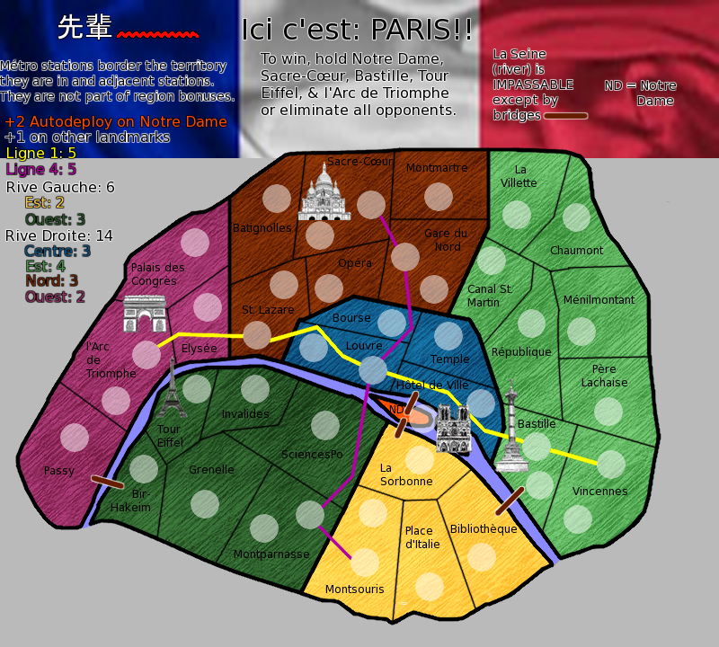
sempaispellcheck wrote:What if I moved the text down a little more so it didn't start in the flag? Or made the flag less wide, so it's kind of in the top right corner?
you are going to have to redo your whole legend from scratch. It is hard to read, looks blurred and is just plain ugly. Not to worry though, it is a very easy thing to fix as you have all of the elements there.
A couple of things to maybe consider is...
Remove the translation of river and put a small portion of the river.
Having bridges there is self explanatory so remove this. Also, you can cross the river by the trains so is also wrong.
Move the playable part of the map up to the top right.
Title, top left.
Bottom right, box it in and place your legend text here. Turn the glow of completely for now.
Bottom left - nice picture.

It does not matter if the map covers part of the flag but this is a lot of wasted space here.
sempaispellcheck wrote:ComposerNate wrote:Another point about the text: I don't think the explanation of the ND abbreviation is necessary over on the right. You could work it in with the part on the left: +2 autodeploy on Notre Dame (ND)
That's a good idea. I think I'll do that. Thank you.
If you managed to draw the island bigger (you do have room to make it bigger), you can remove the abbreviation completely.
sempaispellcheck wrote:ComposerNate wrote:-I can imagine it might be confusing to some players as to which territories they need to hold for the victory condition, because the army circle for l'Arc de Triomphe metro station is closer to the picture of the Arc than the circle for the territory itself (which is presumably the one that needs to be held). The same problem could occur to a lesser degree with Bastille and Sacre-Coeur.
The métro stations are connected by the métro lines, though. I would hope that would eliminate any confusion. I could switch the two circles so that the lower one was the métro station, though.
Switching circles is not going to work. You are going to rethink this whole thing. You have three different types of territ and all have the same army circle. Go and have a look at Portland (
viewtopic.php?f=64&t=70975) to see a way of doing it. Not saying you should copy this but it is a lot clearer.
sempaispellcheck wrote:ComposerNate wrote:-The bridge symbol is a little bland. Maybe you could do something with a graphic of an actual Paris bridge?
Don't see why not. It might be a little more difficult, but I could figure it out.
Not to worry yet. This is an easy fix. Use the square select tool, make a square the right size and use the textures that came with Gimp to fill. Then rotate to the correct angle.
sempaispellcheck wrote:ComposerNate wrote:One more thing: what's the deal with the Asian characters in the upper left?
That's the "sempai" in "sempaispellcheck."

Get rid of it. This is Paris, the city of love, onions and long bread. Not Chinese takeout.

That should keep you busy for a while.