Nate - glad you agree with Koontz - that makes my life easier.
The sig shall stay for now - I'll shrink it a bit and put it at the bottom of the legend.
Moderator: Cartographers
![]() by sempaispellcheck on Thu May 10, 2012 7:39 am
by sempaispellcheck on Thu May 10, 2012 7:39 am


![]() by ViperOverLord on Mon May 14, 2012 9:27 pm
by ViperOverLord on Mon May 14, 2012 9:27 pm


![]() by sempaispellcheck on Mon May 14, 2012 10:35 pm
by sempaispellcheck on Mon May 14, 2012 10:35 pm
![]() by Flapcake on Tue May 15, 2012 4:26 am
by Flapcake on Tue May 15, 2012 4:26 am
sempaispellcheck wrote:La Tour Eiffel = the Eiffel (not Eifle) Tower.


![]() by sempaispellcheck on Tue May 15, 2012 7:41 am
by sempaispellcheck on Tue May 15, 2012 7:41 am
Flapcake wrote:the rest of the world known it as Eiffel tower
![]() by cairnswk on Tue May 15, 2012 10:02 am
by cairnswk on Tue May 15, 2012 10:02 am


![]() by Flapcake on Tue May 15, 2012 11:47 am
by Flapcake on Tue May 15, 2012 11:47 am
sempaispellcheck wrote:Most English speakers (particularly Americans) will eventually (and I hope soon) have to realize that the rest of the world will not speak English simply because they're too lazy to learn another language.
![]() by koontz1973 on Tue May 15, 2012 11:56 am
by koontz1973 on Tue May 15, 2012 11:56 am


![]() by sempaispellcheck on Tue May 15, 2012 12:16 pm
by sempaispellcheck on Tue May 15, 2012 12:16 pm
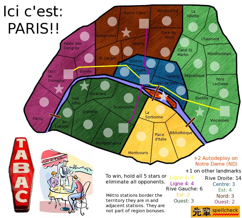
cairnswk wrote:Also, you have the Juillet Column in the Place de la Bastille...while i recognise the Bastille no longer stands wouldn't it be more appropriate for an image of the Bastilleto appear there, rather than a monument celebrating the occassion and date. Or at least a floor plan image of the Bastille.
cairnswk wrote:sempaispellcheck, i hope this will go somewhere graphically...i have to say it is not looking too good at present imho. I am sorry to be blunt. i don't like the oriental characters whatever they represent, and for such a huge city like Paris, i think something more/better could have been made of the arrondissements (districts including the outer porte ones), quartiers (quaters e.g. Latin), rive droite (right bank) and rive gauche (left bank) towards the gameplay.
![]() by koontz1973 on Tue May 15, 2012 12:28 pm
by koontz1973 on Tue May 15, 2012 12:28 pm
sempaispellcheck wrote:Don't worry, koontz - I speak French fluently. In fact, I just got back from Paris in January - was studying there for a semester.
![]() by sempaispellcheck on Tue May 15, 2012 1:19 pm
by sempaispellcheck on Tue May 15, 2012 1:19 pm
koontz1973 wrote:You lucky lucky bastard.
koontz1973 wrote:Getting fresh eyes onto the map, giving ideas and feedback in general is always good.
koontz1973 wrote:Your Chinese character has to go though for your sig. Bung your name onto the map with the character behind it. Sort of like cairnswk butterfly.
![]() by koontz1973 on Tue May 15, 2012 10:51 pm
by koontz1973 on Tue May 15, 2012 10:51 pm
![]() by ComposerNate on Mon May 21, 2012 4:37 pm
by ComposerNate on Mon May 21, 2012 4:37 pm
![]() by sempaispellcheck on Mon May 21, 2012 5:30 pm
by sempaispellcheck on Mon May 21, 2012 5:30 pm
ComposerNate wrote:Conservez le en Francais. Si quelques idiotes ne recognisent pas l'image de la Tour, ils n'ont pas l'intelligence a comprendre les mots anglais!
ComposerNate wrote:I like the Japanese and squiggle, as long as it's smaller, at the bottom, and your actual username is there too.
ComposerNate wrote:I would agree with Cairns that something more could be done with the arrondissements, but it would make a very large map, which you don't want to do as a first time mapmaker. Maybe this one could be Paris mini and you eventually do Paris maximum or something.
ComposerNate wrote:I also agree with whoever said the metro lines don't do much. They would be more strategic if there were more overall territs (maybe in Paris maximum) so they could connect faraway places like in NYC.
![]() by ComposerNate on Wed May 23, 2012 12:08 pm
by ComposerNate on Wed May 23, 2012 12:08 pm
sempaispellcheck wrote:Meme si c'est un peu evident que tu n'es pas un vrai francophone.
sempaispellcheck wrote:ComposerNate wrote:I also agree with whoever said the metro lines don't do much. They would be more strategic if there were more overall territs (maybe in Paris maximum) so they could connect faraway places like in NYC.
What if I just had 3 stations on each metro line? Ligne 1 would have stations at l'Arc de Triomphe, Louvre, and Vincennes, and Ligne 4 would have stations at Sacre-Cœur, Montparnasse or Montsouris, and Louvre. Would that work?
![]() by ManBungalow on Wed May 23, 2012 4:36 pm
by ManBungalow on Wed May 23, 2012 4:36 pm


![]() by koontz1973 on Mon Jun 04, 2012 10:49 pm
by koontz1973 on Mon Jun 04, 2012 10:49 pm
![]() by sempaispellcheck on Tue Jun 05, 2012 6:16 am
by sempaispellcheck on Tue Jun 05, 2012 6:16 am
![]() by koontz1973 on Tue Jun 05, 2012 6:51 am
by koontz1973 on Tue Jun 05, 2012 6:51 am
![]() by thehippo8 on Sun Jun 17, 2012 2:48 am
by thehippo8 on Sun Jun 17, 2012 2:48 am


![]() by sempaispellcheck on Tue Sep 18, 2012 11:27 pm
by sempaispellcheck on Tue Sep 18, 2012 11:27 pm
![]() by sempaispellcheck on Wed Sep 19, 2012 9:24 pm
by sempaispellcheck on Wed Sep 19, 2012 9:24 pm
![]() by koontz1973 on Wed Sep 19, 2012 11:49 pm
by koontz1973 on Wed Sep 19, 2012 11:49 pm
What do you think? How can I make it better?
What do you think?
How can I make it better?
 Just copy and paste, tile it so it fits everywhere.
![]() by sempaispellcheck on Thu Sep 20, 2012 7:34 am
by sempaispellcheck on Thu Sep 20, 2012 7:34 am
koontz1973 wrote:sempai, [moved] back for you.
koontz1973 wrote:sempai, the following may sound harsh but please remember, I am here to help and even though my words may sound harsh, everything is going to help you in the end.
koontz1973 wrote:It looks like crap.
koontz1973 wrote:Here are a few things you can do very quickly to make this map look a 100 times better very quickly.
Remove the tabac sign.
koontz1973 wrote:Make the cartoon fill the whole corner. In fact, that cartoon is the only thing that works. Look at it and use it...the colours are nice so replace the ones you have on the map with these.
koontz1973 wrote:Map texture, remove it and replace it with a paper one all over the map. Here is one you can use.
koontz1973 wrote:Using the paper and the colours from the cartoon will give you a map that looks a lot better.
koontz1973 wrote:Territ lines. The lines for the territs are nice and thin and work. The ones around the bonus areas are huge and horrible. Go back and redo them. I do not know what settings you used for the territ lines but you need to copy that but make the lines slightly thicker.
koontz1973 wrote:Title. Here is a font for you to use. http://www.dafont.com/boingo.font?fpp=50 That will make the title a lot better.
koontz1973 wrote:Map itself. Move the two bonuses south of the river down to make the river a lot wider. Notre Dame can then get drawn bigger so the name and star fit inside the territ.
koontz1973 wrote:Lose the metros. A paris metro map is being made now and it adds nothing to this one apart from confusion.
koontz1973 wrote:sempai, as I said, some harsh words here, but it is all meant in a way to help you. Please do not be offended and we can get this ready to move to the next level together.
![]() by koontz1973 on Thu Sep 20, 2012 9:48 am
by koontz1973 on Thu Sep 20, 2012 9:48 am
Return to Melting Pot: Map Ideas
Users browsing this forum: No registered users
|
|||||||
| Conquer Club is not associated with RISK online in any way. Copyright © 2006-2024 by Big Wham LLC | |||||||