DiM wrote:i don't feel very inspired regarding the title so i'll work on that some other time.
for now here's:
good, i look forward to seeing what you do.
V8:
*made the outside border crisper
nice, but version 8 hasn't been added to your front page, V7 still sits there.
*fixed a bit of land going into the border
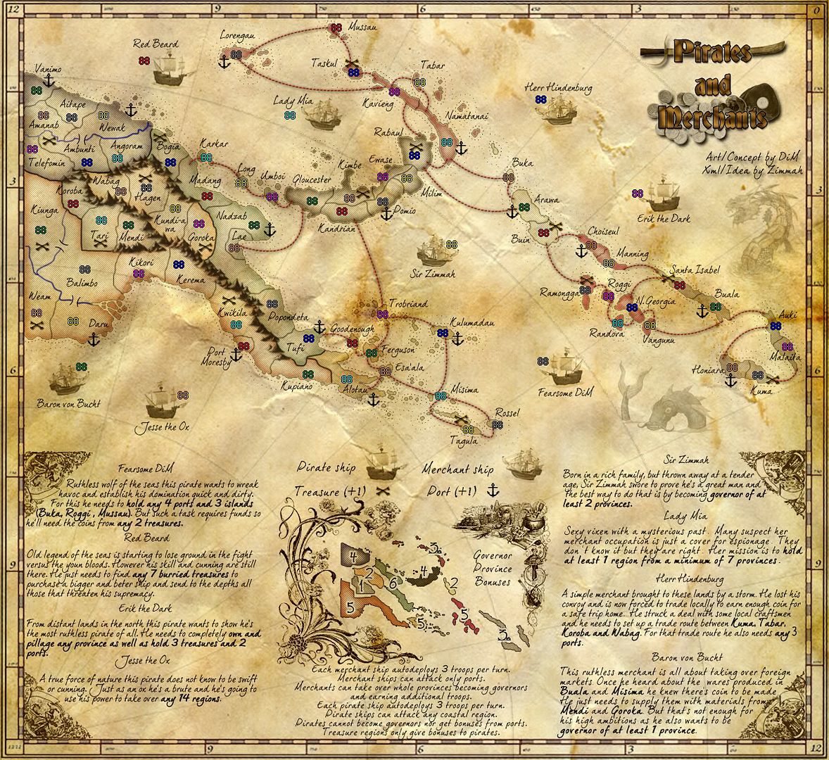
i beleive you fixed it the wrong way...that chunk of land was still supposed to be there, it is afterall part of PNG, and you've simply just deleted it...perhaps re-instate it so that the country borders are proper but they eat in to the carto border that you've just made crisper.

*extended river all the way to the border
nice, but that is the northern tributary of the fly river that you fixed called the
Strickland River.
There is part of the
Fly River where it doesn't now meet with the border on your map, actually it forms part of that curved section of the border with the then Dutch East Indies. Perhaps the Fly River could be shown in full if you place back that chunk of land that was deleted (as above)
*redrawn coastal line where fly river used to be
Dim, that is perfect and looks really nice. Great job on that section
*improved visibility of the numbers on the minimap
these look much better, except for the 3s.
Can i ask what the little bit (looks like an open unfilled punkt) is behind the 3s
*fixed mountains
meh, they're still far too dark and eye catching.
i've noticed upon close inspection that you have various shades of colour in them which actually looks quite nice and reflective of the region colours and in some places that's how the landscape looks i.e. the green...but,
this colour is completely lost by the dark shadows being on the eastern side of the mountains.
Is it possible to switch those colours and shadows around so that the shadow falls on the west of mountains and the east is lit up by the various mountain colours. That might make the mountains a lot lighter/brighter and not so dark and forboding. I mean as it is now, it looks like a version of LotR with Mt Doom all over it.
*made the dots more transparent
better, but i still have this image of fly pooh all over the map
*unblurred the flourishes
mmm, i still don't like them, they're far too busy and fussy for the map and i really don't think thematic for the map...
the bottom outside four look like a couple of fair maidens from an english garden surrounded by some swirling ribbons..
the flourish to the left of the mini-map looks like it is full of english flowers...totally inappropriate i beleive
the images on the right look like they're a large pot, an oriental person, a lion with a broomstick, and goodness knows what is in that jumble to the left of the large pot...perhaps it's the wardrobe...

Come on Dim. you can do better than this...do you're own drawings and make this map you own, not something borrowed and EASY and lazy from the internet
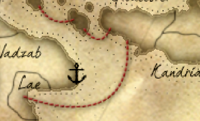
on the land and border treatments...something else i have noticed...
in the past various mapmakers have been asked to correct uneven lines where there are erratic pressure points from drawing lines etc.
1. there are several of these on the map that could do with some attention

2. there seems to be some inconsistent treatment of the land immediately inside the coastal perimeter.
you have this on some islands where there is a distinct perimeter around the inside of the islands

and then this on the mainland which doesn't match the the treatment of the islands (as shown above) nor to the islands, nor to Gloucester region as shown on this image.

I really think it should be one or the other, but not both.
Hope this helps some

more.