Page 5 of 8

Re: Papua New Guinea [11 Jan 2012][Pg. 7] old new layout + s

PostPosted: Wed Jan 11, 2012 3:03 pm
by ndrs
Peter Gibbons wrote:Thought crossed my mind... might it be worth swapping colors between Manus-New Ireland and Bougainville?

It seems pretty obvious by the connections, but someone playing the map for the first time might initially think all the yellow islands are part of one bonus if they don't read the legend carefully. Swapping those two bonus colors would prevent that. It would also distribute the color balance a little more (though I only think that will look better... it might not in the end).


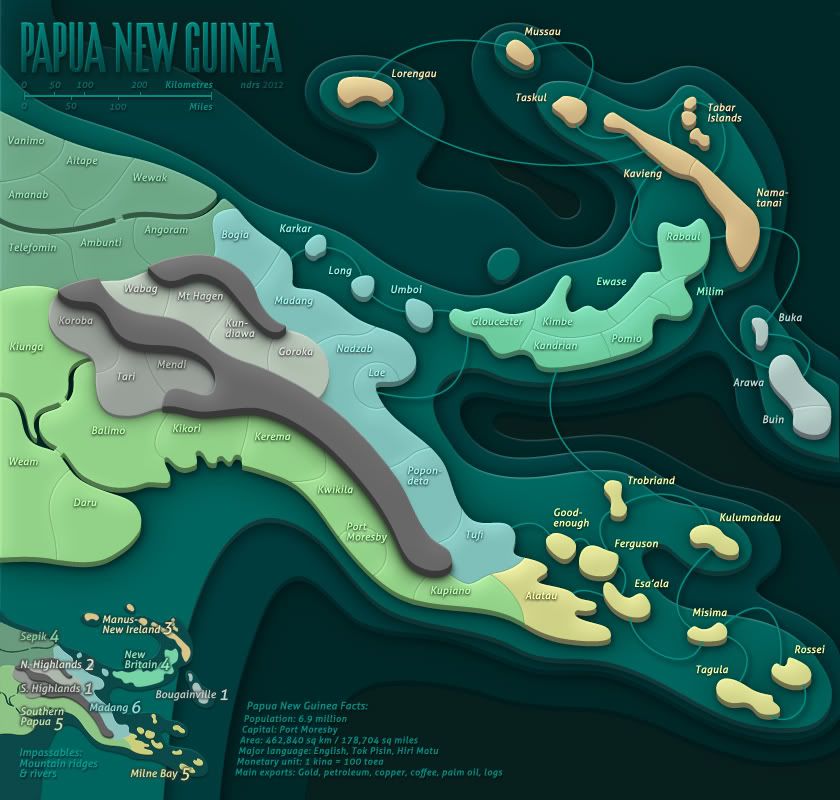
Is this better?

Click image to enlarge.
image

Re: Papua New Guinea [11 Jan 2012][Pg. 7] old new layout + s

PostPosted: Wed Jan 11, 2012 3:52 pm
by AndyDufresne
I think resolves any issue distinguishing bonus zones.

In regards to the 'main exports'--is logs the real term they use? Or is lumber? Ha.

Does anyone think there is a need to add the pattern hatching for New Britian, Bougainville, and Manus-New Ireland to the little legend map?

Keep up the good work.


--Andy

Re: Papua New Guinea [11 Jan 2012][Pg. 7] old new layout + s

PostPosted: Wed Jan 11, 2012 4:09 pm
by DiM
AndyDufresne wrote:In regards to the 'main exports'--is logs the real term they use? Or is lumber? Ha.


i'm not sure but i think lumber is a more general term that can mean a freshly cut tree or an already debarked tree or even one cut into measured pieces, while logs are just cut trees that haven't been prepared in any way.

Re: Papua New Guinea [11 Jan 2012][Pg. 7] old new layout + s

PostPosted: Wed Jan 11, 2012 9:09 pm
by Peter Gibbons
ndrs wrote:Is this better?


I like it, yes. Do you?

AndyDufresne wrote:Does anyone think there is a need to add the pattern hatching for New Britian, Bougainville, and Manus-New Ireland to the little legend map?


I personally don't. I think the colors are enough on the mini-map.

Re: Papua New Guinea [11 Jan 2012][Pg. 7] old new layout + s

PostPosted: Wed Jan 11, 2012 9:21 pm
by DiM
i find it disturbing that some terits have diagonal lines and some don't. i think you should find 3 more pastel colour and use those for the terits with diagonal lines.
also the lines are very pixelated.


PS: i liked the leaves in the title.

Re: Papua New Guinea [11 Jan 2012][Pg. 7] old new layout + s

PostPosted: Thu Jan 12, 2012 8:14 am
by ndrs
Peter Gibbons wrote:I like it, yes. Do you?


Yes, yes I do. I makes perfect sense to separate the yellows, and my intention from day one was to keep the mainlands down to green
and yellows as much as possible. Smaller blue regions certainly helps with that. Thanks for a great suggestion there! :)

AndyDufresne wrote:Does anyone think there is a need to add the pattern hatching for New Britian, Bougainville, and Manus-New Ireland to the little legend map?


I tried it but the mini map is smaller now compared to earlier versions. The hatches barely shows and mostly just
clutters the map.
And it has to be even small on the small map. :o
For me it's pretty clear as it is?

DiM wrote:also the lines are very pixelated.

Which lines are very pixelated? The sea connections?


Oh, and about the logs – all I know is that I swiped the texts from a decently reliable source... ;)

Re: Papua New Guinea [11 Jan 2012][Pg. 7] old new layout + s

PostPosted: Thu Jan 12, 2012 8:40 am
by ndrs
Click image to enlarge.
image


- Tweaked the sea passages

Re: Papua New Guinea [11 Jan 2012][Pg. 7] old new layout + s

PostPosted: Thu Jan 12, 2012 4:57 pm
by gimil
I love the simplicity of this map mate. But I feel that the flat colour are just to flat...almost feeling plain than simplistic. Can I suggest that you add a very very very subtle texture over the top of the whole map? When I say subtle I mean basically unseeable...jut enough to break the flatness of the colour.

cheers,
gimil

Re: Papua New Guinea [11 Jan 2012][Pg. 7] old new layout + s

PostPosted: Fri Jan 13, 2012 2:56 am
by pamoa
gimil wrote:I love the simplicity of this map mate. But I feel that the flat colour are just to flat...almost feeling plain than simplistic. Can I suggest that you add a very very very subtle texture over the top of the whole map? When I say subtle I mean basically unseeable...jut enough to break the flatness of the colour.
cheers,
gimil
For me the flatness of colours are really the beauty of this map

Re: Papua New Guinea [11 Jan 2012][Pg. 7] old new layout + s

PostPosted: Fri Jan 13, 2012 3:05 am
by perchorin
pamoa wrote:
gimil wrote:I love the simplicity of this map mate. But I feel that the flat colour are just to flat...almost feeling plain than simplistic. Can I suggest that you add a very very very subtle texture over the top of the whole map? When I say subtle I mean basically unseeable...jut enough to break the flatness of the colour.
cheers,
gimil
For me the flatness of colours are really the beauty of this map

I agree, the colors are great as is.

Re: Papua New Guinea [11 Jan 2012][Pg. 7] old new layout + s

PostPosted: Fri Jan 13, 2012 3:34 am
by natty dread
Maybe something like this could be done

Click image to enlarge.
image

Re: Papua New Guinea [11 Jan 2012][Pg. 7] old new layout + s

PostPosted: Fri Jan 13, 2012 4:08 am
by pamoa
do you REALLY find it better ? :o

Re: Papua New Guinea [11 Jan 2012][Pg. 7] old new layout + s

PostPosted: Fri Jan 13, 2012 5:21 am
by natty dread
pamoa wrote:do you REALLY find it better ? :o


I think it's an interesting option, it would give the map a sort of fabric-like texture - as you see, it's not even very noticeable on the playable areas, it mostly shows on the sea.

I'm not saying it's better necessarily, but not worse either.

Re: Papua New Guinea [11 Jan 2012][Pg. 7] old new layout + s

PostPosted: Fri Jan 13, 2012 10:31 am
by AndyDufresne
I'm pretty indifferent on the slight texture vs not.


--Andy

Re: Papua New Guinea [11 Jan 2012][Pg. 7] old new layout + s

PostPosted: Fri Jan 13, 2012 2:08 pm
by gimil
natty_dread wrote:
pamoa wrote:do you REALLY find it better ? :o


I think it's an interesting option, it would give the map a sort of fabric-like texture - as you see, it's not even very noticeable on the playable areas, it mostly shows on the sea.

I'm not saying it's better necessarily, but not worse either.


Yes natty. I was thinking something like that...but a little more subtle still!

Re: Papua New Guinea [11 Jan 2012][Pg. 7] old new layout + s

PostPosted: Fri Jan 13, 2012 6:51 pm
by Kabanellas
pamoa wrote:For me the flatness of colours are really the beauty of this map


Theres a plastic look, probably given by that flatness, that I really like and find quite unique on this map.

Nice work ndrs :)

Re: Papua New Guinea [11 Jan 2012][Pg. 7] old new layout + s

PostPosted: Fri Jan 13, 2012 6:54 pm
by DiM
DiM wrote:i find it disturbing that some terits have diagonal lines and some don't. i think you should find 3 more pastel colour and use those for the terits with diagonal lines.
also the lines are very pixelated.


PS: i liked the leaves in the title.

Re: Papua New Guinea [11 Jan 2012][Pg. 7] old new layout + s

PostPosted: Fri Jan 13, 2012 8:28 pm
by ndrs
Thanks guys for all the comments :)

As Kabanellas wrote, a plastic effect is what I was after – the smooth surfaces, bright colours and rather reflective.
I think adding a texturized surface would be to move away from that and probably calls for a different lightning as well.

That being said, I kinda agree with what gimil wrote. I think it could improve the map to bring some more life into it.
I''ll try to add some kind of texture to it and tweak the lightning, and then we can compare. I'm in no rush with this map
and happy to try it out.

I'll probably look into the title face again. The current one is in a late 19th century style, and even though it's beautiful it doesn't go that well with the graphical style. ;)

DiM wrote:i find it disturbing that some terits have diagonal lines and some don't. i think you should find 3 more pastel colour and use those for the terits with diagonal lines.
also the lines are very pixelated.


PS: i liked the leaves in the title.


koontz1973 wrote:
gimil wrote:Out of curiosity why do some regions have stripes whether others are plain?

It was to keep the colours down. I already asked. ;)


I'll see what I can do about the stripes. If I can find a couple of colours that doesn't make the map all tutti-frutti I'd be happy to change them!
Re: Papua New Guinea [11 Jan 2012][Pg. 7] old new layout + s

PostPosted: Sat Jan 14, 2012 5:20 pm
by Victor Sullivan
I rather like the texture natty tested out. I also like the use of the diagonal lines, though I think I preferred one of the previous drafts that mixed the hatched and solid between the mainland and the islands. And I miss the branch on the title! :(

-Sully

Re: Papua New Guinea [11 Jan 2012][Pg. 7] old new layout + s

PostPosted: Mon Jan 16, 2012 10:33 am
by ndrs
I'm in the process of trying out a faint wood-like texture. I like how this would give the map a small connection with the Pot Mosbi map.

Also, looking at the High Sea map, would it be possible to colour all the bonus regions in different green-yellow hues if I made the bonus borders thicker?
That way I could remove the striped regions and still avoid using pinks and reds.

Re: Papua New Guinea [11 Jan 2012][Pg. 7] old new layout + s

PostPosted: Mon Jan 16, 2012 1:16 pm
by natty dread
It depends, if the colours are colourblind-friendly.

Re: Papua New Guinea [11 Jan 2012][Pg. 7] old new layout + s

PostPosted: Sat Jan 21, 2012 6:29 am
by ndrs
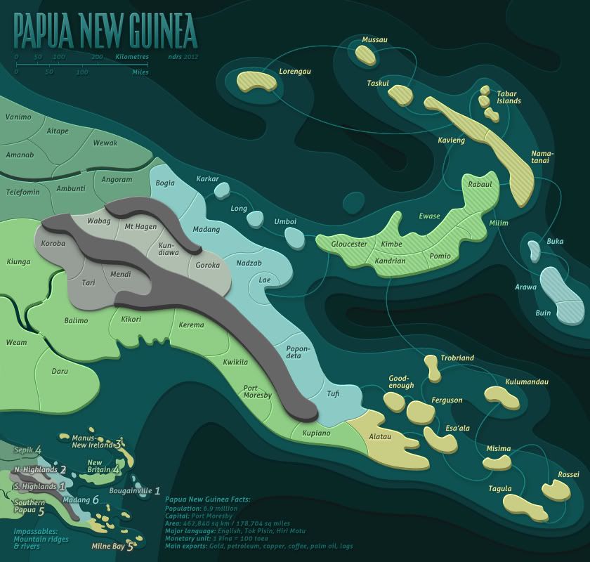
Finally had some time to update.

Tried to add different textures to the surfaces but didn't like it at all and abandoned it.

Instead I decided to breath some life into the original idea by adding a slight bevel to the regions and
increasing volume overall, richer shadows and more contrast.


Click image to enlarge.
image

Re: Papua New Guinea [21 Jan 2012][Pg. 9] V6

PostPosted: Sat Jan 21, 2012 7:55 pm
by cairnswk
I think this is changing, at first view of this new version i liked it, but then the shapes of the islands started to look like tablets (pills) on the tables (weird I know)...perhaps just a touch too much curvature on the top of the shapes ? Although it does give the perception of some releif, and PNG is very mountainous.
It could be step in the right direction without the shading though and a slight change-up in the colours.

Re: Papua New Guinea [21 Jan 2012][Pg. 9] V6

PostPosted: Tue Feb 07, 2012 4:08 am
by RedBaron0
Be aware too that the final image will be a .jpg, so there might be a bit of detail lost.... :/

I like the fact card for PNG, but it's bland, something little that can go next to this for a just a splash of cultural color? Flag perhaps?

Re: Papua New Guinea [21 Jan 2012][Pg. 9] V6

PostPosted: Sun Feb 12, 2012 5:51 am
by koontz1973
Can I ask you to look at te sea routes. They start and finish at the top of the islands. It might look better if the start and finish at the bottom in the water.