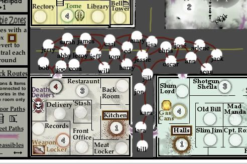
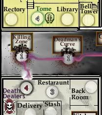
TaCktiX wrote: Floorplan idea is nifty, but entirely too confusing. Having 4 different passables and as many impassables (typo on the map, btw) is overkill. Simplify it, having solid borders where there is no connection, and open space where there are. You've still got your floorplan, but we don't have to worry about lots of symbols.
That makes a lot of sense, I was just being artsy and putting in stuff that I thought looked neat rather than thinking practical and readable.
(impassible is also an acceptable spelling... of the adjective anyway, not the made-up noun used in Foundry jargon... so perhaps I'm still in error.)
TaCktiX wrote: That, and you can graphically buff out two symbols easier than you can nine..
Er, not quite sure what this last sentence meant... not hip to the jargon, methinks. By 'buff out' symbols, do you mean polish up in later map editions? Again, that argument would make lots of sense.
TaCktiX wrote: Starting deployment is far too high. Consider that the territories will pick up +2 autodeploy on turn start, and the player will get 3 more armies. That's 13 armies TO START. I suggest lowering it down to 3 or 4
Hmmm... well, 3 is too low for sure unless I do something else to protect the auto-deploy from a first-turn steal. With open deployment, it's sort of a conundrum... but you're right about 8 being too high, I just grabbed that number without much thought.
I don't think 4 is good enough to discourage attacks completely, either. Some players are willing to do 6-versus-4 attacks. Then again 5 seems to high when we consider the havoc that could be wrought on other players by 10 armies.
No matter which way I go, the order of the drop becomes too advantageous for players who go first. At least with the current setup. I'll have to think on this. Suggestions are welcome.
TaCktiX wrote: More Choppers? Seriously? Come on, use some L4D inspiration and have a better territory name.
Well, actually the simplistic repetition was intentional, meant to be mildly amusing. Sort of like "Not Mexico" in the USApocalypse Map. Obviously though it didn't do the trick.
I'm certainly open to other names, I know I have a lot of them and really I want them to be a strength of the map, and add the flavor it needs.
TaCktiX wrote: The buildings are too flat compared to the streets, their connectors, and the helipad. Have some fun with it, perhaps take inspiration from Operation Drug War.
Good graphical suggestion- although Operation Drug War isn't my favorite map to view... actually I kind of avoid playing it based on its looks. It sort of reminds me of a bunch of tackleboxes full of brightly colored lures rather than buildings full of items and furniture.
In order to raise the buildings and add more perspective, I'll have to compress the streets, which could cause some headaches, but it'll get done. I probably won't do it right away, however, as I'm pursuing the gameplay and overall feasibility of the map first.
Thanks Tac for taking the time and giving the veteran advice. Very much appreciated. As for the overall rough look, layout, theme and gameplay, does the map hold promise or is it still trying to find its way?


