Victor Sullivan wrote:I apologize for my lateness in posting my thoughts, as I know youve been holding your breath for this.
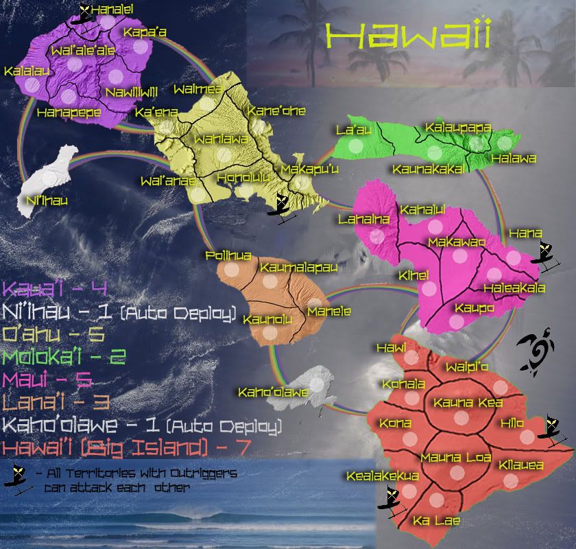
- I absolutely love your graphical style, especially those rainbow connectors, that is sexy right there, and I rarely use that word (except when it comes to ljex, but thats another story...)
- The outriggers are a nice gameplay touch to balance things out, good thinking!
- The (Big Island) could be dropped from the legend, I dont believe you need the extra clarification.
- The text colour of Niihau doesnt match the colour of the island.
- I say the single territory islands, Niihau and Kahoolawe, shouldnt be autodeploys at all but standard +1 bonuses.
- Careful with your borders, they have varying pixelation (as it seems your island images do too, yikes...), as the thick borders in Hawaii are rather pixelated, while the thin borders in Lanai are fine. Consistency in that area is certainly recommended.
- Bonus changes: It seems Oahu would be harder to hold than Maui, as it has more borders to defend and more territories connect to its borders, so I think this justifies an increase for Oahu from +5 to +6. In addition, I believe Hawaii should be upped to +8, as it is at least worth +2 more than Oahu and it would be much harder to hold than Asia in Classic (which has a +7 bonus).
Cheers,
Sully
1-thanks for the support on our graphic style. there is still work to be done, and we are still trying to get the rainbows to look good. living in Hawaii makes me appreciate them, and i realize there is lots of prejudice against them in other places, but we are trying to be true to the Islands. That being said, if they don't look good, they don't stay.
2-yeah, we needed the outriggers. when we play the original board without them, whoever gets Kauai will always win. Also, the yellow canoe symbol on them is a nod to the Kanaka Maoli & King Kamehameha's personal flag.
3-the Big Island thing is something we are undecided on. on one hand, every body in Hawaii calls that island "big island", nobody calls it Hawaii. on the other hand, Hawaii is its name, and the extra clarification in the map key is sorta distracting. i could go either way on it.
4-we will make sure the text color matches the color of the island. like i mentioned elsewhere, we are using each islands official color
5-we have come around to agree with you about changing from autodeploy to standard +1. i assume its possible to have them start neutral though, so during gameplay some lucky player doesnt start with a bonus. makes it less fair.
6-yeah, that variance in border thickness/pixelation has got to be fixed. Maui and Big Island look the worst b/c of all their resizing. we will fix it.
7-bonus changes- we agree with all your sentiments. well put and argued. i'm sure as this map progresses through the foundry other people will have a say in this too, and we are totally cool with changing these values. the map has to be fair to be fun, right?
good input Sully

Mahalo!
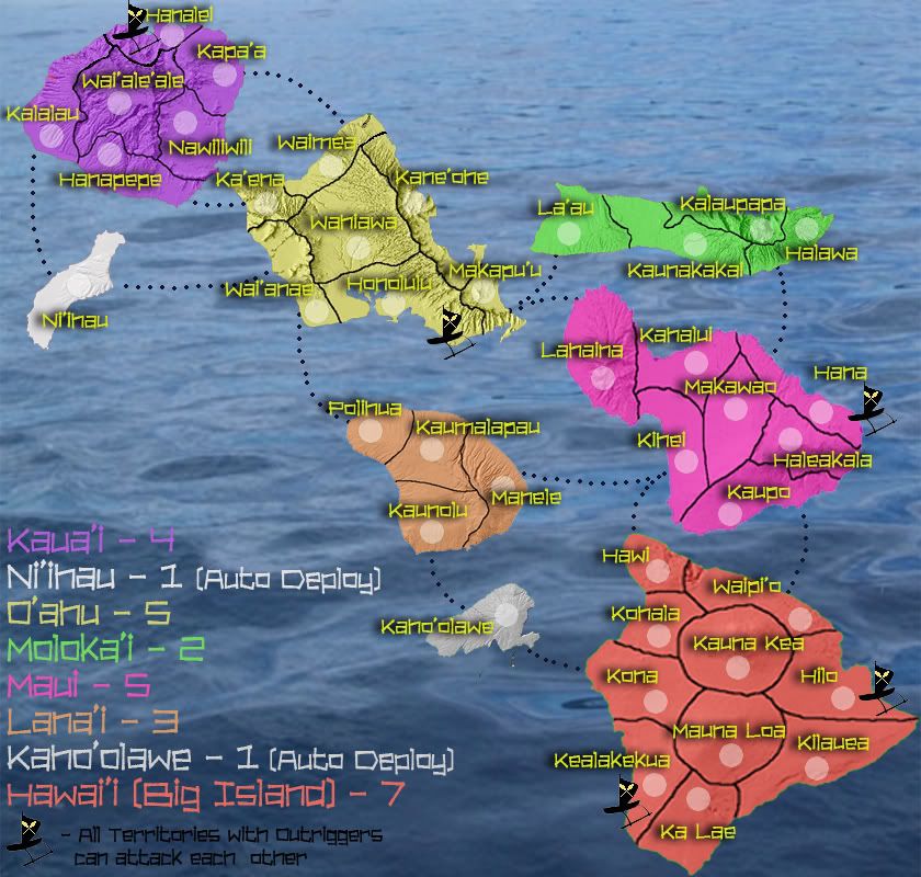
greenoaks wrote:(i suppose i could look this up but i'm a bit lazy today, the 1st) is there something significant about those two islands ie.are those 2 islands active volcanoes ? is there something historical that would lend itself to a +1 auto-deploy ?
+ is that a typo 'outriggers can attact each other' - attack
There are no active Volcanoes on those islands, they are special for other reasons, but we were imagining this map as a pretty straightforward traditional map. Our next map (assuming there is interest) will be of Hawaii with Volcanoes, Tiki gods, boats, amakua, Capt Cook, King Kamehameha, Heiau, and all that stuff. Baby steps brah
