Re: Tokyo [11 Jul 2011]
since this is tokyo wouldn't rice paper texture fit better than simple paper? or perhaps a sheet of nori...
Conquer Club, a free online multiplayer variation of a popular world domination board game.
https://www.conquerclub.com/forum/
https://www.conquerclub.com/forum/viewtopic.php?f=242&t=137746
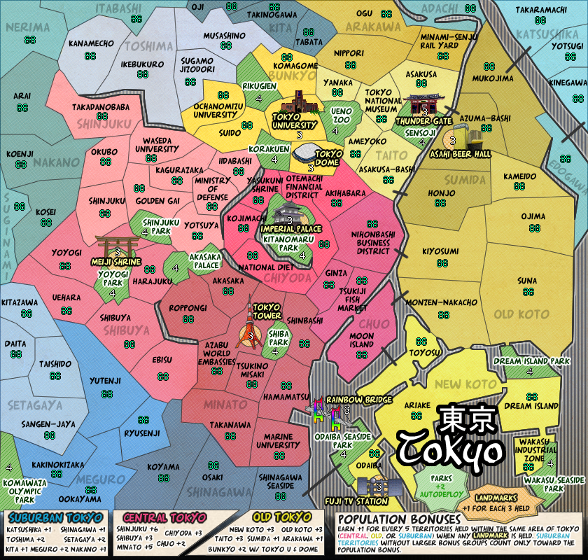
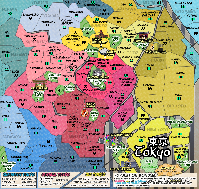
DiM wrote:since this is tokyo wouldn't rice paper texture fit better than simple paper? or perhaps a sheet of nori...
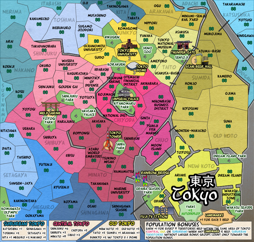
gimil wrote:I prefer the older texture myself. That said thou, their isn't anything wrong with the new one either.
MrBenn wrote:gimil wrote:I prefer the older texture myself. That said thou, their isn't anything wrong with the new one either.
The previous texture you had was virtually invisible; the current one is probably too visible... I'd suggest something between the two, but nearer the previous version with the texture barely visible.
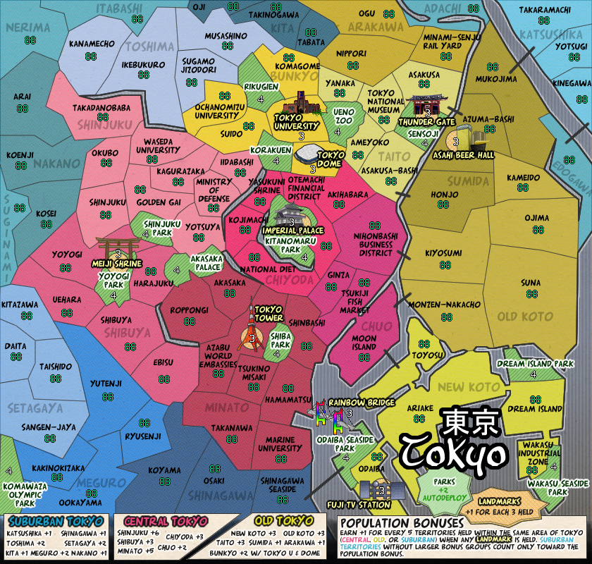
shakeycat wrote:It makes me feel like I need to clean my monitor or something.
zimmah wrote:Cant really say which one is better from my iPhone so i Will watch On my pc later and give my opinion About which one i think looks best
shakeycat wrote:zimmah wrote:Cant really say which one is better from my iPhone so i Will watch On my pc later and give my opinion About which one i think looks best
You'll know when you start smudging up your screen with fingerprints, trying to get the pesky dust particles offit almost makes me want to use it as a texture!
It's so subtle though.
Maybe if I reduced the opacity of the wards?
flip between:
http://www.atomation.com/~thazzard/fun/tokyo/jul11.jpg
http://www.atomation.com/~thazzard/fun/tokyo/jul13a.jpg
TaCktiX wrote:- The black lines look silly compared to the Rainbow Bridge landmark. Perhaps consider making them generic bridges instead of lines?