ROME: CIVIL WAR v31
Moderator: Cartographers
Re: ROME [3/8/2011] V 1 pg 2
![]() by Nola_Lifer on Wed Aug 10, 2011 12:12 pm
by Nola_Lifer on Wed Aug 10, 2011 12:12 pm
Why not separate regions for the Via? So the Market of Livia will have one sport for the Market and another for the Via.

-
 Nola_Lifer
- Posts: 819
- Joined: Mon Oct 13, 2008 4:46 pm
- Location: 雪山


Re: ROME [3/8/2011] V 1 pg 2
![]() by Minister X on Wed Aug 10, 2011 1:03 pm
by Minister X on Wed Aug 10, 2011 1:03 pm
I'm afraid there's no way I could fit in 26 more territories.
-

Minister X
- Posts: 424
- Joined: Tue Nov 11, 2008 4:45 pm


Re: ROME [3/8/2011] V 1 pg 2
![]() by Minister X on Sun Aug 14, 2011 11:10 am
by Minister X on Sun Aug 14, 2011 11:10 am
PROCESS QUESTION:
I've created a new draft that addresses the desire expressed above for more of a Roman "feel" to the graphics. I encased the map inside the facade of a "temple" with columns and triangular top. But this makes the map super-sized. I'm not sure I prefer it to the current draft, but others might and I respect their opinions. Should I post it here just so I can get preference reactions first? (Maybe we go back to regular size.) Or do I tentatively apply for supersize?
I've created a new draft that addresses the desire expressed above for more of a Roman "feel" to the graphics. I encased the map inside the facade of a "temple" with columns and triangular top. But this makes the map super-sized. I'm not sure I prefer it to the current draft, but others might and I respect their opinions. Should I post it here just so I can get preference reactions first? (Maybe we go back to regular size.) Or do I tentatively apply for supersize?
-
Minister X
- Posts: 424
- Joined: Tue Nov 11, 2008 4:45 pm
Re: ROME [3/8/2011] V 1 pg 2
![]() by sannemanrobinson on Sun Aug 14, 2011 4:34 pm
by sannemanrobinson on Sun Aug 14, 2011 4:34 pm
You are making me curious. Post it!
An idea to fit a temple front in the current size: crop the lower part where the playable map ends. Legend can be put at the top over a temple background.
An idea to fit a temple front in the current size: crop the lower part where the playable map ends. Legend can be put at the top over a temple background.
-
sannemanrobinson
- Posts: 255
- Joined: Mon Dec 20, 2010 6:35 am


Re: ROME [3/8/2011] V 1 pg 2
![]() by DiM on Sun Aug 14, 2011 4:39 pm
by DiM on Sun Aug 14, 2011 4:39 pm
Minister X wrote:PROCESS QUESTION:
I've created a new draft that addresses the desire expressed above for more of a Roman "feel" to the graphics. I encased the map inside the facade of a "temple" with columns and triangular top. But this makes the map super-sized. I'm not sure I prefer it to the current draft, but others might and I respect their opinions. Should I post it here just so I can get preference reactions first? (Maybe we go back to regular size.) Or do I tentatively apply for supersize?
post the map even if it is supersize. if it looks good and it's unnecessarily supersized then i'm all for it.
right now the map is more about form and function and less about artwork. you should definitely add some artwork.
“In the beginning God said, the four-dimensional divergence of an antisymmetric, second rank tensor equals zero, and there was light, and it was good. And on the seventh day he rested.”- Michio Kaku
-

DiM
- Posts: 10415
- Joined: Wed Feb 14, 2007 6:20 pm
- Location: making maps for scooby snacks


Re: ROME [3/8/2011] V 1 pg 2
![]() by Minister X on Mon Aug 15, 2011 7:55 pm
by Minister X on Mon Aug 15, 2011 7:55 pm
Having not heard otherwise from any CC officials, I'll take the advice of the last few commenters and post the supersized map here but not yet in the supersize-approval thread. Let's see what people think of the larger map first.
I presume you meant to add the word "not" between "it's" and "unnecessarily". If it's not unnecessarily supersized, then yada yada yada. And that, to my mind, is the issue. I didn't need supersized to fit everything in, as with the sixth draft. It's only the desire for some "art" that makes the larger size necessary. I'm now 989 wide by 932 high, which is well within the supersize limits, and which easily fits onto my monitor. Being new at this CC mapmaking thing, I don't know why supersized was created. Was it just so the occasional map could reluctantly be approved? Or was it a recognition that 1024x768 monitors are getting darned scarce, and larger maps can become the norm? If it's the latter, then I favor the new draft. It's not as cluttered and I think the artwork won't be distracting once you're in the heat of battle. But if it's the former I think the smaller map can be made attractive enough if I get some good suggestions from some mapmakers who are better than I with the artwork.
As for this artwork, I'd rate it mediocre. It has some shadowing but no real 3D depth to it. That could be added by having the roof flow to the top left corner and adding some angled perspective to the whole thing, but is it really worth it?
Next question: what's the name of this map? It used to be "The Gates and Roads of Rome", or maybe just "Rome". Is it now "Vias Et Portas Romano"??? Or "The Avenues and Gates of Rome"? Should I get rid of the Latin??
DiM wrote:post the map even if it is supersize. if it looks good and it's unnecessarily supersized then i'm all for it.
I presume you meant to add the word "not" between "it's" and "unnecessarily". If it's not unnecessarily supersized, then yada yada yada. And that, to my mind, is the issue. I didn't need supersized to fit everything in, as with the sixth draft. It's only the desire for some "art" that makes the larger size necessary. I'm now 989 wide by 932 high, which is well within the supersize limits, and which easily fits onto my monitor. Being new at this CC mapmaking thing, I don't know why supersized was created. Was it just so the occasional map could reluctantly be approved? Or was it a recognition that 1024x768 monitors are getting darned scarce, and larger maps can become the norm? If it's the latter, then I favor the new draft. It's not as cluttered and I think the artwork won't be distracting once you're in the heat of battle. But if it's the former I think the smaller map can be made attractive enough if I get some good suggestions from some mapmakers who are better than I with the artwork.
As for this artwork, I'd rate it mediocre. It has some shadowing but no real 3D depth to it. That could be added by having the roof flow to the top left corner and adding some angled perspective to the whole thing, but is it really worth it?
Next question: what's the name of this map? It used to be "The Gates and Roads of Rome", or maybe just "Rome". Is it now "Vias Et Portas Romano"??? Or "The Avenues and Gates of Rome"? Should I get rid of the Latin??

Last edited by Minister X on Sun Aug 21, 2011 10:11 pm, edited 1 time in total.
-
Minister X
- Posts: 424
- Joined: Tue Nov 11, 2008 4:45 pm
Re: ROME [3/8/2011] V 1 pg 3
![]() by thenobodies80 on Tue Aug 16, 2011 6:46 am
by thenobodies80 on Tue Aug 16, 2011 6:46 am
As said previously I'd like to see more arts on the playable part, or at least see on the map the main buildings of the map, for example it would better to have the Flavian Amphiteater on the map instead of an empty territory with just a label on it. Your new draft is nice, but the playable part is a bit anonymous and I can't see the real complexity of the "City" at that time.
Honestly I think that the map should be Rome instead of the avenues and gates of Rome. I would prefer to have as subject of the map the whole city and maybe use the avenues and gates as bonus features more than as subject of the map itself. Rome was Caput Mundi not just for its gates.
In any case your current Latin title is wrong, you used the accusative case, but in your case you should use the nominative, being the avenues and gates the subject of the phrase. A Latin translation of "The avenues and gates of Rome" could be " Viae et Portae Romae Urbis" or just "Viae et Portae Urbis" (the word Urbs was used by romans to indicate the city of Rome more than "a" city).
If you want to use more space is fine for me, but use only the necessary space, for example on the left side you have lot of useless space.
I don't get the SPQR bonus....it has not so much sense imo. It looks just something to add a roman flavour to the map, but it lacks of consistence. For example what is the reason to have the Temple of Jupiter marked with a S (senatus) and the senate with a R (romanus) ?
Maybe I'm stubborn, but I really think that the Ancient Rome, the city that gave rise to one of the largest empires in history, one of the most visited city in the world, deserves a more detailed map.
Nobodies
Honestly I think that the map should be Rome instead of the avenues and gates of Rome. I would prefer to have as subject of the map the whole city and maybe use the avenues and gates as bonus features more than as subject of the map itself. Rome was Caput Mundi not just for its gates.
In any case your current Latin title is wrong, you used the accusative case, but in your case you should use the nominative, being the avenues and gates the subject of the phrase. A Latin translation of "The avenues and gates of Rome" could be " Viae et Portae Romae Urbis" or just "Viae et Portae Urbis" (the word Urbs was used by romans to indicate the city of Rome more than "a" city).
If you want to use more space is fine for me, but use only the necessary space, for example on the left side you have lot of useless space.
I don't get the SPQR bonus....it has not so much sense imo.
Maybe I'm stubborn, but I really think that the Ancient Rome, the city that gave rise to one of the largest empires in history, one of the most visited city in the world, deserves a more detailed map.
Nobodies
-

thenobodies80
- Posts: 5400
- Joined: Wed Sep 05, 2007 4:30 am
- Location: Milan


Re: ROME [3/8/2011] V 1 pg 3
![]() by Minister X on Tue Aug 16, 2011 8:54 am
by Minister X on Tue Aug 16, 2011 8:54 am
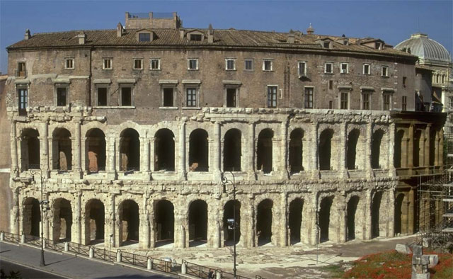
Honest question: do you really think an image of the Flavian Amphitheater (aka Colosseum) inside the territory boundaries would be recognizable and add more to the overall aesthetics than it would detract from the ability to read everything? And that is about the only landmark that everyone would recognize and it's territory is one of the largest on the map. What else would work? The Theater of Marcellus? I'd never recognize it. It looks an awful lot like the Colosseum:
Depicting that in any meaningful way behind the title and unit designations is beyond my skill. Most of the landmarks used as territory names no longer exist and no one knows what they looked like. One that's different is the Baths of Caracalla - very famous tourist destination because of how massive the remaining bits of arch are. But would depicting this in a tiny territory really add to the game:

What I think I'm hearing from you is that you simply don't like this idea for a game. I think you'd prefer one with many fewer spaces, fewer bonus opportunities, and more pictures of landmarks - sort of a tourist's map game. I tried, in the text at the upper left, to explain why the gates and roads are important. There were in fact several extremely important battles at these gates. For instance, at the battle of the Colline Gate, fought in November of 82 BC, Sulla secured control of Rome and ended the civil war against his rivals. This was a huge turning point in Roman history. For obvious reasons, gates were extremely strategic points in ancient walled cities.
It appears that I've really bit off more than I can chew in trying to make a large/complex map. Maybe instead of this and Gettysburg I'll try some really simple one with nothing special and just work on making it pretty. Perhaps the practice will serve me well before I get ambitious.
Depicting that in any meaningful way behind the title and unit designations is beyond my skill. Most of the landmarks used as territory names no longer exist and no one knows what they looked like. One that's different is the Baths of Caracalla - very famous tourist destination because of how massive the remaining bits of arch are. But would depicting this in a tiny territory really add to the game:
What I think I'm hearing from you is that you simply don't like this idea for a game. I think you'd prefer one with many fewer spaces, fewer bonus opportunities, and more pictures of landmarks - sort of a tourist's map game. I tried, in the text at the upper left, to explain why the gates and roads are important. There were in fact several extremely important battles at these gates. For instance, at the battle of the Colline Gate, fought in November of 82 BC, Sulla secured control of Rome and ended the civil war against his rivals. This was a huge turning point in Roman history. For obvious reasons, gates were extremely strategic points in ancient walled cities.
It appears that I've really bit off more than I can chew in trying to make a large/complex map. Maybe instead of this and Gettysburg I'll try some really simple one with nothing special and just work on making it pretty. Perhaps the practice will serve me well before I get ambitious.
-
Minister X
- Posts: 424
- Joined: Tue Nov 11, 2008 4:45 pm
Re: ROME [3/8/2011] V 1 pg 3
![]() by AndyDufresne on Tue Aug 16, 2011 9:24 am
by AndyDufresne on Tue Aug 16, 2011 9:24 am
When I look at this, I feel like there are light-cycles in Rome.
--Andy
--Andy
-

AndyDufresne
- Posts: 24919
- Joined: Fri Mar 03, 2006 8:22 pm
- Location: A Banana Palm in Zihuatanejo


Re: ROME [3/8/2011] V 1 pg 3
![]() by thenobodies80 on Tue Aug 16, 2011 1:55 pm
by thenobodies80 on Tue Aug 16, 2011 1:55 pm
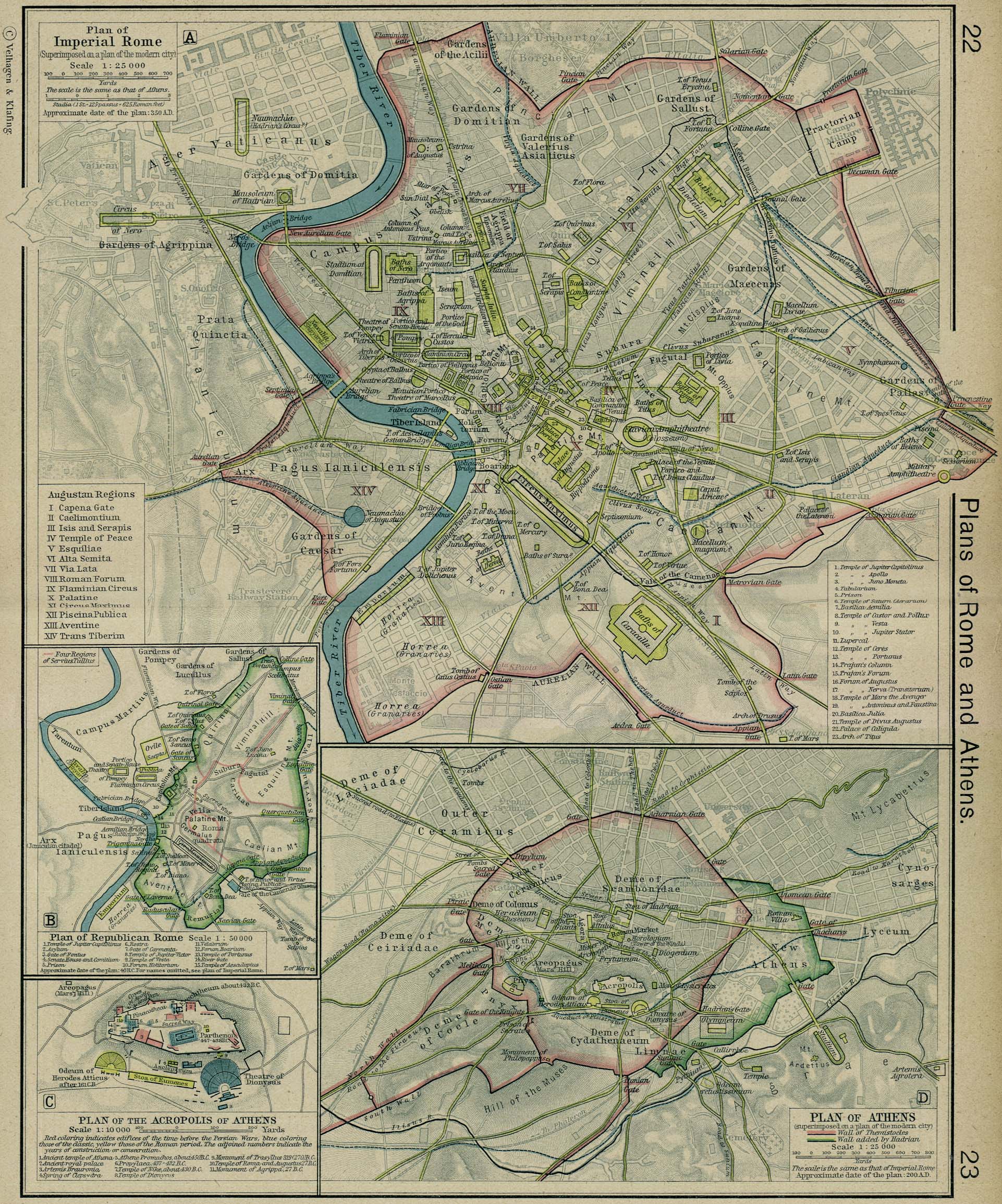
You don't have to draw the whole colosseum , you have a bird eye point of view. You need only to insert the shape of buildings, just have the city that looks like a city, the roads that look more like roads.
Say that no one knows how they looked like is not true. For example Google Earth can help you with this http://earth.google.com/rome/
Obviously I'm not asking you to draw something like that.
But more something like this --> http://it.wikipedia.org/wiki/File:Map_o ... _large.png
That image (the link) looks like a city!
I'm not for less bonuses, I'm not for having it just pretty. I'm saying that focusing just on roads and gates is like to put a limit to a map that can be developed in a better way!
I don't want a touristic map, just if you want to draw a map about a city (the immortal city), then draw a city..... not neon-worms on a gray anonymous land.
But maybe I'm wrong and it's just the Italian guy in me that is not able to recognize Rome in your draft.
-
thenobodies80
- Posts: 5400
- Joined: Wed Sep 05, 2007 4:30 am
- Location: Milan
Re: ROME [3/8/2011] V 1 pg 3
![]() by Minister X on Tue Aug 16, 2011 5:51 pm
by Minister X on Tue Aug 16, 2011 5:51 pm
thenobodies80 wrote:But maybe I'm wrong and it's just the Italian guy in me that is not able to recognize Rome in your draft.
Maybe you're Italian, but you're not an ancient Roman. Who would recognize more of ancient Rome than the Forum, Circus Maximus and Colosseum? And that's really the problem. I started out with exactly what you describe, but for the (almost) modern city with what's left from the ancients showing. The Shepherd map is good for this and is what I used. I tried to get it to work, despite having railroad lines and other modern artifacts to deal with. The real problem was getting anything meaningful to show through at the scales at which I'm working. An attendant problem is that I couldn't map everything [url]exactly[/url] where it was in real life. Things recognizable might show through for a handful of territories, but for many others would be nothing but a confused mish-mash. I think I still have (or can reproduce) one of those first versions - I'll PM the link to you.
That's why I went with the big temple-as-frame in an effort to add "art". I wasn't aware that you meant solely as an organic part of the map.
-
Minister X
- Posts: 424
- Joined: Tue Nov 11, 2008 4:45 pm
Re: ROME [3/8/2011] V 1 pg 3
![]() by Nola_Lifer on Wed Aug 17, 2011 2:55 pm
by Nola_Lifer on Wed Aug 17, 2011 2:55 pm
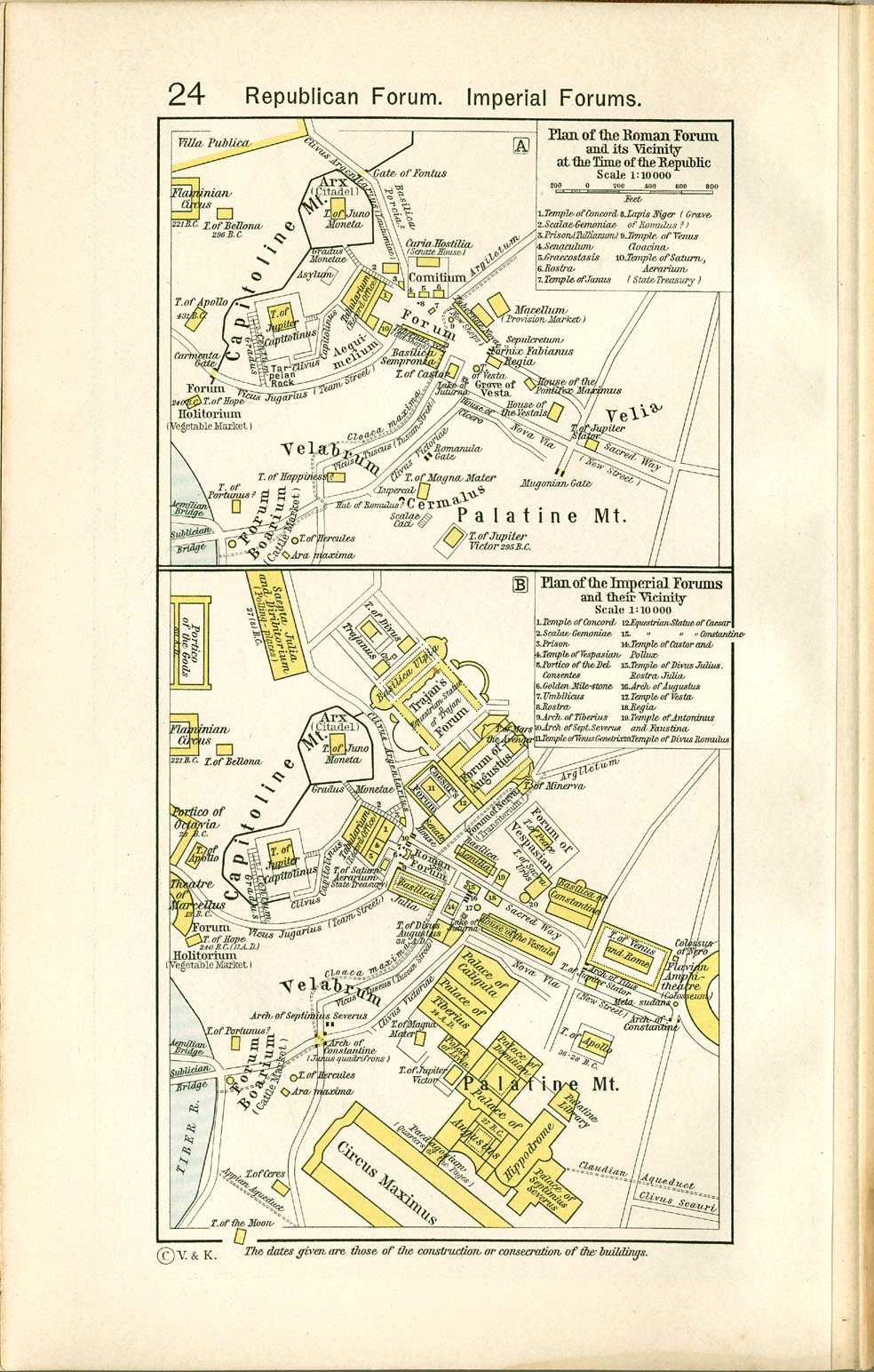
Hope these help!
- Click image to enlarge.
- Click image to enlarge.
-
Nola_Lifer
- Posts: 819
- Joined: Mon Oct 13, 2008 4:46 pm
- Location: 雪山
Re: ROME [3/8/2011] V 1 pg 3
![]() by Minister X on Wed Aug 17, 2011 3:18 pm
by Minister X on Wed Aug 17, 2011 3:18 pm
I appreciate the effort but the top one is the Shepherd map I'd just linked to and the bottom ones each cover but three of the 75 territories. Guys: I know how to use Google image search.
A start-from-scratch alternative would be to map only "downtown" Rome: the forum and whatever else can be put together from maps like those last two. But that's a whole different game - can we decide if mine is worth pursuing or not? (I gather: not.)
A start-from-scratch alternative would be to map only "downtown" Rome: the forum and whatever else can be put together from maps like those last two. But that's a whole different game - can we decide if mine is worth pursuing or not? (I gather: not.)
-
Minister X
- Posts: 424
- Joined: Tue Nov 11, 2008 4:45 pm
Re: ROME [3/8/2011] V 1 pg 3
![]() by Nola_Lifer on Thu Aug 18, 2011 12:10 pm
by Nola_Lifer on Thu Aug 18, 2011 12:10 pm
Minister X wrote:I appreciate the effort but the top one is the Shepherd map I'd just linked to and the bottom ones each cover but three of the 75 territories. Guys: I know how to use Google image search.
A start-from-scratch alternative would be to map only "downtown" Rome: the forum and whatever else can be put together from maps like those last two. But that's a whole different game - can we decide if mine is worth pursuing or not? (I gather: not.)
I get my maps from a database online that may not show up on google images. I was just trying to throw ideas out there. I think the biggest thing that goes against you is so many good maps have been made and Rome is such an important subject that it will be difficult to come up with a challenging gameplay design and map design that everyone will enjoy. I think your ideas and efforts are good but you gotta be even more outside the box because of all the good map makers.
-
Nola_Lifer
- Posts: 819
- Joined: Mon Oct 13, 2008 4:46 pm
- Location: 雪山
Re: ROME [3/8/2011] V 1 pg 3
![]() by Minister X on Thu Aug 18, 2011 4:52 pm
by Minister X on Thu Aug 18, 2011 4:52 pm
Nola_Lifer wrote:Minister X wrote:...you gotta be even more outside the box because of all the good map makers.
I'm not here to compete with other map-makers. I think this must be the attitude that causes the Foundry to be full of very complex games that push the limits of XML capabilities and the limits of space/readability. "Risk" is anything but an "outside the box" game (no pun) and yet Classic is by far the most popular map despite the horrible Oceania flaw. I aim to cater to players who want simple inside-the-box games. If the Foundry is not inclined to approve such games, so be it. I will resist the temptation to design "way out" games if I can. (It's a difficult temptation to resist).
I can't pretend to be the world's most talented map-maker. I think it's entirely reasonable for the Foundry to reserve the Rome-as-a-city theme for someone with a lot more talent. Just let me know so I won't waste my time.
-
Minister X
- Posts: 424
- Joined: Tue Nov 11, 2008 4:45 pm
Re: ROME [3/8/2011] V 1 pg 3
![]() by isaiah40 on Thu Aug 18, 2011 5:35 pm
by isaiah40 on Thu Aug 18, 2011 5:35 pm
In the opinion of others, more standard maps a are welcome. IMHO, I think go with this and let the community decide. A suggestion, you can use the columns you have, but instead of putting the map inside of it, why not place the legend and game play instructions in it? Just a thought.
-
isaiah40
- Posts: 3990
- Joined: Mon Aug 27, 2007 7:14 pm


Re: ROME [3/8/2011] V 1 pg 3
![]() by natty dread on Thu Aug 18, 2011 7:33 pm
by natty dread on Thu Aug 18, 2011 7:33 pm
Minister X wrote:Classic is by far the most popular map despite the horrible Oceania flaw.
Classic is popular because it is so well known. A lot (most?) people already are familiar with the map when they come on the site, and some are simply purists when it comes to Risk-type games.
Classic is at the top, yes, but right after it are lots of non-standard maps. CC already has a whole shitload of standard-gameplay vanilla maps. If you make another standard-gameplay vanilla map, it will need to have exceptional graphics and balanced & fun gameplay to become popular, otherwise it will be forgotten in the huge mass of other standard-gameplay vanilla maps.

-

natty dread
- Posts: 12877
- Joined: Fri Feb 08, 2008 8:58 pm
- Location: just plain fucked


Re: ROME [3/8/2011] V 1 pg 3
![]() by Minister X on Thu Aug 18, 2011 8:03 pm
by Minister X on Thu Aug 18, 2011 8:03 pm
natty_dread wrote:Minister X wrote:If you make another standard-gameplay vanilla map...
Classic has two ways of earning reinforcements, I have four. Classic has no impassable, I have two entire walls and a river. That you see my game as "another standard-gameplay vanilla map" is evidence of how far the goalposts have moved. Indeed, compared to most of them in the Foundry, mine is simple.natty_dread wrote:Classic is at the top, yes, but right after it are lots of non-standard maps.
And also a lot of standard ones. The next five after Classic: Doodle Earth, Luxembourg, Feudal War, Arms Race!, and World 2.1. My Rome map is more complex than three or four of these, yet you see it as vanilla and assume it won't be liked unless extraordinary. Like Doodle Earth? I like all the simple games of those five but have never played Arms Race. And I'm no point farmer. I doubt I'm alone.
But please understand: I'm not suggesting that Rome is ready, or even good. I'm just saying it's not vanilla simple. I'd like to improve it to where it earns a spot with the played, but I need help figuring out what needs to be done. I'm not happy with the temple. I'll probably work on something halfway between it and the previous draft - something where the graphics are more integrated with gameplay. Maybe I can replace S, P, Q and R with little icons for temples, entertainment, gardens and baths. Hmm. Entertainment can be the two masks: sad and happy. That's evocative and not anachronistic. An icon of Jupiter (??) for temples? One of laurel and berries for the gardens? And a tiny mosaic for the baths??? Could work but I doubt I'm a good enough artist to pull it off. I'd obviously re-assign the bonus territories for these, and I'd have to redraw the map from scratch to make room within the 12 special terits.
Does it sound worth the effort?
-
Minister X
- Posts: 424
- Joined: Tue Nov 11, 2008 4:45 pm
Re: ROME [3/8/2011] V 1 pg 3
![]() by isaiah40 on Thu Aug 18, 2011 8:26 pm
by isaiah40 on Thu Aug 18, 2011 8:26 pm
Yes it is worth the effort. If you have a problem there are people here that help you out. So go ahead and give it a try.
-
isaiah40
- Posts: 3990
- Joined: Mon Aug 27, 2007 7:14 pm
Re: ROME [3/8/2011] V 1 pg 3
![]() by thenobodies80 on Sat Aug 20, 2011 8:06 pm
by thenobodies80 on Sat Aug 20, 2011 8:06 pm
Finally there are two things on which we agree  :
:
1. Oceania sucks (sorry for that map...really )
)
2. What you said here:
Some good ideas here...go with it. And I DON'T think you're not a good enough to develope it, you're just in the drafting room..in italy we say: "dai tempo al tempo". If you get stuck give me a whistle and I'll be happy to give you all my help.
Sorry if my words made you think I was against your project, it's not in this way...it's just that Rome is a so important subject!
I must admit that i think it's so important that I binned all my (private) attempts to draw a Rome map through the years, just because i never found a perfect way to represent its majesty.
But keep on...i think you're finally on the right way.
Looking forward your next update.
Nobodies
1. Oceania sucks (sorry for that map...really
2. What you said here:
Minister X wrote:I'm not happy with the temple. I'll probably work on something halfway between it and the previous draft - something where the graphics are more integrated with gameplay. Maybe I can replace S, P, Q and R with little icons for temples, entertainment, gardens and baths. Hmm. Entertainment can be the two masks: sad and happy. That's evocative and not anachronistic. An icon of Jupiter (??) for temples? One of laurel and berries for the gardens? And a tiny mosaic for the baths??? Could work but I doubt I'm a good enough artist to pull it off. I'd obviously re-assign the bonus territories for these, and I'd have to redraw the map from scratch to make room within the 12 special terits.
Some good ideas here...go with it. And I DON'T think you're not a good enough to develope it, you're just in the drafting room..in italy we say: "dai tempo al tempo". If you get stuck give me a whistle and I'll be happy to give you all my help.
Sorry if my words made you think I was against your project, it's not in this way...it's just that Rome is a so important subject!
I must admit that i think it's so important that I binned all my (private) attempts to draw a Rome map through the years, just because i never found a perfect way to represent its majesty.
But keep on...i think you're finally on the right way.
Looking forward your next update.
Nobodies
-
thenobodies80
- Posts: 5400
- Joined: Wed Sep 05, 2007 4:30 am
- Location: Milan
Re: ROME [3/8/2011] V 1 pg 3
![]() by Minister X on Sat Aug 20, 2011 10:07 pm
by Minister X on Sat Aug 20, 2011 10:07 pm
Thanks for the good vibes. The next update is in the works. I've gone to a 1000x1000 map. It's not strictly necessary, but as you put it, Rome's an important (majestic!) subject and deserves/needs nothing less than the best. A decorative mosaic border accounts for 114 of the 1000. I've scaled the map up a bit, and I have proper icons for the SPQR-type bonuses. So graphically the improvements are significant. The controversial news: I've dropped the avenues/vias and renamed the map "ROME: Civil War". The gates are still crucial. ("The Gates of Rome" is another possible title.)
I had made true roads, using a strip of paving-stone-pattern, with four different colors. It looked horrible, and once you add the unit designators into the mix so much of the road gets covered up that the linearity of it gets lost and it just looks confusing. I suspect that the only option would be colored terts, but I'll try some other things before I give up entirely.
The game is simpler without any continents but I don't see that as necessarily a bad thing.
-
Minister X
- Posts: 424
- Joined: Tue Nov 11, 2008 4:45 pm
Re: ROME [3/8/2011] V 1 pg 3
![]() by Minister X on Sun Aug 21, 2011 10:07 pm
by Minister X on Sun Aug 21, 2011 10:07 pm
Eighth Draft. No more roads. Instead, the gates plus five special icons spread around.
I must say that starting out I didn't appreciate how much work this would be, nor how much improvement I could squeeze out of my limited graphics skills when pushed.
QUESTION: Do you like the title? The alternative would be "ROME: Civil War"
I must say that starting out I didn't appreciate how much work this would be, nor how much improvement I could squeeze out of my limited graphics skills when pushed.
QUESTION: Do you like the title? The alternative would be "ROME: Civil War"

Last edited by Minister X on Tue Aug 23, 2011 3:48 pm, edited 1 time in total.
-
Minister X
- Posts: 424
- Joined: Tue Nov 11, 2008 4:45 pm
Re: ROME [3/8/2011] V 1 pg 4
![]() by Minister X on Sun Aug 21, 2011 10:14 pm
by Minister X on Sun Aug 21, 2011 10:14 pm
I only realized now that the non-gate tert names are too similar to the blood-red gate tert names. I'll alter the non-gate ones next draft.
-
Minister X
- Posts: 424
- Joined: Tue Nov 11, 2008 4:45 pm
Re: ROME [3/8/2011] V 1 pg 3
![]() by mviola on Sun Aug 21, 2011 10:55 pm
by mviola on Sun Aug 21, 2011 10:55 pm
Minister X wrote:QUESTION: Do you like the title? The alternative would be "ROME: Civil War"
I like this a lot better. When I hear Caesar, I think of Julius Caesar. He was assassinated in 44 BC, so it makes it seem like most of the stuff that the territories are named after are anachronisms. I do know this is what the Romans called their emperor, but it's just something to think about.
Other than that, this map looks amazing.
Also, on the bottom left, it's Tiber not Tibur.
High Score: 2906
-

mviola
- Posts: 847
- Joined: Sat Nov 07, 2009 1:52 pm
- Location: Ann Arbor, MI/NY


Re: ROME [3/8/2011] V 1 pg 4
![]() by Nola_Lifer on Mon Aug 22, 2011 8:18 pm
by Nola_Lifer on Mon Aug 22, 2011 8:18 pm
I like this! Has a good theme. Maybe keep the names all the same color but my the red gates actually red. Also, To avoid the three gates or three... or three... use the symbols in stead of words of each and say plus 4. So instead of theaters have the 3 masks = +2. I like the title name. This plus Conquer Rome would make for a good tournament.
-
Nola_Lifer
- Posts: 819
- Joined: Mon Oct 13, 2008 4:46 pm
- Location: 雪山
Who is online
Users browsing this forum: No registered users
|
|||||||
| Conquer Club is not associated with RISK online in any way. Copyright © 2006-2024 by Big Wham LLC | |||||||