Temple bonus instead Gate bonus = thumbs up.
--Andy
ROME: CIVIL WAR v31
Moderator: Cartographers
Re: ROME [3/8/2011] V 18 pg 10
![]() by AndyDufresne on Wed Sep 21, 2011 4:26 pm
by AndyDufresne on Wed Sep 21, 2011 4:26 pm
-

 AndyDufresne
- Posts: 24919
- Joined: Fri Mar 03, 2006 8:22 pm
- Location: A Banana Palm in Zihuatanejo


Re: ROME [3/8/2011] V 18 pg 10
![]() by lostatlimbo on Wed Sep 21, 2011 6:02 pm
by lostatlimbo on Wed Sep 21, 2011 6:02 pm
I must say - as a fan of the map - that you might be getting carried away with all the colors. It is starting to look busy and not all that ancient Roman.
I much preferred the more simplified look with the more limited color palette. After all, why do you need to color the bonuses? The icons are self-explanatory and very clear, imo.
I think the 5 highlighter colors could go without losing any usability and the map would look much better for it.
I much preferred the more simplified look with the more limited color palette. After all, why do you need to color the bonuses? The icons are self-explanatory and very clear, imo.
I think the 5 highlighter colors could go without losing any usability and the map would look much better for it.
-

lostatlimbo
- Posts: 1386
- Joined: Wed Mar 28, 2007 3:56 pm
- Location: Portland, OR


Re: ROME [3/8/2011] V 18 pg 10
![]() by Gillipig on Thu Sep 22, 2011 2:32 am
by Gillipig on Thu Sep 22, 2011 2:32 am
lostatlimbo wrote:I must say - as a fan of the map - that you might be getting carried away with all the colors. It is starting to look busy and not all that ancient Roman.
I much preferred the more simplified look with the more limited color palette. After all, why do you need to color the bonuses? The icons are self-explanatory and very clear, imo.
I think the 5 highlighter colors could go without losing any usability and the map would look much better for it.
I beg to differ. One of the turn offs for me early on was the lack of colours. I like this map more now, but I don't think you should make it more colourful.
-

Gillipig
- Posts: 3565
- Joined: Fri Jan 09, 2009 1:24 pm


Re: ROME [3/8/2011] V 18 pg 10
![]() by firsal901 on Thu Sep 22, 2011 5:03 am
by firsal901 on Thu Sep 22, 2011 5:03 am
I like it. the map has potential for interesting 4-5 player games.
grapics are as fine as it is. Bonuses are fine, exept the gate bouses, which are kinda easy to get. maybe lower to 3 or 2?
grapics are as fine as it is. Bonuses are fine, exept the gate bouses, which are kinda easy to get. maybe lower to 3 or 2?
-

firsal901
- Posts: 193
- Joined: Thu Jul 17, 2008 3:33 am
- Location: Laguna, Philippines (Google it)

Re: ROME [3/8/2011] V 18 pg 10
![]() by Minister X on Thu Sep 22, 2011 8:31 am
by Minister X on Thu Sep 22, 2011 8:31 am
Elmo9199 wrote:Bonuses are fine, exept the gate bouses, which are kinda easy to get. maybe lower to 3 or 2?
Maybe. Playtesting will tell. Remember that they all start neutral.
Regarding colors: both the above commenters have a good point. Answer: reduce the intensity of the colors by half and get rid of the legend color "swatches". This leaves just enough color to both 1) give some cohesiveness to the three separated terts of each symbol bonus, and 2) keep the map from being monochromatic. But it's not so much color as to be disruptive or gaudy. I think everyone will be happy with it.
-

Minister X
- Posts: 424
- Joined: Tue Nov 11, 2008 4:45 pm


Re: ROME [3/8/2011] V 18 pg 10
![]() by Gillipig on Thu Sep 22, 2011 8:58 am
by Gillipig on Thu Sep 22, 2011 8:58 am
to get this moved to the final forge you need to what?
Edit: I know you need to get a graphic stamps but I think it looks great as it is now. Don't want to rush anything if I'm the only one who think it should be moved to the forge.
Edit: I know you need to get a graphic stamps but I think it looks great as it is now. Don't want to rush anything if I'm the only one who think it should be moved to the forge.
-
Gillipig
- Posts: 3565
- Joined: Fri Jan 09, 2009 1:24 pm
Re: ROME [3/8/2011] V 18 pg 10
![]() by Flapcake on Thu Sep 22, 2011 9:59 am
by Flapcake on Thu Sep 22, 2011 9:59 am
Gillipig wrote:to get this moved to the final forge you need to what?
Edit: I know you need to get a graphic stamps but I think it looks great as it is now. Don't want to rush anything if I'm the only one who think it should be moved to the forge.
pls dont change the color set, it looks greate, if you remove the color around the bonus legend it get doll to look at

-

Flapcake
- Posts: 756
- Joined: Tue Jan 11, 2011 8:22 am
- Location: beyond the unknown


Re: ROME [3/8/2011] V 18 pg 10
![]() by Minister X on Thu Sep 22, 2011 10:14 am
by Minister X on Thu Sep 22, 2011 10:14 am
Flapcake wrote:Gillipig wrote:to get this moved to the final forge you need to what?
Edit: I know you need to get a graphic stamps but I think it looks great as it is now. Don't want to rush anything if I'm the only one who think it should be moved to the forge.
pls dont change the color set, it looks greate, if you remove the color around the bonus legend it get doll to look at
Don't make up your mind until you see it.
-
Minister X
- Posts: 424
- Joined: Tue Nov 11, 2008 4:45 pm
Re: ROME [3/8/2011] V 18 pg 10
![]() by Flapcake on Thu Sep 22, 2011 12:44 pm
by Flapcake on Thu Sep 22, 2011 12:44 pm
Minister X wrote:Flapcake wrote:Gillipig wrote:to get this moved to the final forge you need to what?
Edit: I know you need to get a graphic stamps but I think it looks great as it is now. Don't want to rush anything if I'm the only one who think it should be moved to the forge.
pls dont change the color set, it looks greate, if you remove the color around the bonus legend it get doll to look at
Don't make up your mind until you see it.
ofc, your rigth
-
Flapcake
- Posts: 756
- Joined: Tue Jan 11, 2011 8:22 am
- Location: beyond the unknown
Re: ROME [3/8/2011] V 18 pg 10
![]() by firsal901 on Sun Sep 25, 2011 3:57 am
by firsal901 on Sun Sep 25, 2011 3:57 am
Graphics are fine, i like colorful maps(wee!!!!) .
-
firsal901
- Posts: 193
- Joined: Thu Jul 17, 2008 3:33 am
- Location: Laguna, Philippines (Google it)
Re: ROME [3/8/2011] V 18 pg 10
![]() by RedBaron0 on Mon Sep 26, 2011 2:17 am
by RedBaron0 on Mon Sep 26, 2011 2:17 am
As long as it fits the theme... lol
A nice addition I believe would be the phrase "Et tu, Brute?" under Caesar's body, or just maybe, "Et tu...?" since in theory all the players player should think of themselves as senators who were involved in the plot and now vi for power within the city!
A nice addition I believe would be the phrase "Et tu, Brute?" under Caesar's body, or just maybe, "Et tu...?" since in theory all the players player should think of themselves as senators who were involved in the plot and now vi for power within the city!


-

RedBaron0
- Posts: 2657
- Joined: Sun Aug 19, 2007 12:59 pm
- Location: Pennsylvania


Re: ROME [3/8/2011] V 18 pg 10
![]() by Victor Sullivan on Wed Sep 28, 2011 4:08 pm
by Victor Sullivan on Wed Sep 28, 2011 4:08 pm
"Then fall, Caesar." 
-Sully
-Sully
Beckytheblondie: "Don't give us the dispatch, give us a mustache ride."
Scaling back on my CC involvement...
Scaling back on my CC involvement...
-

Victor Sullivan
- Posts: 6010
- Joined: Mon Feb 08, 2010 8:17 pm
- Location: Columbus, OH


Re: ROME [3/8/2011] V 18 pg 10
![]() by Minister X on Wed Sep 28, 2011 4:17 pm
by Minister X on Wed Sep 28, 2011 4:17 pm
19th Drafts
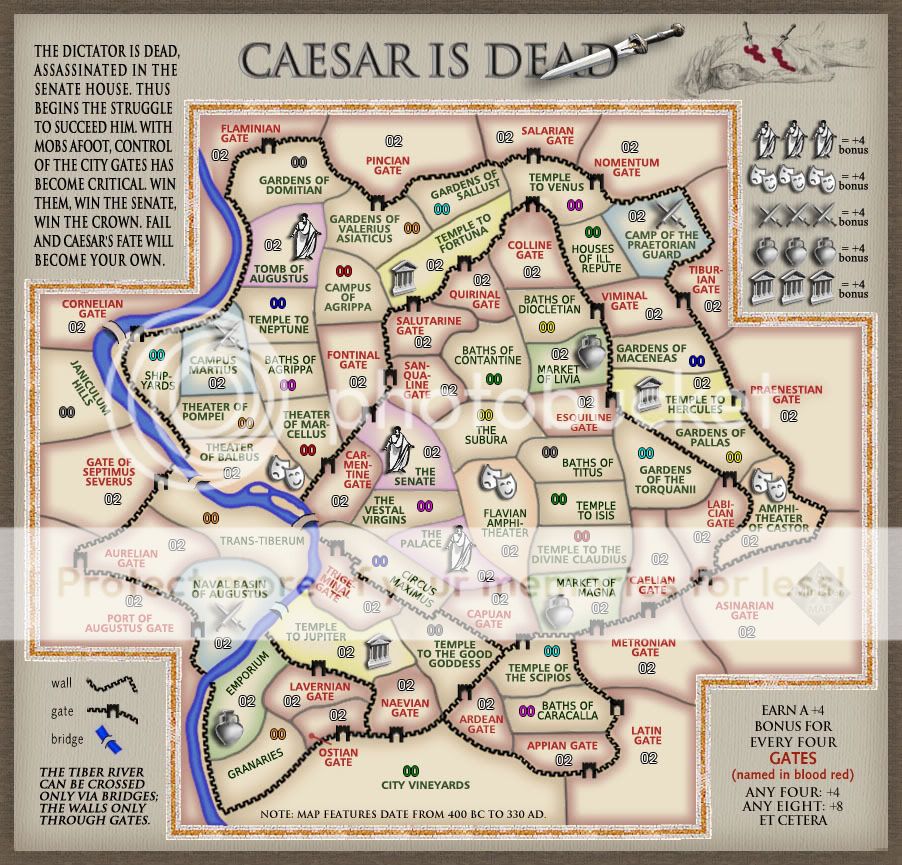
Colors revised and location of label for Andean Gate (in the far south end) changed. I thinks that's all. Hopefully this is a good compromise between gaudy and bland.
Colors revised and location of label for Andean Gate (in the far south end) changed. I thinks that's all. Hopefully this is a good compromise between gaudy and bland.
Last edited by Minister X on Sat Oct 01, 2011 9:49 am, edited 1 time in total.
-
Minister X
- Posts: 424
- Joined: Tue Nov 11, 2008 4:45 pm
Re: ROME [3/8/2011] V 19 pg 11
![]() by Victor Sullivan on Wed Sep 28, 2011 4:35 pm
by Victor Sullivan on Wed Sep 28, 2011 4:35 pm
I think you can fit the Ostian Gate label in its territory. I myself am not a huge fan of lines connecting names to territories.
-Sully
-Sully
Beckytheblondie: "Don't give us the dispatch, give us a mustache ride."
Scaling back on my CC involvement...
Scaling back on my CC involvement...
-
Victor Sullivan
- Posts: 6010
- Joined: Mon Feb 08, 2010 8:17 pm
- Location: Columbus, OH
Re: ROME [3/8/2011] V 19 pg 11
![]() by lostatlimbo on Wed Sep 28, 2011 8:32 pm
by lostatlimbo on Wed Sep 28, 2011 8:32 pm
That seems a bit better. At least the colors aren't too bright now.
-
lostatlimbo
- Posts: 1386
- Joined: Wed Mar 28, 2007 3:56 pm
- Location: Portland, OR
Re: ROME [3/8/2011] V 19 pg 11
![]() by firsal901 on Fri Sep 30, 2011 3:48 am
by firsal901 on Fri Sep 30, 2011 3:48 am
Make the 4 gates bonus 3. Gates are a plenty and they border with a lot of territories.
-
firsal901
- Posts: 193
- Joined: Thu Jul 17, 2008 3:33 am
- Location: Laguna, Philippines (Google it)
Re: ROME [3/8/2011] V 19 pg 11
![]() by Minister X on Fri Sep 30, 2011 5:14 am
by Minister X on Fri Sep 30, 2011 5:14 am
I don't understand. Are you saying the bonus should be only three when you own four gates, or that it should be four when you own just three gates? Bordering a lot of territories means the bonus should be high. The total quantity isn't really very relevant.
-
Minister X
- Posts: 424
- Joined: Tue Nov 11, 2008 4:45 pm
Re: ROME [3/8/2011] V 19 pg 11
![]() by Victor Sullivan on Fri Sep 30, 2011 7:24 pm
by Victor Sullivan on Fri Sep 30, 2011 7:24 pm
He's saying one should receive +3 per 4 gates. Not sure if I prefer it one way or the other. Given that the gameplay is already stamped, I say keep it like it is for now, then tweak it in beta if a problem arises.
-Sully
-Sully
Beckytheblondie: "Don't give us the dispatch, give us a mustache ride."
Scaling back on my CC involvement...
Scaling back on my CC involvement...
-
Victor Sullivan
- Posts: 6010
- Joined: Mon Feb 08, 2010 8:17 pm
- Location: Columbus, OH
Re: ROME [3/8/2011] V 19 pg 11
![]() by firsal901 on Sat Oct 01, 2011 12:46 am
by firsal901 on Sat Oct 01, 2011 12:46 am
Victor Sullivan wrote:He's saying one should receive +3 per 4 gates. Not sure if I prefer it one way or the other. Given that the gameplay is already stamped, I say keep it like it is for now, then tweak it in beta if a problem arises.
-Sully
Well, i guess play testing should iron out any problem that arises
-
firsal901
- Posts: 193
- Joined: Thu Jul 17, 2008 3:33 am
- Location: Laguna, Philippines (Google it)
Re: ROME [3/8/2011] V 19 pg 11
![]() by Minister X on Sat Oct 01, 2011 9:48 am
by Minister X on Sat Oct 01, 2011 9:48 am
Draft #20
Fixed location of label for Ostian Gate (moved borders around) plus numerous little fixes to label and army number locations. I'm proud to say that now, to make the small map, all I have to do is reduce the size of the whole then increase the army numbers font back to 14-point size. That's all.
It's time to get REALLY picky about small adjustments like moving an army number one pixel's-worth one way or another. I am honestly looking forward to seeing how detail-oriented y'all can get.

Last edited by Minister X on Sun Oct 09, 2011 9:51 am, edited 1 time in total.
-
Minister X
- Posts: 424
- Joined: Tue Nov 11, 2008 4:45 pm
Re: ROME [3/8/2011] V 20 pg 12
![]() by Victor Sullivan on Sat Oct 01, 2011 10:29 am
by Victor Sullivan on Sat Oct 01, 2011 10:29 am
No need to worry about coordinates until you've got the XML done. Things are likely to change at least slightly once you convert your pseudo-coordinates to real ones.
-Sully
-Sully
Beckytheblondie: "Don't give us the dispatch, give us a mustache ride."
Scaling back on my CC involvement...
Scaling back on my CC involvement...
-
Victor Sullivan
- Posts: 6010
- Joined: Mon Feb 08, 2010 8:17 pm
- Location: Columbus, OH
Re: ROME [3/8/2011] V 20 pg 12
![]() by lostatlimbo on Thu Oct 06, 2011 8:51 pm
by lostatlimbo on Thu Oct 06, 2011 8:51 pm
If it were up to me (it isn't), I'd say this is ready for another stamp and a move to the forge!
If you do want to get real nitpicky, I find it odd that the bridge between Naval Basin of Augustus & Temple to Jupiter is a bright blue. The others seem blended well, that one just stands out. Have you tried making them all a uniform gray or brown? (I'm sure the foundry regulars will find this comment hilariously ironic).
If you do want to get real nitpicky, I find it odd that the bridge between Naval Basin of Augustus & Temple to Jupiter is a bright blue. The others seem blended well, that one just stands out. Have you tried making them all a uniform gray or brown? (I'm sure the foundry regulars will find this comment hilariously ironic).
-
lostatlimbo
- Posts: 1386
- Joined: Wed Mar 28, 2007 3:56 pm
- Location: Portland, OR
Re: ROME [3/8/2011] V 20 pg 12
![]() by isaiah40 on Thu Oct 06, 2011 8:59 pm
by isaiah40 on Thu Oct 06, 2011 8:59 pm
lostatlimbo wrote:If it were up to me (it isn't), I'd say this is ready for another stamp and a move to the forge!
If you do want to get real nitpicky, I find it odd that the bridge between Naval Basin of Augustus & Temple to Jupiter is a bright blue. The others seem blended well, that one just stands out. Have you tried making them all a uniform gray or brown? (I'm sure the foundry regulars will find this comment hilariously ironic).
Nah, it's only because it is coming from that blue territory. That's all.
-
isaiah40
- Posts: 3990
- Joined: Mon Aug 27, 2007 7:14 pm


Re: ROME [3/8/2011] V 20 pg 12
![]() by DiM on Fri Oct 07, 2011 8:49 am
by DiM on Fri Oct 07, 2011 8:49 am
1. the map is full of graphical issues like the colouring near the borders:

almost every terit has such discoloured spots and it looks really bad.
2. the bridges look bad. i think they were hand drawn and that's why they look so choppy/sloppy. try using the path tool
3. the dagger in the title wasn't cut the proper way. the green portion in the image bellow should be deleted. this way the dagger will follow the red line of the D

4. the icons on the map don't work well together. you have the guys in toga who are bright white, 2d, with pixely black contours. then you have the theatre masks who are also 2d but the contours are more blurry and they are grey. and then you have the other 3 images (swords, vase, temple) which are all grey and in 3d. you need consistency. decide on one style and make all the icons the same.
5. the title font is very blurry
6. the black walls are overpowering the rest of the image. my eyes are constantly drawn to them. soften them, blend them better.
7. some borders are thin (ie. the senate) while others are thick (ie. the suburba)
but aside from all the points above, i feel like the map has one major flaw. it simply does not do this wonderful city any justice. i've visited rome this year and i've been impressed. it's gorgeous. when i look at your map i honestly can't even tell it's rome. i have to read the terit names to realise it. normally it should scream ancient rome at me. i should be able to recognize it in the first milliseconds.
almost every terit has such discoloured spots and it looks really bad.
2. the bridges look bad. i think they were hand drawn and that's why they look so choppy/sloppy. try using the path tool
3. the dagger in the title wasn't cut the proper way. the green portion in the image bellow should be deleted. this way the dagger will follow the red line of the D
4. the icons on the map don't work well together. you have the guys in toga who are bright white, 2d, with pixely black contours. then you have the theatre masks who are also 2d but the contours are more blurry and they are grey. and then you have the other 3 images (swords, vase, temple) which are all grey and in 3d. you need consistency. decide on one style and make all the icons the same.
5. the title font is very blurry
6. the black walls are overpowering the rest of the image. my eyes are constantly drawn to them. soften them, blend them better.
7. some borders are thin (ie. the senate) while others are thick (ie. the suburba)
but aside from all the points above, i feel like the map has one major flaw. it simply does not do this wonderful city any justice. i've visited rome this year and i've been impressed. it's gorgeous. when i look at your map i honestly can't even tell it's rome. i have to read the terit names to realise it. normally it should scream ancient rome at me. i should be able to recognize it in the first milliseconds.
“In the beginning God said, the four-dimensional divergence of an antisymmetric, second rank tensor equals zero, and there was light, and it was good. And on the seventh day he rested.”- Michio Kaku
-

DiM
- Posts: 10415
- Joined: Wed Feb 14, 2007 6:20 pm
- Location: making maps for scooby snacks


Re: ROME [3/8/2011] V 20 pg 12
![]() by AndyDufresne on Fri Oct 07, 2011 8:59 am
by AndyDufresne on Fri Oct 07, 2011 8:59 am
I like the black walls the way they are, they help break of the map in a good way for me.
As for the major flaw, you are entitled to your opinion, but I think the overall graphics are fine. I don't feel like every map has to 'scream.'
--Andy
As for the major flaw, you are entitled to your opinion, but I think the overall graphics are fine. I don't feel like every map has to 'scream.'
--Andy
-
AndyDufresne
- Posts: 24919
- Joined: Fri Mar 03, 2006 8:22 pm
- Location: A Banana Palm in Zihuatanejo
Who is online
Users browsing this forum: No registered users
|
|||||||
| Conquer Club is not associated with RISK online in any way. Copyright © 2006-2024 by Big Wham LLC | |||||||