
[Abandoned] Pirates and Merchants - V9 - Pg 1&13
Moderator: Cartographers
Re: Pirates and Merchants [30.Jan.12] - Missions Map - V7 -
![]() by isaiah40 on Mon Feb 27, 2012 10:50 pm
by isaiah40 on Mon Feb 27, 2012 10:50 pm
After discussing this with iancanton and tnb80, while we don't find any major problems with the gameplay right now, we are going to go ahead and stamp this with the caveat that the mapmaker my have to do some major gameplay changes while in beta.
-
 isaiah40
- Posts: 3990
- Joined: Mon Aug 27, 2007 7:14 pm


Re: Pirates and Merchants [30.Jan.12] - Missions Map - V7 -
![]() by Victor Sullivan on Mon Feb 27, 2012 11:12 pm
by Victor Sullivan on Mon Feb 27, 2012 11:12 pm
Fair enough.
-Sully
-Sully
Beckytheblondie: "Don't give us the dispatch, give us a mustache ride."
Scaling back on my CC involvement...
Scaling back on my CC involvement...
-

Victor Sullivan
- Posts: 6010
- Joined: Mon Feb 08, 2010 8:17 pm
- Location: Columbus, OH


Re: Pirates and Merchants [30.Jan.12] - Missions Map - V7 -
![]() by DiM on Tue Feb 28, 2012 8:16 am
by DiM on Tue Feb 28, 2012 8:16 am
cool 
“In the beginning God said, the four-dimensional divergence of an antisymmetric, second rank tensor equals zero, and there was light, and it was good. And on the seventh day he rested.”- Michio Kaku
-

DiM
- Posts: 10415
- Joined: Wed Feb 14, 2007 6:20 pm
- Location: making maps for scooby snacks


Re: Pirates and Merchants [30.Jan.12] - Missions Map - V7 -
![]() by QoH on Wed Feb 29, 2012 8:59 pm
by QoH on Wed Feb 29, 2012 8:59 pm
I wanna play this! Release it!

Please don't invite me to any pickup games. I will decline the invite.
-
QoH
- Posts: 1817
- Joined: Fri Aug 20, 2010 12:37 pm


Re: Pirates and Merchants [30.Jan.12] - Missions Map - V7 -
![]() by DiM on Fri Mar 02, 2012 6:02 am
by DiM on Fri Mar 02, 2012 6:02 am
my laptop with all my files just died. i'm taking it to a service today and hopefully i'll manage to salvage something. 
“In the beginning God said, the four-dimensional divergence of an antisymmetric, second rank tensor equals zero, and there was light, and it was good. And on the seventh day he rested.”- Michio Kaku
-
DiM
- Posts: 10415
- Joined: Wed Feb 14, 2007 6:20 pm
- Location: making maps for scooby snacks
Re: Pirates and Merchants [30.Jan.12] - Missions Map - V7 -
![]() by natty dread on Sat Mar 03, 2012 3:52 am
by natty dread on Sat Mar 03, 2012 3:52 am
DiM wrote:my laptop with all my files just died. i'm taking it to a service today and hopefully i'll manage to salvage something.
If the hard drive is intact you should be able to get the data moved from it to your new computer.
Anyway, I've read so many scary stories how people's map files have gotten corrupted or lost that I've made a habit of periodically backing up all my map files on a usb memory stick. It's something I recommend to everyone

-

natty dread
- Posts: 12877
- Joined: Fri Feb 08, 2008 8:58 pm
- Location: just plain fucked


Re: Pirates and Merchants [30.Jan.12] - Missions Map - V7 -
![]() by DiM on Sat Mar 03, 2012 8:07 am
by DiM on Sat Mar 03, 2012 8:07 am
natty dread wrote:DiM wrote:my laptop with all my files just died. i'm taking it to a service today and hopefully i'll manage to salvage something.
If the hard drive is intact you should be able to get the data moved from it to your new computer.
Anyway, I've read so many scary stories how people's map files have gotten corrupted or lost that I've made a habit of periodically backing up all my map files on a usb memory stick. It's something I recommend to everyone
the hdd is unreadable. i've placed it in another laptop and nothing.
i'm scheduled to a repair shop on monday and i'll know more.
“In the beginning God said, the four-dimensional divergence of an antisymmetric, second rank tensor equals zero, and there was light, and it was good. And on the seventh day he rested.”- Michio Kaku
-
DiM
- Posts: 10415
- Joined: Wed Feb 14, 2007 6:20 pm
- Location: making maps for scooby snacks
Re: Pirates and Merchants [30.Jan.12] - Missions Map - V7 -
![]() by DiM on Thu Mar 15, 2012 3:19 pm
by DiM on Thu Mar 15, 2012 3:19 pm
are there any big concerns before i start working on the small?
“In the beginning God said, the four-dimensional divergence of an antisymmetric, second rank tensor equals zero, and there was light, and it was good. And on the seventh day he rested.”- Michio Kaku
-
DiM
- Posts: 10415
- Joined: Wed Feb 14, 2007 6:20 pm
- Location: making maps for scooby snacks
Re: Pirates and Merchants [30.Jan.12] - Missions Map - V7 -
![]() by natty dread on Thu Mar 15, 2012 3:27 pm
by natty dread on Thu Mar 15, 2012 3:27 pm
Yeah, I think the title could use a bit of work. The font and the background image are fine, but the colour & pattern of the text looks a bit off. It looks like you just applied a black & brown cloud filter on the text (I don't know if that's what you did but it looks that way). I think it would look better if you made the colour lighter and made it a bit more grungy.
Also, the frame around the map looks a bit blurry. Is there any way to make it look sharper, like the rest of the map?
Also, the frame around the map looks a bit blurry. Is there any way to make it look sharper, like the rest of the map?
-
natty dread
- Posts: 12877
- Joined: Fri Feb 08, 2008 8:58 pm
- Location: just plain fucked
Re: Pirates and Merchants [30.Jan.12] - Missions Map - V7 -
![]() by cairnswk on Thu Mar 15, 2012 6:12 pm
by cairnswk on Thu Mar 15, 2012 6:12 pm
DiM wrote:are there any big concerns before i start working on the small?
- Click image to enlarge.

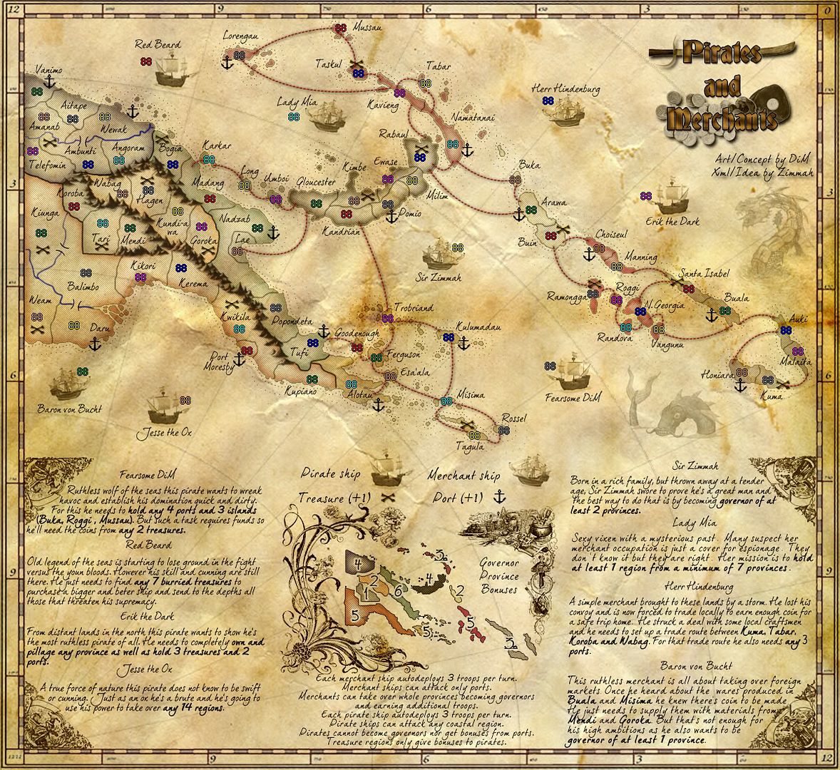
Dim, yes i have some concerns, and you can choose to ignore them if you wish, but I beleive they are worth the change.
red - i don't think the carto border lines should cover the actual territory...there is no actual distinction there to show the border actually follows the river...i'd lose the lines that cover that piece of land
light blue - that river doesn't meet the border of Korba...there is clearly a small gap
dark blue - those islands are actully surrounded by the Coral Sea not by the Fly River (check google maps)...can you make this adjustment to start the river further inland by re-drawing that coastal outline better? Also there is some blurriness in that regions regards lines.
dark green - the fine text of the numbers for bonuses are losts amongst the island...you have to really look to find them without them being instantly apparent like the other bonus numbers are...they could be moved slightly for easier idientification, or bolded or similar
teal the clarity of the title is almost lost on the coins and dark pirate hat behind it....some contrast could improve this.
purple mountains i feel the mountains overall don't reflect the nature of the countryside...PNG has 3 volcanos, and while many of the mountains are high, they are not single pointed peaks like you have. Many of them roll into each other and are curve topped ranges. Also the mountains you have are far too dark and a constant eye-catcher taking one's gaze away from the rest of the map. Can you make them more like ranges of rolling mountains with a couple of peaks, and reduce the darness to have blend in more with the map. Gaining the style of these mountains would be worthwhile spending some time on...
yellow flourishes - you recently made a comment on my NZ map about how you thought i got the border from some clipart on the internet. Given that these flousishes haven't changed much since the map first appeared, and that you boast of the two hour job on this map for that competition, i have to ask...are these flourishes all your work also, or are they simply imported from clipart? REgardless of that anyways, i think these are far too blurry, you can't make out what is in them and what they are depicting even if you try to justify this as being part of an aged map with decline of image etc.
I'd like to see you replace them with something that is more Papua New Guinea themed that gives flavour to this map of the countryside, rather than some English/German concept or European artwork. I am sure you have the skills to do this. Tbh, i have never thought they were appropriate for the map as they are currently themed and you can so much better.
The dots around the coastline look like there has been an infestation of flies and they've do-doed all over the place. i think they are totally distracting and while i understand you are trying for something different, perhaps reduce their opacity somewhat so they are not so prominent on the eye.
Lastly, the pirate bonus text....it is legible now for me, but what will it look like on the small...i hope legible also.
From my experience in mapmaking (however you wish to regard that)...it is clear to me that lots of reading that players have to do to interpret objective requirements (even if they are bolded) is considered a no-no. To this end, cut the stories down to bare minimum with the objectives clearly defined at the end of story. If you wish to use this long storyboard thing as a distinction for this map from yours or other maps out there, then i have to say you are heading in the wrong direction, imho.
I hope you will rise to these suggestions.

* Pearl Harbour * Waterloo * Forbidden City * Jamaica * Pot Mosbi
-

cairnswk
- Posts: 11510
- Joined: Sat Feb 03, 2007 8:32 pm
- Location: Australia


Re: Pirates and Merchants [30.Jan.12] - Missions Map - V7 -
![]() by DiM on Thu Mar 15, 2012 6:35 pm
by DiM on Thu Mar 15, 2012 6:35 pm
red - will fix
light blue - will fix
dark blue - will fix
dark green - will fix
teal - will fix
purple mountains - will fix the darkness issue but i'll leave the mountains be. i really don't think it matters if the mountains are pointy or round or how many peaks i have. it's important that they are easily recognisable as impassable mountains.
yellow flourishes - they're free to use images imported and tweaked. i obviously did not make them. and my comment on your NZ map wasn't if you made them or not it was that they were blurry or something like that, i don't quite remember. i don't really care how you got them. also i don't see why i would change this to a papua style since it's obvious the map is done by european sailors. anyway, i'll try to make them crisper. i don't have the original images since i did not recover everything from the old hdd but i'll try to fix what i have.
The dots around the coastline... - will fix
Lastly, the pirate bonus text.... we'll see when we get to the small. for now people have agreed it is legible. i don't want to shorten to a simple objective list since that would kinda ruin part of the theme.
PS: you said you put me on "foe ignore list". how did you see my post if you're ignoring me?
“In the beginning God said, the four-dimensional divergence of an antisymmetric, second rank tensor equals zero, and there was light, and it was good. And on the seventh day he rested.”- Michio Kaku
-
DiM
- Posts: 10415
- Joined: Wed Feb 14, 2007 6:20 pm
- Location: making maps for scooby snacks
Re: Pirates and Merchants [30.Jan.12] - Missions Map - V7 -
![]() by DiM on Thu Mar 15, 2012 8:04 pm
by DiM on Thu Mar 15, 2012 8:04 pm
i don't feel very inspired regarding the title so i'll work on that some other time.
for now here's:
V8:
*made the outside border crisper
*fixed a bit of land going into the border
*extended river all the way to the border
*redrawn coastal line where fly river used to be
*improved visibility of the numbers on the minimap
*fixed mountains
*made the dots more transparent
*unblurred the flourishes
- Click image to enlarge.
Last edited by DiM on Thu Mar 15, 2012 10:44 pm, edited 1 time in total.
“In the beginning God said, the four-dimensional divergence of an antisymmetric, second rank tensor equals zero, and there was light, and it was good. And on the seventh day he rested.”- Michio Kaku
-
DiM
- Posts: 10415
- Joined: Wed Feb 14, 2007 6:20 pm
- Location: making maps for scooby snacks
Re: Pirates and Merchants [30.Jan.12] - Missions Map - V7 -
![]() by RjBeals on Thu Mar 15, 2012 9:39 pm
by RjBeals on Thu Mar 15, 2012 9:39 pm
i don't think the land on the far west should be the same color as the sea. It's confusing at first - looks funny.

-

RjBeals
- Posts: 2506
- Joined: Mon Nov 20, 2006 5:17 pm
- Location: South Carolina, USA


Re: Pirates and Merchants [30.Jan.12] - Missions Map - V7 -
![]() by natty dread on Thu Mar 15, 2012 10:22 pm
by natty dread on Thu Mar 15, 2012 10:22 pm
RjBeals wrote:i don't think the land on the far west should be the same color as the sea. It's confusing at first - looks funny.
I was just thinking about the same thing!
-
natty dread
- Posts: 12877
- Joined: Fri Feb 08, 2008 8:58 pm
- Location: just plain fucked
Re: Pirates and Merchants [30.Jan.12] - Missions Map - V7 -
![]() by DiM on Thu Mar 15, 2012 10:42 pm
by DiM on Thu Mar 15, 2012 10:42 pm
my bad, i forgot to unhide a layer 
will fix it
will fix it
“In the beginning God said, the four-dimensional divergence of an antisymmetric, second rank tensor equals zero, and there was light, and it was good. And on the seventh day he rested.”- Michio Kaku
-
DiM
- Posts: 10415
- Joined: Wed Feb 14, 2007 6:20 pm
- Location: making maps for scooby snacks
Re: Pirates and Merchants [30.Jan.12] - Missions Map - V7 -
![]() by cairnswk on Fri Mar 16, 2012 10:01 am
by cairnswk on Fri Mar 16, 2012 10:01 am
DiM wrote:i don't feel very inspired regarding the title so i'll work on that some other time.
for now here's:
good, i look forward to seeing what you do.
V8:
*made the outside border crisper
nice, but version 8 hasn't been added to your front page, V7 still sits there.
*fixed a bit of land going into the border
i beleive you fixed it the wrong way...that chunk of land was still supposed to be there, it is afterall part of PNG, and you've simply just deleted it...perhaps re-instate it so that the country borders are proper but they eat in to the carto border that you've just made crisper.

*extended river all the way to the border
nice, but that is the northern tributary of the fly river that you fixed called the Strickland River.
There is part of the Fly River where it doesn't now meet with the border on your map, actually it forms part of that curved section of the border with the then Dutch East Indies. Perhaps the Fly River could be shown in full if you place back that chunk of land that was deleted (as above)
*redrawn coastal line where fly river used to be
Dim, that is perfect and looks really nice. Great job on that section
*improved visibility of the numbers on the minimap
these look much better, except for the 3s.
Can i ask what the little bit (looks like an open unfilled punkt) is behind the 3s
*fixed mountains
meh, they're still far too dark and eye catching.
i've noticed upon close inspection that you have various shades of colour in them which actually looks quite nice and reflective of the region colours and in some places that's how the landscape looks i.e. the green...but,
this colour is completely lost by the dark shadows being on the eastern side of the mountains.
Is it possible to switch those colours and shadows around so that the shadow falls on the west of mountains and the east is lit up by the various mountain colours. That might make the mountains a lot lighter/brighter and not so dark and forboding. I mean as it is now, it looks like a version of LotR with Mt Doom all over it.
*made the dots more transparent
better, but i still have this image of fly pooh all over the map
*unblurred the flourishes
mmm, i still don't like them, they're far too busy and fussy for the map and i really don't think thematic for the map...
the bottom outside four look like a couple of fair maidens from an english garden surrounded by some swirling ribbons..
the flourish to the left of the mini-map looks like it is full of english flowers...totally inappropriate i beleive
the images on the right look like they're a large pot, an oriental person, a lion with a broomstick, and goodness knows what is in that jumble to the left of the large pot...perhaps it's the wardrobe...
Come on Dim. you can do better than this...do you're own drawings and make this map you own, not something borrowed and EASY and lazy from the internet
on the land and border treatments...something else i have noticed...
in the past various mapmakers have been asked to correct uneven lines where there are erratic pressure points from drawing lines etc.
1. there are several of these on the map that could do with some attention

2. there seems to be some inconsistent treatment of the land immediately inside the coastal perimeter.
you have this on some islands where there is a distinct perimeter around the inside of the islands

and then this on the mainland which doesn't match the the treatment of the islands (as shown above) nor to the islands, nor to Gloucester region as shown on this image.

I really think it should be one or the other, but not both.
Hope this helps some
* Pearl Harbour * Waterloo * Forbidden City * Jamaica * Pot Mosbi
-
cairnswk
- Posts: 11510
- Joined: Sat Feb 03, 2007 8:32 pm
- Location: Australia
Re: Pirates and Merchants [30.Jan.12] - Missions Map - V7 -
![]() by DiM on Fri Mar 16, 2012 10:43 am
by DiM on Fri Mar 16, 2012 10:43 am
cairnswk wrote:*fixed a bit of land going into the border
i beleive you fixed it the wrong way...
i understood what you meant from the start but i chose to do it this way cause i feel it looks better. deleting that chunk of land is not affecting in any way how the map plays but it improves the overall aspect.
cairnswk wrote:*improved visibility of the numbers on the minimap
Can i ask what the little bit (looks like an open unfilled punkt) is behind the 3s
that's actually how the font writes the 3 but i'll fix it if it's a problem.
cairnswk wrote:*fixed mountains
Is it possible to switch those colours and shadows around so that the shadow falls on the west of mountains and the east is lit up by the various mountain colours.
it is possible but i won't do it since that would be a completely opposite light direction from what i have on all other elements on the map and it would look awful to get the mountains lighted from the east and everything else from the west. it would probably make the mountains stick out even more.
cairnswk wrote:*unblurred the flourishes
mmm, i still don't like them, they're far too busy and fussy for the map and i really don't think thematic for the map...
de gustibus non est disputandum.
personally, i think they fit very nicely. that being said, if i feel inspired with change i might do something else, but it's certainly not a priority.
cairnswk wrote:in the past various mapmakers have been asked to correct uneven lines where there are erratic pressure points from drawing lines etc.
i have no idea what you mean by this, but i'm drawing all my lines with a mouse, so it can't be a pressure issue since only tablets handle that. could you explain it better? i don't want to redraw lines without knowing what i must correct.
cairnswk wrote:2. there seems to be some inconsistent treatment of the land immediately inside the coastal perimeter.
no inconsistency there. everything is the same since it is an inside stroke applied everywhere. the stroke is even and coloured the same. if you check the land closer you'll find it is there. you're probably having trouble seeing it.
“In the beginning God said, the four-dimensional divergence of an antisymmetric, second rank tensor equals zero, and there was light, and it was good. And on the seventh day he rested.”- Michio Kaku
-
DiM
- Posts: 10415
- Joined: Wed Feb 14, 2007 6:20 pm
- Location: making maps for scooby snacks
Re: Pirates and Merchants [30.Jan.12] - Missions Map - V7 -
![]() by cairnswk on Fri Mar 16, 2012 10:56 am
by cairnswk on Fri Mar 16, 2012 10:56 am
cairnswk wrote:in the past various mapmakers have been asked to correct uneven lines where there are erratic pressure points from drawing lines etc.
i have no idea what you mean by this, but i'm drawing all my lines with a mouse, so it can't be a pressure issue since only tablets handle that. could you explain it better? i don't want to redraw lines without knowing what i must correct.
certainly.
1. in some places the border lines don't meet the coastal outlines, buy in others they do.
2. the colour of some lines seems to run for some length, and then a harder/darker colour seems to have been applied to the end or the end of the line has been gone over twice making it appear as though there are double the opacity applied on the same line.
cairnswk wrote:2. there seems to be some inconsistent treatment of the land immediately inside the coastal perimeter.
no inconsistency there. everything is the same since it is an inside stroke applied everywhere. the stroke is even and coloured the same. if you check the land closer you'll find it is there. you're probably having trouble seeing it.
it might be that you've applied the stroke evenly on all pieces of land, but that's not what the map is actually showing.
* Pearl Harbour * Waterloo * Forbidden City * Jamaica * Pot Mosbi
-
cairnswk
- Posts: 11510
- Joined: Sat Feb 03, 2007 8:32 pm
- Location: Australia
Re: Pirates and Merchants [30.Jan.12] - Missions Map - V7 -
![]() by DiM on Fri Mar 16, 2012 11:06 am
by DiM on Fri Mar 16, 2012 11:06 am
cairnswk wrote:cairnswk wrote:in the past various mapmakers have been asked to correct uneven lines where there are erratic pressure points from drawing lines etc.
i have no idea what you mean by this, but i'm drawing all my lines with a mouse, so it can't be a pressure issue since only tablets handle that. could you explain it better? i don't want to redraw lines without knowing what i must correct.
certainly.
1. in some places the border lines don't meet the coastal outlines, buy in others they do.
2. the colour of some lines seems to run for some length, and then a harder/darker colour seems to have been applied to the end or the end of the line has been gone over twice making it appear as though there are double the opacity applied on the same line.
ah, ok, it's fixable.
cairnswk wrote:cairnswk wrote:2. there seems to be some inconsistent treatment of the land immediately inside the coastal perimeter.
no inconsistency there. everything is the same since it is an inside stroke applied everywhere. the stroke is even and coloured the same. if you check the land closer you'll find it is there. you're probably having trouble seeing it.
it might be that you've applied the stroke evenly on all pieces of land, but that's not what the map is actually showing.
i'll double check.
yep i double checked and it's ok.
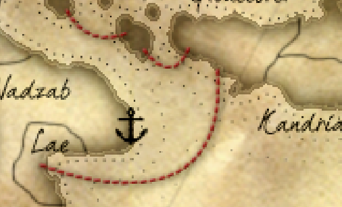
look, in the image below i made the continent the same colour as the island and removed the diagonal lines.
now it's clear that they look the identical. however when the continent colour gets changed we get an optical illusion.
Last edited by DiM on Fri Mar 16, 2012 11:18 am, edited 1 time in total.
“In the beginning God said, the four-dimensional divergence of an antisymmetric, second rank tensor equals zero, and there was light, and it was good. And on the seventh day he rested.”- Michio Kaku
-
DiM
- Posts: 10415
- Joined: Wed Feb 14, 2007 6:20 pm
- Location: making maps for scooby snacks
Re: Pirates and Merchants [30.Jan.12] - Missions Map - V7 -
![]() by cairnswk on Fri Mar 16, 2012 11:11 am
by cairnswk on Fri Mar 16, 2012 11:11 am
DiM wrote:cairnswk wrote:*fixed a bit of land going into the border
i beleive you fixed it the wrong way...
i understood what you meant from the start but i chose to do it this way cause i feel it looks better. deleting that chunk of land is not affecting in any way how the map plays but it improves the overall aspect.
it might not affect the gameplay, but PNG does not have a straight border with it's neighbour and i beleive it should be fixed to show the correct border.
cairnswk wrote:*improved visibility of the numbers on the minimap
Can i ask what the little bit (looks like an open unfilled punkt) is behind the 3s
that's actually how the font writes the 3 but i'll fix it if it's a problem.
yes, could you fix it please, it is distracting
cairnswk wrote:*fixed mountains
Is it possible to switch those colours and shadows around so that the shadow falls on the west of mountains and the east is lit up by the various mountain colours.
it is possible but i won't do it since that would be a completely opposite light direction from what i have on all other elements on the map and it would look awful to get the mountains lighted from the east and everything else from the west. it would probably make the mountains stick out even more.
well, i think you could try to see what it looks, i'm not convinced that it would look worse.
cairnswk wrote:*unblurred the flourishes
mmm, i still don't like them, they're far too busy and fussy for the map and i really don't think thematic for the map...
de gustibus non est disputandum.
personally, i think they fit very nicely. that being said, if i feel inspired with change i might do something else, but it's certainly not a priority.
since you're looking for input before you do the small map, this was a suggestion that, yes, is a matter of taste, but as for being inspired and not a matter of priority, i think it is a matter of priority since it applies to the graphics quality of this map you're trying to pump out and that quality has changed very little since you did the two hour job on the contest version.
* Pearl Harbour * Waterloo * Forbidden City * Jamaica * Pot Mosbi
-
cairnswk
- Posts: 11510
- Joined: Sat Feb 03, 2007 8:32 pm
- Location: Australia
Re: Pirates and Merchants [16.Mar.12] - Missions Map - V8 -
![]() by natty dread on Fri Mar 16, 2012 12:53 pm
by natty dread on Fri Mar 16, 2012 12:53 pm
cairnswk wrote:it might not affect the gameplay, but PNG does not have a straight border with it's neighbour and i beleive it should be fixed to show the correct border.
I have to say I don't think this is a big issue. If this was a map about PNG, then it would be more reasonable to demand an accurate outer border... but the map is a pirate-themed map that just happens to take place in PNG, so the fully accurate geographical representation shouldn't be the first priority here...
I also think that it looks better to have the frame on top of the land- it would look weird if the frame was "cut off" in that one spot only while being consistent everywhere else.
I do agree about the cliparts though, I'd like to see something a bit more in line with the pirate theme - the current ones are a bit too "flowery" to match the theme. The sea serpents are good though.
-
natty dread
- Posts: 12877
- Joined: Fri Feb 08, 2008 8:58 pm
- Location: just plain fucked
Re: Pirates and Merchants [16.Mar.12] - Missions Map - V8 -
![]() by DiM on Fri Mar 16, 2012 2:02 pm
by DiM on Fri Mar 16, 2012 2:02 pm
ok then i'll take out the current flourishes and try something else.
i'm not really in a map making mood and i haven't been for quite some time but i'll see what i can come up with.
i'm not really in a map making mood and i haven't been for quite some time but i'll see what i can come up with.
“In the beginning God said, the four-dimensional divergence of an antisymmetric, second rank tensor equals zero, and there was light, and it was good. And on the seventh day he rested.”- Michio Kaku
-
DiM
- Posts: 10415
- Joined: Wed Feb 14, 2007 6:20 pm
- Location: making maps for scooby snacks
Re: Pirates and Merchants [30.Jan.12] - Missions Map - V7 -
![]() by DiM on Fri Mar 16, 2012 2:29 pm
by DiM on Fri Mar 16, 2012 2:29 pm
cairnswk wrote:quality has changed very little since you did the two hour job on the contest version.
so the number of changes or updates is irrelevant. if you look at most of my recent maps the final version is very similar to the first version. that's simply because i try to make the maps as complete as possible before the release.
same goes for the amount of time spent on a map. you keep reproaching me i made that map in 2 hours like it was a bad thing. i felt inspired and i worked fast. other times i'm simply stumped on the littlest thing and i waste hours not accomplishing anything. am i supposed to work 100 more hours now to compensate? is there a certain standard for number of hours spent on a map?
“In the beginning God said, the four-dimensional divergence of an antisymmetric, second rank tensor equals zero, and there was light, and it was good. And on the seventh day he rested.”- Michio Kaku
-
DiM
- Posts: 10415
- Joined: Wed Feb 14, 2007 6:20 pm
- Location: making maps for scooby snacks
Re: Pirates and Merchants [30.Jan.12] - Missions Map - V7 -
![]() by zimmah on Fri Mar 16, 2012 2:43 pm
by zimmah on Fri Mar 16, 2012 2:43 pm
DiM wrote:cairnswk wrote:quality has changed very little since you did the two hour job on the contest version.
so the number of changes or updates is irrelevant. if you look at most of my recent maps the final version is very similar to the first version. that's simply because i try to make the maps as complete as possible before the release.
same goes for the amount of time spent on a map. you keep reproaching me i made that map in 2 hours like it was a bad thing. i felt inspired and i worked fast. other times i'm simply stumped on the littlest thing and i waste hours not accomplishing anything. am i supposed to work 100 more hours now to compensate? is there a certain standard for number of hours spent on a map?
- Click image to enlarge.
this is an actual playable map on CC, do i need to say more?
- Click image to enlarge.

-

zimmah
- Posts: 1652
- Joined: Fri Jun 01, 2007 12:43 pm
- Location: VDLL


Re: Pirates and Merchants [30.Jan.12] - Missions Map - V7 -
![]() by DiM on Fri Mar 16, 2012 3:19 pm
by DiM on Fri Mar 16, 2012 3:19 pm
zimmah wrote:this is an actual playable map on CC, do i need to say more?
wow
the shitty graphics on that map are nothing compared to the awful counterintuitive design.
i honestly have no idea what connects to what.
thank god for BoB otherwise that map would be unplayable.
“In the beginning God said, the four-dimensional divergence of an antisymmetric, second rank tensor equals zero, and there was light, and it was good. And on the seventh day he rested.”- Michio Kaku
-
DiM
- Posts: 10415
- Joined: Wed Feb 14, 2007 6:20 pm
- Location: making maps for scooby snacks
Who is online
Users browsing this forum: No registered users
|
|||||||
| Conquer Club is not associated with RISK online in any way. Copyright © 2006-2024 by Big Wham LLC | |||||||