i really like this map
but the continenal and jet blue circles being so far away isnt going to work. also i dont get the coffee shops. why are they in other territories, like delta. can the purple transit attack c14 or does it have to go through star bucks. good map, just a bit unclear in areas.
[Abandoned] - Sea-Tac Int'l Airport
Moderator: Cartographers
98 posts
• Page 2 of 4 • 1, 2, 3, 4
![]() by vakEirn79 on Sun Apr 08, 2007 10:30 pm
by vakEirn79 on Sun Apr 08, 2007 10:30 pm
mibi wrote:but the continenal and jet blue circles being so far away isnt going to work. also i dont get the coffee shops. why are they in other territories, like delta. can the purple transit attack c14 or does it have to go through star bucks. good map, just a bit unclear in areas.
I think the idea is that Coffee Shop circles are actually territories, but the other icons are just going to be army circles for the coloured territories they're in. If you look carefully, the Coffee Shop circles are have a thin white border on the outside to separate them from other territories, whereas other icons are placed directly on top of its territory. It's such a subtle difference, though, that I didn't even notice it until just now.
I think the Coffee Shop icons should be different from other icons if they're supposed to be territories. If you want to keep them circular, then it would help if they were made noticeably larger. You could also change the border color of the icon, to Teal for example, to indicate that they're different from regular icons. The easiest way to make them distinguishable would probably be to use a different shape altogether, maybe square or diamond?
-
 vakEirn79
- Posts: 46
- Joined: Sun Jan 28, 2007 4:52 pm
![]() by KoolfuZ on Mon Apr 09, 2007 1:16 am
by KoolfuZ on Mon Apr 09, 2007 1:16 am
Fourth Draft:
-Changed coffee circles. Implemented vakEirn's suggestion to differentiate Starbucks and Seattle's Best.
-Changed transit lines back to straight lines. They were fat and circuitous.
-Apparently there is also a train going between concourse A and concourse D. Revised map accordingly.
-Enshrinked one-way arrows.
-Shrank text, replaced "glow" with outline; rearranged circles.
-New compass.
-Fixed arrows on south transit loop.


Right on. Hopefully the new circles further emphasize this. I will work up some different shapes, though, and put it up for vote. I'm afraid coffee cups will look more iconic and less territorial, but I'll try that too.
To further clarify, for example, "Starbucks Central" is adjacent to "Food Court", "Duty Free", and "Gates C1-C3". "Starbucks Main" is adjacent to "Southwest" and "Continental". "A Transit" can attack "Starbucks A", as well as "Atrium", "Gates A1-A3", "South Transit", and "D Transit".
-Changed coffee circles. Implemented vakEirn's suggestion to differentiate Starbucks and Seattle's Best.
-Changed transit lines back to straight lines. They were fat and circuitous.
-Apparently there is also a train going between concourse A and concourse D. Revised map accordingly.
-Enshrinked one-way arrows.
-Shrank text, replaced "glow" with outline; rearranged circles.
-New compass.
-Fixed arrows on south transit loop.


vakEirn79 wrote:I think the idea is that Coffee Shop circles are actually territories, but the other icons are just going to be army circles for the coloured territories they're in. If you look carefully, the Coffee Shop circles are have a thin white border on the outside to separate them from other territories, whereas other icons are placed directly on top of its territory. It's such a subtle difference, though, that I didn't even notice it until just now.
Right on. Hopefully the new circles further emphasize this. I will work up some different shapes, though, and put it up for vote. I'm afraid coffee cups will look more iconic and less territorial, but I'll try that too.
To further clarify, for example, "Starbucks Central" is adjacent to "Food Court", "Duty Free", and "Gates C1-C3". "Starbucks Main" is adjacent to "Southwest" and "Continental". "A Transit" can attack "Starbucks A", as well as "Atrium", "Gates A1-A3", "South Transit", and "D Transit".
Last edited by KoolfuZ on Sat May 19, 2007 7:45 pm, edited 1 time in total.
-

KoolfuZ
- Posts: 30
- Joined: Thu Jan 25, 2007 4:28 pm


![]() by mibi on Mon Apr 09, 2007 1:21 am
by mibi on Mon Apr 09, 2007 1:21 am
this looks great, like a real airport map.
i would nice the A-D train, its a bit confusing, also concourse A and D are only 3 spaces away from each other anyways.
also, i fear bad things will happen when you try to make a small version of this.
i would nice the A-D train, its a bit confusing, also concourse A and D are only 3 spaces away from each other anyways.
also, i fear bad things will happen when you try to make a small version of this.
-

mibi
- Posts: 3350
- Joined: Thu Mar 01, 2007 8:19 pm
- Location: The Great State of Vermont


![]() by KoolfuZ on Mon Apr 09, 2007 1:38 am
by KoolfuZ on Mon Apr 09, 2007 1:38 am
mibi wrote:this looks great, like a real airport map.
i would nice the A-D train, its a bit confusing, also concourse A and D are only 3 spaces away from each other anyways.
also, i fear bad things will happen when you try to make a small version of this.
Thanks
Yes, the A-D train is confusing. But it's there in real life! Are you asking my map to be not completely accurate??? I already moved the central Starbucks several yards north, and that nearly killed me.
As for the small version, I have got it figured out (I think). I'm going to keep everything the same size. The main building will mostly fit; concourse A will have to be shortened, and the satellites will get cut off so I will move them down and put in "to..." arrows. It will be just be very, very tall (~700 px). The other alternative is just to pull in the satellites so they are almost touching the concourses, which might be even more confusing. Maybe I can kill some of the decoration and get it under 550...
-
KoolfuZ
- Posts: 30
- Joined: Thu Jan 25, 2007 4:28 pm
![]() by Will_Liam on Wed Apr 18, 2007 7:35 pm
by Will_Liam on Wed Apr 18, 2007 7:35 pm
This is a nice map. Other than that I can't really say anything because its
an airport, other than that it looks alot like an airport. GJ Keep going.
Only 1 Suggestion:
Mabye add a background?
an airport, other than that it looks alot like an airport. GJ Keep going.
Only 1 Suggestion:
Mabye add a background?
I probably don't like you, if you don't belive me, look in the mirror
-

Will_Liam
- Posts: 96
- Joined: Fri Mar 30, 2007 2:31 pm
- Location: Somewhere...

![]() by KoolfuZ on Fri Apr 20, 2007 8:36 pm
by KoolfuZ on Fri Apr 20, 2007 8:36 pm
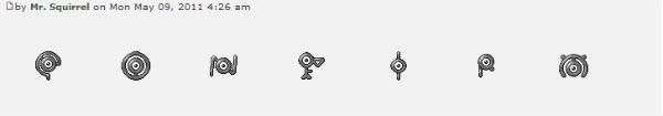
Sorry, been busy lately, and by busy I mean lazy. Here are some prototypes for the coffee stands. Obviously these aren't all the possibilities; larger borders, e.g., would be easy to do...

Any preferences or ideas?
I'm kind of partial to the ellipse. It's compact with a well-defined border, the text is almost readable, and it more closely resembles the company logo.
I would really prefer to keep the plain white background so as not to confuse busy travelers. A border, maybe, but even for that I think anything beyond a simple solid line would be excessive.
Other things that need changing:
-The name
-The 'STOP!' box is too big, I feel
-Compass
-Tram lines
-Territory names?
-A-D Train?
-
KoolfuZ
- Posts: 30
- Joined: Thu Jan 25, 2007 4:28 pm
![]() by Evil DIMwit on Fri Apr 20, 2007 9:16 pm
by Evil DIMwit on Fri Apr 20, 2007 9:16 pm
KoolfuZ wrote:
I like F; it shows the cup nicely. Perhaps if you changed G so that it had the same number-cup arrangement as F.
Then again, a circle would very possibly look better when put into the map itself.
I think you ought to do something to make the bonus list less repetitive, too.
-

Evil DIMwit
- Posts: 1616
- Joined: Thu Mar 22, 2007 1:47 pm
- Location: Philadelphia, NJ


![]() by ZawBanjito on Fri Apr 20, 2007 11:23 pm
by ZawBanjito on Fri Apr 20, 2007 11:23 pm
Har har, my dad built this map! Or... oversaw it, anyway...
I like D from that list... the distinctive shape will make it easier to pick them all out quickly.
I agree entirely. This map looks like it might suffer from the criticisms being leveled at US Senate and Chinese Checkers, that both sides are too equally balanced and stalemate will be common. The continent borders and bonuses need jiggling to make it competitive.
Also, something more needs to be done with the coffee stands. I think they're clever visually, but the bonuses are not compelling enough to make them worthwhile. Nobody is going to forge all over the map to try and collect'em all. I don't know what they're adding to the map.
My first thought is to make them somewhat like the embassies in Tamriel, which do make for some interesting plays.
I congratulate you, however, on making a very visually compelling map. I'm eager already to play it!
I like D from that list... the distinctive shape will make it easier to pick them all out quickly.
Evil DIMwit wrote:I think you ought to do something to make the bonus list less repetitive, too.
I agree entirely. This map looks like it might suffer from the criticisms being leveled at US Senate and Chinese Checkers, that both sides are too equally balanced and stalemate will be common. The continent borders and bonuses need jiggling to make it competitive.
Also, something more needs to be done with the coffee stands. I think they're clever visually, but the bonuses are not compelling enough to make them worthwhile. Nobody is going to forge all over the map to try and collect'em all. I don't know what they're adding to the map.
My first thought is to make them somewhat like the embassies in Tamriel, which do make for some interesting plays.
I congratulate you, however, on making a very visually compelling map. I'm eager already to play it!
-

ZawBanjito
- Posts: 379
- Joined: Mon Jan 23, 2006 12:25 am
- Location: Somewhere


![]() by KoolfuZ on Sat May 19, 2007 7:44 pm
by KoolfuZ on Sat May 19, 2007 7:44 pm
One month since last update 
Small revision this time, mostly gameplay changes.
Fifth draft:
-New coffee stands, again
-Fixed army circles
-New bonus legend

With Tully's back and better coffee rewards, the south side represents greater investment for greater return. A subtle difference, but significant enough, I hope, to force different strategies for each side.
Hooray for XML changes! My original idea was to have bonuses start around 3 or 4 stands, but that wasn't viable before. I threw together some preliminary bonuses, but with all the new options, I'm still not decided and open to ideas.
My plan was to keep them as is on the map, but in the drop-down menus they'll be 'North Transit', 'A Transit', etc. Think that should be clear enough?
Small revision this time, mostly gameplay changes.
Fifth draft:
-New coffee stands, again
-Fixed army circles
-New bonus legend

ZawBanjito wrote:This map looks like it might suffer from the criticisms being leveled at US Senate and Chinese Checkers, that both sides are too equally balanced and stalemate will be common. The continent borders and bonuses need jiggling to make it competitive.
With Tully's back and better coffee rewards, the south side represents greater investment for greater return. A subtle difference, but significant enough, I hope, to force different strategies for each side.
ZawBanjito wrote:Also, something more needs to be done with the coffee stands. I think they're clever visually, but the bonuses are not compelling enough to make them worthwhile. Nobody is going to forge all over the map to try and collect'em all. I don't know what they're adding to the map.
Hooray for XML changes! My original idea was to have bonuses start around 3 or 4 stands, but that wasn't viable before. I threw together some preliminary bonuses, but with all the new options, I'm still not decided and open to ideas.
freezie wrote:There is three transits.
Probably will be good to add a number ( transit1, transite2..) To avoid confusion.
My plan was to keep them as is on the map, but in the drop-down menus they'll be 'North Transit', 'A Transit', etc. Think that should be clear enough?
Last edited by KoolfuZ on Mon May 21, 2007 2:51 am, edited 1 time in total.
-
KoolfuZ
- Posts: 30
- Joined: Thu Jan 25, 2007 4:28 pm
![]() by KoolfuZ on Sat May 19, 2007 8:00 pm
by KoolfuZ on Sat May 19, 2007 8:00 pm
Some previews of the other coffee options:
D: F:
F: 
Is it possible to make this into a poll? I have no problem with changing them, but I'd like to know what others think.
D:
F:
wicked wrote:the gates are too confusing with the multiple numbers. how about simplifying those to one number, e.g. B1?
Is it possible to make this into a poll? I have no problem with changing them, but I'd like to know what others think.
-
KoolfuZ
- Posts: 30
- Joined: Thu Jan 25, 2007 4:28 pm

![]() by paranoid-android on Sat May 19, 2007 9:51 pm
by paranoid-android on Sat May 19, 2007 9:51 pm
i loooooove the looks of this already, and for a first post that's incredible!
Keep the range, i think it looks better IMO. It may be more stuff to put on the map, but it gives a better feel for an airport.
As for the name, i can't see why you couldn't call it Sea-Tac, i'd like to see it called that, unless there'll be some legal problems, like the name is copywrite.
Alot of the other maps use the actualy country name, why not use the actual airport name?
-

paranoid-android
- Posts: 298
- Joined: Thu Jan 11, 2007 10:55 am
![]() by wicked on Sun May 20, 2007 11:07 pm
by wicked on Sun May 20, 2007 11:07 pm
Concourses A and D should be worth more, as there's more countries to hold than B and C. Also, it looks like you can go directly from A to D through the transit stops? If that's the case, definitely needs to be worth more.
-

wicked
- Posts: 15787
- Joined: Thu Jan 26, 2006 1:23 pm


![]() by KoolfuZ on Mon May 21, 2007 2:44 am
by KoolfuZ on Mon May 21, 2007 2:44 am
2:1 in favor of simplifying the gate numbers... I'm calling it. Simplify is the winnar!

-Added two territories, one each to concourses B and C.
-Security warning box is now blue in honor of DHS. Can't decide if blue or white looks better. There's room for two more prohibited items...
-Changed gate numbers and some other names
-Added 'Bonus Legend' because I couldn't think of anything better to put there
I don't know, I can't see giving +3 to a 5country/2border group? I added countries to B and C because, yeah, they were too small.
Analysis time!
A/D: 5c/2b, borders 4 continents on offense, 4 on defense
B: 6c/3b or 7c/2b, borders 2/3 off, 2/3 def
C: 5c/3b or 6c/2b, borders 2/3 off, 2/3 def
N/S: 4c/1b, borders 1 off, 1 def
P: 4c/3b, borders 1 off, 1 def
central: 5c/3b, borders 5 off, 5 def
main: 9c/6b, borders 4 off, 4 def

-Added two territories, one each to concourses B and C.
-Security warning box is now blue in honor of DHS. Can't decide if blue or white looks better. There's room for two more prohibited items...
-Changed gate numbers and some other names
-Added 'Bonus Legend' because I couldn't think of anything better to put there
wicked wrote:Concourses A and D should be worth more, as there's more countries to hold than B and C. Also, it looks like you can go directly from A to D through the transit stops? If that's the case, definitely needs to be worth more.
I don't know, I can't see giving +3 to a 5country/2border group? I added countries to B and C because, yeah, they were too small.
Analysis time!
A/D: 5c/2b, borders 4 continents on offense, 4 on defense
B: 6c/3b or 7c/2b, borders 2/3 off, 2/3 def
C: 5c/3b or 6c/2b, borders 2/3 off, 2/3 def
N/S: 4c/1b, borders 1 off, 1 def
P: 4c/3b, borders 1 off, 1 def
central: 5c/3b, borders 5 off, 5 def
main: 9c/6b, borders 4 off, 4 def
Last edited by KoolfuZ on Wed May 23, 2007 5:35 am, edited 1 time in total.
-
KoolfuZ
- Posts: 30
- Joined: Thu Jan 25, 2007 4:28 pm
98 posts
• Page 2 of 4 • 1, 2, 3, 4
Who is online
Users browsing this forum: No registered users
|
|||||||
| Conquer Club is not associated with RISK online in any way. Copyright © 2006-2024 by Big Wham LLC | |||||||