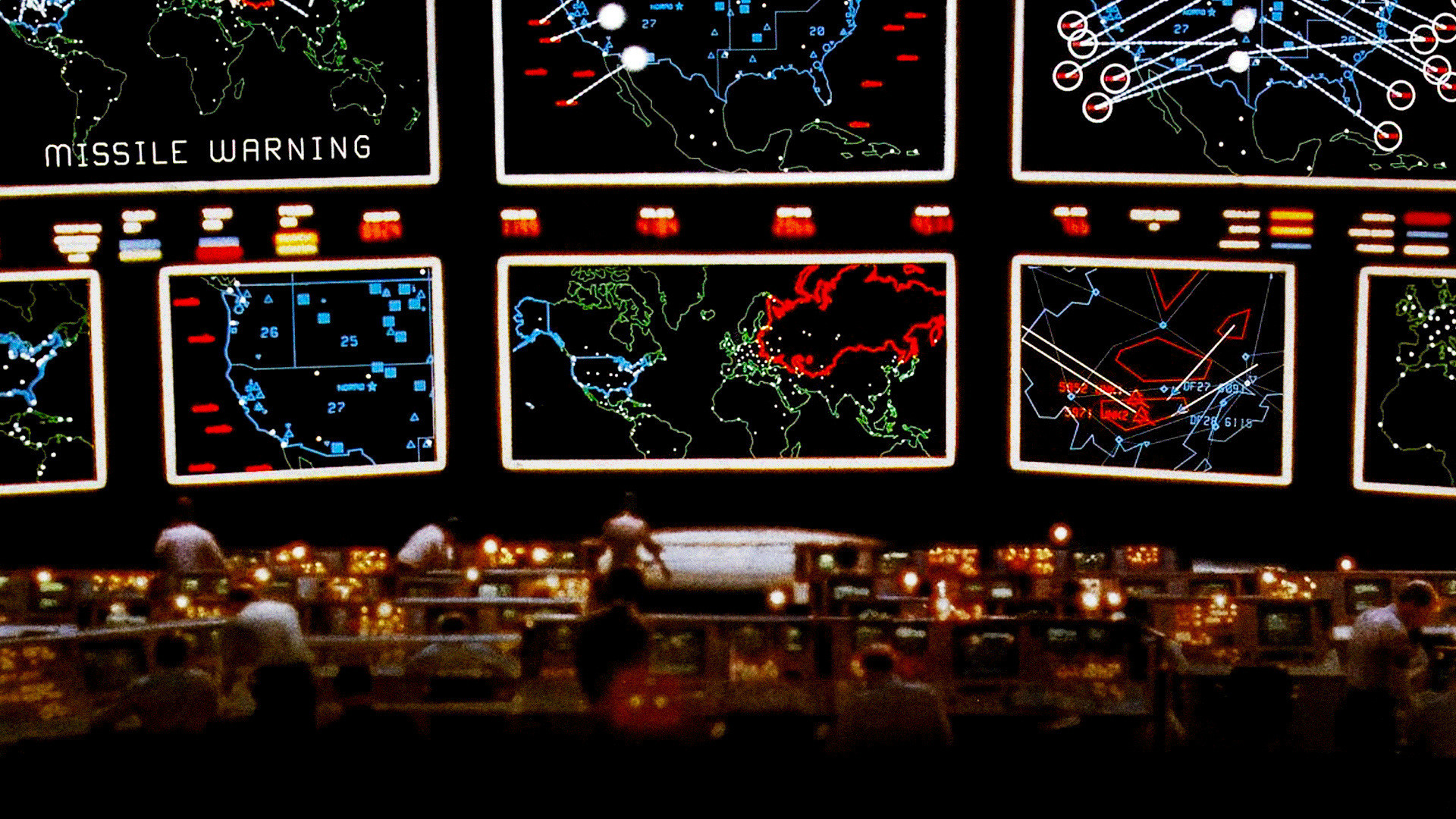
Doing ok there kiddo. I am beginning to think a little bit about your setup here and think I see why, at least for me why it looks a little off. The idea and theme is great, don't get me wrong, but a bit of an approach change I believe is in order. To me, the map looks kinda like a map, a regular ordinary paper type map with several TV monitors stacked up in front of it.
To really enhance the map's theme and overall feel I suggest the entire map be just one framed out monitor with the instructions/legend be split screens along the bottom, positioned just as you have them now. The remaining negative areas, currently filled with blue/blank background should be filled in a little bit with graphical accents, text like "MISSILE ALERT, ENEMY ENGAGED, SIGNAL LOST, TARGET INBOUND" and so on, and additional military type jargon, map coordinates, random numbers, bright shiny lights!

Again I'll throw out the classic 80's movie
Wargames as a reference.
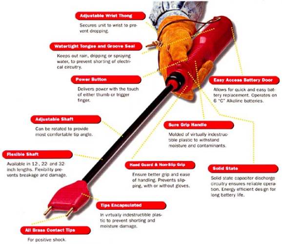
- Click image to enlarge.