Sure - I'm pretty sure all that copy will change a lot of it is greek. I sort of like the stuff about the Dutch East Indy company but it's superficial to gameplay. It's never really been in my purview to pick fonts so I'll do the best I can. Suggestions would be welcome. I'm thinking that I'd like fonts that reflect the period - 1602-1798. Of course I can do things to improve legibility of the fonts as they are - size, color, color of background, but many of those adjustments are subject to where and how much copy we end up with.
I've checked out thehippo8 article and agree that some of my ideas do exist just in a different form than I envisioned. I want the little boat to move... Oh well, I can deal with it... I need to talk to him or someone about some of those maps. Have not played Das Schloss - looks interesting but scares me some, I'm going to lose points figuring it out... Played Trench Warfare once but couldn't dig out so didn't really figure out all that gameplay either. Will ask for more explanations/examples - maybe you can help...? I guess I can look at games or the rules somewhere as well...
Thanks for input.
Battle for the Spice Islands
Moderator: Cartographers
Re: Ring of Fire - Battle for the Spice Islands
![]() by vaughn03 on Thu Oct 18, 2012 3:21 pm
by vaughn03 on Thu Oct 18, 2012 3:21 pm
-

 vaughn03
- Posts: 145
- Joined: Thu Mar 17, 2011 8:25 pm
- Location: Kalifornia


Re: Ring of Fire - Battle for the Spice Islands
![]() by vaughn03 on Wed Oct 31, 2012 3:19 pm
by vaughn03 on Wed Oct 31, 2012 3:19 pm
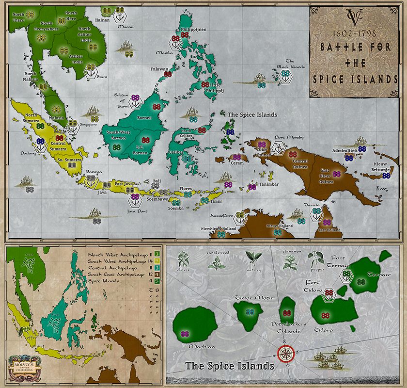
Battle for the Spice Islands:
vaughn03:
Number of Territories - Uncertain:
Special Features - Inset Maps, Navies, Supply Lines, Commodities, Ports:
What Makes This Map Worthy of Being Made? - Historical significance based on Wallace Map of the Malay Archipelago 1869 and the Dutch East India Company, Special Game Play, Lack of Maps of this region of the world:
Battle for the Spice Islands:
Large
- Click image to enlarge.
-
vaughn03
- Posts: 145
- Joined: Thu Mar 17, 2011 8:25 pm
- Location: Kalifornia
Re: Ring of Fire - Battle for the Spice Islands
![]() by vaughn03 on Wed Oct 31, 2012 3:45 pm
by vaughn03 on Wed Oct 31, 2012 3:45 pm
I've posted a revision to the map in order to keep things moving - it's still not all thought out but I would like input.
Due to not being able to randomize volcanos and/or typhoons I've decided to drop them from this map and hence I am also dropping the 'Ring of Fire' from the title. Perhaps a future version.
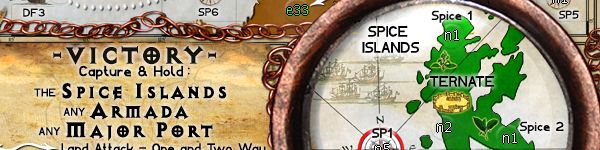
Also since no pop-up maps I have made a single inset - The Spice Islands - this is also based on a historic map, near as my limited knowledge can surmise, there seemed to be a lot of spices and hence fighting around these small islands.
Here I'm thinking somewhere along the lines that perhaps each island in the Spice Islands can be one-way attacked from different ports and/or fleets. Spice Islands could attack internally. Same with fleets and ports, perhaps one attacks the other and vise versa but land in the archepagos has to be attacked via the ports and other land..?
Ports could get bonus's compounded by number of ports, but I sort of like the idea that ships perhaps cost something because they are, after all, expensive to maintain. Maybe like 'Russian Winter' in NAPOLEONIC EUROPE -1 troop per turn?
I also like the idea of incorporating commodities as part of a bonus - historically it was what everyone was killing each other for. Maybe they could have some heirachy for a bonus and/or role in a victory condition.
I think the nature of the geography with the island chains makes for nice one way attacks which a enjoy ala FRACTURED CHINA map. Also here - if possible - still like the idea of receiving bonus for supply lines - not clear to me if that is allowed and if so how much control/latitude I have.
I have Ships or Fleets but not sure how I want to play them - I like the idea of them having some movement, perhaps as thehippo8 suggested ala 1982 and TRENCH WARFARE. I agree that that does essentially the same thing as what I wanted, if not giving me the pleasure of my little ships moving across the map. Also not sure how to illustrate there range/territory - I prefer the lines to be natural perhaps incorporating the Longitude and Latitude lines that are on the map..?
Lastly - I realize my type/fonts need to be improved. I've been building this in Photoshop much bigger than the meager 840 x 800 pixels that CC allows. Unfortunately when I bring it done the fonts suffer and I will need to deal with that.
Thanks - looking forward to input.
Vaughn03
Due to not being able to randomize volcanos and/or typhoons I've decided to drop them from this map and hence I am also dropping the 'Ring of Fire' from the title. Perhaps a future version.
Also since no pop-up maps I have made a single inset - The Spice Islands - this is also based on a historic map, near as my limited knowledge can surmise, there seemed to be a lot of spices and hence fighting around these small islands.
Here I'm thinking somewhere along the lines that perhaps each island in the Spice Islands can be one-way attacked from different ports and/or fleets. Spice Islands could attack internally. Same with fleets and ports, perhaps one attacks the other and vise versa but land in the archepagos has to be attacked via the ports and other land..?
Ports could get bonus's compounded by number of ports, but I sort of like the idea that ships perhaps cost something because they are, after all, expensive to maintain. Maybe like 'Russian Winter' in NAPOLEONIC EUROPE -1 troop per turn?
I also like the idea of incorporating commodities as part of a bonus - historically it was what everyone was killing each other for. Maybe they could have some heirachy for a bonus and/or role in a victory condition.
I think the nature of the geography with the island chains makes for nice one way attacks which a enjoy ala FRACTURED CHINA map. Also here - if possible - still like the idea of receiving bonus for supply lines - not clear to me if that is allowed and if so how much control/latitude I have.
I have Ships or Fleets but not sure how I want to play them - I like the idea of them having some movement, perhaps as thehippo8 suggested ala 1982 and TRENCH WARFARE. I agree that that does essentially the same thing as what I wanted, if not giving me the pleasure of my little ships moving across the map. Also not sure how to illustrate there range/territory - I prefer the lines to be natural perhaps incorporating the Longitude and Latitude lines that are on the map..?
Lastly - I realize my type/fonts need to be improved. I've been building this in Photoshop much bigger than the meager 840 x 800 pixels that CC allows. Unfortunately when I bring it done the fonts suffer and I will need to deal with that.
Thanks - looking forward to input.
Vaughn03
-
vaughn03
- Posts: 145
- Joined: Thu Mar 17, 2011 8:25 pm
- Location: Kalifornia
Re: Ring of Fire - Battle for the Spice Islands
![]() by thehippo8 on Wed Oct 31, 2012 5:51 pm
by thehippo8 on Wed Oct 31, 2012 5:51 pm
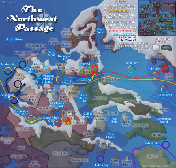
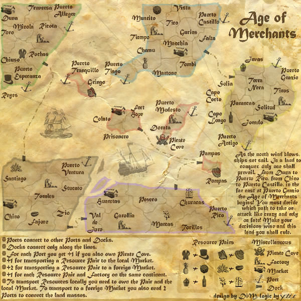
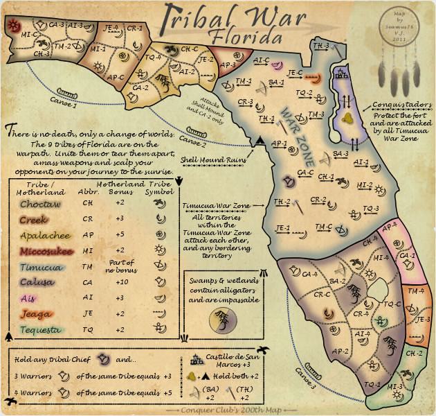
Yes, you can do supply lines ala Northwest Passage and commodity bonuses ala Age of Merchants or Tribal War ... there are other examples but those will do for now!
Otherwise, I am enjoying your thought processes and would be good to see some input from others on your gameplay suggestions.
Otherwise, I am enjoying your thought processes and would be good to see some input from others on your gameplay suggestions.


-

thehippo8
- Posts: 1025
- Joined: Fri Feb 19, 2010 5:32 pm


Re: Ring of Fire - Battle for the Spice Islands
![]() by koontz1973 on Thu Nov 01, 2012 1:46 am
by koontz1973 on Thu Nov 01, 2012 1:46 am
[Moved]
Into the drafting room you go. You should get a few more to look over there.
vaughn, territ names are to bloody small. I find it very hard to read them and when you make the small, it will be even harder. When you shrink you map, you need to do the names on the shrunken map. Text does not scale nicely.
Ships need to have a name put on them. Will think about connections but lines are the norm. different ways can be found and will think on it. Theme, why spice islands? What made these islands so special people fought over them? And how can you bring them into the gameplay. Think about maybe holding port(s), a ship and a spice. Make these bonuses progressive so holding the same spice will increase with the amount of ships and ports you hold. More ships allow you to transport more, and ports allow you to sell more. You only have 5 spices so there is plenty of expansion for small games and plenty to fight over in large games. Spice islands inset. You can remove the pretty graphics (compass and ships), move the islands down and bung a port on each island. This makes sense as all are islands. You can then use the spices at the top as the spice territs needed to hold for a bonus. Link each one to specific island(s).
Will have a longer/better look later for you and try to come up with some ideas.

-

koontz1973
- Posts: 6960
- Joined: Thu Jan 01, 2009 10:57 am


Re: Ring of Fire - Battle for the Spice Islands
![]() by koontz1973 on Thu Nov 01, 2012 7:46 am
by koontz1973 on Thu Nov 01, 2012 7:46 am
vaughn, now that you are in the foundry proper, their are some little things you need to do to make things simple for everyone.
Title of thread needs to be changed and kept up to date.
Maps name - date of last update - page of latest version.
I have done this for you this time around, but please keep it up to date.
Secondly, keep the latest version of the map in post one. Drafts can go into spoilers.
Title of thread needs to be changed and kept up to date.
Maps name - date of last update - page of latest version.
I have done this for you this time around, but please keep it up to date.
Secondly, keep the latest version of the map in post one. Drafts can go into spoilers.
-
koontz1973
- Posts: 6960
- Joined: Thu Jan 01, 2009 10:57 am
Re: Ring of Fire - Battle for the Spice Islands [1/10] Pg2
![]() by AndyDufresne on Thu Nov 01, 2012 10:07 am
by AndyDufresne on Thu Nov 01, 2012 10:07 am
I am liking the development of this map. In terms of the small version, have you played around with how big you'll want that to be?
--Andy
--Andy
-

AndyDufresne
- Posts: 24919
- Joined: Fri Mar 03, 2006 8:22 pm
- Location: A Banana Palm in Zihuatanejo


Re: Ring of Fire - Battle for the Spice Islands
![]() by isaiah40 on Thu Nov 01, 2012 8:04 pm
by isaiah40 on Thu Nov 01, 2012 8:04 pm
koontz1973 wrote:Title of thread needs to be changed and kept up to date.
Maps name - date of last update - page of latest version.
Basically like this: Ring of Fire - Battle for the Spice Islands [1 Nov 2012] v1, pg 2
-
isaiah40
- Posts: 3990
- Joined: Mon Aug 27, 2007 7:14 pm


Re: Ring of Fire - Battle for the Spice Islands [1/10] Pg2
![]() by thenobodies80 on Tue Nov 06, 2012 4:21 pm
by thenobodies80 on Tue Nov 06, 2012 4:21 pm
First of all let me say that I'm very impressed for a such nice draft.
In past I tried to develop a map about this zone and I'm well aware about how much is hard to find a good layout staying within the size limits, but I'm with cairnswk on this one.
Actually your map is really challenging: text is hard to read, there're important information that are not exaplined, it's not easy to understand how it will work...actually it would be an hell to play without the bob.
So, my very first suggestion is to make it more friendly. All the information you need to play the map should be clear on the map and you should be able to gather them just looking at it. Here we have a thread and we can discuss, but when the map will be played players should be able to play it without having to come here and ask for a clarification.
If you want to develop something that isn't exactly classic, if you want to go into something more complex....then it's fine, but please keep in mind that there's a big difference in having a complex map and a confusing one. A clear and complex map can be fun to play, a confusing and complex one will be just frustrating and players won't play it. That's simple.
I would like to comment a bit more the gameplay but actually it's not totally clear to me how you want to it plays...
For example ships, they connect together? Can attack ports? It's a two way thing or just a one way attack? Also ports connects each other?
Some land connections are also not so clear, for example how do you reach Tanimbar? Bali connects with?
Also ships have names? How people will distinguish them when playing the map? (I know we have clicky maps but we can't assume everyone uses them)
A final note, the minimap on the left...there's a reason for a such big space? Symbols can be visible even if you make the land smaller, moreover I think that they can pop out more if you reduce the size of the land but leave the symbols as they are now, or maybe just a bit smaller. reducing the space required for the minimap you can expand the bonus legend a bit more, actually i need a telescope to read names. Vertical text is in general ahrder to read when it is typed on 2+ lines (our brain tend to read horizzontally in any case, well not if you're japanese, but this is not the case I think ), so you have to use or a very clear font (basically CAPITAL letters) or write it horizontally.
Also the other inset on the right, you have a lot of "wasted" space in the lower part. If it was my map I would try to increase a bit the playable area, even if it means have a few pixels more than the limits of width. In the same time you should try to organize the other parts of the map in a better way, if possible try to keep the height within the limits.
I will leave more thoughts soon, keep it up...it's a good map and I like the spice theme.
Looking forward your next update.
Nobodies
In past I tried to develop a map about this zone and I'm well aware about how much is hard to find a good layout staying within the size limits, but I'm with cairnswk on this one.
Actually your map is really challenging: text is hard to read, there're important information that are not exaplined, it's not easy to understand how it will work...actually it would be an hell to play without the bob.
So, my very first suggestion is to make it more friendly. All the information you need to play the map should be clear on the map and you should be able to gather them just looking at it. Here we have a thread and we can discuss, but when the map will be played players should be able to play it without having to come here and ask for a clarification.
If you want to develop something that isn't exactly classic, if you want to go into something more complex....then it's fine, but please keep in mind that there's a big difference in having a complex map and a confusing one. A clear and complex map can be fun to play, a confusing and complex one will be just frustrating and players won't play it. That's simple.
I would like to comment a bit more the gameplay but actually it's not totally clear to me how you want to it plays...
For example ships, they connect together? Can attack ports? It's a two way thing or just a one way attack? Also ports connects each other?
Some land connections are also not so clear, for example how do you reach Tanimbar? Bali connects with?
Also ships have names? How people will distinguish them when playing the map? (I know we have clicky maps but we can't assume everyone uses them)
A final note, the minimap on the left...there's a reason for a such big space? Symbols can be visible even if you make the land smaller, moreover I think that they can pop out more if you reduce the size of the land but leave the symbols as they are now, or maybe just a bit smaller. reducing the space required for the minimap you can expand the bonus legend a bit more, actually i need a telescope to read names. Vertical text is in general ahrder to read when it is typed on 2+ lines (our brain tend to read horizzontally in any case, well not if you're japanese, but this is not the case I think
Also the other inset on the right, you have a lot of "wasted" space in the lower part. If it was my map I would try to increase a bit the playable area, even if it means have a few pixels more than the limits of width. In the same time you should try to organize the other parts of the map in a better way, if possible try to keep the height within the limits.
I will leave more thoughts soon, keep it up...it's a good map and I like the spice theme.
Looking forward your next update.
Nobodies
-

thenobodies80
- Posts: 5400
- Joined: Wed Sep 05, 2007 4:30 am
- Location: Milan


Re: Ring of Fire - Battle for the Spice Islands [1/10] Pg2
![]() by Industrial Helix on Tue Nov 13, 2012 1:38 pm
by Industrial Helix on Tue Nov 13, 2012 1:38 pm
I have very little input outside of that I love it, but the text seems very small to me.
Sketchblog [Update 07/25/11]: http://indyhelixsketch.blogspot.com/
Living in Japan [Update 07/17/11]: http://mirrorcountryih.blogspot.com/
Russian Revolution map for ConquerClub [07/20/11]: viewtopic.php?f=241&t=116575
Living in Japan [Update 07/17/11]: http://mirrorcountryih.blogspot.com/
Russian Revolution map for ConquerClub [07/20/11]: viewtopic.php?f=241&t=116575
-

Industrial Helix
- Posts: 3462
- Joined: Mon Jul 14, 2008 6:49 pm
- Location: Ohio


Re: Ring of Fire - Battle for the Spice Islands [1/10] Pg2
![]() by koontz1973 on Fri Nov 16, 2012 1:46 pm
by koontz1973 on Fri Nov 16, 2012 1:46 pm
vaughn03, I have been waiting like a lot of other to see what your next draft is going to be like. Like a lot of posts in your thread, I love this map. Please please post something soon and put me out of my misery.
-
koontz1973
- Posts: 6960
- Joined: Thu Jan 01, 2009 10:57 am
Re: Ring of Fire - Battle for the Spice Islands [1/10] Pg2
![]() by vaughn03 on Tue Nov 20, 2012 8:53 am
by vaughn03 on Tue Nov 20, 2012 8:53 am
Sorry was off diving. Will work on this over Thanksgiving - should have a post. Thanks.
-
vaughn03
- Posts: 145
- Joined: Thu Mar 17, 2011 8:25 pm
- Location: Kalifornia
Re: Ring of Fire - Battle for the Spice Islands [1/10] Pg2
![]() by vaughn03 on Tue Nov 20, 2012 9:57 am
by vaughn03 on Tue Nov 20, 2012 9:57 am
Regarding size - When I helped on the Mississippi map size became a big issue and the project was abandoned because creator could not get Super Size approval.
So... I made my map 840 x 800 to conform. Now I am being told I should 'play with the size'... I prefer bigger maps - what size can I use..? Now you have me all confused. (Not hard)
So... I made my map 840 x 800 to conform. Now I am being told I should 'play with the size'... I prefer bigger maps - what size can I use..? Now you have me all confused. (Not hard)
-
vaughn03
- Posts: 145
- Joined: Thu Mar 17, 2011 8:25 pm
- Location: Kalifornia
Re: Ring of Fire - Battle for the Spice Islands [1/10] Pg2
![]() by koontz1973 on Tue Nov 20, 2012 11:59 am
by koontz1973 on Tue Nov 20, 2012 11:59 am
vaughn, regarding the size, use this as a rule of thumb. If you can justify every single pixel over the 840/800, then it can be done. What I mean is, pretty graphics will not be allowed (like the border around the map, you might be asked to reduce the thickness of it) but something that allows the gameplay and players experience to be clearer will be. Right now, the spice islands are very large so you might be asked to shrink them. The mini map is also large, so that could be made smaller. But the text needs to go bigger so it can be read. This all gives you wiggle room to play with.
Mississippi could not justify this. That was the reason behind that.
Mississippi could not justify this. That was the reason behind that.
-
koontz1973
- Posts: 6960
- Joined: Thu Jan 01, 2009 10:57 am
Re: Ring of Fire - Battle for the Spice Islands [1/10] Pg2
![]() by vaughn03 on Tue Nov 20, 2012 12:12 pm
by vaughn03 on Tue Nov 20, 2012 12:12 pm
OK - Thanks - will follow those suggestions. Think I will push it out to 880-900 make the large map bigger - make the smaller maps smaller and better proportioned. Will fix text - I'll set it at size and change fonts.
-
vaughn03
- Posts: 145
- Joined: Thu Mar 17, 2011 8:25 pm
- Location: Kalifornia
Re: Ring of Fire - Battle for the Spice Islands [1/10] Pg2
![]() by koontz1973 on Tue Nov 20, 2012 12:28 pm
by koontz1973 on Tue Nov 20, 2012 12:28 pm
Let me put it this way vaughn, rarely does nobodies post in the drafting room, that is how much he regards your map. You have got a lot of support for this one and we will try to help in any way we can.
-
koontz1973
- Posts: 6960
- Joined: Thu Jan 01, 2009 10:57 am
Re: Ring of Fire - Battle for the Spice Islands [1/10] Pg2
![]() by generalhead on Tue Nov 20, 2012 5:24 pm
by generalhead on Tue Nov 20, 2012 5:24 pm
Shoot man! You have the talent. I wish my first draft looked that good. I cant wait to see future drafts.
-
generalhead
- Posts: 806
- Joined: Mon Apr 26, 2010 10:09 pm


Re: Battle for the Spice Islands Pg3
![]() by vaughn03 on Sun Nov 25, 2012 6:13 pm
by vaughn03 on Sun Nov 25, 2012 6:13 pm
Thanks for all the nice comments - I think I've read everyone's suggestions and tried to incorporate many. Still open for more...
Names/borders are an attempt to be historically accurate - I'm sure there are issues and will correct as pointed out or as I discover... Map based roughly on Wallace Map - names more roughly...
As far as playability - I think it will work but I may have missed something. Sure it will need adjustments.
At one point the way I had it, if you got knocked off the ships you couldn't get back - fixed that...
Think I would rather not have the 'troop landing dots' Fractured China map doesn't and seems better for it, to me.
Maybe should clean-up arrows? Straighter lines - maybe lines instead of dots?
Let me know what you think.
Hope I posted everything correctly - sometimes I'm pretty dumb...
Thanks.
-
vaughn03
- Posts: 145
- Joined: Thu Mar 17, 2011 8:25 pm
- Location: Kalifornia
Re: Battle for the Spice Islands Pg3
![]() by nolefan5311 on Sun Nov 25, 2012 11:01 pm
by nolefan5311 on Sun Nov 25, 2012 11:01 pm
This looks friggin phenomenal vaughn.
-

nolefan5311
- Posts: 1768
- Joined: Mon Nov 22, 2010 11:51 am
- Location: Florida


Re: Battle for the Spice Islands Pg3
![]() by koontz1973 on Mon Nov 26, 2012 12:49 am
by koontz1973 on Mon Nov 26, 2012 12:49 am
vaughn, sticky for now, stamp in a couple of days.
Let me say that this is a very nice map and whilst some of the changes you have made seem to be going in the wrong direction (coloured lines) I can appreciate what you are trying to do for the players.
Let me say that this is a very nice map and whilst some of the changes you have made seem to be going in the wrong direction (coloured lines) I can appreciate what you are trying to do for the players.
-
koontz1973
- Posts: 6960
- Joined: Thu Jan 01, 2009 10:57 am
Re: Battle for the Spice Islands Pg3
![]() by generalhead on Mon Nov 26, 2012 12:55 am
by generalhead on Mon Nov 26, 2012 12:55 am
When you post new maps can you keep the old ones up there so we can compare. Ty.
-
generalhead
- Posts: 806
- Joined: Mon Apr 26, 2010 10:09 pm
Re: Battle for the Spice Islands Pg3
![]() by koontz1973 on Mon Nov 26, 2012 1:01 am
by koontz1973 on Mon Nov 26, 2012 1:01 am
gh is right. Bung the old drafts into spoiler tags. Another thing, can you post the map on the most recent page.
-
koontz1973
- Posts: 6960
- Joined: Thu Jan 01, 2009 10:57 am
Re: Battle for the Spice Islands Pg3
![]() by vaughn03 on Mon Nov 26, 2012 11:06 am
by vaughn03 on Mon Nov 26, 2012 11:06 am
What's a 'spoiler tag'..? I'm sorry I appear to be really dense when it comes to forums, this is really my first one... I'm trying to get it right. Thanks for your patience.
I'll fix the 'colored lines' and repost later this afternoon with all my previous posted versions. I'll use black with dots and dashes and lines and arrows and what-not. I get that now... I almost changed these anyways - but I was still going to use color... Going to make them more direct, not wandering as they are a little bit now... If you have anything else that's a MUST - let me know if you have time.
I've also made this one 1200 x 1313 pixels - all the encouragement emboldened me - so I need to apply for a OVERSIZED MAP, eh? (Although my post for the forum appears to be smaller? Know why?)
Thanks
-Vaughn03
-
vaughn03
- Posts: 145
- Joined: Thu Mar 17, 2011 8:25 pm
- Location: Kalifornia
Re: Battle for the Spice Islands Pg3
![]() by isaiah40 on Mon Nov 26, 2012 11:42 am
by isaiah40 on Mon Nov 26, 2012 11:42 am
vaughn03 wrote:What's a 'spoiler tag'..? I'm sorry I appear to be really dense when it comes to forums, this is really my first one... I'm trying to get it right. Thanks for your patience.
I'll fix the 'colored lines' and repost later this afternoon with all my previous posted versions. I'll use black with dots and dashes and lines and arrows and what-not. I get that now... I almost changed these anyways - but I was still going to use color... Going to make them more direct, not wandering as they are a little bit now... If you have anything else that's a MUST - let me know if you have time.
I've also made this one 1200 x 1313 pixels - all the encouragement emboldened me - so I need to apply for a OVERSIZED MAP, eh? (Although my post for the forum appears to be smaller? Know why?)
Thanks
-Vaughn03
Spoiler tags are basically the word spoiler enclosed in [ ]. With the closing tag being [/spoiler]. So it will show like this:
You can also add a title to the spoiler just by adding an equal sign after the first instance of spoiler and what you want it to say like this:
As for supersized, as of right now we are not allowing them, on the flip side if a map really needs some extra room within reason then thenobodies80 and myself will discuss it and let you know. So before you go and make you map that size, let me look at it and see what can be done to get everything to fit within the current large size of 840x800.
-
isaiah40
- Posts: 3990
- Joined: Mon Aug 27, 2007 7:14 pm
Re: Battle for the Spice Islands Pg3
![]() by vaughn03 on Mon Nov 26, 2012 12:31 pm
by vaughn03 on Mon Nov 26, 2012 12:31 pm
Here we go - I started out keeping to the 840 x 800. Then Cartographers told me I should look to go extra - admittedly I went for the full 1200... Now it's not in 840 x 800 proportions any more - changing that is a LOT harder than changing the attack lines... Worse case that would be 876 wide x 800... I think bigger is much better for this map because of the small straights and the graphic elements.
Don't understand with 2 sizes why they are so close together in size..? Makes more sense to me to have a big at - 1314 x 1200 (In my case) and then size the small to like 657 x 600 pixels for people playing on tablets/phones. No?
Anyways let me know - thanks.
Don't understand with 2 sizes why they are so close together in size..? Makes more sense to me to have a big at - 1314 x 1200 (In my case) and then size the small to like 657 x 600 pixels for people playing on tablets/phones. No?
Anyways let me know - thanks.
-
vaughn03
- Posts: 145
- Joined: Thu Mar 17, 2011 8:25 pm
- Location: Kalifornia
Who is online
Users browsing this forum: No registered users
|
|||||||
| Conquer Club is not associated with RISK online in any way. Copyright © 2006-2024 by Big Wham LLC | |||||||